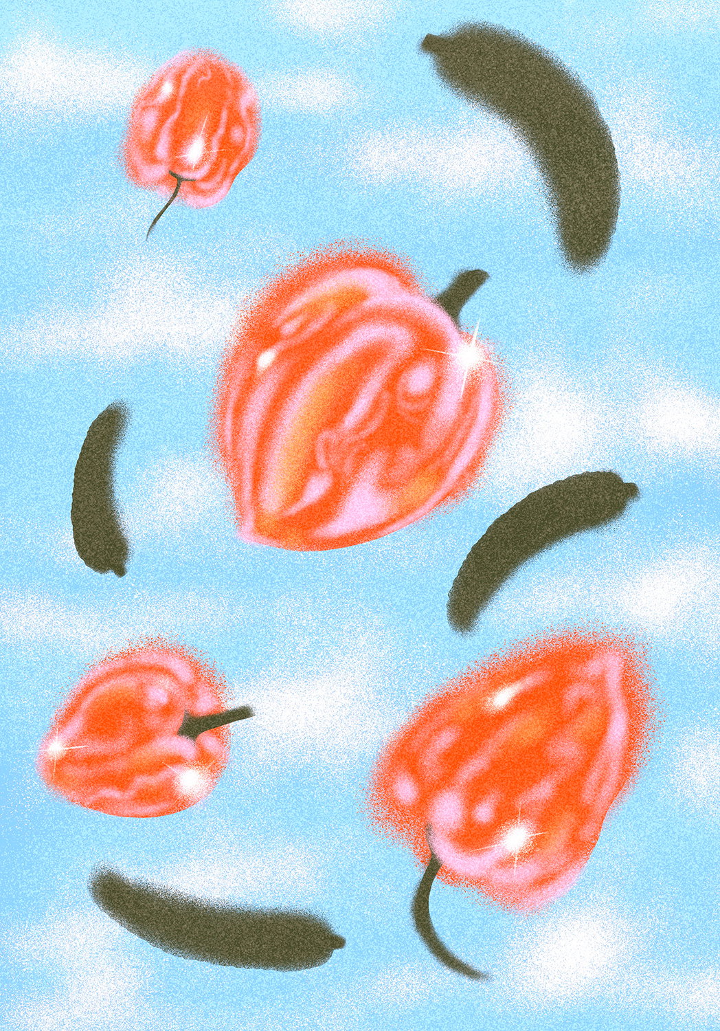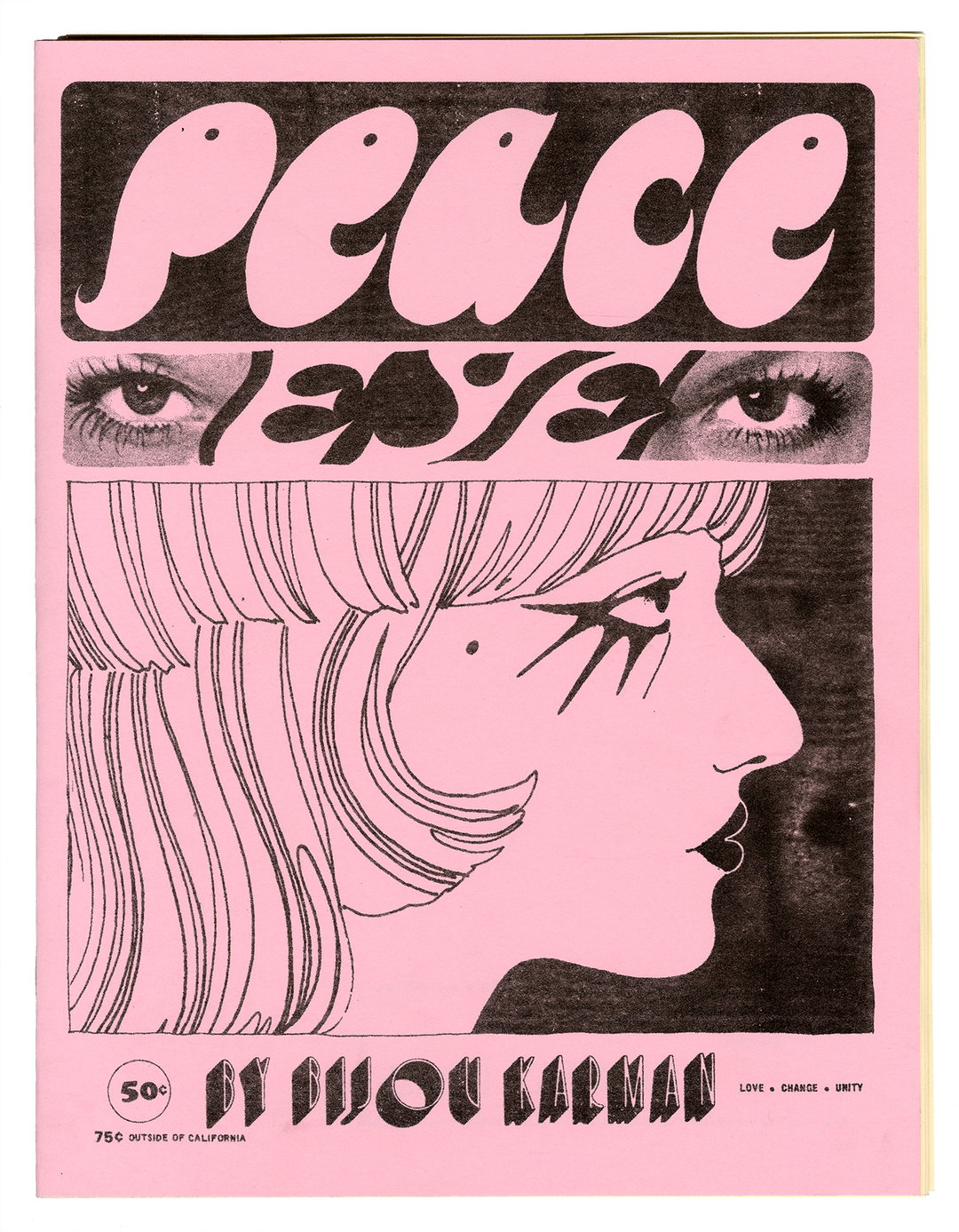
Jo Iijima’s graphic design works are cosmic swirls of moving image and blended brand identities
The artist transmits a strong signal of emotion, surprise and connection from his multilingual universe.
Jo Iijima is part of It’s Nice That’s Ones to Watch 2025 – a curated list of next generation creative talent from across the globe. Discover all 65 creatives in our directory, here.
“Ever since I landed on Earth, I’ve known words to be limiting,” says Jo Iijima, a graphic designer and creative based in New York City. “Visuals, however, speak to me in infinite ways.” Through design, Jo layers cultures, colours and typography that go beyond mere language and dimension – and it shows. His brand identity, campaign, art direction, Risograph printing and custom typography work embraces a chaotic blend of Japanese and English, putting diverse letterforms and graphic textures into a blender. “Because I’ve lived in so many cities, I see Japanese culture from a cosmic point of view. My roots are in Japan, but my imagination floats somewhere out in space,” says Jo.
The rhythms of Jo’s moving images are a blistering swirl of technicolour and personality borrowed from the “playful eccentricity” of Japanese culture. Jo cites J-pop as an inspiration in pushing everything to the 200% (just listen to the ear-popping walls of volume of Ging Nang Boyz). As well as that, vocaloid artist Hatsune Miku influences Jo’s impossibly high tempos – he exaggerates visuals with “joy and purpose”. Jo’s work wants to stay in people’s, something he ensures with sparks and whiplashing movement. “From the glowing vibrant Chinese character signs in Hong Kong, to the neon sounds of Tokyo’s arcades, to the dynamic rhythm of people in New York, all these memories swirl together inside me like a vibrant colorful collage from a cosmic point of view,” shares Jo. “Design isn’t just something I create; it’s something that has been waiting for me like a memory from the far future. I see a world no one else has seen.”
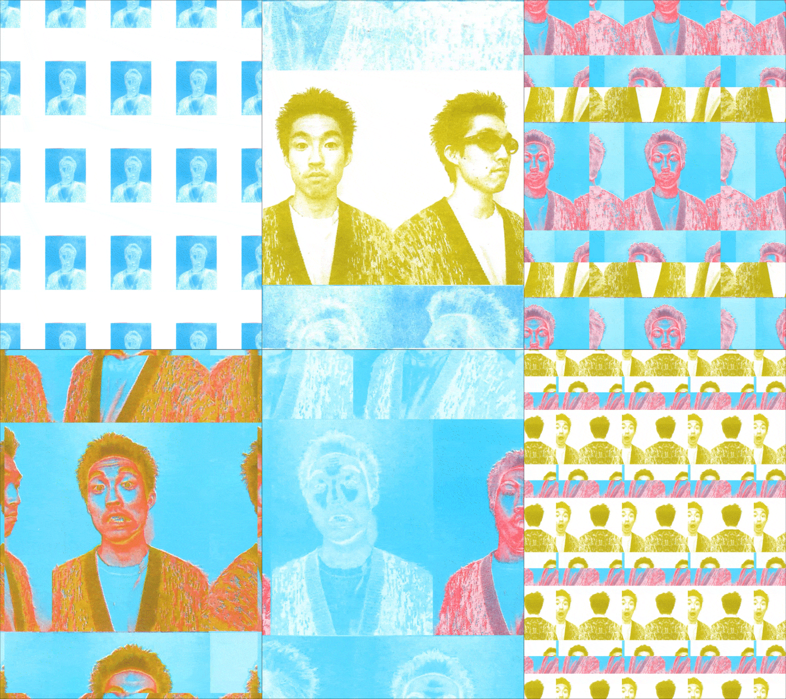
Jo Iijima: Self Portrait (Copyright © Jo Iijima, 2025)
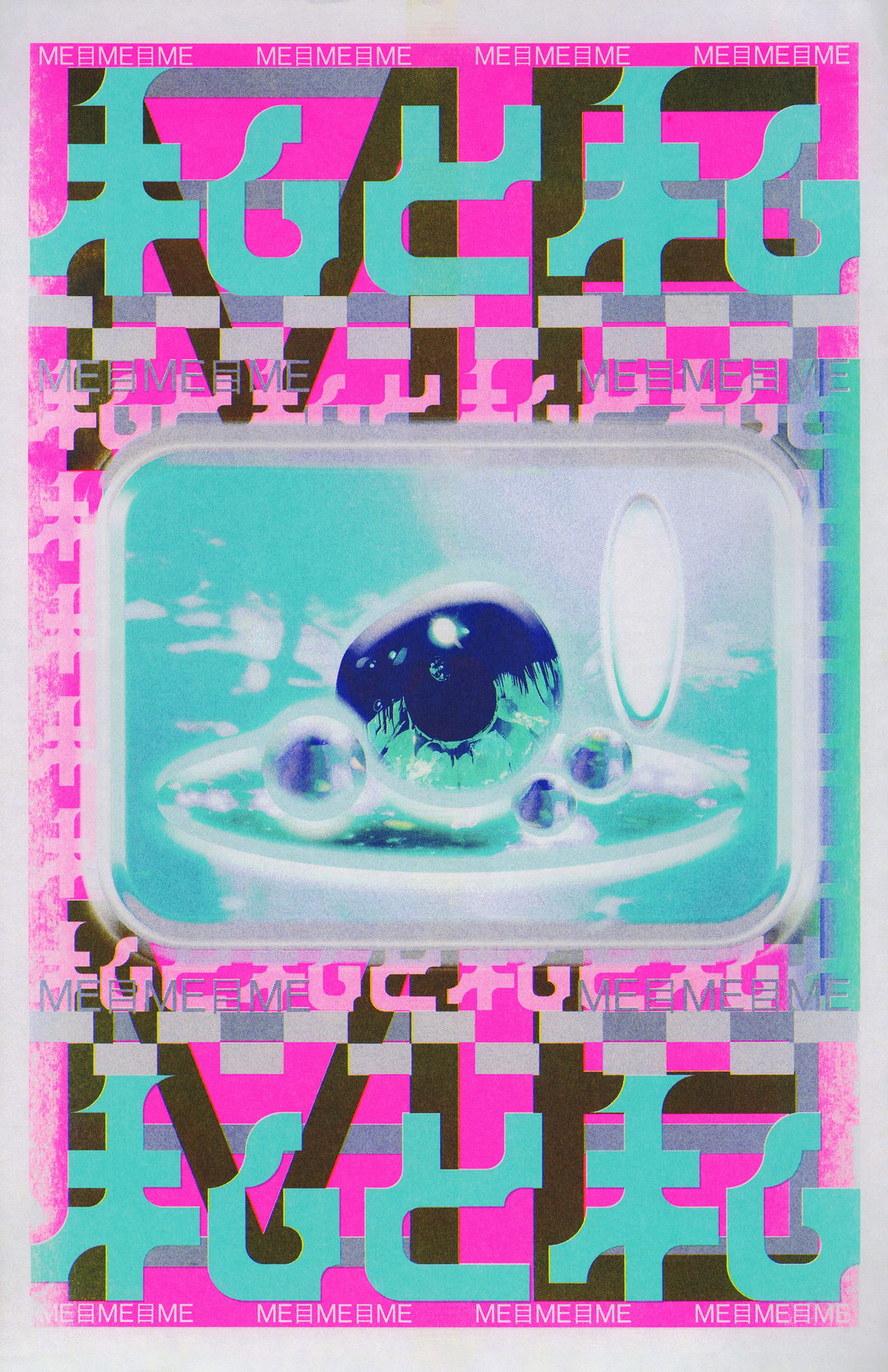
Jo Iijima: Watashi To Watashi (Copyright © Jo Iijima, 2025)
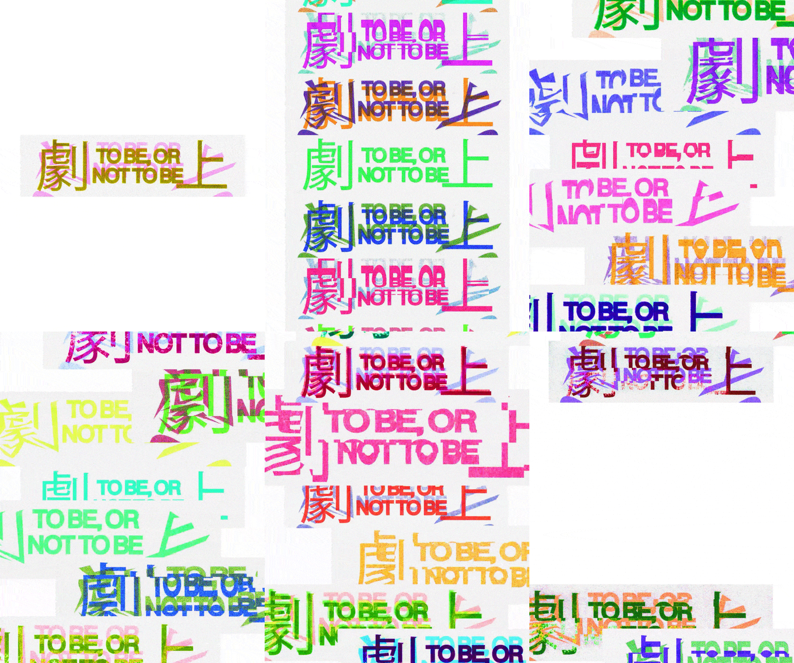
Jo Iijima: Gekijyo (To Be Or Not To Be) (Copyright © Jo Iijima, 2025)
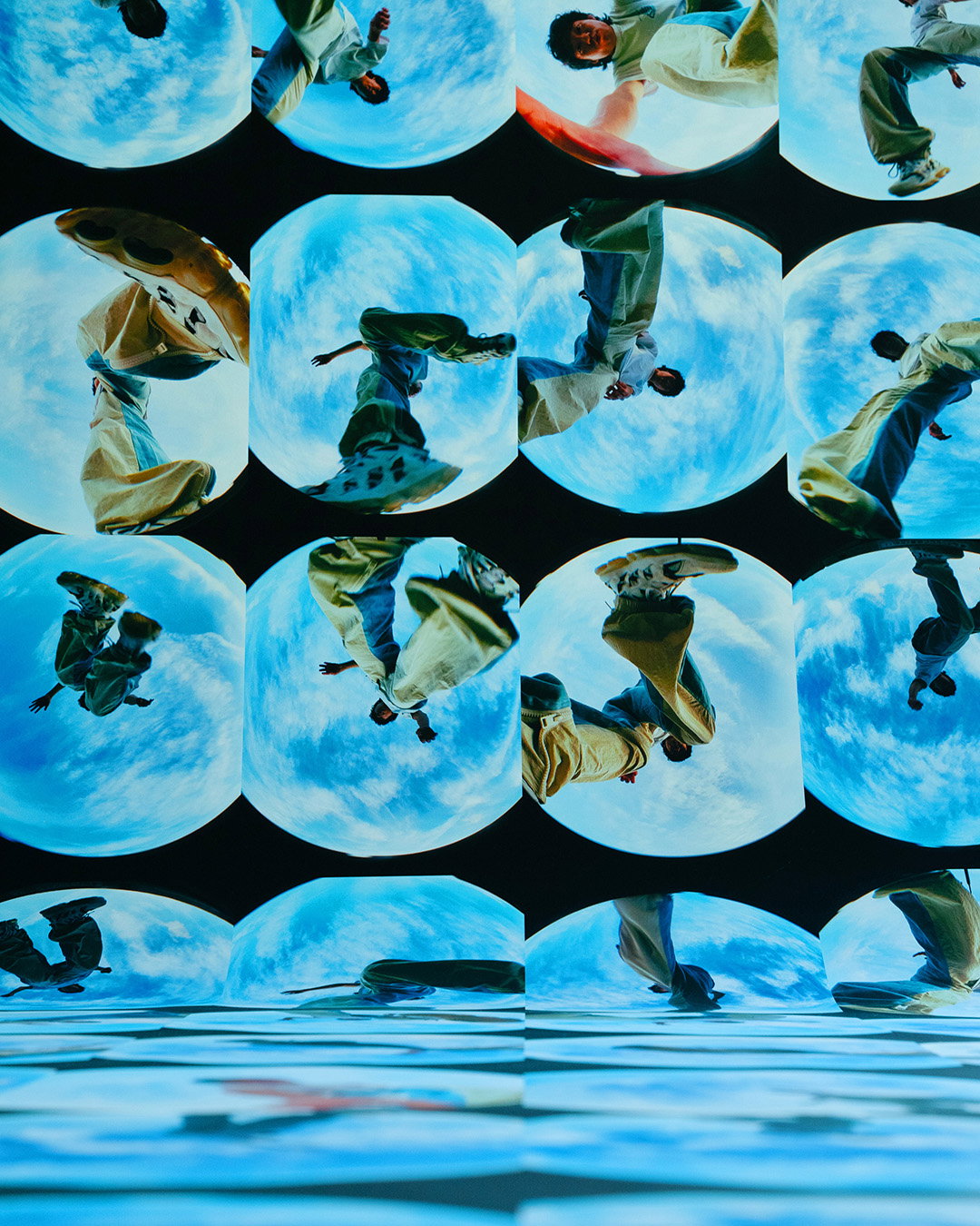
Jo Iijima: Globe Self Portrait (Copyright © Jo Iijima, 2025)

Jo Iijima: Iris Out (Copyright © Jo Iijima, 2025)
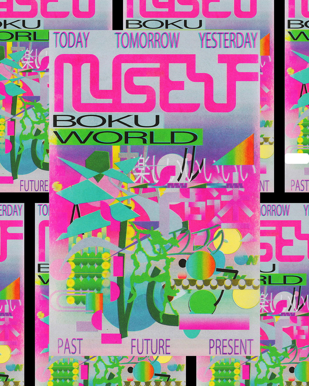
Jo Iijima: Myself (Copyright © Jo Iijima, 2025)
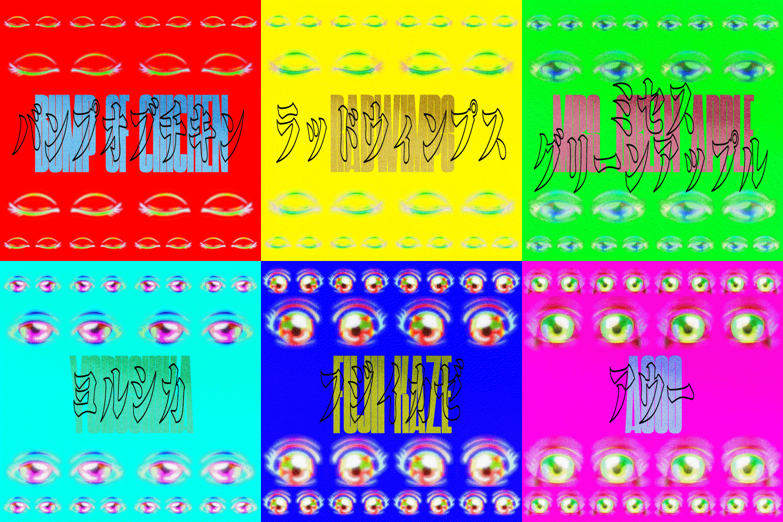
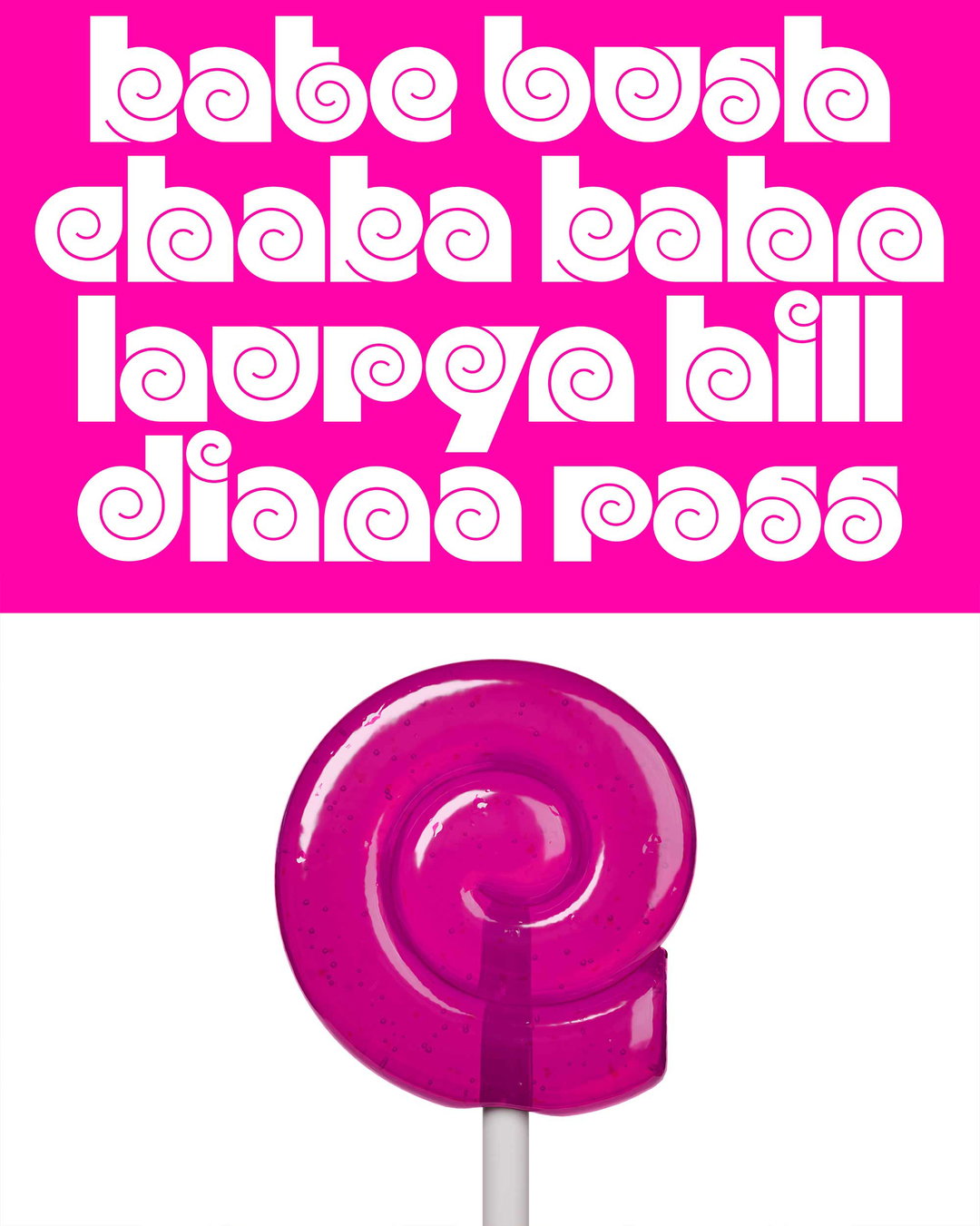
Jo Iijima: J-Pop Playlist Cover (Copyright © Jo Iijima, 2025)
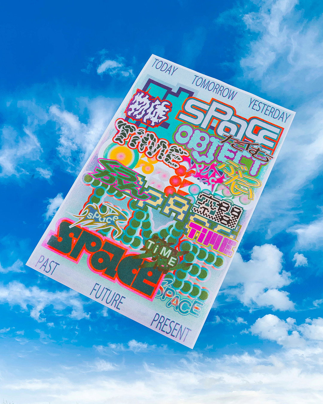
Jo Iijima: Time Object Space (Copyright © Jo Iijima, 2025)
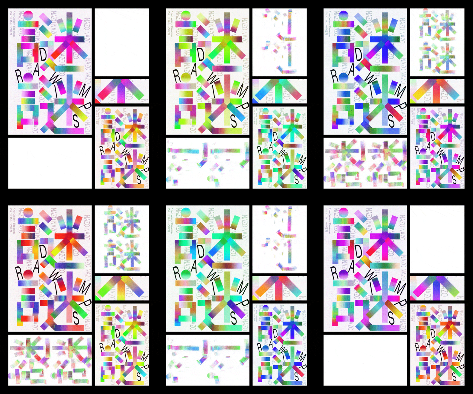
Jo Iijima: Nazonazo (Copyright © Jo Iijima, 2025)
Hero Header
Jo Iijima: J-Pop Playlist Cover (Copyright © Jo Iijima, 2025)
Share Article
Further Info
About the Author
—
Paul M (He/Him) is a Junior Writer at It’s Nice That since May 2025. He has a strong interest in graphic design, digital kitsch, multimedia painting, collage, nostalgia, analogue technology and all matters of strange stuff. pcm@itsnicethat.com
To submit your work to be featured on the site, see our Submissions Guide.