Jonathan Castro on how he's developed the emotional side of his graphic design practice
Graphic designer Jonathan Castro, no stranger to It’s Nice That, has been doing a lot of thinking, he tells us in a recent catch-up. In regards to how his practice has developed since we last wrote about his work), he explains: “I’ve been thinking about this lately. Moving along with your practice is to dig within yourself more, part of the work is not just to improve your craft or your capacity to communicate but to understand and know more the human being behind the practice, being aware of routes you took and the aura you put on things.”
It’s this which has been essential to the progression of Jonathan’s work which has developed both from a technical standpoint, but also from a conceptual one. This has only been furthered by his recent travels throughout Europe and Asia. “Working and sharing ideas with international students, clients and artists inspires me a lot, it gives you a more mature perspective on how you are doing things and the audiences you work for. You learn a lot from these experiences that, in a kind of way, helps to re-shape your work.” A key learning from the past few years, Jonathan explains, is to take a more holistic approach to developing your work: it’s not just aesthetics and techniques that need to be worked on, but your personal and emotional approach to your practice.
“I think one of the best ways to improve your practice is researching about and learning new things out of the graphic design spectrum,” he continues. As a result, he’s recently started a residency at the Jan van Eyck Academie in Maastricht. Here, he’s allowing himself to take a break from constant commercial work and explore themes that have always been of interest to him, like anthropology and rhythm.
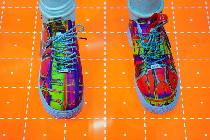
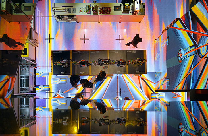
Jonathan Castro: Nike House of Innovation, Shanghai
On these topics, Jonathan tells us: “Rhythm is a medium of change; it constitutes a transition – from fear to joy, from ennui to awareness, from a simple movement to choreography or ritual movements, organic and inorganic, ranging from dance to breathing, prayer to meditation, drumming to the sound of a heartbeat, a medium capable of reaching down into the deepest layers of ‘sensuous thinking’. Most of the things I am mentioning here are inspired by film director Sergei Eisenstein and his research on this theme, he outlines what we could call an ‘anthropology of the moving image’, linking the corporeal and emotional appeal of cinema with invocations of archaic practices, forms, and desires. Bodies are thus in turn transformed into a ‘living medium’, capable of ‘processing, receiving, and transmitting images’ this is how I exactly see my practice.”
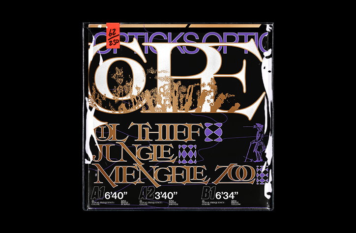
Aside from these topics, Jonathan has also been referencing pre-hispanic Peruvian textiles, an influence which is clear in some of his more recent work, including a shoe tag for Nike. Particularly in relation to textiles from Paracas culture, he explains: “In general, on basic cotton fabrics, the designs were embroidered with coloured wool. They had seven colours with which they achieved 190 colour gradations.” When looking at Jonathan’s striking designs, which often feature myriad colour combinations, his historical research shines through, only bolstered by his concluding statement: “There is a lot of identity and memory in my work.”
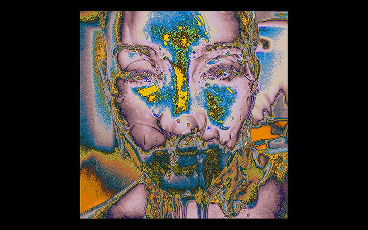
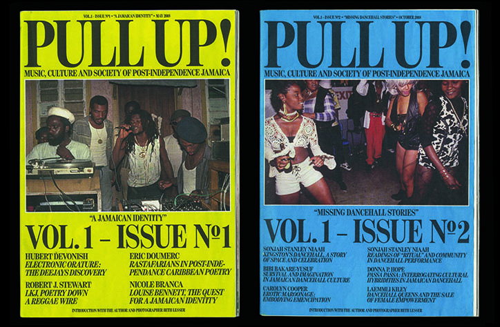
Jonathan Castro: Fake Fanzine and LP
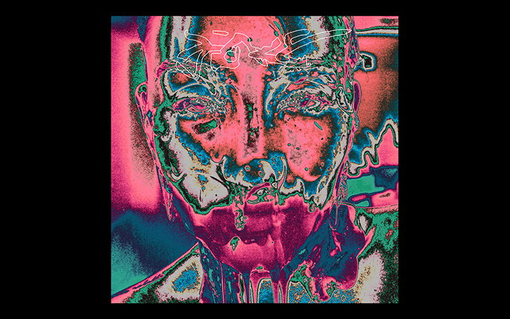
Jonathan Castro: Fake Fanzine and LP
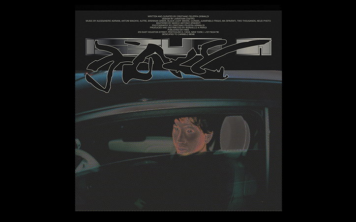
Jonathan Castro: Fake Fanzine and LP

Jonathan Castro: Nike Air Max 720
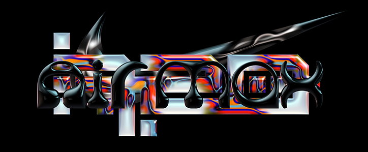
Jonathan Castro: Nike Air Max 720

Jonathan Castro: Nike Air Max 720
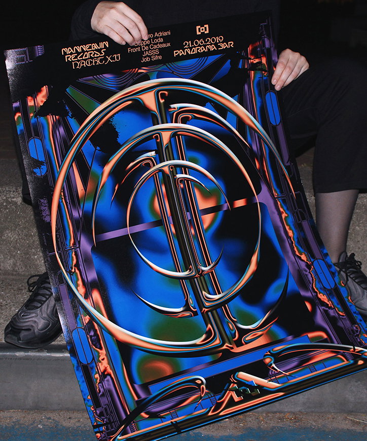
Jonathan Castro: Mannequin Records
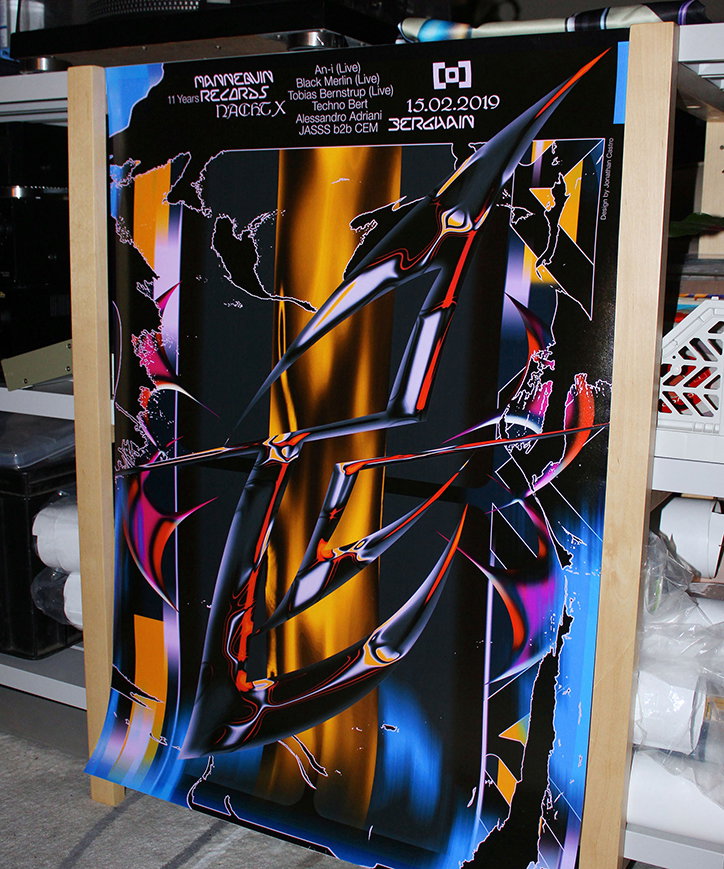
Jonathan Castro: Mannequin Records
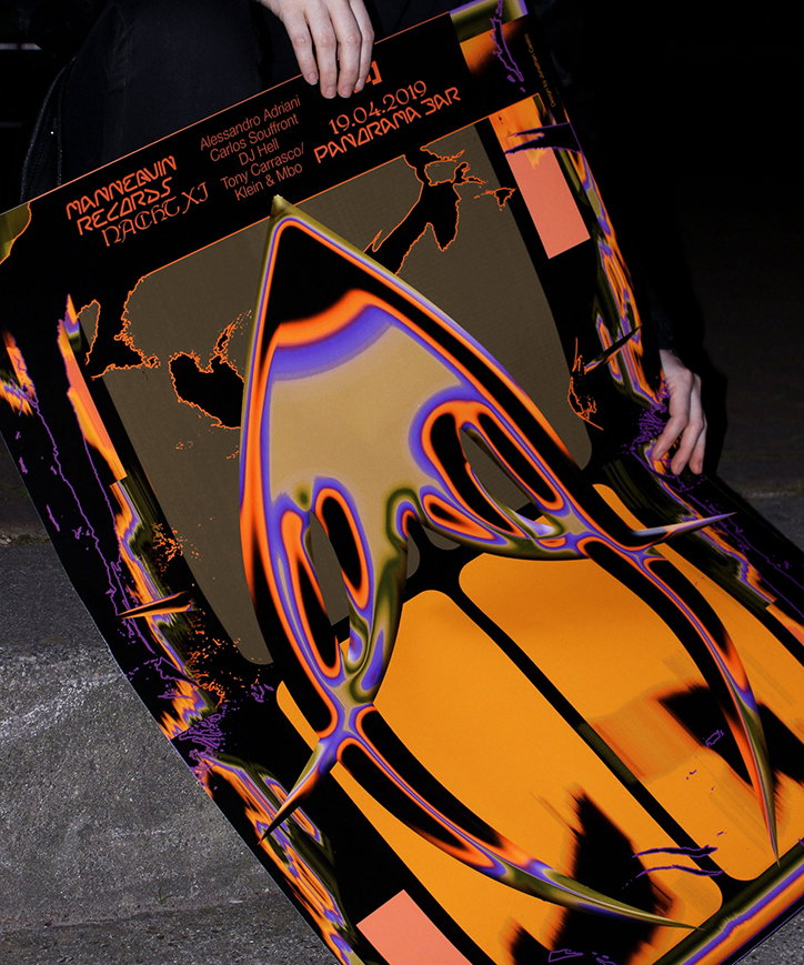
Jonathan Castro: Mannequin Records
Share Article
Further Info
About the Author
—
Ruby is Senior Creative at It's Nice That, overseeing our visual output across platforms and projects. Before that, she was associate editor on the editorial team, after joining in September 2017 following graduation from Central Saint Martins.