Jungmyung Lee on how typography can provoke a feeling in its readers
Typography is far more than a just mode of written communication for the Amsterdam-based designer, Jungmyung Lee. An alphabet’s design can invoke emotion in the reader as the collaging-together of strokes and dots can amalgamate in much much more than a shape we call a letter. “The anatomy of typefaces creates a tone of voice which could be a sound, word, language or speech,” adds Jung.
“I believe verbal communication becomes non-verbal when it is written down in print or online, therefore, typefaces are one of the most significant non-verbal cues," Jung tells It’s Nice That. "Each visual element of a typeface including its colour, point size or style is made to create a contextual background of linguistic material, and that background may carry subliminal connotations in regard to its form.” And so, these layers of meaning are embedded into each and every type design. This deeper meaning upholds Jung’s continuing fascination with the design of type and, consequently, each of her works is evidence of this expression.
But back when Jung was first introduced to the discipline in 2010 she unexpectedly “recalls an experience of shock” rather than elation. She went on a one-week typography workshop with the late Gerard Unger, renowned for his work within Dutch design, and was shocked when she realised the craftsmanship involved in making a new typeface. “The meticulous work that goes into every single character reminded me of a level of obsession I had practised when I studied car design,” she explains. However, she wasn’t deterred, going onto complete a degree in the subject and still working in the field today.
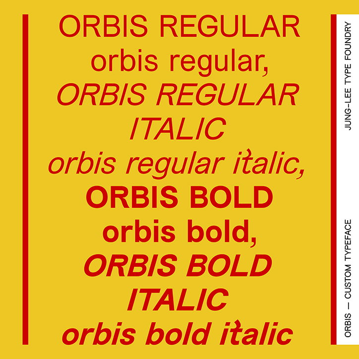
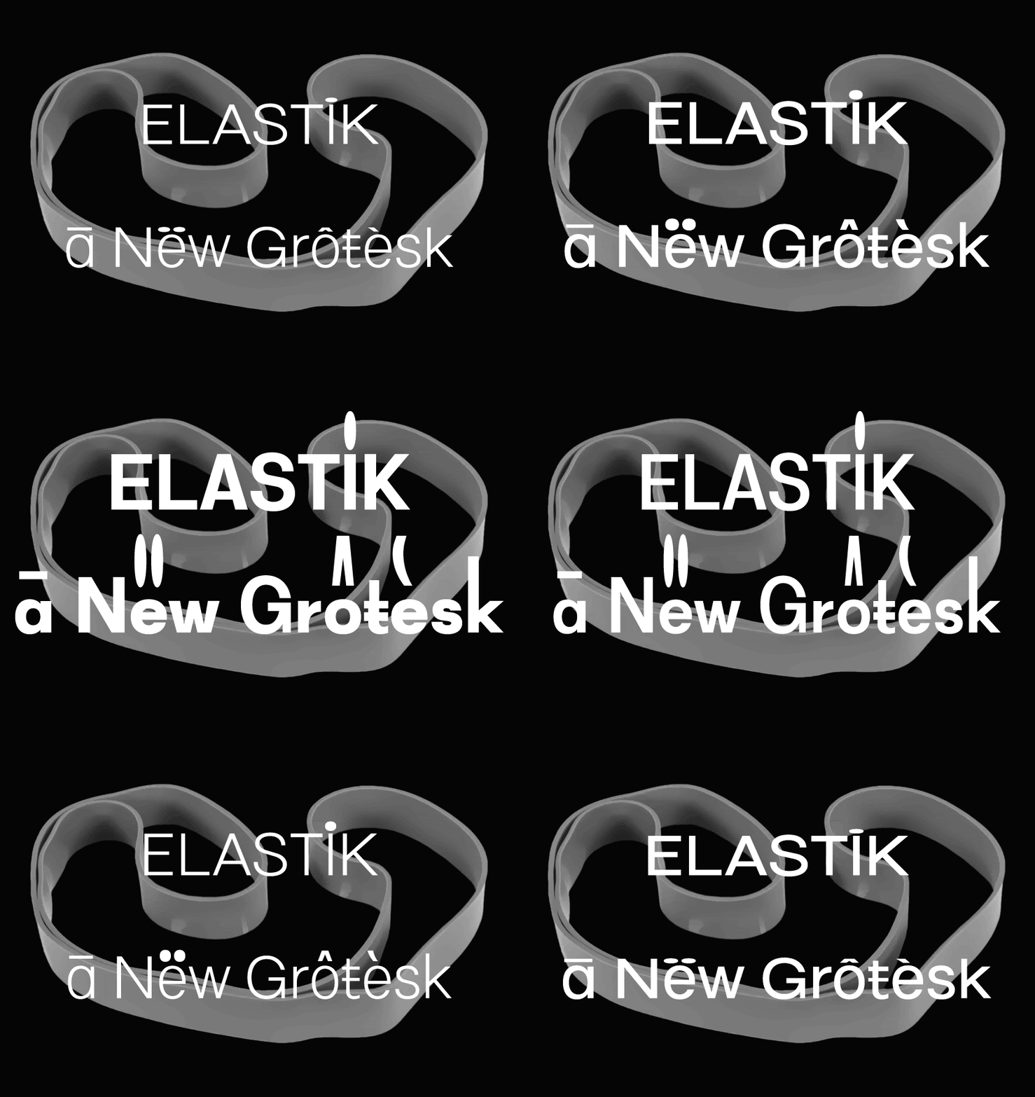
Jung-Lee Type Foundry: Orbis
In 2013, she enrolled at Werkplaats Typografie in Arnhem, developing an appreciation for the emotion and expression of a letterform. She would create a custom typeface for every student project which in turn, brought her joy. “I was quite obsessed with making characters funky or quirky, even jokey and that looked different from anything else.” She analogises this design experience to walking in high heels: “Once your eyes get used to yourself in high heels, it’s quite hard to go back to flat shoes.”
Under the tutelage of the design legend Karel Martens, Jung developed a type design practice that evokes emotion from its readers. Fundamentally, she’s most interested in how the “shape of a stroke – including its beginning, ending, thickness, angles and curves – all contain details that provoke a feeling in its readers”. Since then, she’s established her own type foundry Jung-Lee Type Foundry in 2015, and has designed myriad typefaces full of personality.
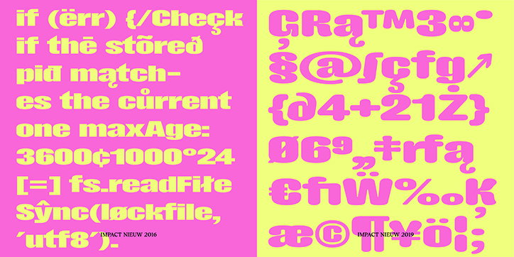
For instance, Impact Nieuwe was designed as a response to the default meme font Impact. Jung came across an article that labelled it, “one of the most hated fonts” and decided to design a new version akin to “a man in his mid-life crisis” undergoing a reinvention. “Impact Nieuw shares the same letter structure as Impact but it has daring, flowery cursive lines, ink-traps and different width variations” to contrast the previously-rigid look. Jung’s other typefaces include Joseleen, Jungka, Pirelli and custom font Orbis which also have their own distinct feeling crafted by the designer’s concept-driven skills.
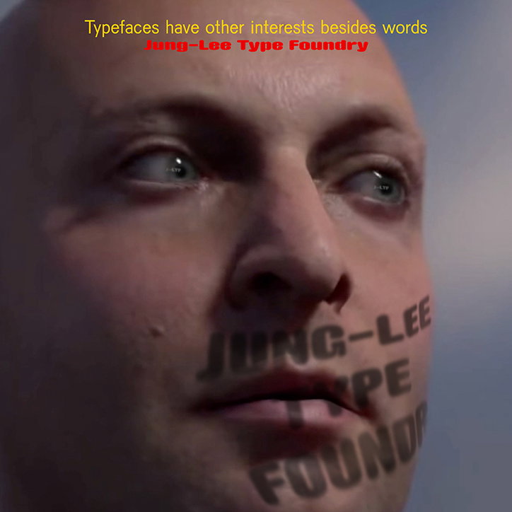
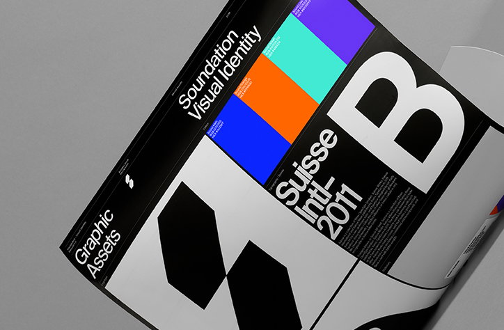
Jung-Lee Type Foundry
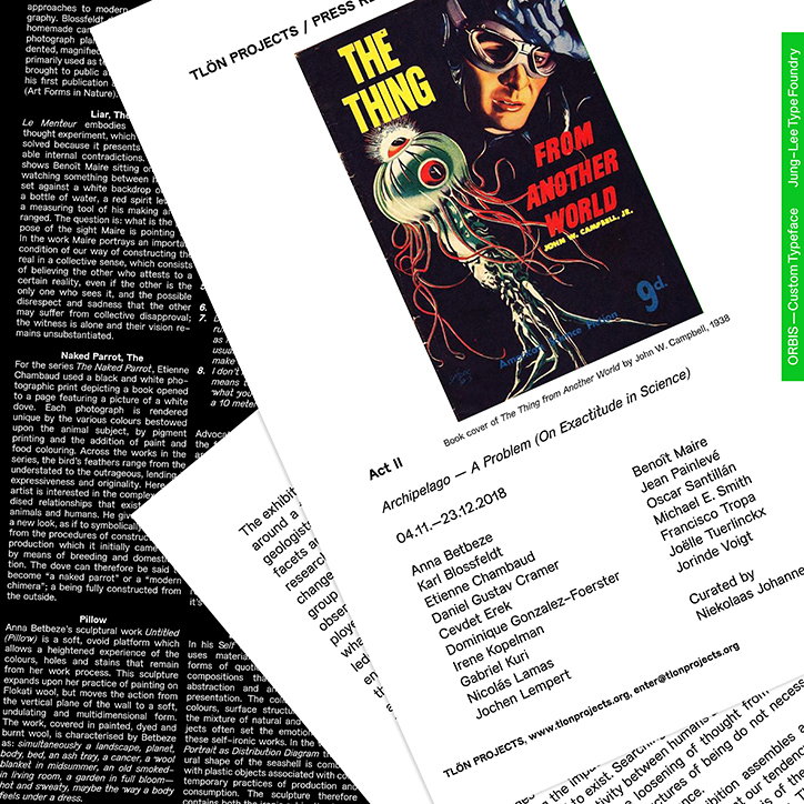
Jung-Lee Type Foundry: Orbis
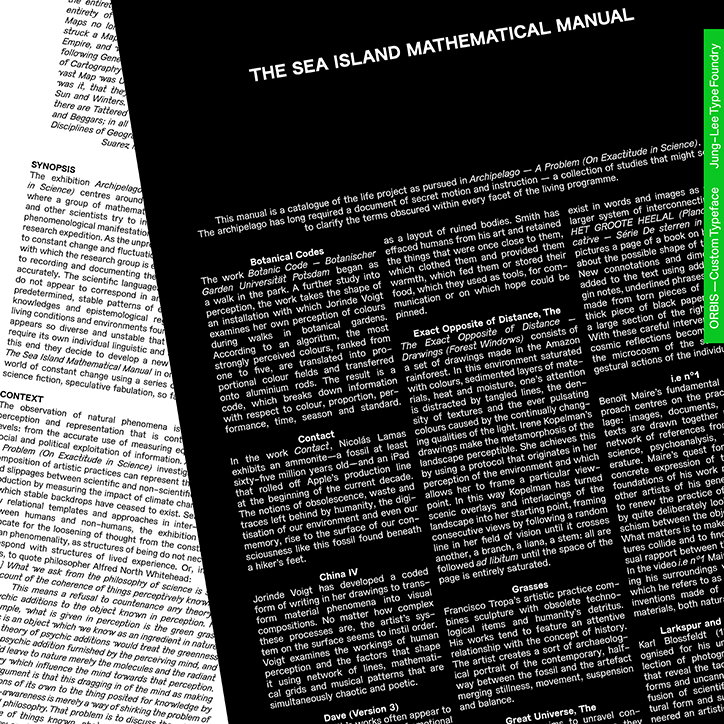
Jung-Lee Type Foundry: Orbis
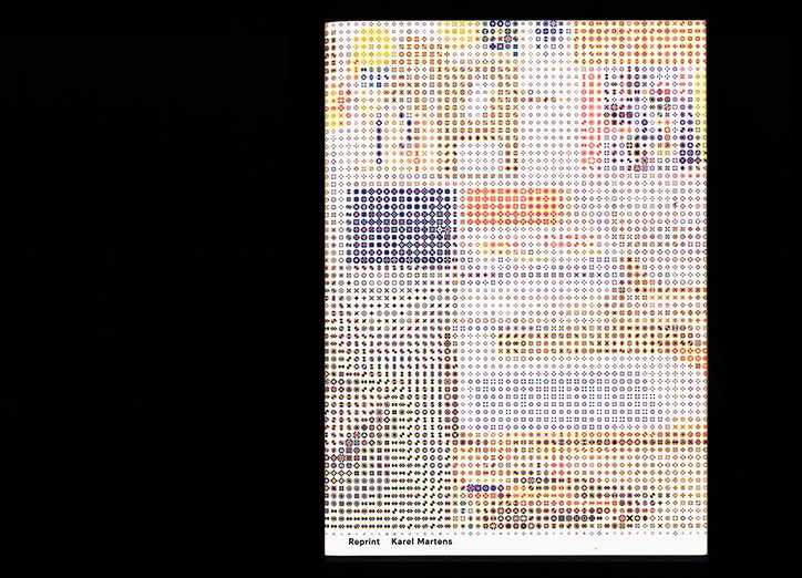
Jung-Lee Type Foundry: Jungka
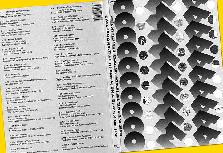
Jung-Lee Type Foundry: Oase Oma
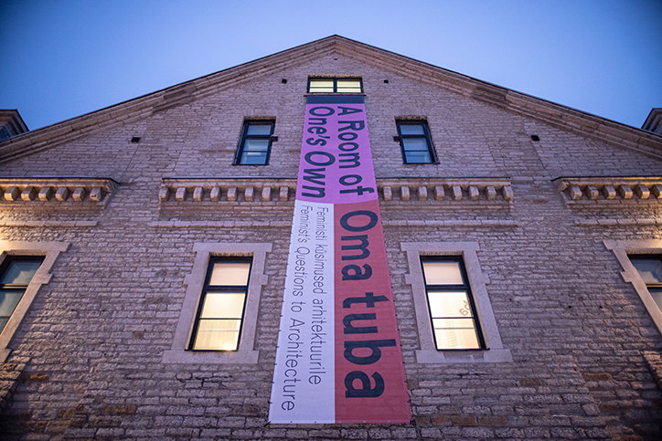
Jung-Lee Type Foundry: Pirelli
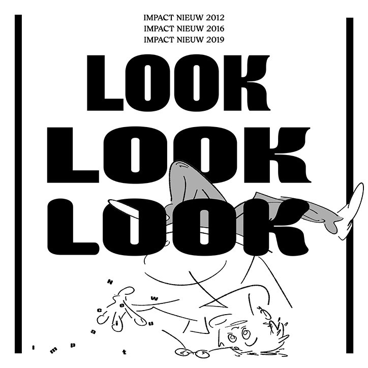
Jung-Lee Type Foundry: Impact Nieuwe
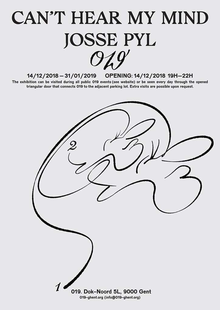
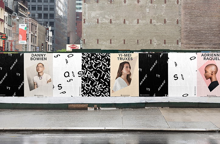
Jung-Lee Type Foundry
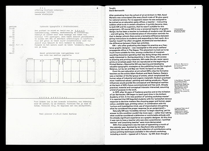
Jung-Lee Type Foundry: Jungka
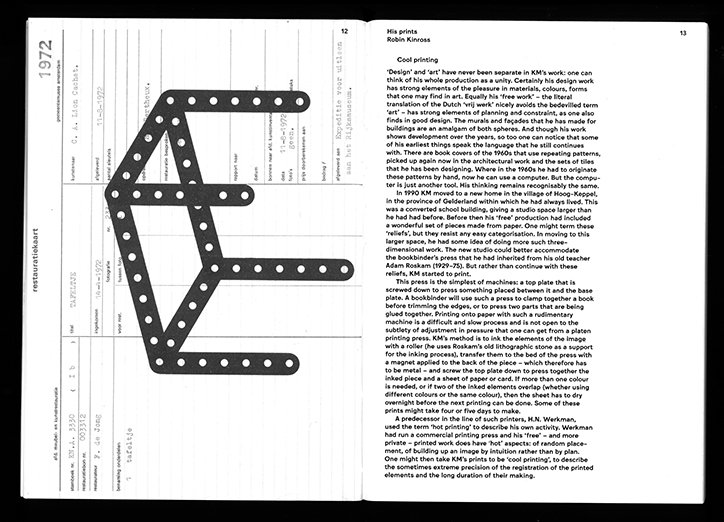
Jung-Lee Type Foundry: Jungka
Share Article
Further Info
About the Author
—
Jynann joined It’s Nice That as an editorial assistant in August 2018 after graduating from The Glasgow School of Art’s Communication Design degree. In March 2019 she became a staff writer and in June 2021, she was made associate editor. She went freelance in 2022.