Systematic and inventive, Swiss graphic designer Kevin Hoegger draws on his background in industrial design
The Zürich-based designer tells us how his past studies in industrial and interior design have profoundly affected the work that he creates today.
When Kevin Hoegger hit 15 is when he decided to embark on an apprenticeship as a graphic designer in a “very” small town just outside of Zürich. Here he learnt the ropes of the printshop, design and photo studio, working closely with a mentor who taught him the skills that he will “never forget”. Afterwards, he gained some industry experience in New York which opened up the doors for further development and a much-needed detour towards industrial and interior design. “The lack of conceptual learning brought me to the decision to study industrial design in Zürich,” Kevin tells It’s Nice That. “The process of solving problems through a new product brought me the conceptual skills I was missing.”
After his studies, Kevin returned to New York a few times but ultimately spent most of his post-grad life working for an architect on interior design and corporate architecture. During this time he was working as a freelance graphic designer on the side, then at the beginning of 2018 he started his own studio. As a result, Kevin’s work spans identity and graphic design, flitting between logos, posters, website, signage and installation, “with the other disciplines always in the back of my head.”
It’s safe to say that Kevin’s background has had a profound influence on the work that he creates today. So much so that he shares his studio space with two industrial designers, with whom he works closely. Beginning his day at 9 AM sharp, Kevin will first embark on the research phase before amending his practice to the project at hand. An identity project, for example, will involve finding the relevant system for the “whole communication of the company”. He adds: “This is going to be an already very important visual building block – typography or lettering are others.” Once deciphered and these “blocks” have been defined, everything else falls into place and he will start to design.
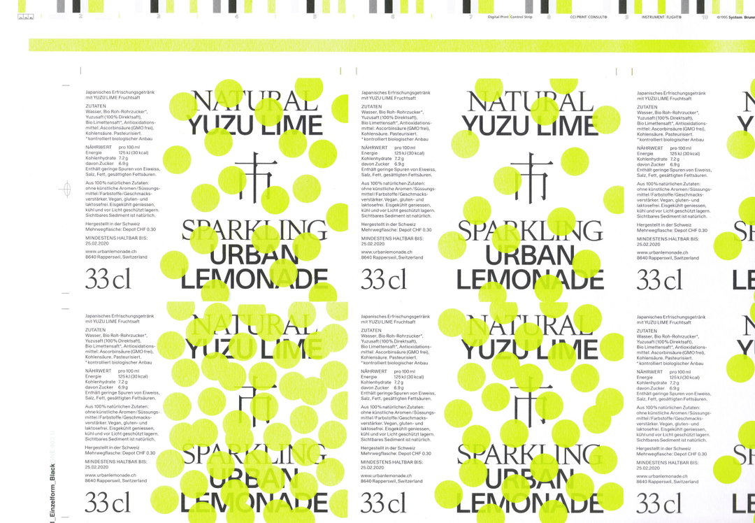
Kevin Hoegger: Urban Lemonade with Jalscha Römer. Type: Isar by Chi-Long Trieu. Funktional Grotesk by Davide Rossetto
Having grown up in Switzerland, Kevin was inadvertently surrounded by a rich design history. An obvious influence, he was able to travel regularly and absorb other cultures and new methods of working. Travel was thus a big player for this designer, who would actively soak up different processes, tools, materials, structures and systems from all parts of the globe, adapting what he finds to create his own ways of working.
“I also find inspiration in ugly beauty,” he continues, “things that have happened without purpose. Patina, textures of materials and random compositions in everyday life – but also in digital experiments, tools and computing.”
As of late, he’s been particularly interested in creating identities for different companies, because of the “everyday challenges” that they grant. Above all, he values the art of collaboration the most and thrives off meeting and working with people; it’s the feeling of understanding and learning from someone else's values on which Kevin thrives. “So if I can working on a signage project, I want to know the thoughts of architects, city planners, builders, monument preservationists, industrial designers and also the people who are potentially going to live or work there.”
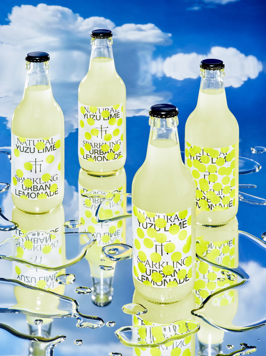
A recent project has seen Kevin release an identity for a lemonade brand, called Urban Lemonade – a name and recipe conceived by his uncle, Urban, who’d originally designed a label himself. “I thought it could be done in a better way,” Kevin says, “so my friend and now business partner Jalscha Römer (also a graphic designer) created an identity for a fresh and bubbly lemonade with yuzu as the first flavour.” He continues to explain how they didn’t want it to be perceived as a typical drinks brand, so much thought went into a new and updated design. “We used our friends’ typefaces, Chi-Long Trieu and Davide Rosseto, and chose a much more radical systematic look for the identity,” says Kevin. “The visual side of the project also has an eye on future flavours – two new ones are being released right now.”
In addition to the bottles, there will be a whole new line of printed matter added to the spectrum in the very near future – alongside the newly added flavours, packaging tape and photoshoots. Elsewhere, Kevin has plans to work on a larger signage project and a few typography-driven identities for a handful of photographers, architects, tech companies and a hotel in Sri Lanka – watch this space!
GalleryKevin Hoegger
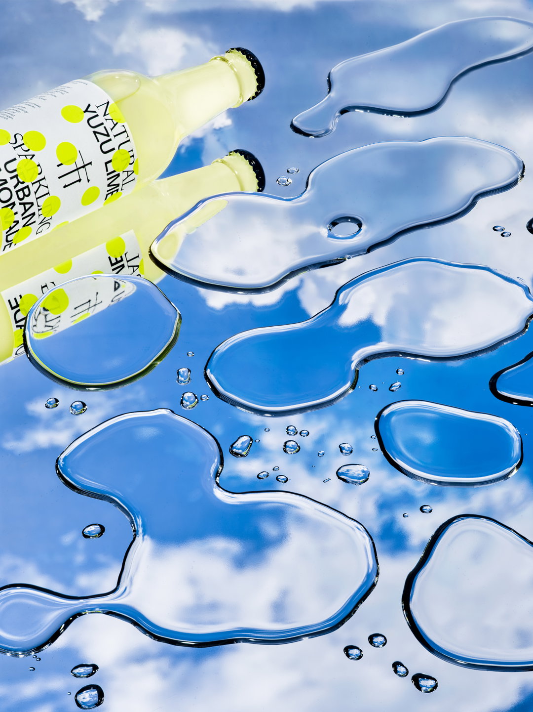
Urban Lemonade with Jalscha Römer. Photo by Tobias Siebrecht
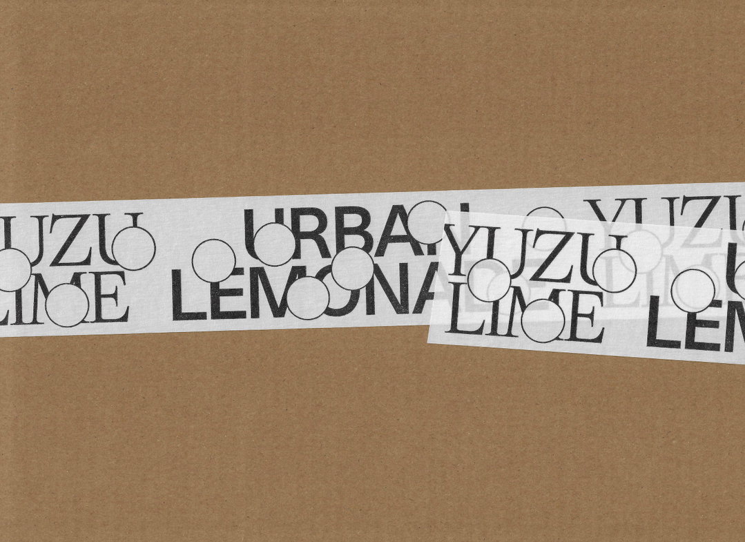
Urban Lemonade with Jalscha Römer. Type: Isar by Chi-Long Trieu. Funktional Grotesk by Davide Rossetto
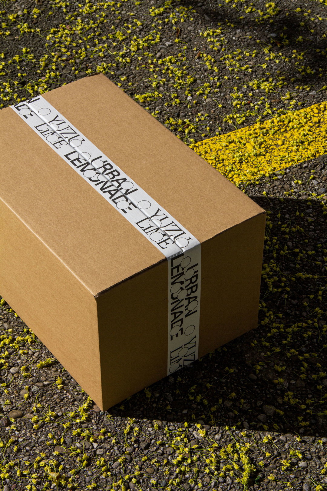
Urban Lemonade with Jalscha Römer. Type: Isar by Chi-Long Trieu. Funktional Grotesk by Davide Rossetto
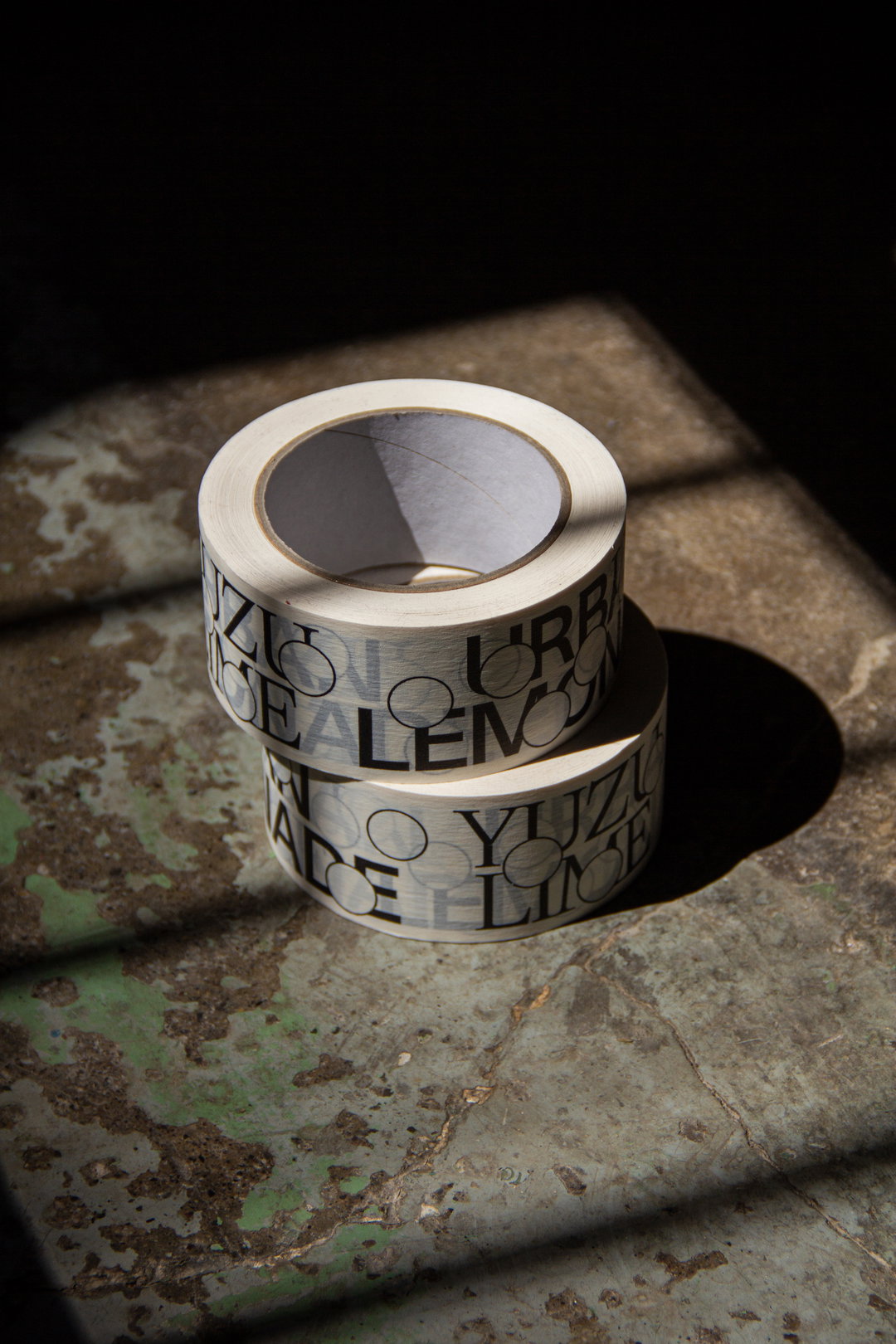
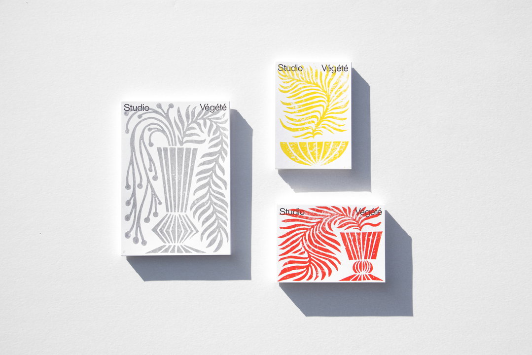
Studio Végété. Floral Design Studio run by Aline Rüede in Zürich. studiovegete.ch
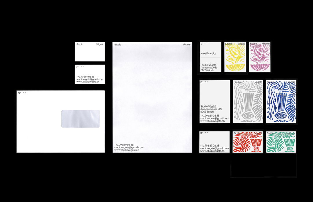
Studio Végété. Floral Design Studio run by Aline Rüede in Zürich. studiovegete.ch
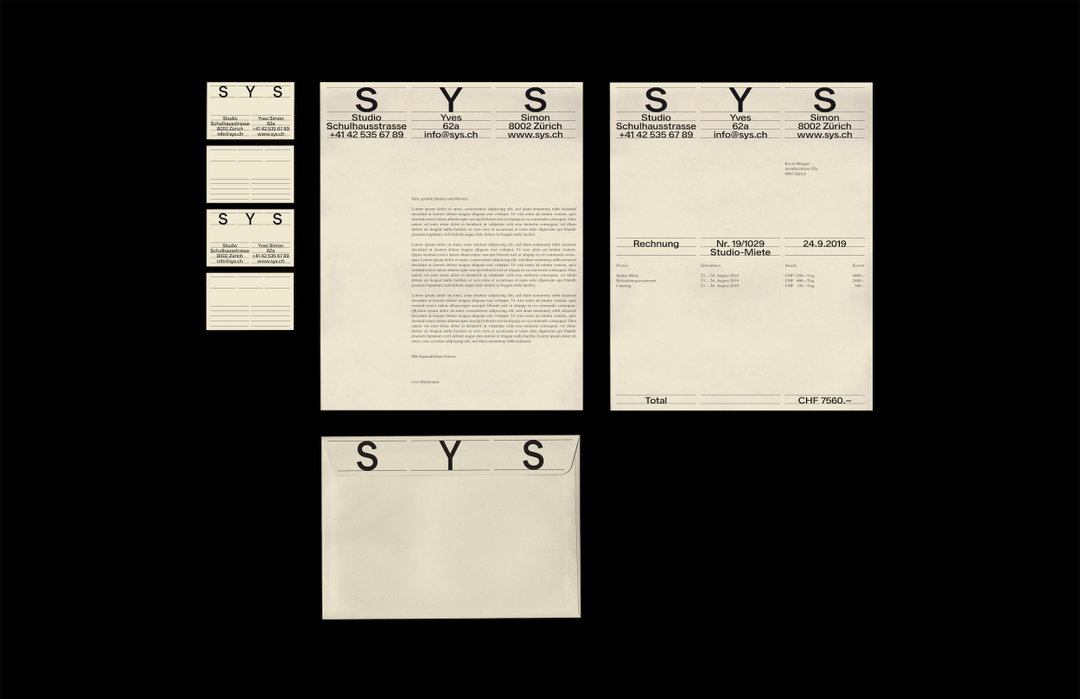
SYS. Photo Studio run by Yves Bachmann and Simon Nagel, Zürich
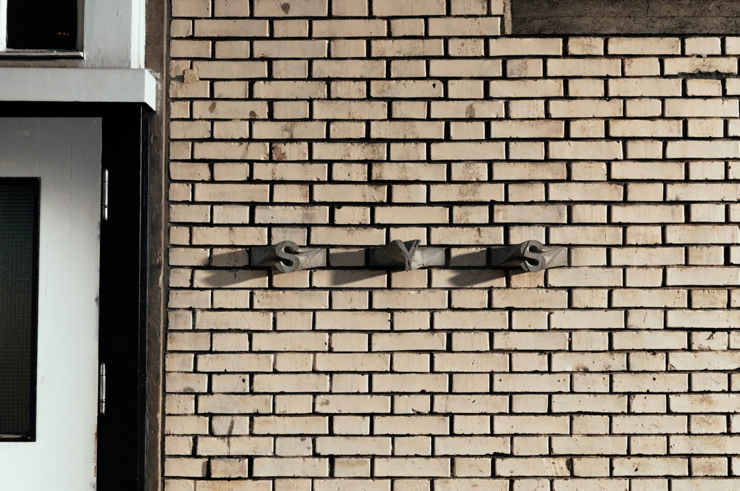
SYS. Photo Studio run by Yves Bachmann and Simon Nagel, Zürich
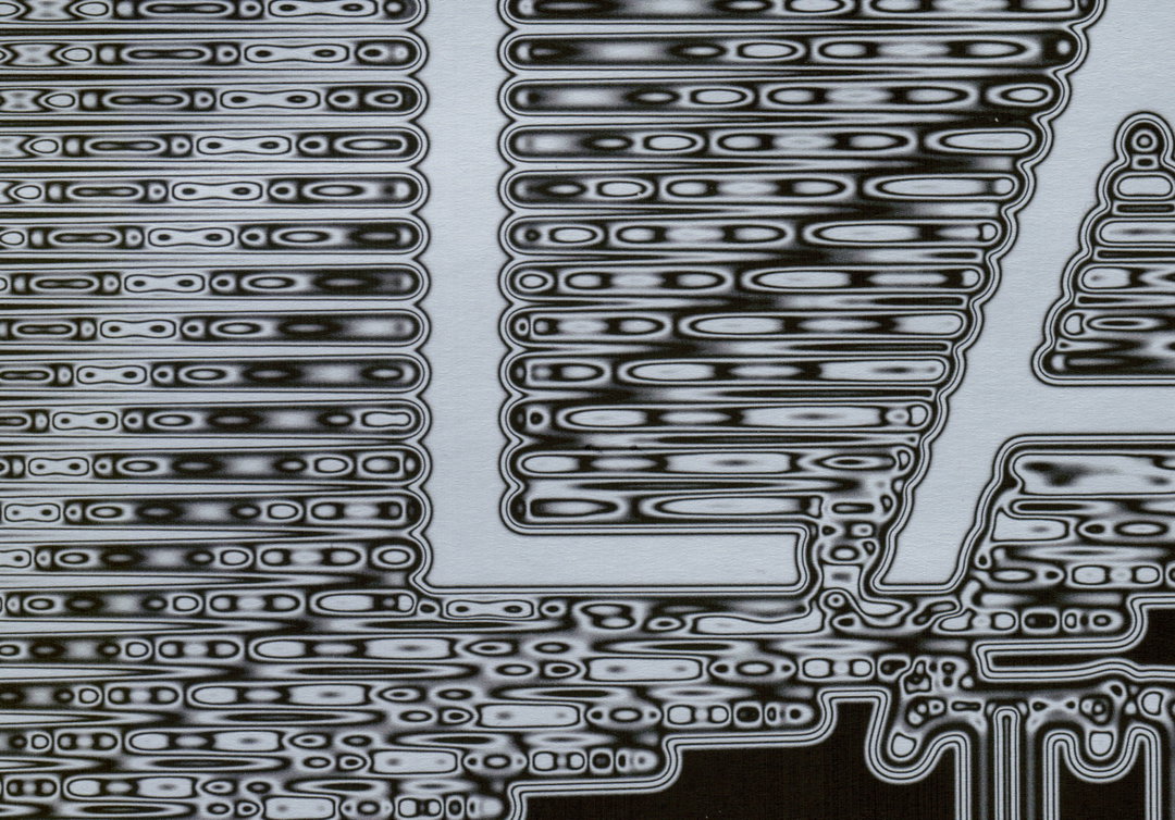
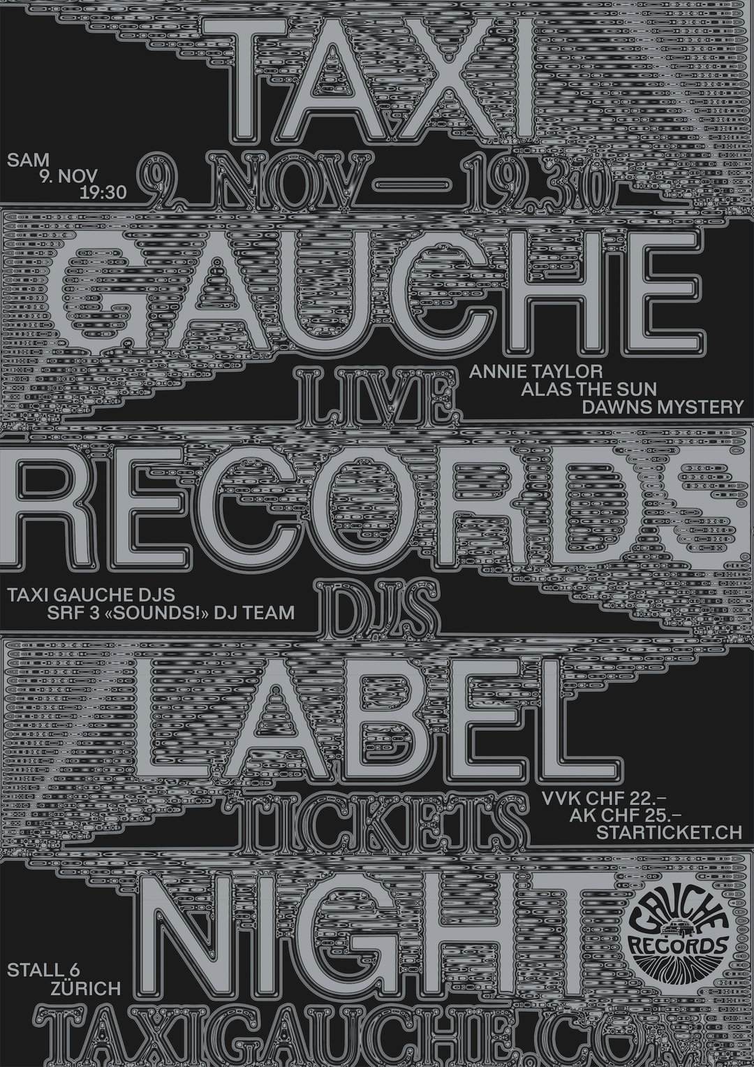
Taxi Gauche Records. Poster for the Labelnight in Zürich
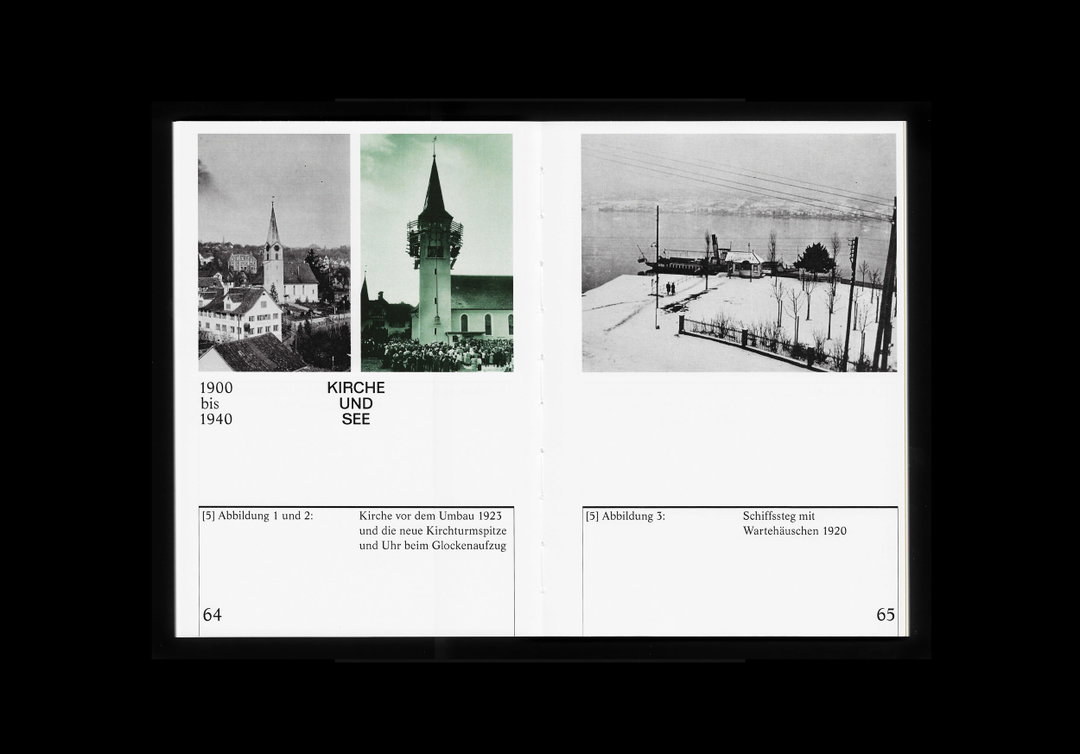
Ortsmuseum Rüschlikon. Small local history Museum. Exhibition design, flyers, poster and catalog
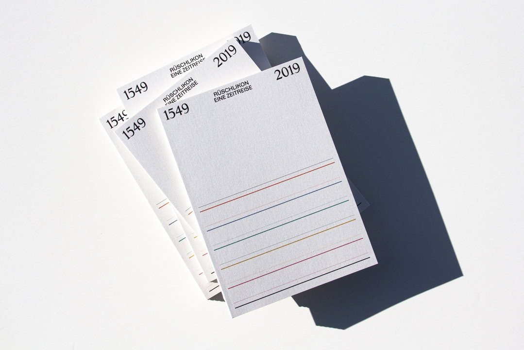
Ortsmuseum Rüschlikon. Small local history Museum. Exhibition design, flyers, poster and catalog
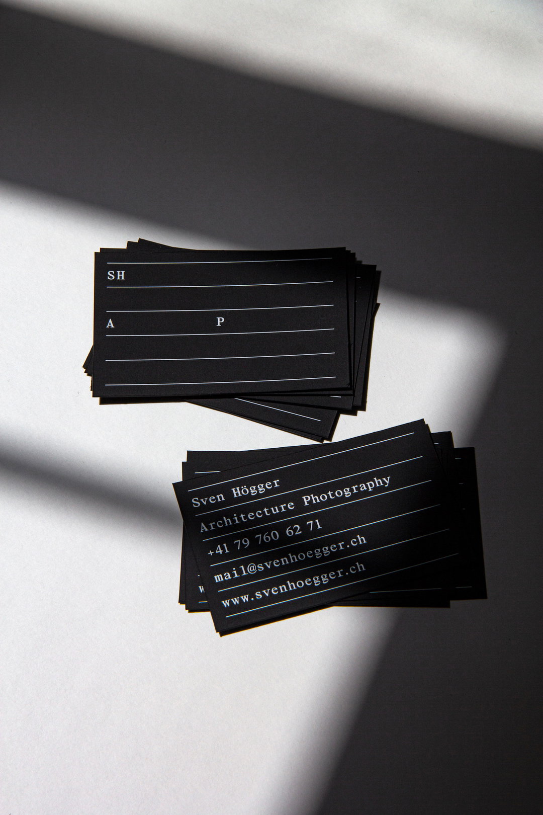
Sven Högger. Architecture Photographer in Geneva. Type: Tempos by Samara Keller, printed white on black paper
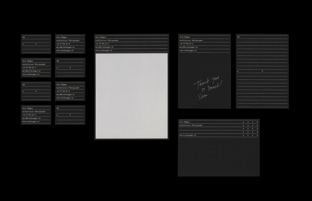
Sven Högger. Architecture Photographer in Geneva. Type: Tempos by Samara Keller, printed white on black paper
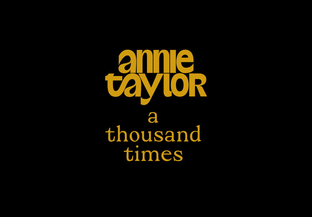
Annie Taylor. Logo Type Custom Video Titles
Share Article
About the Author
—
Ayla is a London-based freelance writer, editor and consultant specialising in art, photography, design and culture. After joining It’s Nice That in 2017 as editorial assistant, she was interim online editor in 2022/2023 and continues to work with us on a freelance basis. She has written for i-D, Dazed, AnOther, WePresent, Port, Elephant and more, and she is also the managing editor of design magazine Anima.