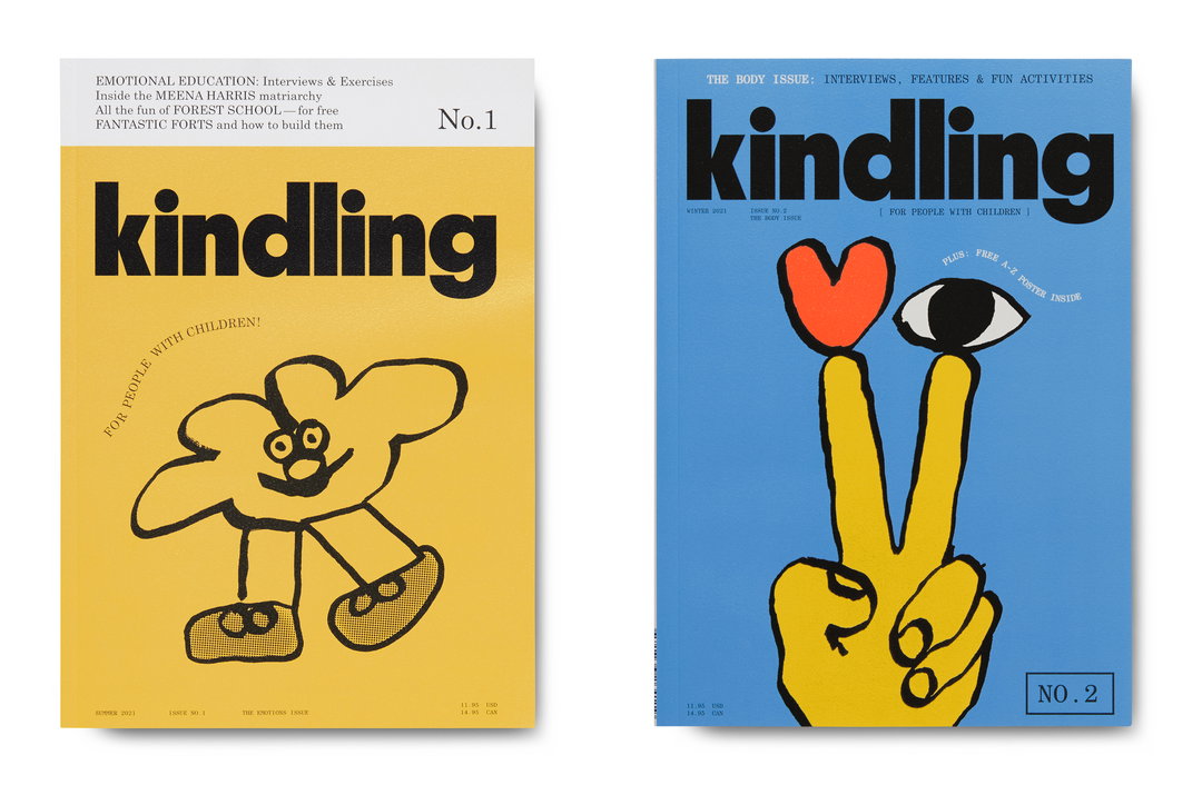
Kindling magazine explores the fresh perspectives that come with having children
The magazine aimed at “people with children” is a new sister offering to Kinfolk, and shows a more spontaneous, DIY approach from the team behind the established title.
Share
Kinfolk, the magazine dedicated to all things home, work, style and culture, is known for being sharp and refined. It’s astute and adult – serious even. Kindling, the magazine’s new sister offering, takes a totally different approach, however, and offered Kinfolk design director Alex Hunting and art director Staffan Sundström a chance to be more playful, loose and youthful – quite literally.
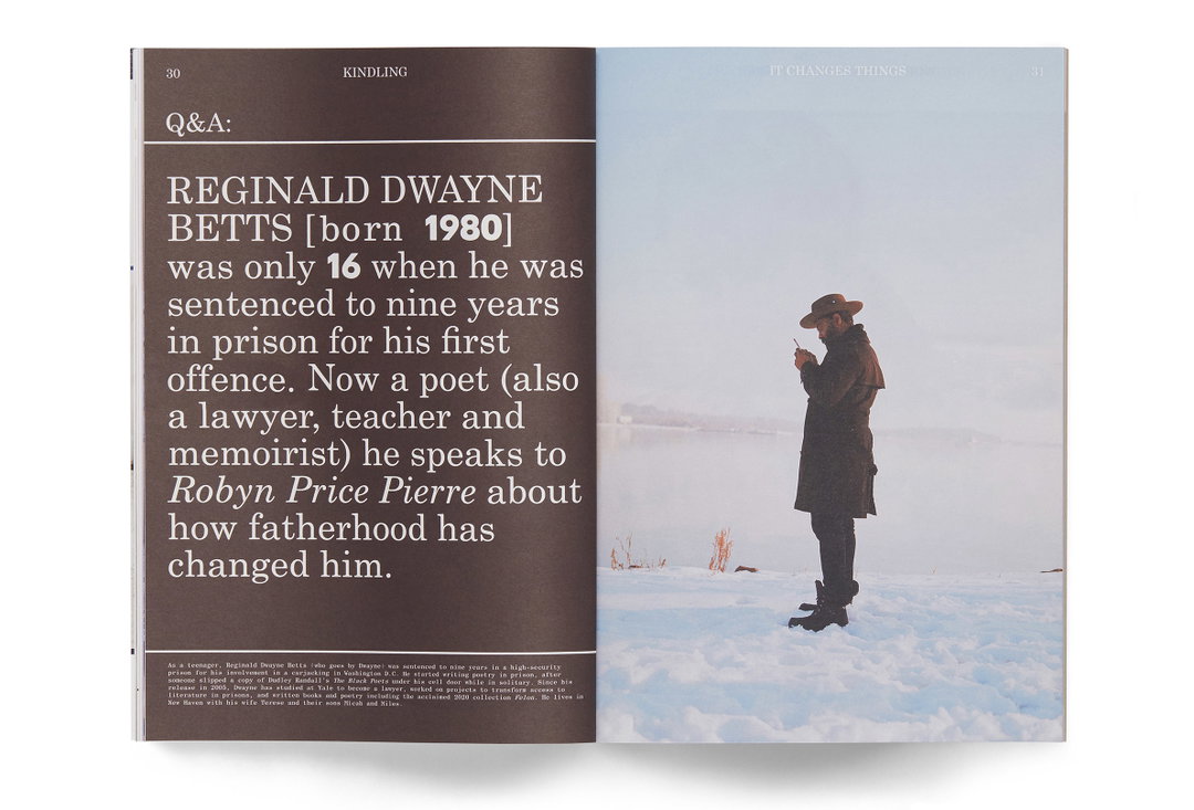
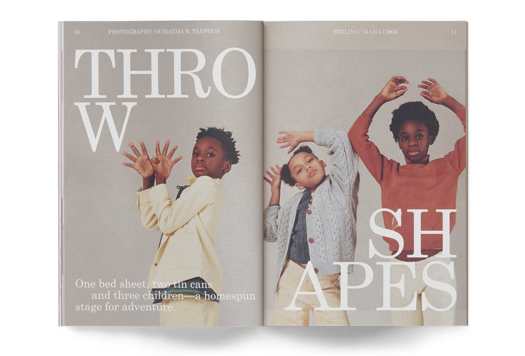
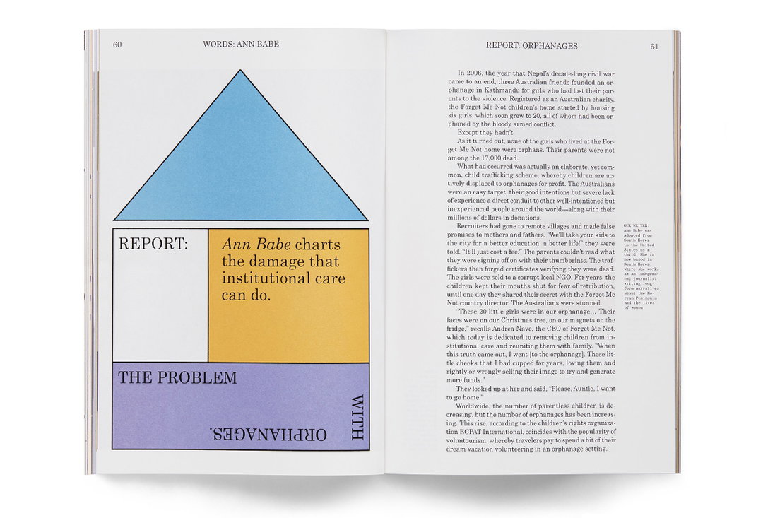
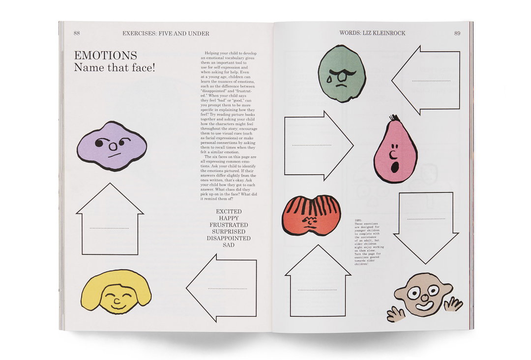
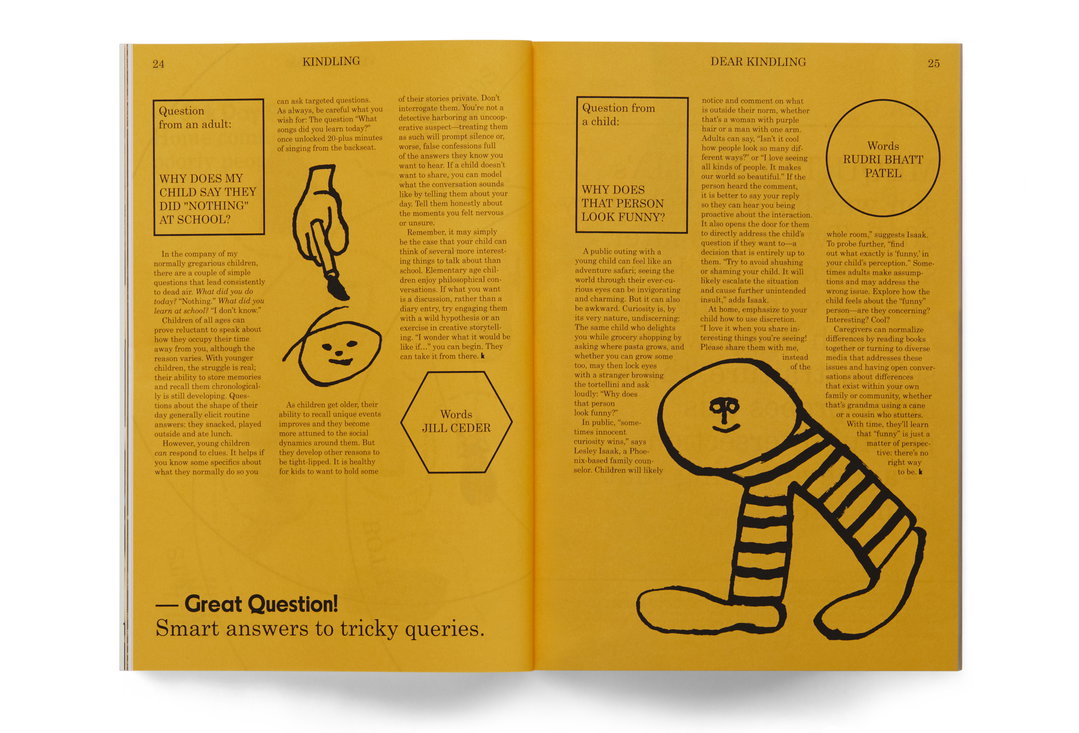
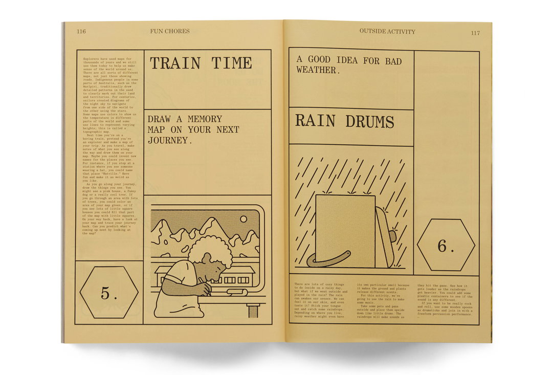
“Kindling is a magazine for ‘People with children’,” Alex tells It’s Nice That. “It explores the new ideas and fresh perspectives that come with raising a child.” Issue one, The Emotions Issue, was released in June 2021 with its follow up, The Body Issue, landing yesterday. Both show a new side to Kinfolk, catering to a slightly different audience while still retaining some of the Kinfolk character through beautiful design and intriguing editorial content. It’s an interesting challenge – to produce something that feels like it belongs within the same family as an existing title, but which pushes its tone of voice into a new direction. Alex explains that while the magazine is very much designed to be read by adults, they still wanted it to be visually stimulating for children, which perhaps explains why the magazine seems to toe the line between playfulness and earnestness. To achieve this, Alex took inspiration from “the visual language around education, spending time researching old children’s activity books and scientific journals”.
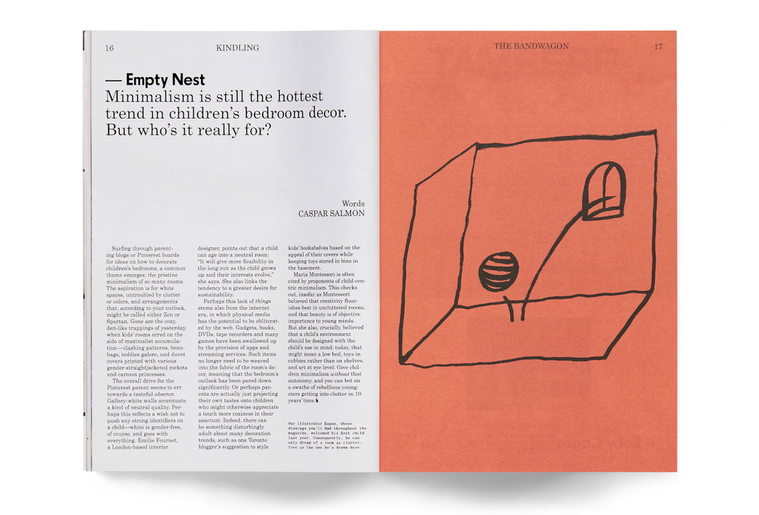
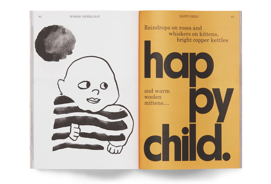
Both covers feature hand-drawn illustrations by Norwegian illustrator Espen Friberg, who works with ink on paper. “I just knew from the moment I first saw his stuff he needed to be in this somehow,” Staffan explains. “He ended up pretty much single-handedly illustrating both issues […] his style really personifies Kindling as an ‘aesthetic’ that just makes sense for everything the magazine is about and feels like.” That being said, Staffan is open to the idea of evolving that aesthetic, remarking that no commitment has been made to follow a certain style going forward: “I think it would be interesting to explore doing some variation on a photographic or typographic cover for the third issue.”
Alex Hunting Studio: Kindling magazine design (Copyright © Kindling, 2021)
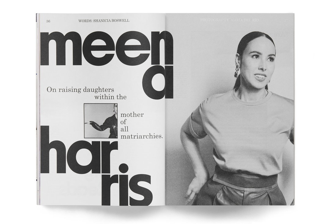
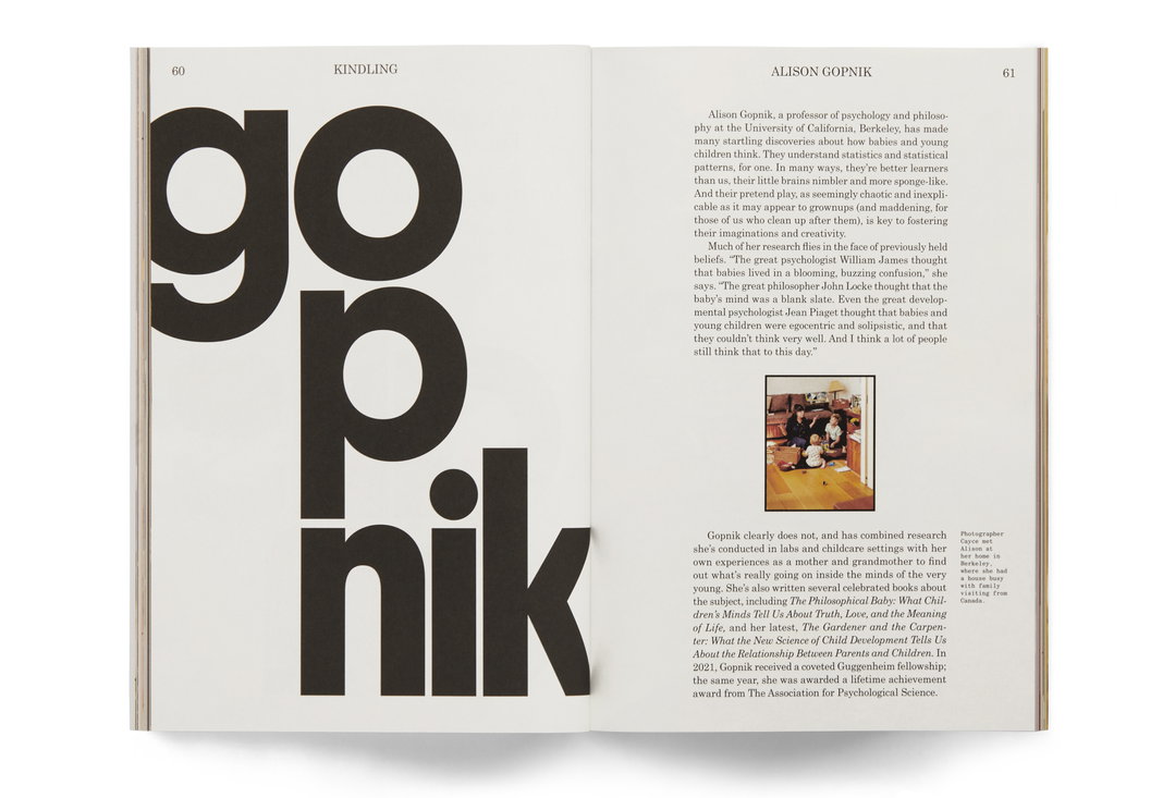
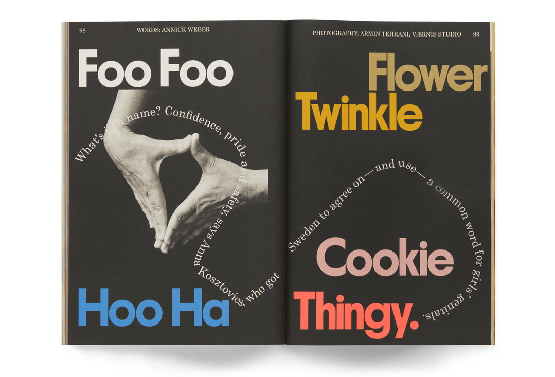
Speaking of typography, in true Kinfolk style, it’s an element that has been paid particularly close attention to. Fittingly, Alex opted for the Century Schoolbook type family (“how could I not?!”) for its “accessible yet authoritative tone,” paired with Feliciano Type’s Parafina, “which is used mainly at display sizes in a bold and playful manner.” Alex continues: “Parafina also adds a lovely Lubalin-esque 1970s feel into the mix with its multi-width geometric characters.” The result is pleasing for the way it adds visual variety and a clear hierarchy to every issue. The illustrations and typography are then accompanied by a graphic language comprised of geometric shapes, used throughout the magazine to tell stories in a simple and immediate way. “They are part infographics, part page furniture, and help to add another layer to the design language above and beyond the photography and the illustration,” Alex outlines.
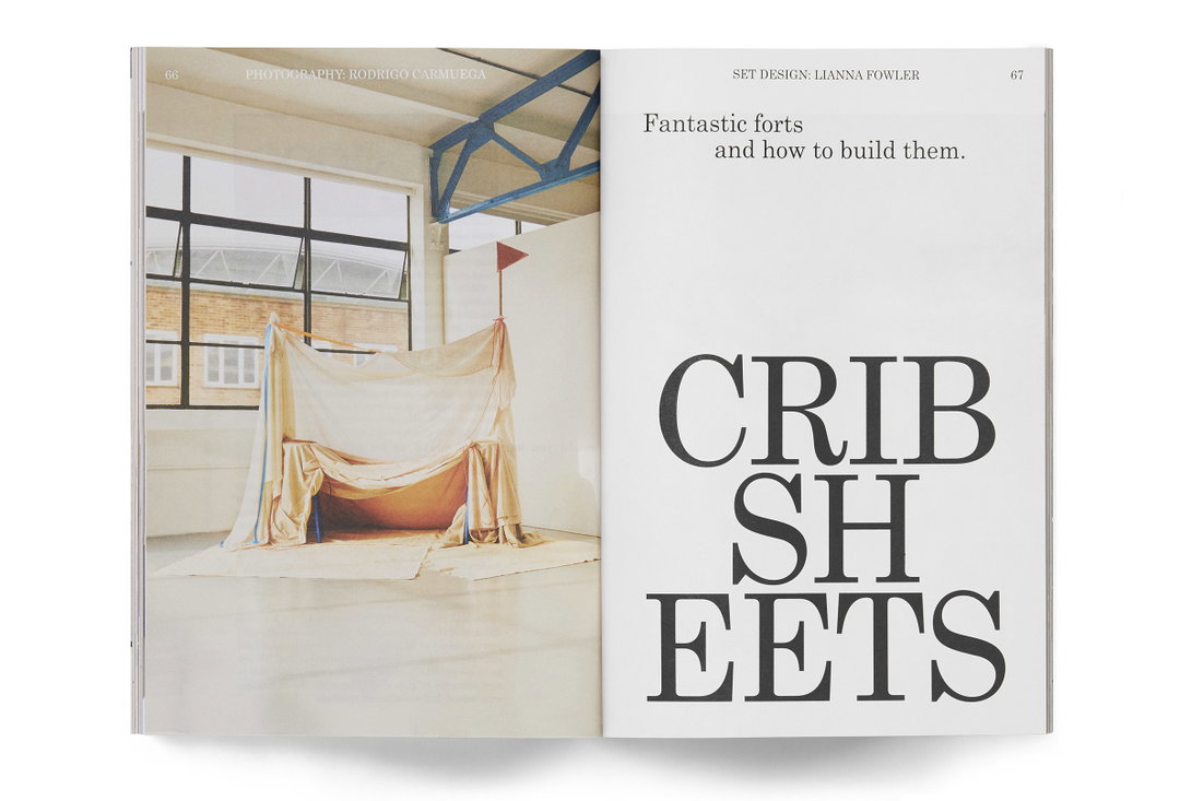
It’s in the art direction of Kindling’s photography that the differences between Kinfolk and the new imprint are perhaps most obvious. While the mother title is heavily stylised and often shot in-studio, Staffan explains that Kindling’s feature profiles and interviews are, in contrast, accompanied by “a very low-key, homely reportage style”. He points to a piece titled Crib Sheets in issue one as a perfect example. Shot on film by Rodrigo Carmuega in collaboration with set-stylist Lianna Fowler, the imagery is free from “elaborate sets and backdrops, it should just feel like photography in a very honest form — the same way the illustrations that run through the longer form editorial content also feel very analogue.”
Ultimately, Kindling feels like a place where the Kinfolk team have been able to communicate a new side of their personality, shaping a publication that is more expressive and naive. It’s the perfect younger sibling for the established magazine. Whereas Kinfolk “is a very refined object, typographically, design-wise, and in its art direction,” Alex summarises, “Kindling has a more DIY aesthetic and its design allows for more spontaneity and freedom.”
GalleryAlex Hunting Studio: Kindling magazine design (Copyright © Kindling, 2021)
Hero Header
Alex Hunting Studio: Kindling magazine design (Copyright © Kindling, 2021)
Share Article
About the Author
—
Ruby is Senior Creative at It's Nice That, overseeing our visual output across platforms and projects. Before that, she was associate editor on the editorial team, after joining in September 2017 following graduation from Central Saint Martins.