Launch Recite Me assistive technology
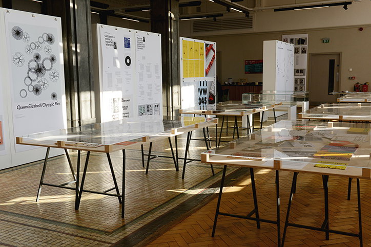
A bright gallery space filled with long, low tables topped with glass and design documents. Large white boards lean against the walls, displaying diagrams and text, including one titled “Queen Elizabeth Olympic Park”.

Unit Editions’ study of Letraset takes on a new form in this Sheffield exhibition

—
Date
15 October 2018

Letraset: The DIY Typography Revolution, held at the Sheffield Institute of Arts, takes a comprehensive look at the history of the rubdown lettering system. Based on the Unit Editions book of the same name, the exhibition considers both the heyday of Letraset – with millions of sheets being sold from the beginning of the 1960s until the 1990s – and its present-day revival.

As Adrian Shaughnessy wrote in a statement on the show: “In the short gap between the end of hot metal setting and the arrival of desktop publishing, with its range of ultra-modish typefaces, Letraset offered designers – and crucially, non-designers–a low-cost passport to instant typographic hipness”. And while in the pre-digital era Letraset “functioned as a metaphorical lifeboat for graphic designers”; it’s now used as more of a creative tool and aesthetic reference, as something that takes time and is itself a limited resource.

The exhibition, curated by Pam Bowman, features everything from magazine covers —including Raygun and Blah Blah Blah — and record sleeves, to reference books, type experiments and illustrative applications of Letraset, as well as a workshop area for people to try it out for themselves.

‘Letraset: The DIY Typography Revolution’ runs ‘til 28th October 2018.
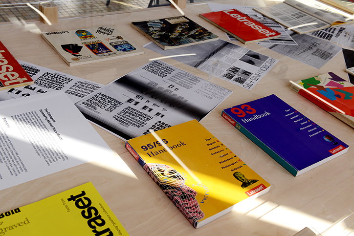
A collection of Letraset design guides and typography samples are spread across a light wood table. A yellow handbook reads “95/96 Handbook” and a blue one reads “93 Handbook”.
Above

Letraset: The DIY Typography Revolution, at Sheffield Institute of Arts
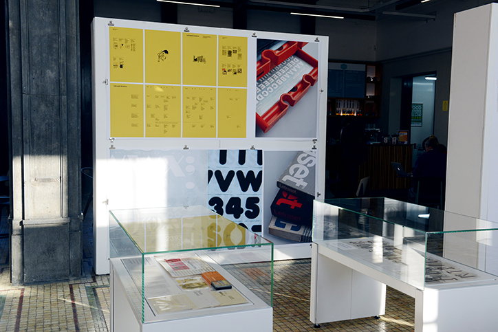
An exhibition display featuring a white wall with yellow posters and a photo of a red keyboard. Below, a large graphic shows bold black letters and numbers. Two glass display cases in the foreground hold printed documents.
Above

Letraset: The DIY Typography Revolution, at Sheffield Institute of Arts
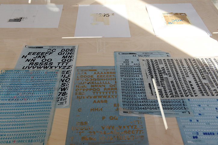
Sheets of Letraset dry transfer lettering in various fonts and sizes are scattered across a light wood table. Some sheets feature bold black capitals, while others show smaller blue characters and symbols.
Above

Letraset: The DIY Typography Revolution, at Sheffield Institute of Arts
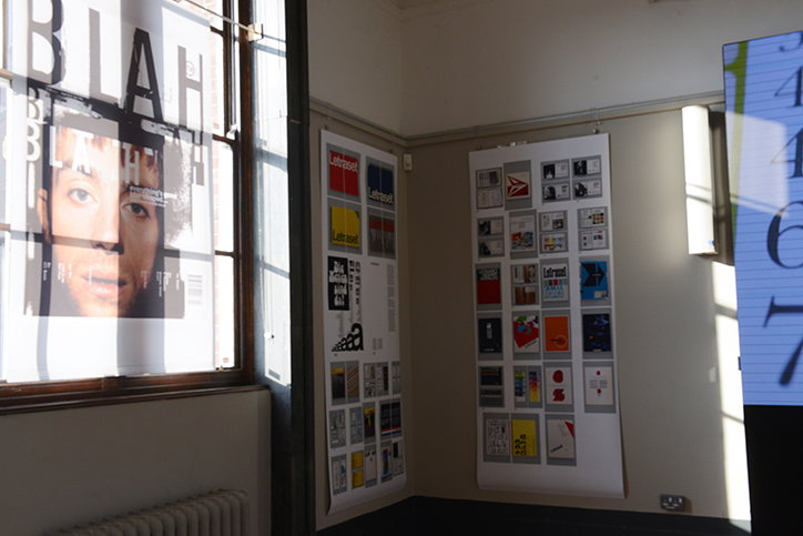
Design posters and mood boards are pinned to the walls of a bright studio. One poster features a close-up of a person’s face under the word “BLAH”.
Above

Letraset: The DIY Typography Revolution, at Sheffield Institute of Arts
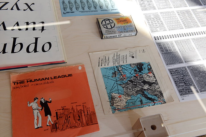
A collection of design archives laid out on a light wood surface. These include a record sleeve for The Human League titled “Being Boiled” and “Circus of Death”, a small booklet for Heaven 17, and a map of Europe.
Above

Letraset: The DIY Typography Revolution, at Sheffield Institute of Arts
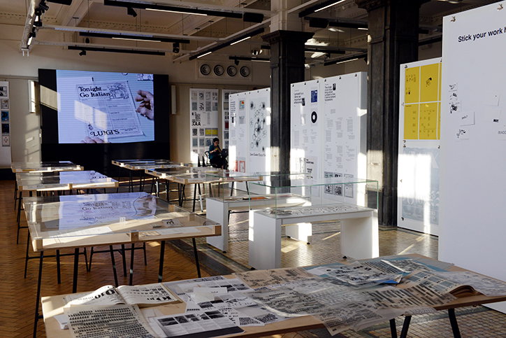
An exhibition space filled with low tables and white display boards. The tables are covered in printed documents and sketches, while a large screen in the background shows a vintage advertisement that reads “Tonight Go Italian”.
Above

Letraset: The DIY Typography Revolution, at Sheffield Institute of Arts
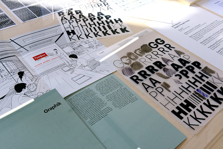
A collection of design documents and typography samples are laid out on a table. A line drawing of an office scene features a screen with the “Grafik” logo, alongside sheets of repeated letters and a pale green booklet.
Above

Letraset: The DIY Typography Revolution, at Sheffield Institute of Arts
A collection of Letraset design guides and typography samples are spread across a light wood table. A yellow handbook reads “95/96 Handbook” and a blue one reads “93 Handbook”.
Above

Letraset: The DIY Typography Revolution, at Sheffield Institute of Arts
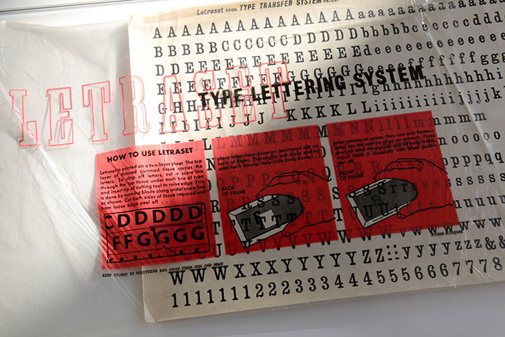
A Letraset type transfer sheet featuring rows of uppercase and lowercase letters and numbers. A red instructional guide is laid over the page, including a “How to use Letraset” section and diagrams.
Above

Letraset: The DIY Typography Revolution, at Sheffield Institute of Arts

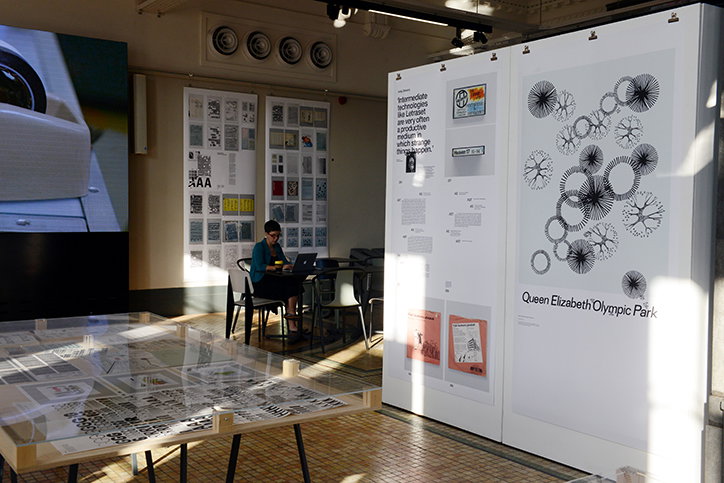
A person sits at a desk in a gallery, working on a laptop. They are surrounded by large white display boards and a table covered in architectural plans and sketches. One board features a black and white diagram of the “Queen Elizabeth Olympic Park”.
Above

Letraset: The DIY Typography Revolution, at Sheffield Institute of Arts

Share Article

About the Author

Billie Muraben

—

Billie studied illustration at Camberwell College of Art before completing an MA in Visual Communication at the Royal College of Art. She joined It’s Nice That as a Freelance Editorial Assistant back in January 2015 and continues to work with us on a freelance basis.

It's Nice That Newsletters

Fancy a bit of It's Nice That in your inbox? Sign up to our newsletters and we'll keep you in the loop with everything good going on in the creative world.