Launch Recite Me assistive technology
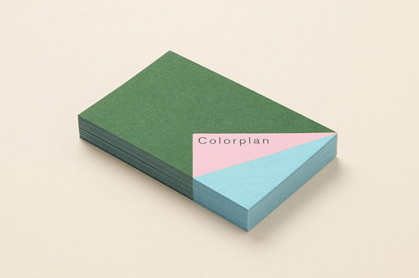
A stack of coloured paper cards rests on a plain beige surface. The top card is green, while a pink card with the word “Colorplan” and a light blue card peek out from the side.

Made Thought smash the branding for GF Smith's Colorplan out the park

—
Date
6 March 2013

Gather round all you design fetishists as Made Thought have produced some drool-inducing printed matter for GF Smith’s Colorplan series. From the drop-dead gorgeous swatch book through some-super stylish business cards and an impressive website to boot, everything about the way this has been produced and documented is sure to bring out the obsessive in any design aficionado. This is a great contemporary refresh for Colorplan, first released in 1972, and with further digital development of the brand in the pipeline this may be one graphic design gift that keeps on giving.

And if that’s whetted your appetite for some Colorplan goodness, then you should DEFINITELY know that GF Smith are kindly supporting our creative symposium Here taking place this June.
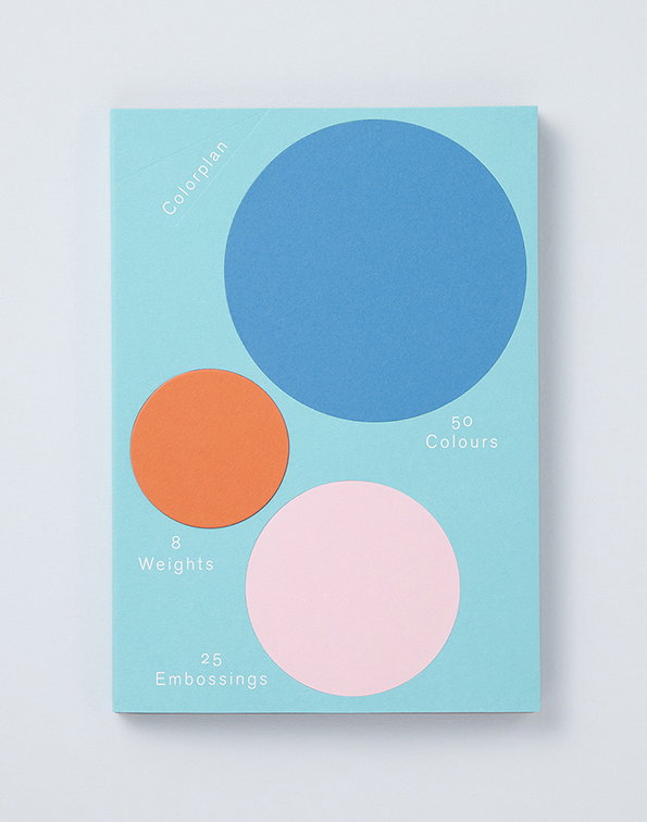
A light blue book cover features three overlapping circles in blue, orange and pink. White text reads “Colorplan”, “50 Colours”, “8 Weights” and “25 Embossings”.
Above

Made Thought: Colorplan for GF Smith

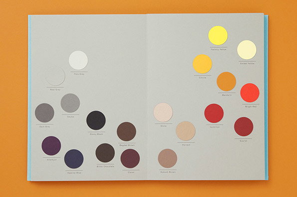
An open book displays a collection of coloured circles arranged in two groups on a light grey background. Each circle is labelled with a colour name, such as “Amethyst”, “Ebony Black” and “Bright Red”.
Above

Made Thought: Colorplan for GF Smith

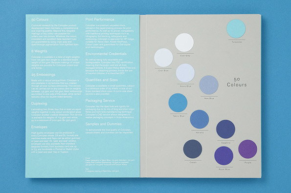
An open brochure displays a grid of circular colour swatches in various shades of blue and purple. The left page contains several columns of text under headings such as “50 Colours” and “Print Performance”.
Above

Made Thought: Colorplan for GF Smith

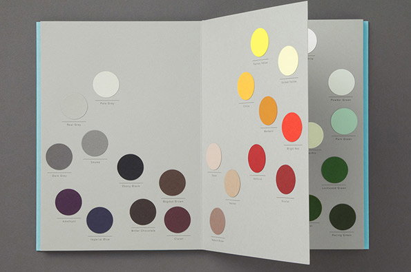
An open colour swatch book displays a series of circular colour samples arranged in columns. The pages show a range of muted greys, deep purples and browns, alongside bright yellows, reds and greens.
Above

Made Thought: Colorplan for GF Smith

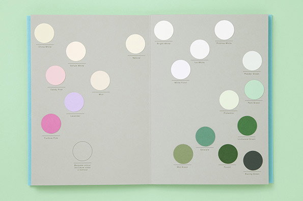
An open lookbook displays a grid of circular colour swatches on a grey background. Each swatch is labelled with a name, including “China White”, “Candy Pink” and “Racing Green”.
Above

Made Thought: Colorplan for GF Smith

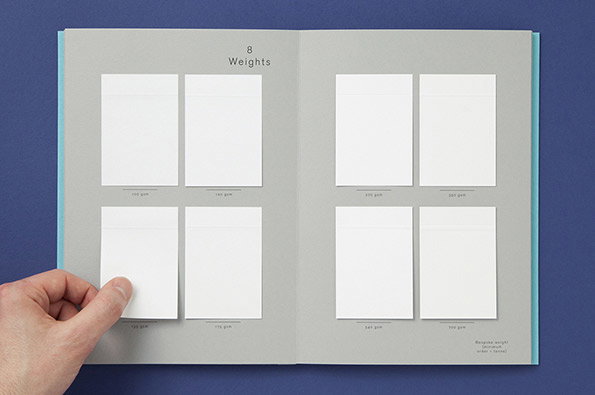
An open sample book titled “8 Weights” displays eight white paper swatches of varying thicknesses. A person’s hand lifts one of the swatches on the left page to reveal the page beneath.
Above

Made Thought: Colorplan for GF Smith

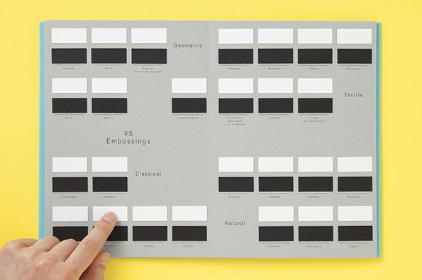
An open grey sample book displays a grid of white and black rectangular paper swatches. The pages are divided into categories including “Geometric”, “Textile”, “Classical” and “Natural”, with the title “25 Embossings” in the centre. A person’s hand points to one of the white swatches.
Above

Made Thought: Colorplan for GF Smith

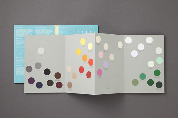
An open accordion-fold colour guide displays a series of circular colour swatches on grey pages. The palette transitions from muted greys and purples on the left to bright yellows, reds and greens on the right.
Above

Made Thought: Colorplan for GF Smith

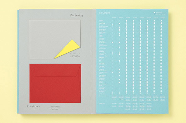
An open brochure shows a grey page on the left and a light blue page on the right. The left page features a red envelope and a grey card with a yellow triangular corner, under the heading “Duplexing”. The right page displays a grid of white dots listing “50 Colours” and various paper weights.
Above

Made Thought: Colorplan for GF Smith

Share Article

About the Author

Rob Alderson

—

Rob Alderson is a freelance writer, editor and strategist. He was previously editor-in-chief of It’s Nice That and WePresent, and editor of Design Week. He publishes the newsletter Undo, which tries to make sense of how AI is changing design work, the design process and the design industry.


It's Nice That Newsletters

Fancy a bit of It's Nice That in your inbox? Sign up to our newsletters and we'll keep you in the loop with everything good going on in the creative world.