Graphic Design: Stunning new Marian Bantjes monograph celebrates a decade of her inimitable work
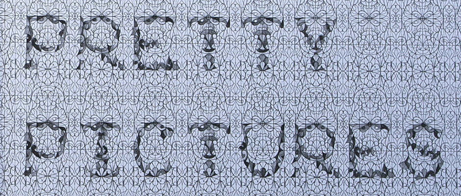
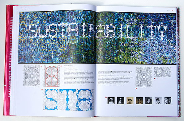
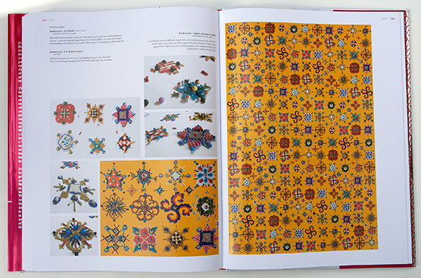
In the Venn diagram of art and graphic design, Marian Bantjes has more reason than most to be placed smack in the middle of the all-important overlap. The Canadian’s intricate, unashamedly maximalist work sits proudly at the intersection of these sometimes uncomfortable bedfellows and her new monograph is a terrific celebration of what Rick Poynor in the book’s introduction calls her “explosive graphic invention.”
With over 800 images, this is a chronological celebration of Marian’s work since she went freelance in 2003 and a visual feast in the truest sense. As Rick writes: "Bantjes created these pieces during a period in which many graphic designers seemed uncertain what to do with the visual potential of the discipline, and grew to believe that visual style and effect were inherently a problem. Some beat a retreat back to the security of unadorned Modernism. Some allowed programmer-determined defaults to make the visual decisions for them. Some prioritised conceptualism over supposedly bankrupt aesthetics. Bantjes’ work showed that such thinking represented a failure of imagination and a loss of faith in design.
“It was still possible, she reminded us, to produce graphic design that was knowledgeable of the past while being entirely contemporary, a celebration of the joy of form while maintaining a rigorous communicative intelligence.”
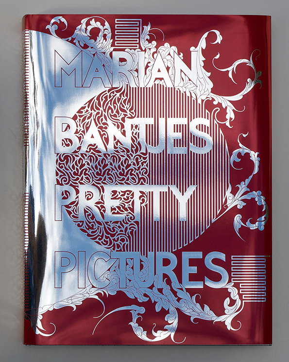
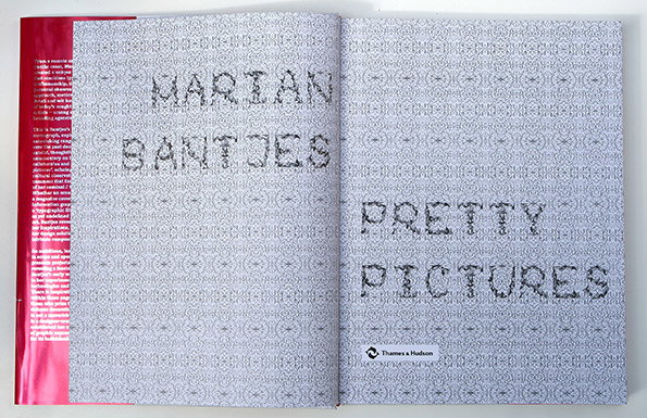
Marian Bantjes: Pretty Pictures
The imagery is accompanied by insights, sketches, anecdotes and searingly honest assessments (i.e. “This is a terrible piece of shit”) and Marian hopes this draws a line under her past work.
“My intention was and is to never speak about this body of work publicly again,” she says. “Everything I’ve ever had to say about the specific work is here: the details, the anecdotes, the stories. It is done.”
Marian Bantjes: Pretty Pictures published by Thames & Hudson is available now.
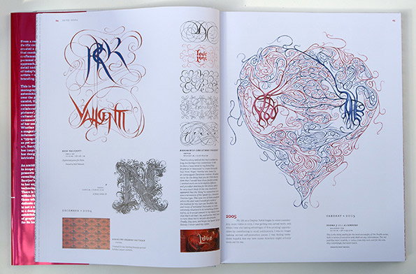
Marian Bantjes: Pretty Pictures
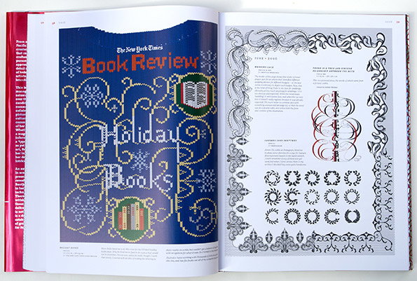
Marian Bantjes: Pretty Pictures
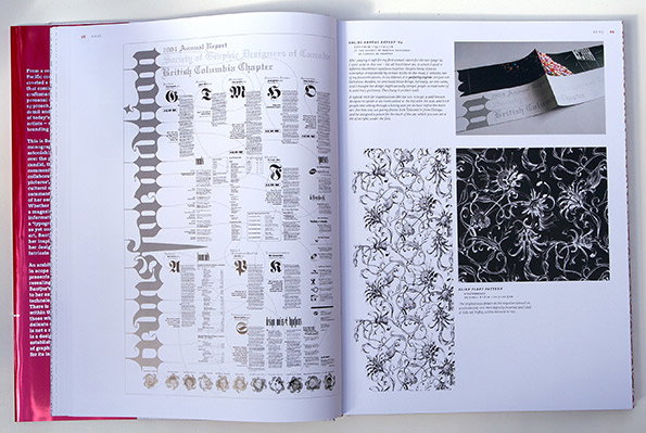
Marian Bantjes: Pretty Pictures
Marian Bantjes: Pretty Pictures
Marian Bantjes: Pretty Pictures
Share Article
Further Info
About the Author
—
Rob Alderson is a freelance writer, editor and strategist. He was previously editor-in-chief of It’s Nice That and WePresent, and editor of Design Week. He publishes the newsletter Undo, which tries to make sense of how AI is changing design work, the design process and the design industry.