




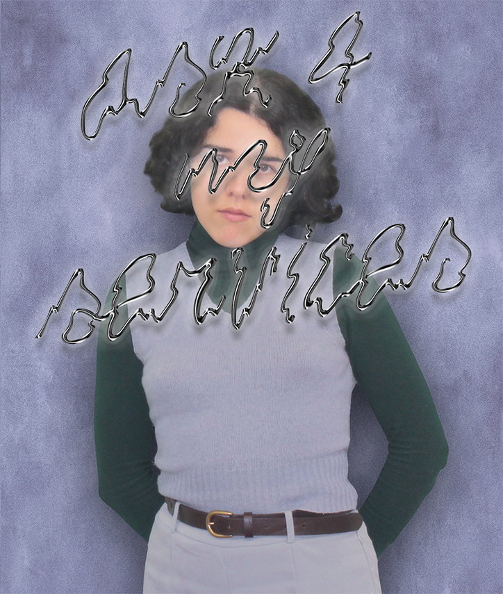
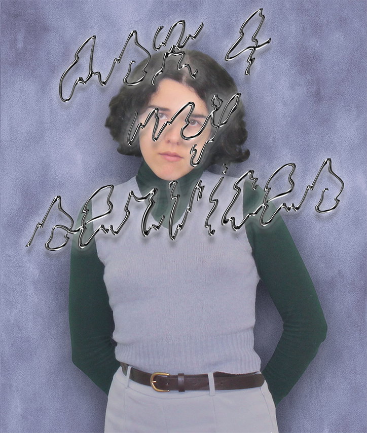
Marta da Silva’s impressive portfolio is “fluid, futuristic and somehow blissfully chaotic”
Growing up in northern Portugal, one of Marta da Silva’s earliest creative endeavours involved a horse, a VHS tape and WordArt. Recalling the particularly fond memory, she tells It’s Nice That: “I had to make some work on an endangered species for school. So my parents helped me record a VHS tape from a TV documentary on the Garrano horse to exhibit in my class. But the most exciting thing for me was using Microsoft Word to make the cover artwork for the VHS and some bookmarks to hand out to my classmates.” For Marta looking back on it now, her younger self’s adorable fascination with these objects and the pride she took in sharing them with her friends was a sign of things to come.
Years later, and with a degree from The University of Porto under her belt, Marta’s love for eccentric type and limited edition prints lives on – albeit in a slightly more refined manner. Currently working between Porto and her hometown of Guimarães, she brings a contemporary creative voice to varying freelance projects while running her independent publishing platform, Mud Pot Prints.
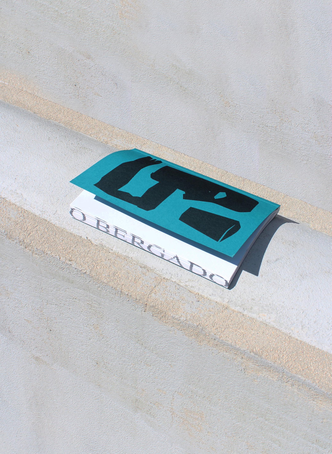
Marta da Silva: O Bergado
Marta da Silva: Mix #1
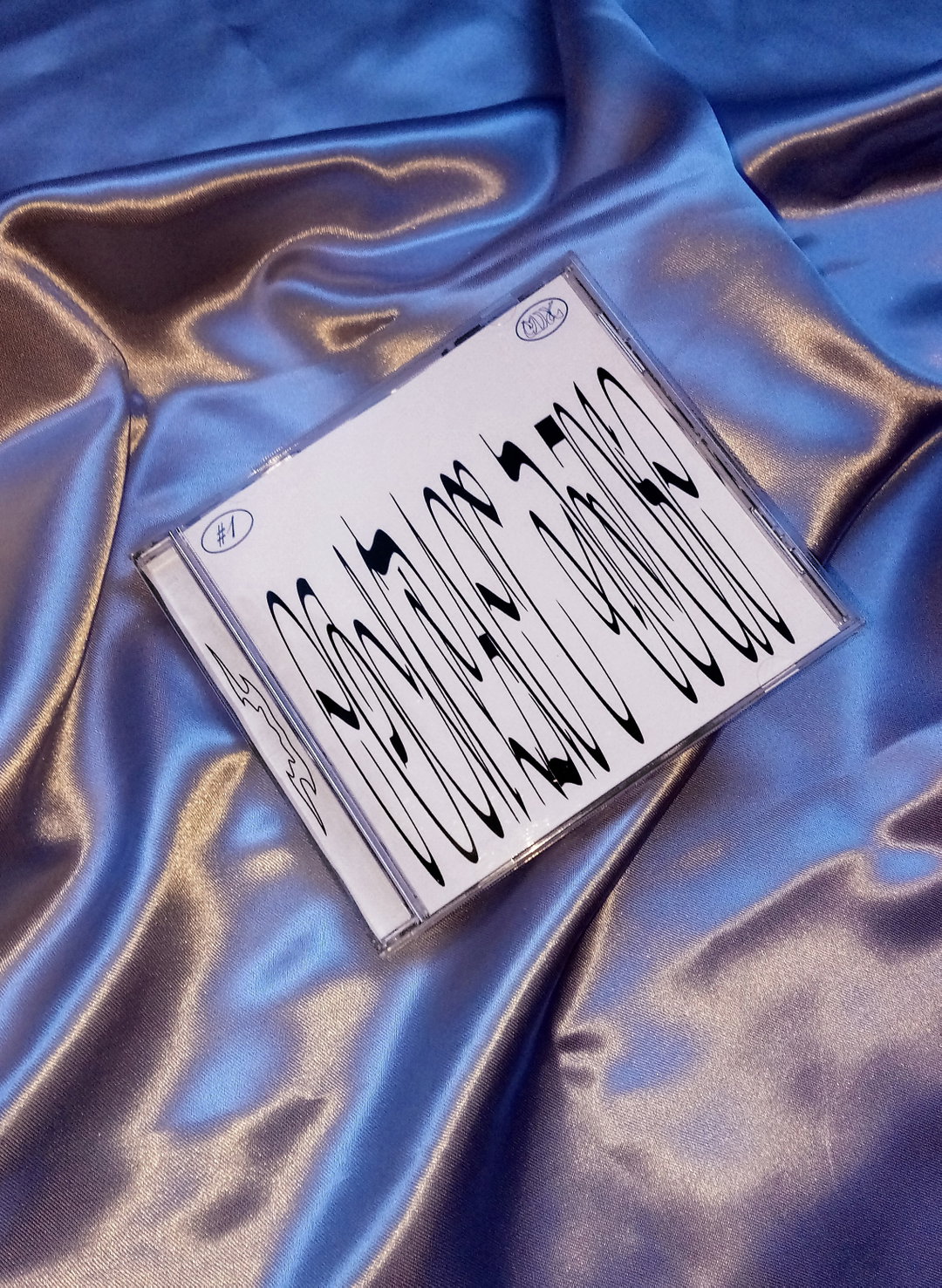
Marta da Silva: Mix #1
Looking through her smart and experimental portfolio, Marta’s own description of her work as “fluid, futuristic and somehow blissfully chaotic,” feels apt. Underpinned by a deep fondness for experimental typography, Marta’s practice explores the power of typographical forms to both enhance and distort the information they portray. “I love type and I love playing with its readability and personality,” she explains. “Testing the limits of that is really exciting to me because it allows me to explore the tensions of reading and subjectivity involved in the process of communication. For me, design as an expanded art form not only delivers information but also allows the audience to play with its notions of realness and fiction.” Marta’s sprawling library of typographical references and resources is a vital part of this process, so taking time for regular “archiving sessions” to research and categorise new fonts is a must.
Reflecting on the current state of the design community, Marta is grateful to have come into the industry at a time when openness to new people and new approaches seems to be at its highest. Thinking back on her experiences in the design world so far, she explains: ”It’s so easy to get in touch with other creatives and see other practices which means you can learn really quickly while being supported by a community.” Ultimately for Marta, “being a designer in this contemporary and experimental era is a very satisfying activity if you like to deconstruct, make unconventional experiences and just go funky.”
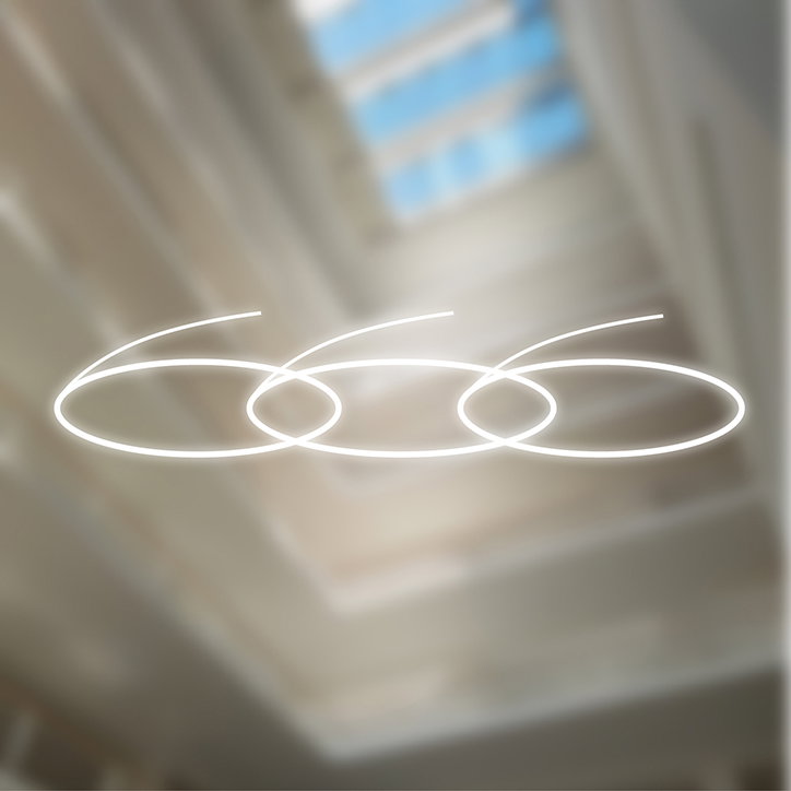
Marta da Silva: 666
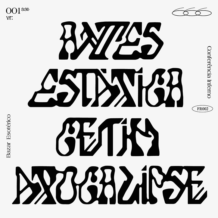
Marta da Silva: Bazar Esotérico
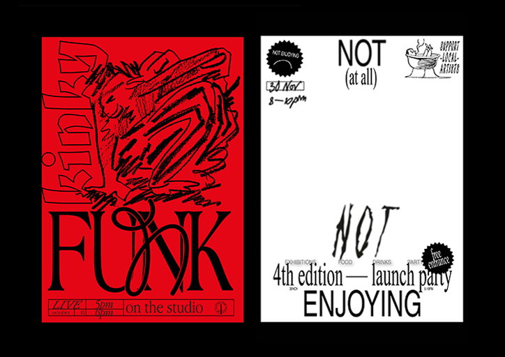
Marta da Silva: Kinky Funk and Not Enjoying It
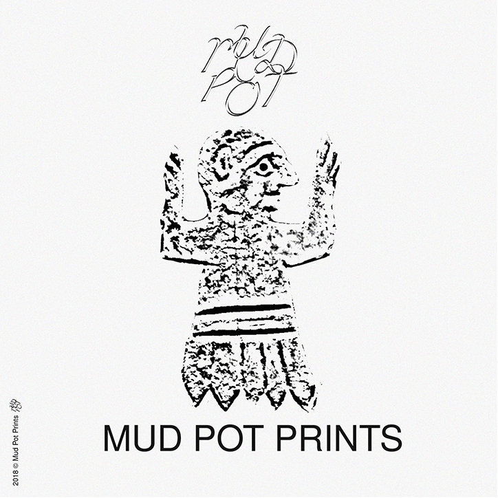
Marta da Silva: Mud Pot Prints
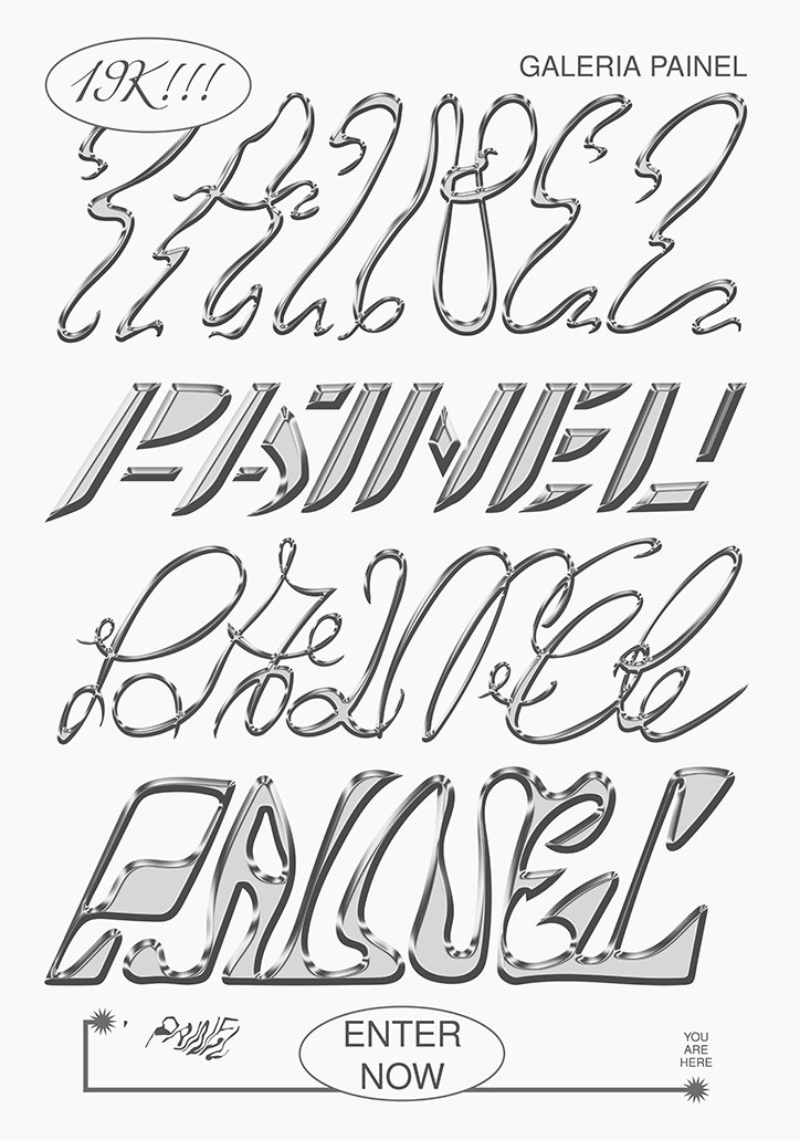
Marta da Silva: Galeria Painel
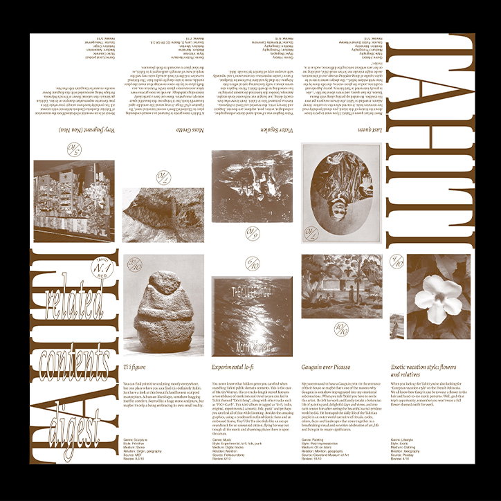
Marta da Silva: Related Contents Digest #1
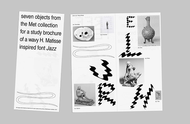
Marta da Silva: Free Text
Share Article
Further Info
About the Author
—
Lorna Pittaway joined us in the summer of 2019 as an editorial assistant. She graduated from Edinburgh College of Art with a degree in graphic design and wrote stories for us on graphic design, film, art and everything in between.