Launch Recite Me assistive technology
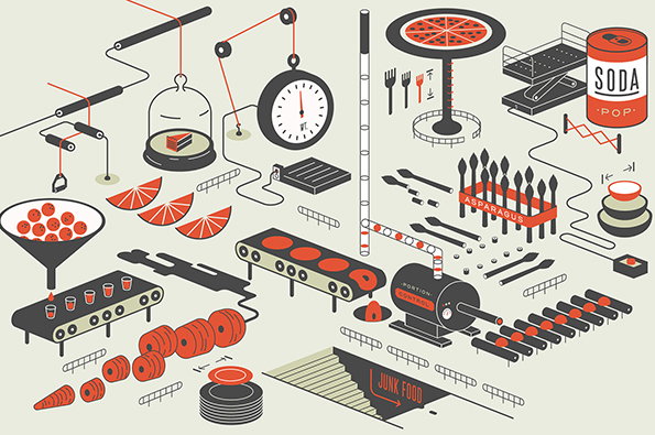
An isometric illustration of a surreal food assembly line. Various components, including pizza, soda, and asparagus, move through a complex system of conveyor belts and pulleys. A machine in the centre is labelled “PORTION CONTROL” and a sign at the bottom reads “JUNK FOOD”.

Illustration: New site, same quality from editorial maestro Mike McQuade

—
Date
27 June 2013

Shockingly it’s been more than a year since we last checked in with Chicago-based designer and illustrator Mike McQuade. He’s launched a shiny new website since then, but his effortless eye for top-notch editorial illustration has remained remarkably consistent. Few people could take an article about Google’s cafeteria redesign and produce accompanying images which are equally interesting to look at and communicative, but Mike is a master at juggling these two (sometimes contrasting) requirements. Given that skill set it’s no real surprise that he’s a favourite of both The New York Times and Wired art direction teams, providing heavyweight visuals which complement the respective publications’ content to perfection.
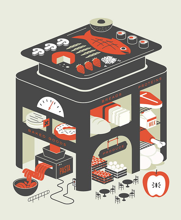
An illustration of a building shaped like a grocery store, with different floors dedicated to food groups. The roof is a large platter of sushi, while levels below are labelled “Baked Goods”, “Breads”, “Proteins” and “Produce”.
Above

Mike McQuade: Bon Appétit – Google cafeteria redesign
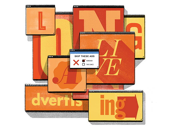
An illustration of overlapping browser windows in shades of red, orange and yellow. The windows contain fragmented letters that spell “long live advertising”, with a small pop-up in the centre reading “SKIP THESE ADS” above two checkboxes for “FOREVER” and “THIS ONCE”.
Above

Mike McQuade: Wired – Article on the death of advertising
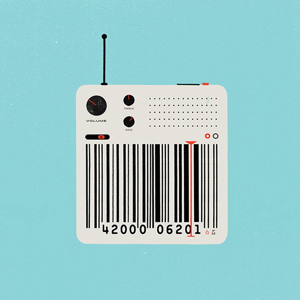
An illustration of a white vintage-style radio against a light blue background. The speaker grille is replaced by a large barcode, with one bar highlighted in red.
Above

Mike McQuade: Wired – Article on selecting the right soundtrack for your retail space
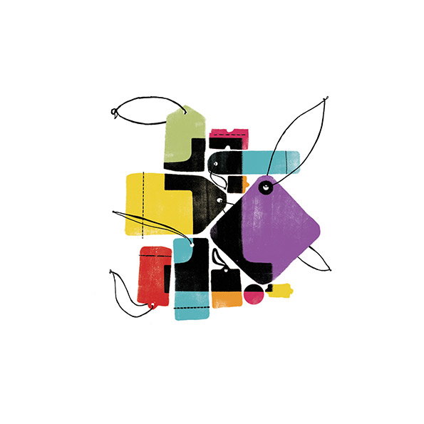
An illustration of a cluster of colourful, overlapping price tags and labels against a white background. The shapes are rendered in bold shades of purple, yellow, red and blue, tied together with thin black strings.
Above

Mike McQuade: Wired – Article on the buy one, give one business model
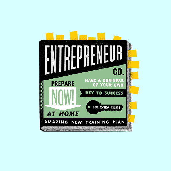
An illustration of a book cover with a bold, black-and-green design. The title reads “ENTREPRENEUR CO.” and includes phrases such as “PREPARE NOW!” and “KEY TO SUCCESS”.
Above

Mike McQuade: Wired – Article about the business of entrepreneurship
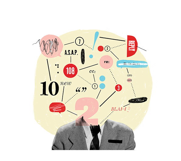
A collage showing a person in a grey suit with their head replaced by a pale yellow cloud of digital clutter. Inside the cloud are email symbols, numbers, and phrases including “A.S.A.P.”, “REPLY”, and “BLAH”.
Above

Mike McQuade: Wired – Article on being over connected and the expectation of constant reply
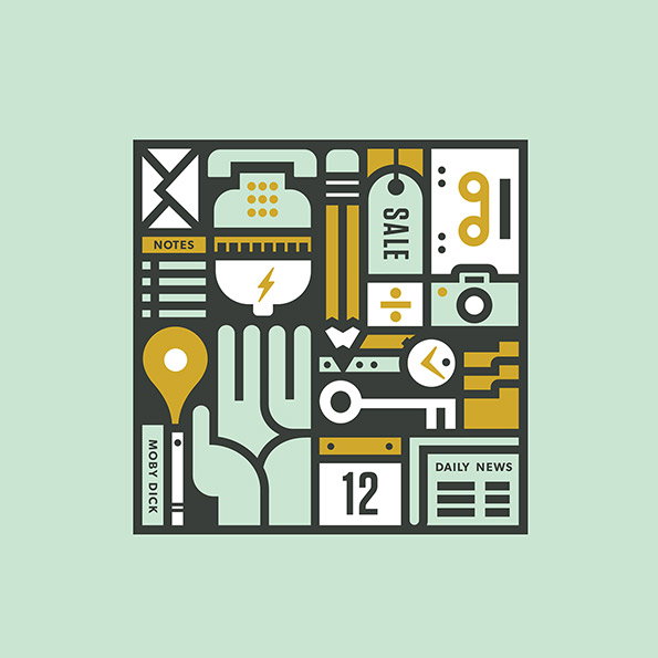
An illustration of a grid of abstract, geometric icons in ochre, mint green and white. Legible text includes “NOTES”, “SALE”, “MOBY DICK” and “DAILY NEWS”.
Above

Mike McQuade: Wired – Article about technology taking over all utilities in our lives.

Share Article

About the Author

Rob Alderson

—

Rob Alderson is a freelance writer, editor and strategist. He was previously editor-in-chief of It’s Nice That and WePresent, and editor of Design Week. He publishes the newsletter Undo, which tries to make sense of how AI is changing design work, the design process and the design industry.

It's Nice That Newsletters

Fancy a bit of It's Nice That in your inbox? Sign up to our newsletters and we'll keep you in the loop with everything good going on in the creative world.