Launch Recite Me assistive technology
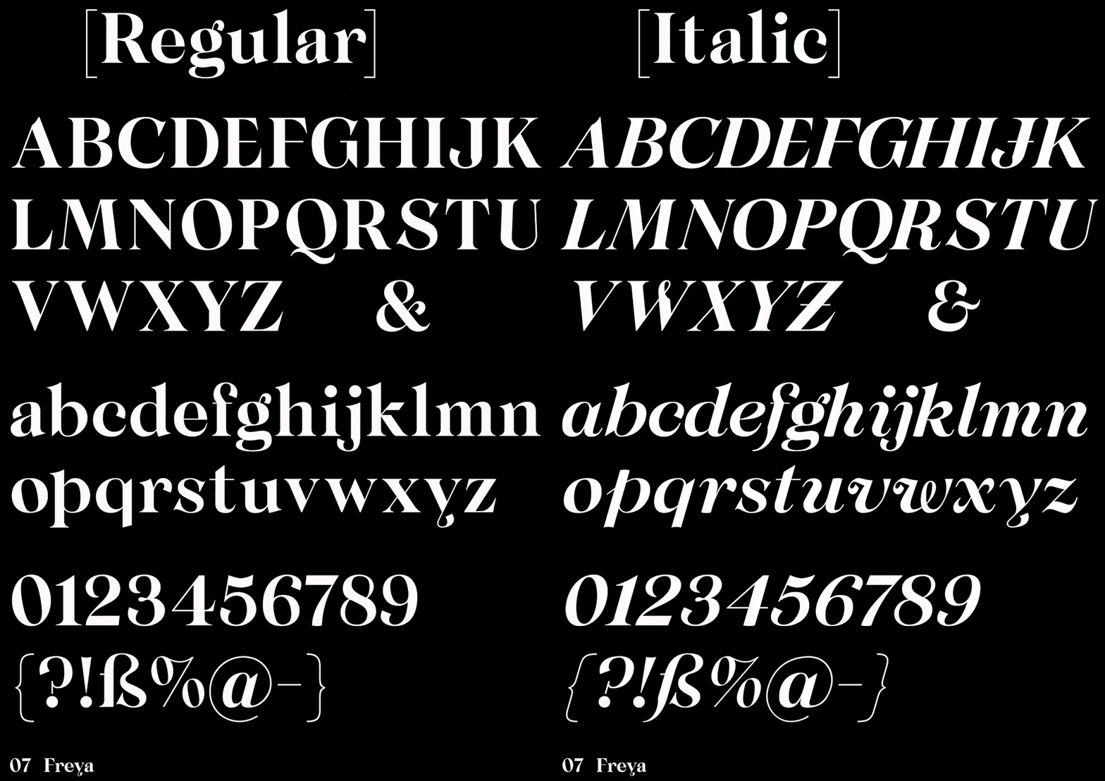
An animation of a typeface specimen on a black background, switching between “Regular” and “Italic” styles. The screen displays the full alphabet in upper and lower case, numbers, and symbols, with “07 Freya” at the bottom.

New Letters bends the rules of typography in contrasting font Freya

—
Date
7 June 2017

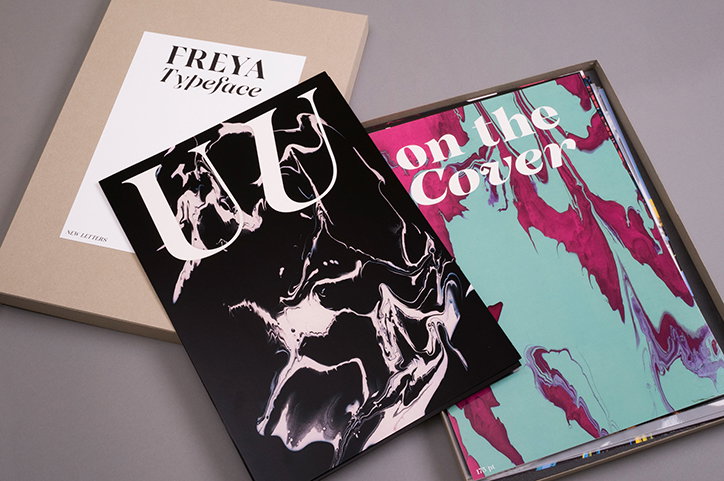
A few weeks ago an A3 sized package arrived at It’s Nice That. We assumed it was a print or a photograph, but inside was a printed type specimen of multiple pages, exuding the elegance of New Letters’ most recent font design Freya.

German type foundry New Letters was founded in 2015 by Armin Brenner and Markus John, merging the lines between typography, graphic design and art direction “with a link between cultural and commercial projects”. Working within “the fields of culture, art and fashion for both digital and print media,” the consistent element in New Letters’ portfolio is impactful typography, “juxtaposing classic type design and great attention to detail, with a modern approach to structure and eclectic use for different projects,” they explain.

Freya embodies this design ethos, “inspired by classic Antique serif typefaces”. However influential typefaces such as Caslon or Didot were designed three decades ago and “while loving those classic typefaces because of their distinctive functionality, we were inspired to reinterpret them in our very own style,” says New Letters. The result is a typeface that has personality while remaining traditional in its aesthetic. “While concentrating on these ideas and influences the main focus was to keep the functionality of Freya — it has a strong varying thickness between the thick and thin strokes and therefore plays a lot with contrast.”

As a font Freya bends the rules typography of slightly: “the whole idea of contrast comes together in different weights of the typeface family, which are connected through the same thickness of all horizontal lines”. However, functionality remains the key aim following “a consistent gradient of styles to ensure best functionality for the headlines and text,” explain New Letters. “Its features are carefully balanced to create a modern and novel appearance.”
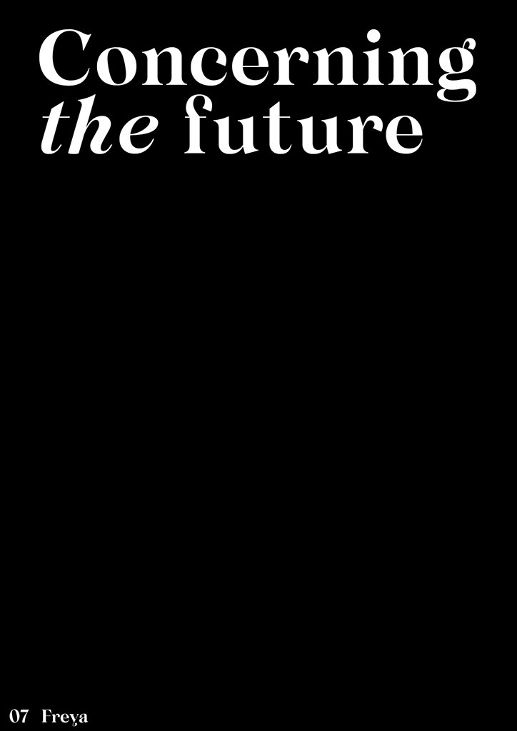
White serif text on a black background reads “Concerning the future”. In the bottom left corner, smaller text reads “07 Freya”.
Above
Left

New Letters: Freya

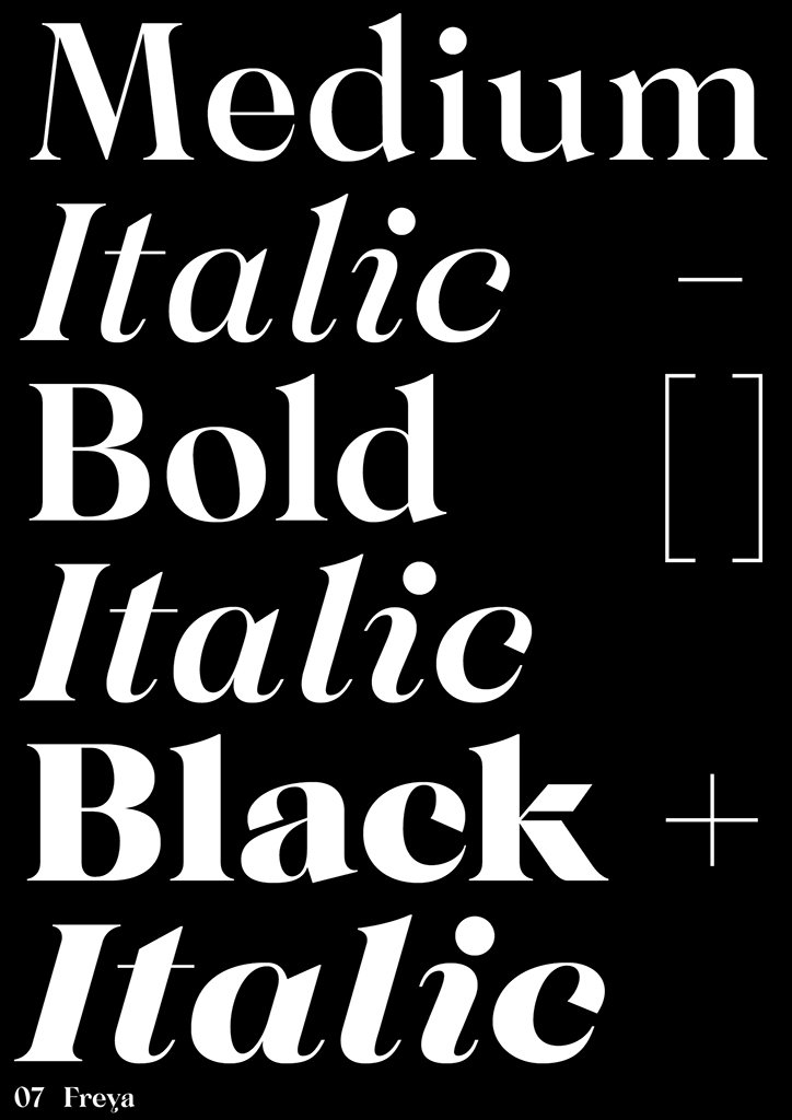
A typographic specimen on a black background showing different weights of a serif typeface. The white text lists “Medium”, “Italic”, “Bold”, “Italic”, “Black” and “Italic”, with “07 Freya” at the bottom.
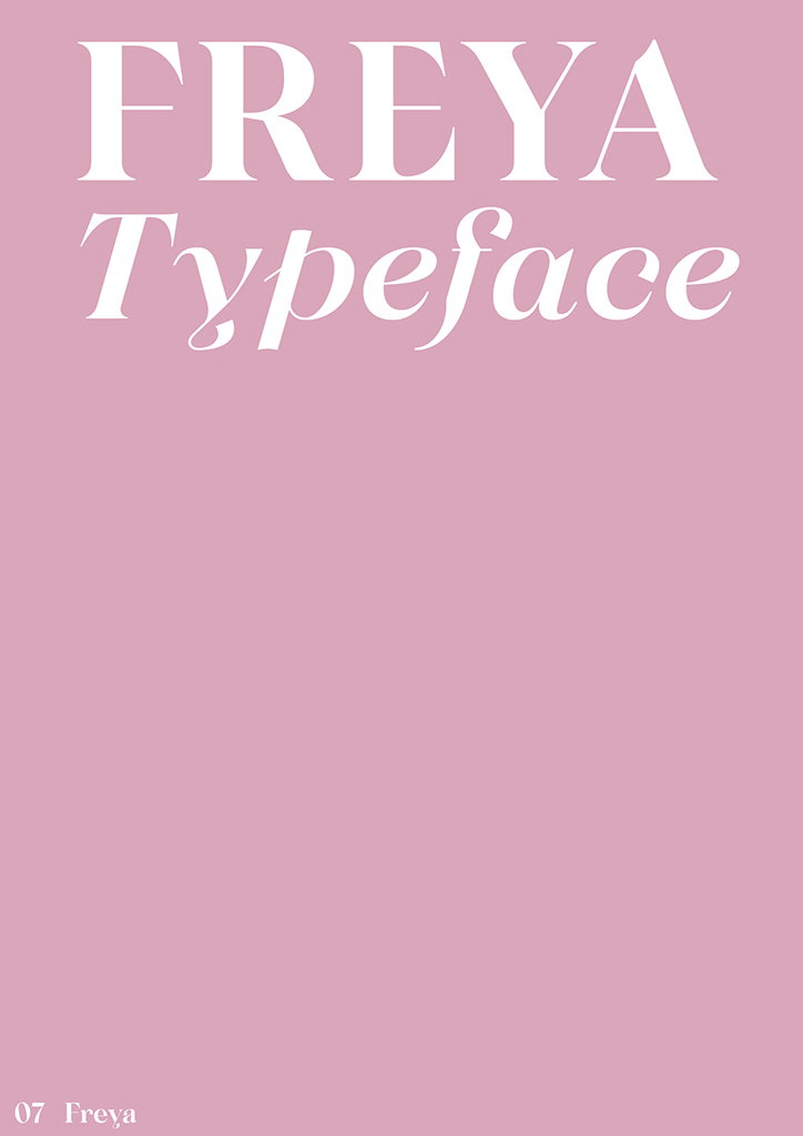
A pink background with white text at the top that reads “FREYA Typeface”. In the bottom left corner, smaller text reads “07 Freya”.
Above
Left

New Letters: Freya

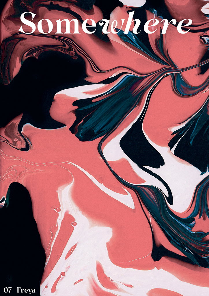
An abstract composition of swirling pink, black and white paint. The word “Somewhere” is written in a white serif typeface at the top, with “07 Freya” in the bottom left corner.
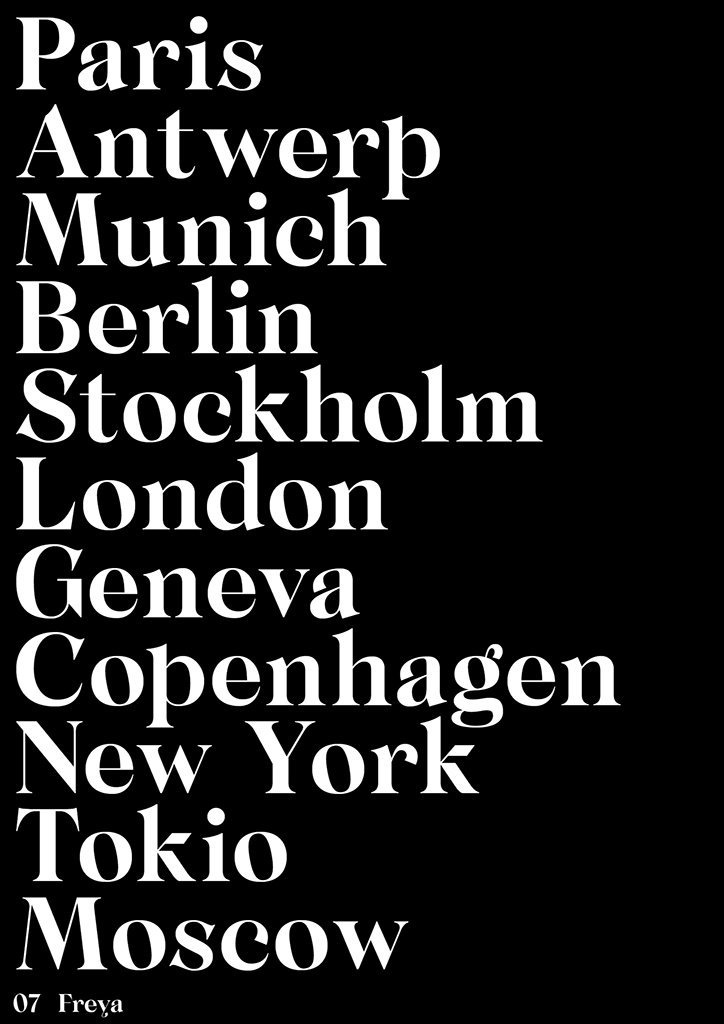
A list of city names in white serif typography against a black background. The list includes “Paris”, “Antwerp”, “Munich”, “Berlin”, “Stockholm”, “London”, “Geneva”, “Copenhagen”, “New York”, “Tokio” and “Moscow”. Small text at the bottom reads “07 Freya”.
Above
Left

New Letters: Freya

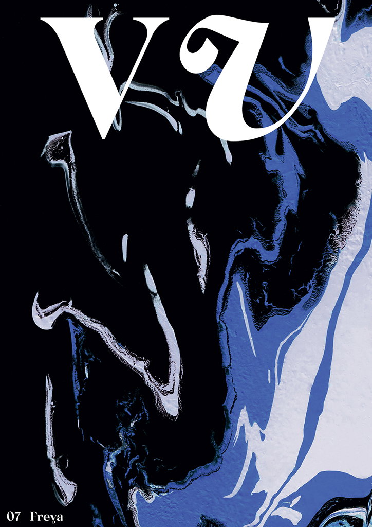
A graphic cover featuring a swirling, abstract pattern of black, blue and white. Large white serif letters “VU” sit at the top, with “07 Freya” written in the bottom left corner.
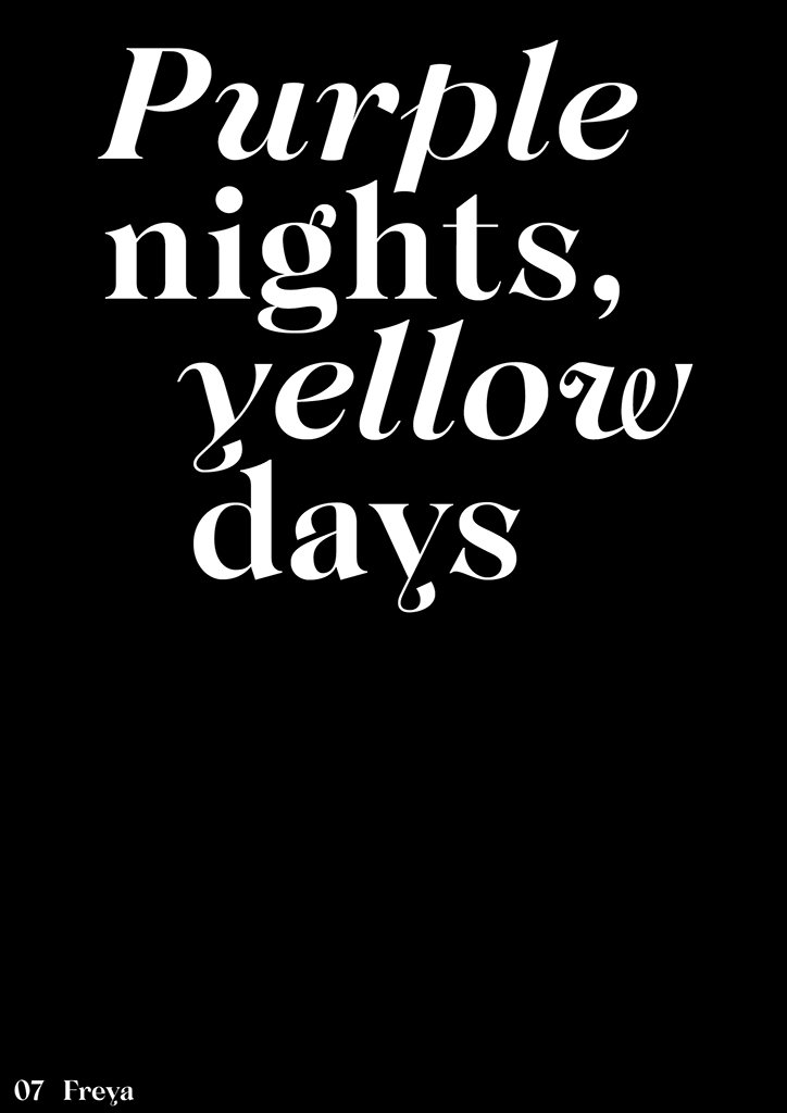
White serif typography on a black background reads “Purple nights, yellow days”. Small text in the bottom left corner reads “07 Freya”.
Above
Left

New Letters: Freya

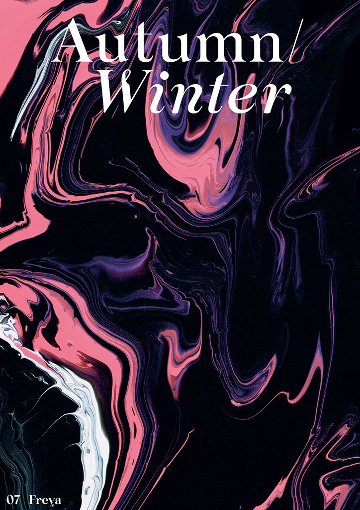
An abstract image of swirling pink, purple and white paint against a black background. White serif text at the top reads “Autumn/Winter” and smaller text at the bottom left reads “07 Freya”.
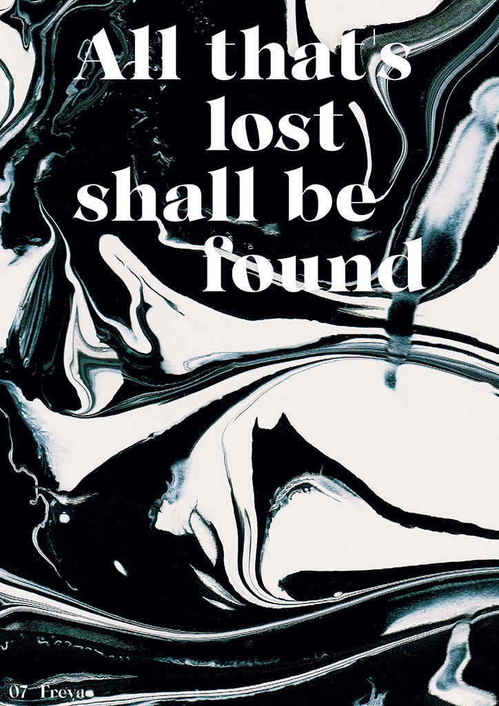
A black and white abstract composition of swirling, marbled ink. Bold white serif text laid over the top reads “All that’s lost shall be found”.
Above
Left

New Letters: Freya

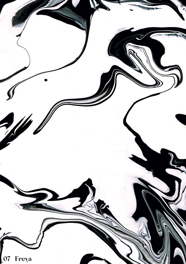
An abstract black and white composition of swirling, marbled ink. In the bottom left corner, small text reads “07 Freya”.
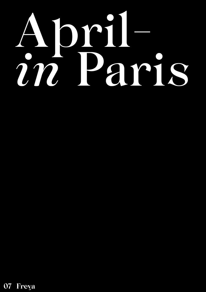
White serif text on a black background reads “April– in Paris”. In the bottom left corner, smaller text reads “07 Freya”.
Above

New Letters: Freya

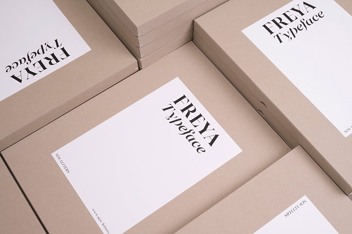
A collection of beige cardboard boxes, each featuring a white label with the words “FREYA Typeface”. The boxes are stacked and angled across the frame.
Above

New Letters: Freya

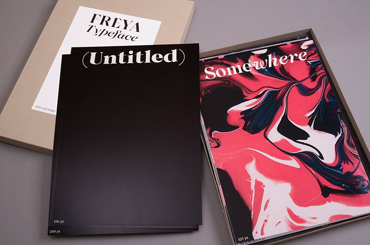
Three printed publications lie on a grey surface. One is a beige folder reading “Freya Typeface”, another is a black cover with “(Untitled)” in white, and the third is a magazine titled “Somewhere” featuring a red, black and white marbled pattern.
Above

New Letters: Freya

Three design publications are laid out on a grey surface. One white cover reads “FREYA Typeface”, while a black cover features a large white “UU” over a marbled pattern. A third book in a slipcase shows a teal and magenta marbled design with the words “on the Cover”.
Above

New Letters: Freya

Share Article

Further Info

About the Author

Lucy Bourton

—

Lucy (she/her) was part of the It’s Nice That team from 2016–2025, first joining as a staff writer after graduating from Chelsea College of Art with a degree in Graphic Design Communication, eventually becoming a senior editor on our editorial team, and most recently at Insights, a research-driven department with It’s Nice That.


It's Nice That Newsletters

Fancy a bit of It's Nice That in your inbox? Sign up to our newsletters and we'll keep you in the loop with everything good going on in the creative world.