Launch Recite Me assistive technology
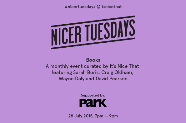
A purple event poster reads “NICER TUESDAYS” in bold, black lettering. Below, text announces a monthly event curated by It’s Nice That about “Books”, featuring Sarah Boris, Craig Oldham, Wayne Daly and David Pearson. The bottom of the poster includes the Park logo and the date “28 July 2015, 7pm – 9pm”.

Join us for our book-themed Nicer Tuesdays!

—
Date
7 July 2015

Nicer Tuesdays is back, and this month we’re joined by four creatives who are each exploring the world of books in wonderful and unique ways.

Joining us will be Sarah Boris, an award-winning graphic designer and illustrator who’s worked for some of the greatest art institutions including the Barbican Centre, Tate and Phaidon Press, as well as Craig Oldham, creator of In Loving Memory of Work, one of our most loved books of the year that documents the UK miners’ strike between 1984 and 1985.

Also joining us will be Wayne Daly, a London-based graphic designer specialising in cultural publishing as well as being co-founder of Bedford Press, as well as David Pearson, one of the UK’s most treasured book designers who’s produced magnificent jackets for the likes of Penguin, Ridley Scott Associates, White’s Books and Éditions Zulma.

Beers will be on us, as always!

Location:
Protein Ltd
31 New Inn Yard
EC2A 3EY
United Kingdom

Sell Tickets Online through Eventbrite

Park Communications

Founded in 1991, Park Communications is considered by many to be London’s preeminent printer. With a roster of both corporate and cultural clients, Park is a one-stop-shop to translate, artwork, print and bind literature of many different kinds, from the finest coffee table books and catalogues, through FTSE annual reports, to niche market magazines and brochures. Working closely with clients to develop bespoke creative solutions, Park’s reputation is built on the highest quality, reliability and flexibility.

They have brought their professionalism to both our Printed Pages magazine and the It’s Nice That Annual 2014, and we look forward to working with them in 2015 and beyond. To contact Park, email Alison at a.branch@parkcom.co.uk or via the website www.parkcom.co.uk.
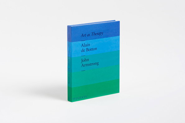
A hardcover book stands against a plain white background. The cover features a blue to green gradient with the title “Art as Therapy” and authors “Alain de Botton” and “John Armstrong”. The Phaidon logo appears at the bottom.
Above

Sarah Boris: Art as Therapy

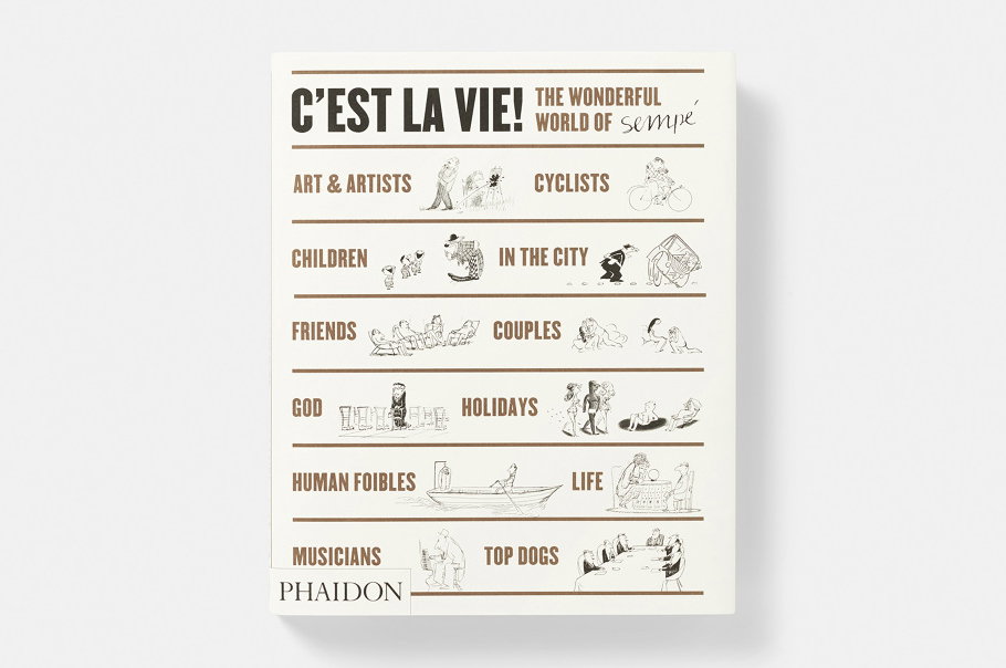
The cover of a book titled “C’est la vie! The wonderful world of Sempe”. The white cover features a grid of small, whimsical ink illustrations paired with category headings such as “Art & artists”, “Children” and “Holidays”. The Phaidon logo appears in the bottom left corner.
Above

Sarah Boris: Best of Sempe

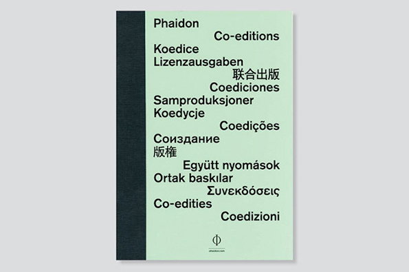
The cover of a Phaidon book in pale green with a dark spine. The words “Co-editions” and its translation in various languages are scattered across the front.
Above

Sarah Boris: Phaidon

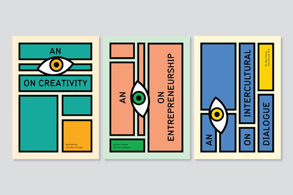
Three book covers featuring bold geometric shapes and a recurring eye motif. The titles read “An On Creativity”, “An On Entrepreneurship” and “An On Intercultural Dialogue”.
Above

Sarah Boris: An Eye On

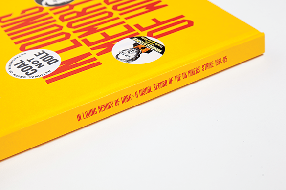
A close-up of a bright yellow book. The spine reads “In Loving Memory of Work: A Visual Record of the UK Miners’ Strike 1984–85”.
Above

Craig Oldham: In Loving Memory of Work
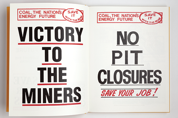
An open book shows two bold typographic posters. The left page reads “VICTORY TO THE MINERS” and the right reads “NO PIT CLOSURES” followed by “SAVE YOUR JOB!”. Both pages feature a red stamp at the top that reads “COAL, THE NATION’S ENERGY FUTURE” and “SAVE IT WITH THE NUM”.
Above

Craig Oldham: In Loving Memory of Work
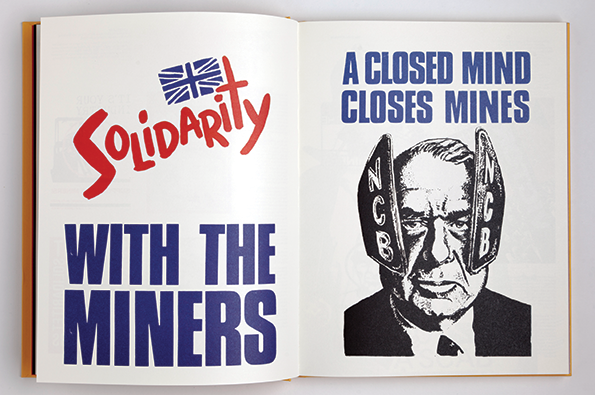
An open book showing two political posters. The left page reads “Solidarity WITH THE MINERS” in red and blue text beneath a Union Jack flag. The right page features a high-contrast portrait of a person with the text “A CLOSED MIND CLOSES MINES” above them. Two shapes resembling coal mine entrances, labelled “NCB”, flank the person’s face.
Above

Craig Oldham: In Loving Memory of Work
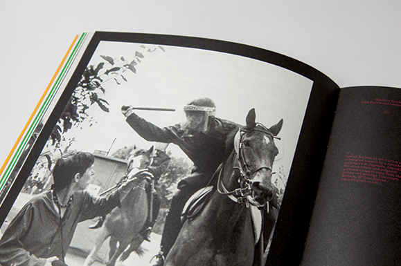
A black and white photograph in an open book shows a person on horseback raising a baton. Beside them, another person holds the reins of a second horse.
Above

Craig Oldham: In Loving Memory of Work
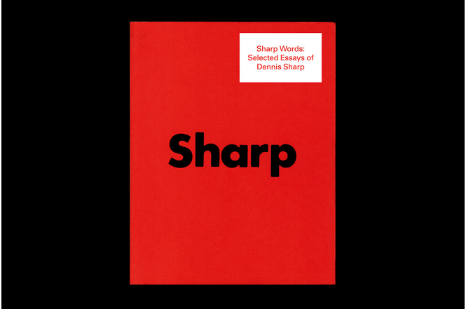
A bright red book cover with the word “Sharp” printed in large, black lowercase type across the centre. A small white label in the top right corner reads “Sharp Words: Selected Essays of Dennis Sharp”.
Above

Wayne Daly: Sharp Words: Selected Essays of Dennis Sharp
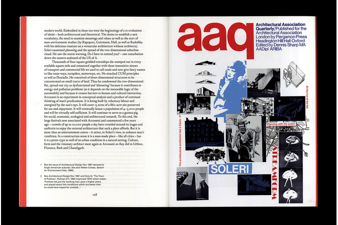
An open magazine showing a page of text opposite a bold red and white layout. The right page features the “aaq” logo and the word “SOLERI” over a collage of architectural sketches and photographs.
Above

Wayne Daly: Sharp Words: Selected Essays of Dennis Sharp
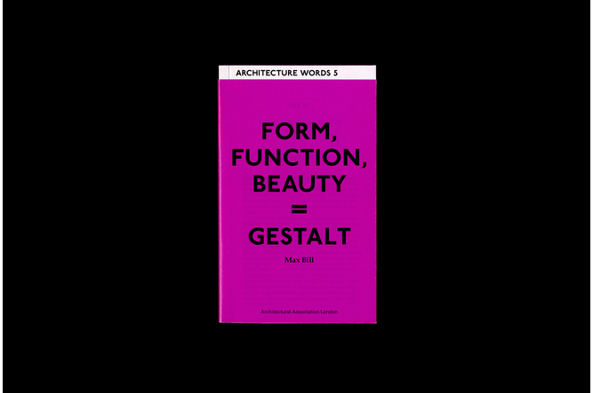
A bright magenta book cover features bold black text that reads “FORM, FUNCTION, BEAUTY = GESTALT”. Below the title is the name “Max Bill” and a white header reads “ARCHITECTURE WORDS 5”.
Above

Wayne Daly: Form, Function, Beauty = Gestalt
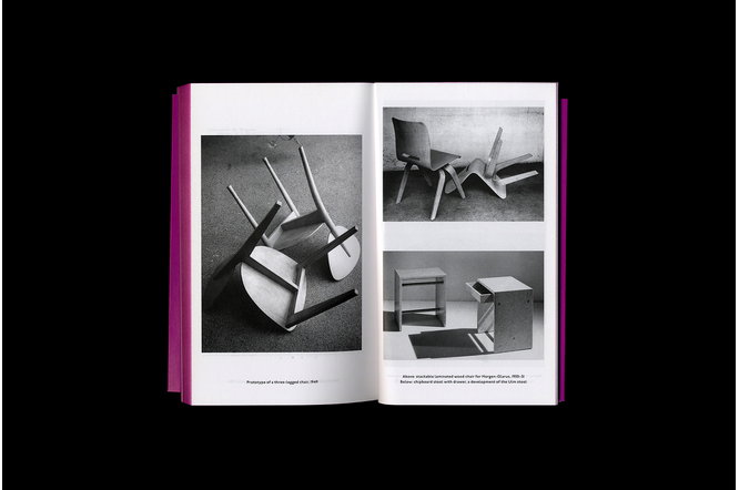
An open book shows black and white photographs of modernist furniture. The left page features a prototype of a three-legged chair, while the right page shows a chair and a stool.
Above

Wayne Daly: Form, Function, Beauty = Gestalt
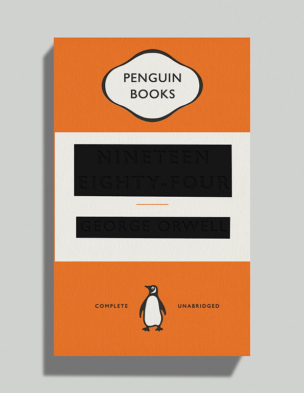
The orange and white cover of George Orwell’s “Nineteen Eighty-Four”, published by Penguin Books. The title and author’s name are printed in black blocks, with the Penguin logo and the words “Complete Unabridged” at the bottom.
Above

David Pearson: George Orwell: Nineteen Eighty Four
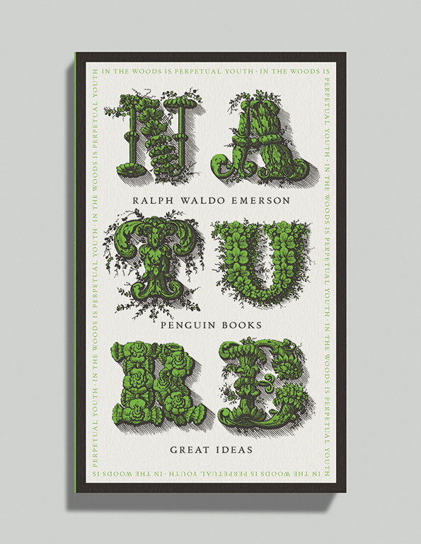
A book cover for Ralph Waldo Emerson’s “Nature”, published by Penguin Books. The title is rendered in large, ornate letters made of green foliage and vines. The phrase “In the woods is perpetual youth” repeats in a border around the edge.
Above

David Pearson: Ralph Waldo Emerson – Nature
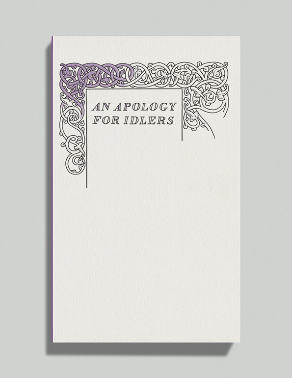
A white book cover features the title “AN APOLOGY FOR IDLERS” in a serif typeface. The text is framed in the top left corner by an intricate, purple and white floral border.
Above

David Pearson: Robert Louis Stevenson – An Apology For Idlers
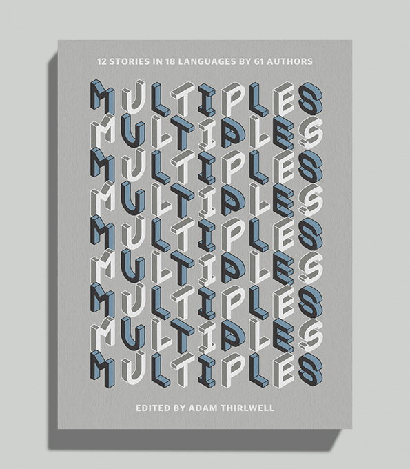
The cover of a book titled “Multiples”, with the word repeated nine times in a 3D typographic style. The letters are rendered in shades of blue, white and grey against a light grey background. Text at the top reads “12 stories in 18 languages by 61 authors”, while the bottom reads “Edited by Adam Thirlwell”.
Above

David Pearson: Adam Thirlwell – Multiples

Share Article

About the Author

It's Nice That

—

This article was written by the It’s Nice That team. To find our editors and writers, please head over to our Contact page.
It's Nice That Newsletters

Fancy a bit of It's Nice That in your inbox? Sign up to our newsletters and we'll keep you in the loop with everything good going on in the creative world.