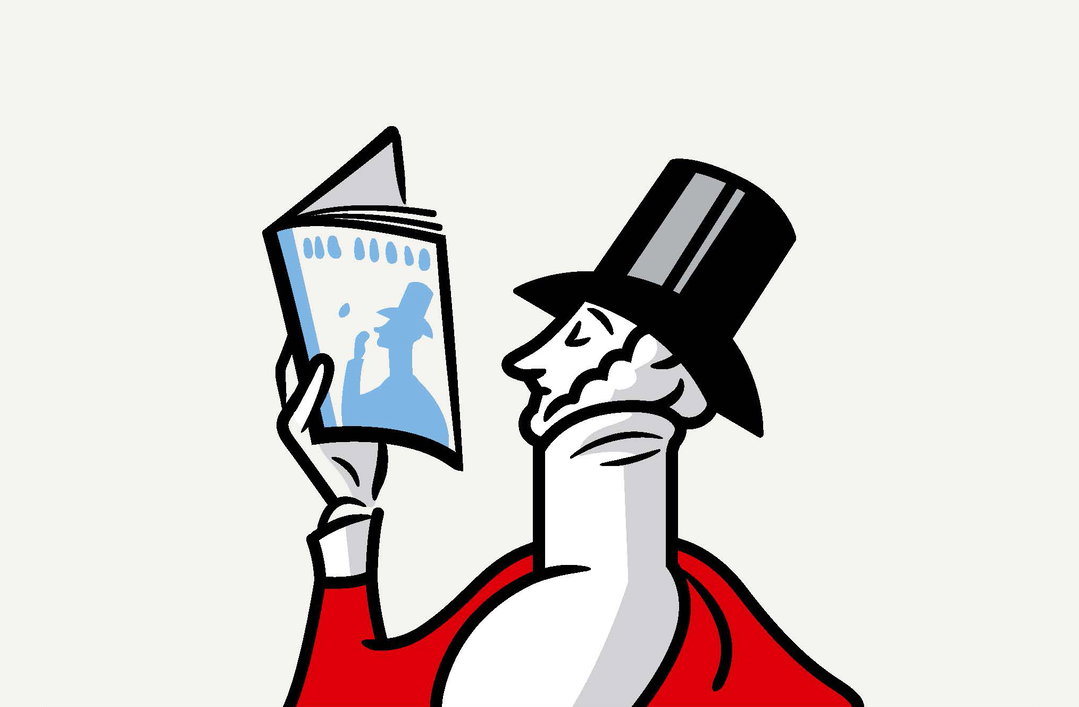
Nicholas Blechman on applying subtle redesign tweaks to The New Yorker
- —
- Date
- 25 June 2018
Earlier this month Nicholas Blechman, the creative director of The New Yorker, introduced a redesign to one of the magazine’s regular features, ‘Goings On About Town’. A redesign, however small, is a rare occurrence within The New Yorker’s pages in comparison to the regular shift other publications apply to its design. Below, Nicholas talks us through the reasoning behind the most recent design tweak, as well as an overview of The New Yorker’s layout design history.
Unlike most magazines, The New Yorker rarely redesigns. In fact, The New Yorker has maintained a remarkably consistent design since it was first published, in 1925. Beyond the introduction of photography, little has changed in its appearance. Consistency, one could argue, is part of its identity.
The one section, however, that has changed over the years is ‘Goings On About Town’, the weekly cultural listings in the front of the book. The original design consisted of dense columns of small type, peppered with black-and-white spot illustrations. Many years later, larger colour illustrations were introduced, and then photography.
In February 2000, for the seventy-fifth anniversary of The New Yorker, the section was redesigned by Massimo Vignelli. He introduced red as a secondary colour for category rubrics (movies, night life, classical music, theatre, etc.), and blue was used to introduce ‘Tables for Two’, a new column. Vignelli used the legendary wavy rule to separate categories. The names of the events were set in Vogue, a bold sans-serif font and a distant cousin of Futura.
More than a decade later, Wyatt Mitchell, The New Yorker’s first creative director, redesigned ‘Goings On About Town’. The new section opened with a full-page photo, and introduced longer lead-in reviews. The section was laid out on a four-column grid and used a greater mix of type styles and sizes. Vogue was replaced with Neutra, and Irvin (The New Yorker’s signature typeface) was redrawn by House Industries to include decorative ligatures.
In 2016, ‘Goings On About Town’ was tweaked again. The section was put back on a three-column grid, and the typography became more closely aligned with Massimo Vignelli’s design.
None of these changes, however, took into consideration the biggest technological change of our time: the internet. The ease with which one can find listings online, for movies and concerts, compelled us to reevaluate how the section was being used (or not used). Information that once seemed crucial, such as the location or telephone number of a gallery, was now less relevant to print — and more useful online. Running the same review of an event for the duration of its run, such as a play or a movie, was a waste of precious editorial space. The review could run once in the magazine and be permanently archived online. The new ‘Goings On About Town’ does not recycle older reviews, and publishes entirely new listings each week.
It is also more user-friendly and legible. The point size for the body text is half a point larger, and the names of the events are the size of small headlines, making the section easier to navigate, and less dense. One can easily scan the section and pick out cultural events.
There is a typographic war in the art department of The New Yorker between fans of Caslon and fans of Irvin. We’ve discovered that Caslon, used in our body copy, also works nicely as a display typeface. On our site and in house ads, we increasingly use Caslon for small headlines. We are now bringing that look into print. Irvin will always be the typeface most associated with The New Yorker, but it’s important not to overuse it.
Visually, the most significant change is the use of colour. While The New Yorker traditionally uses red as a secondary colour, the new ‘Goings On About Town’ uses blue. This is a nod to Vignelli, who used it sparingly in his 2000 redesign. Blue helps give the section an identity, distinguishing it from other parts of the magazine.
The challenge was to create a design that felt fresh but at the same time preserved the look and feel of the classic New Yorker. Readers of the magazine consider The New Yorker a cherished institution. The redesign is subtle enough that it won’t alienate readers, while nudging the magazine forward.
The ‘Goings On About Town’ redesign is by Aviva Michaelov and Nico Schweizer. Illustration, art direction and assignments by Deanna Donegan.
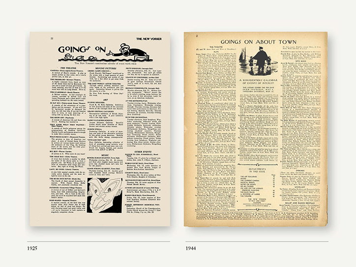
The New Yorker: ‘Goings On About Town’
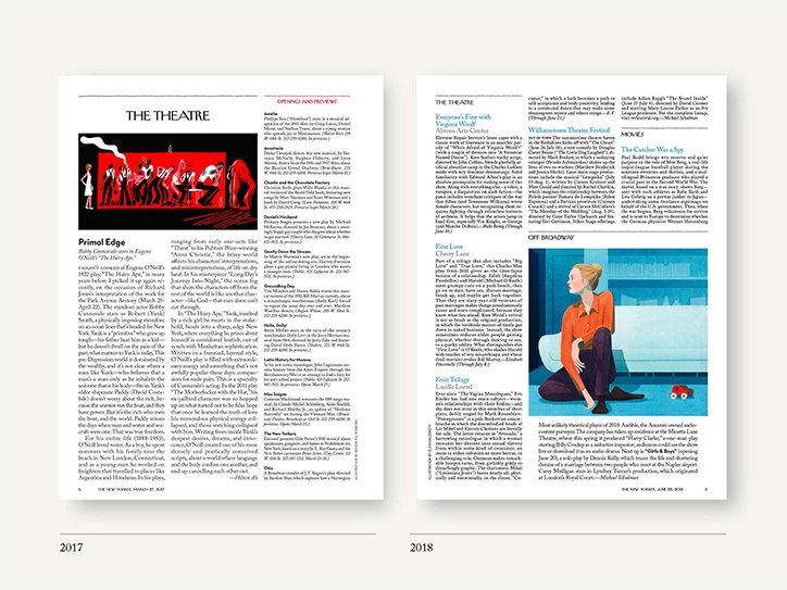
The New Yorker: ‘Goings On About Town’
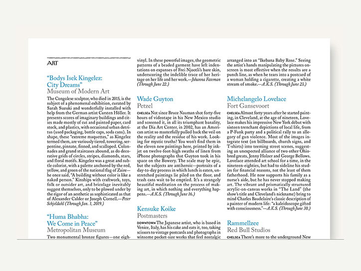
The New Yorker: ‘Goings On About Town’
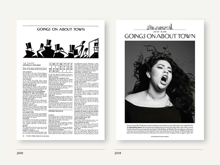
The New Yorker: ‘Goings On About Town’
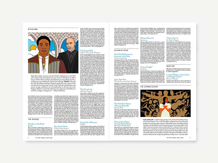
The New Yorker: ‘Goings On About Town’
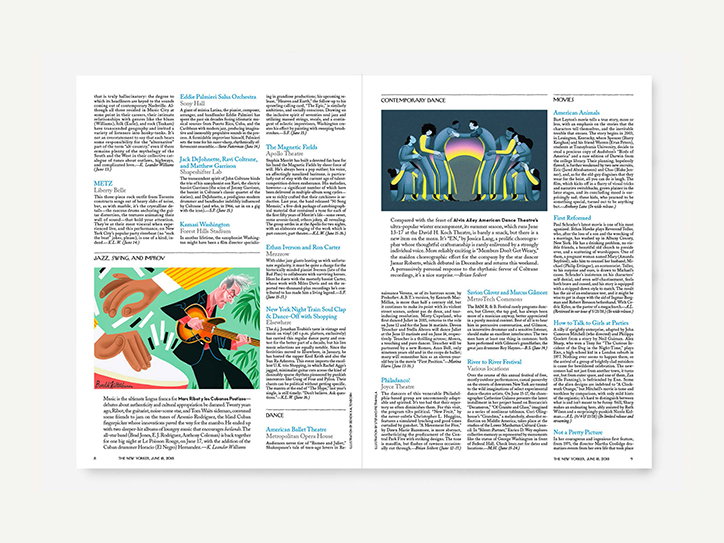
The New Yorker: ‘Goings On About Town’
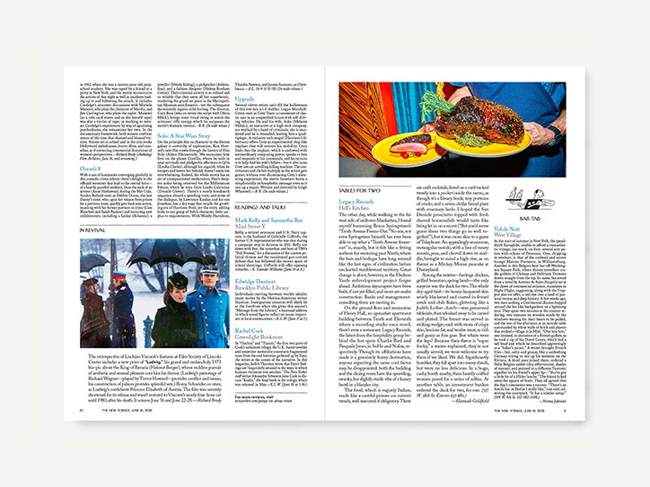
The New Yorker: ‘Goings On About Town’