




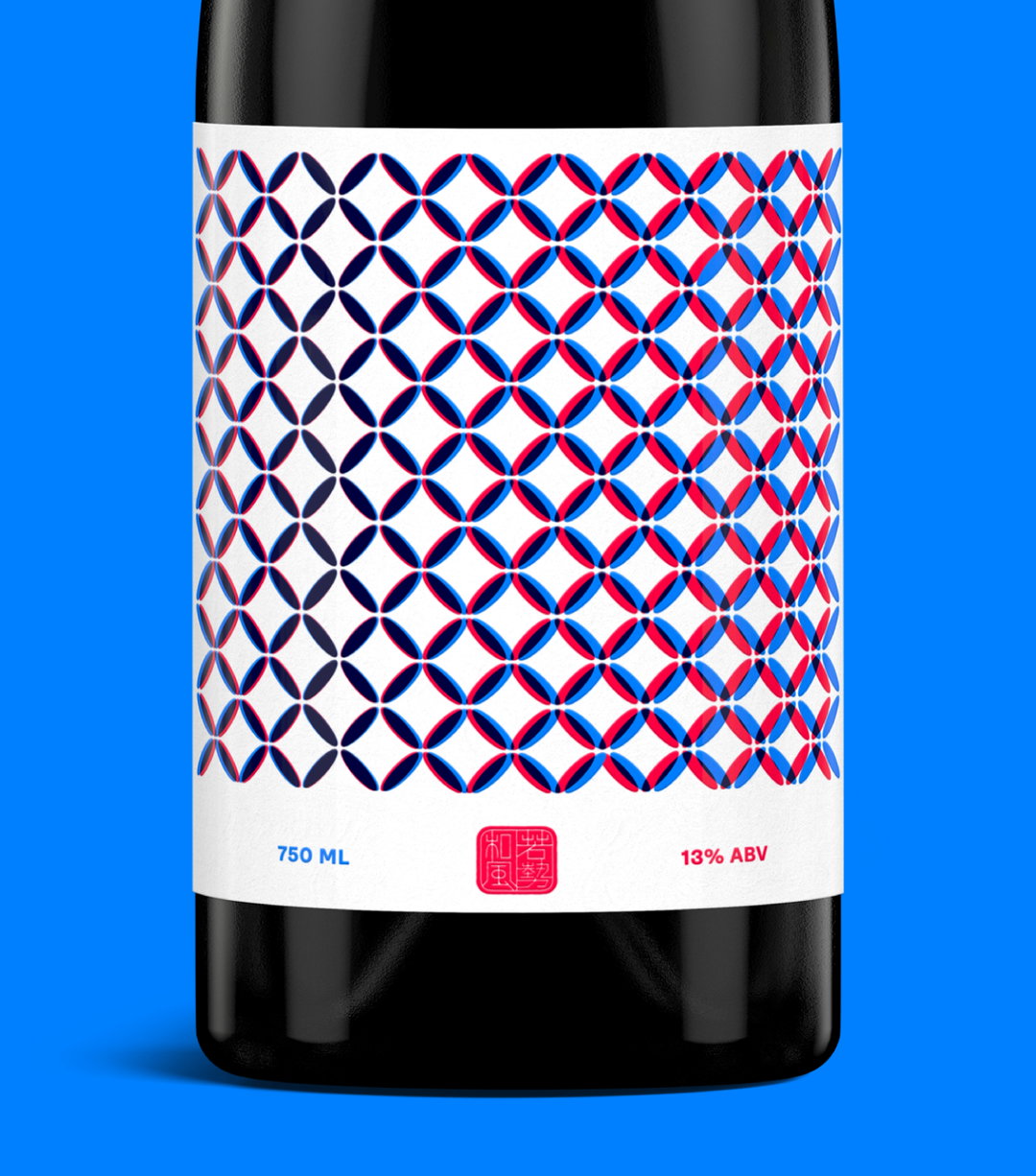
Our Friends in London designs a universally friendly identity for sake brand Wakaze
Briefed to democratise sake and demystify age-old traditions, the agency’s response is illustrative, fresh and approachable.
After launching in 2020, Our Friends in London – an ad agency created by Peter Hale – has already racked up a great list of clients and projects. Referring to the team as a “group of creative thinkers and do-ers” who formed to disrupt traditional methods of working and designing, Peter works alongside strategy director Linda Chen, creative director Russell Saunders and brand designer Eddie Fowler. The agency has over 20 years’ experience and works on all sorts, from food and drink, sport, commerce, retail and placemaking.
The most recent endeavour takes form in an identity for Wakaze, a sakagura that combines Japanese tradition and French culture. Takuma Inagawa, founder of Wakaze, reached out to Our Friends to take the reins of a re-brand. “The brief was to democratise sake,” Peter tells It’s Nice That and, after great success in launching Wakaze, it was an enticing brief no less. “We needed to change the perception of sake; how it’s made and how it’s enjoyed. Western audiences often see sake as a high ABV spirit, to drink only with Japanese food. But it has a versatility like wine.”
Sake is often referred to as Japanese rice wine and is created by fermenting rice that has been polished to remove the bran – the hard outer layers of cereal grain. The process of which is similar to that of beer, where starch turns into sugars and that, in turn, ferments into alcohol. It’s a national beverage in Japan and is often served in special ceremony and ritual events. Wakaze’s founders were trained in Japan and decided to set up shop with a brewery located in Paris, a move decided upon to bring sake to other locations. Shoya is the master brewer at Wakaze and graduated from the Faculty of Agriculture at the University of Tokyo – he also hails from a family of brewers in Gunma, Hijiri. Meanwhile, Takuma is the founder and a graduate of Science and Engineering from the University of Keio and the Ecole Central Paris – he launched Wazake in Japan in 2016.
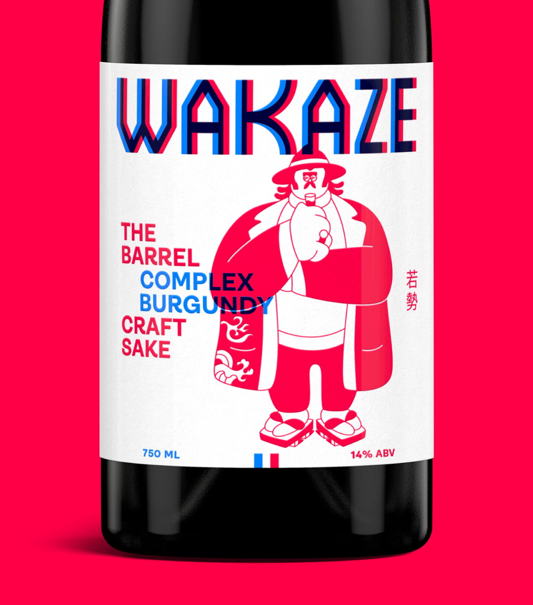
Our Friends in London: Wakaze. (Copyright © Our Friends in London, 2020)
The team saw an opportunity to bring sake into the mainstream and, alongside a declining interest in the beverage – in Japan, too – they wanted to give it a modern twist while combining French ingredients, centuries-old knowledge and new techniques. As such, the rebrand needed to reflect this new direction. “Sake consumption is declining in younger generations,” adds Peter. “Through a craft outlook underpinned by rigorous methods, we can attract new audiences while preserving traditional roots.” The team sought to inspire their work based on the stories of Wakaze’s founders, more specifically how Takuma and Shoya overcame obstacles in brewing an award-winning sake in France. “We set out to evoke this spirit of respectful defiance; experimenting with convention to start a craft sake revolution.”
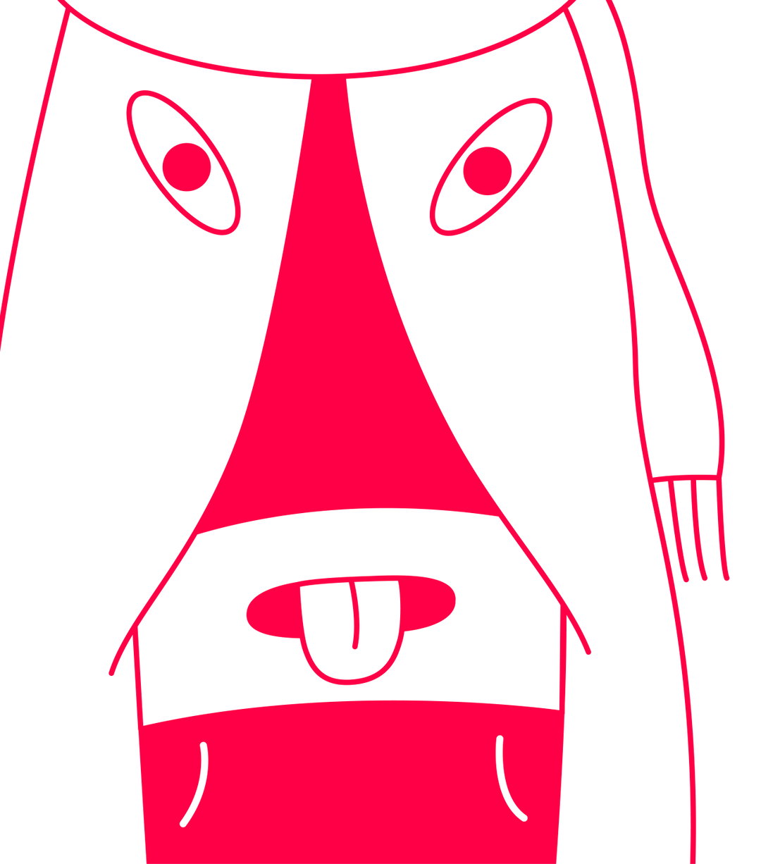
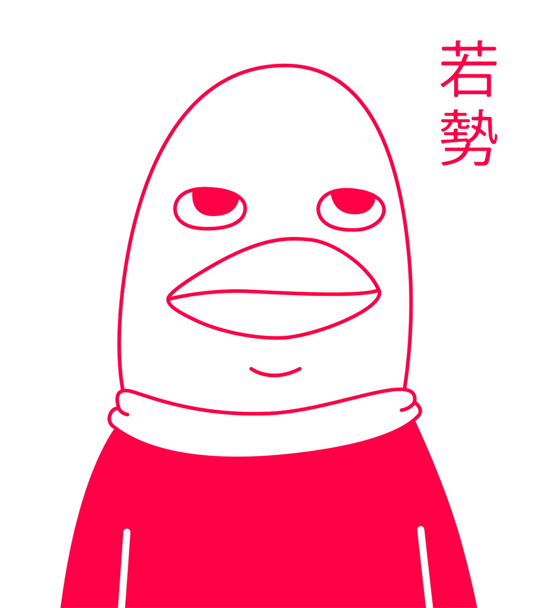
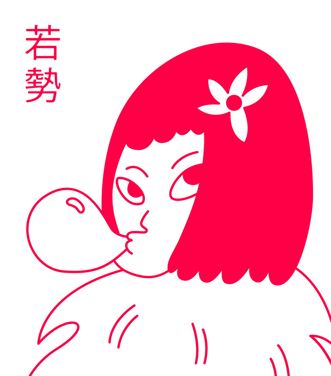
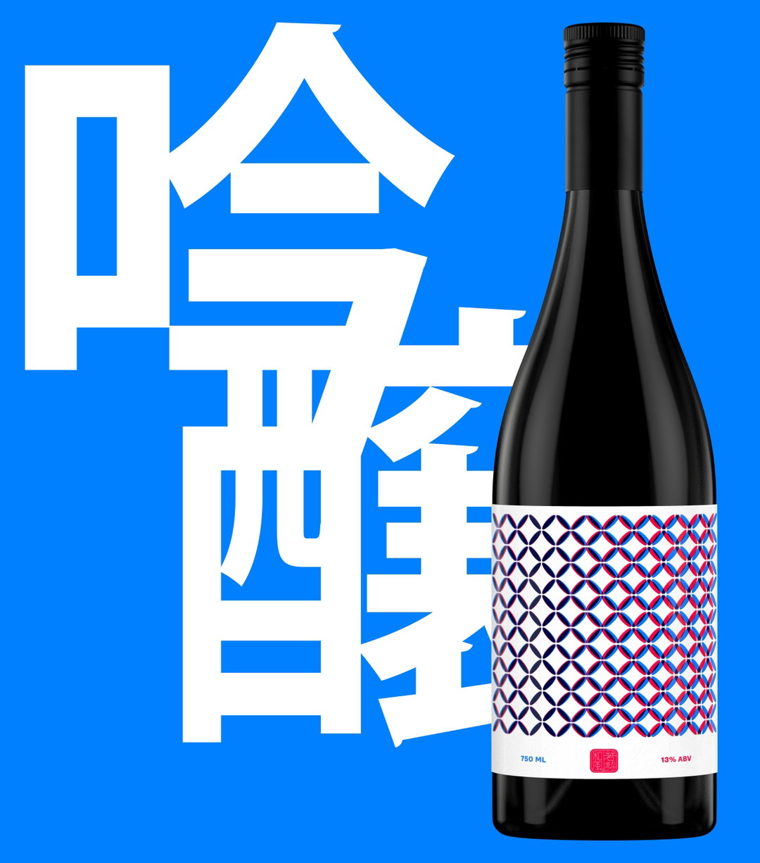
Our Friends in London proceeded with a respectful nod towards traditional Japanese design elements, which includes calligraphic type and muted colours. The main goal was to explicitly place sake and its design tropes along with approachability, steering it away from mysticism. This meant the team opted for a colour palette that was more on the straightforward side of things: “representing France using blue and Japan using red,” says Russell, leading with the presentation of dichotomies of “France and Japan, East and West, older and newer”. These tones were then given a refresh, brightened to make them more energetic and able to transfer across both print and digital – such as the packaging design and website. Los Angeles-based illustrator Andy Busc was commissioned to create the characters in order to personify each individual sake style, inadvertently producing a collection of pieces that’s realistic just as much as they are surreal. “Andy reports on what he sees in real life,” says Eddie, “and also elaborates on what he dreams. We liked this fantastical twist grounded in the everyday. Our characters are symbolic of both cultures.”
These characters take form in a “trio”, featuring a rooster, the French national animal, plus a Kanzashi flower and a “purposefully ambiguous ambassador, a blank slate for new influences,” says Eddie. Each character represents a member of the Wakaze team and has been derived to be relatable, paying special attention to those that might never have heard of sake. This, combined with an Ambit typeface by CoType and a logotype created from Absolution by Helsinki Type Studio, creates a considered, universal and distinctively friendly identity that certainly adds a modern twist to the visual language of sake. A true steer towards democratising sake, the result sees a merging of illustrative packaging – that Linda says "plays with the idea of a single grain of rice" – with web design and recognisable aesthetic to match.
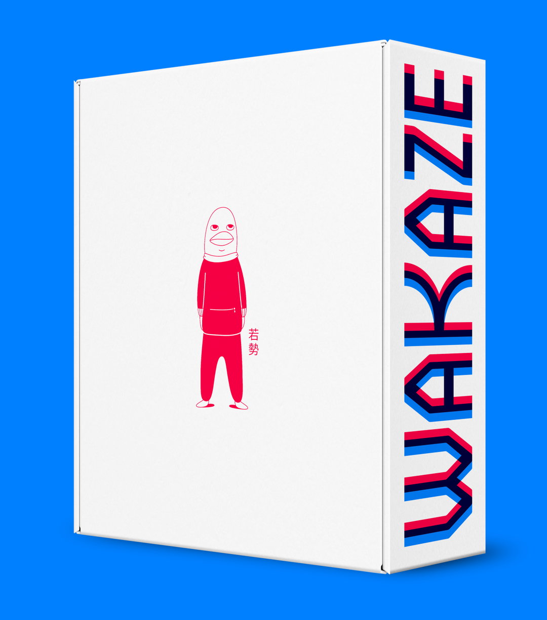
Our Friends in London: Wakaze. (Copyright © Our Friends in London, 2020)
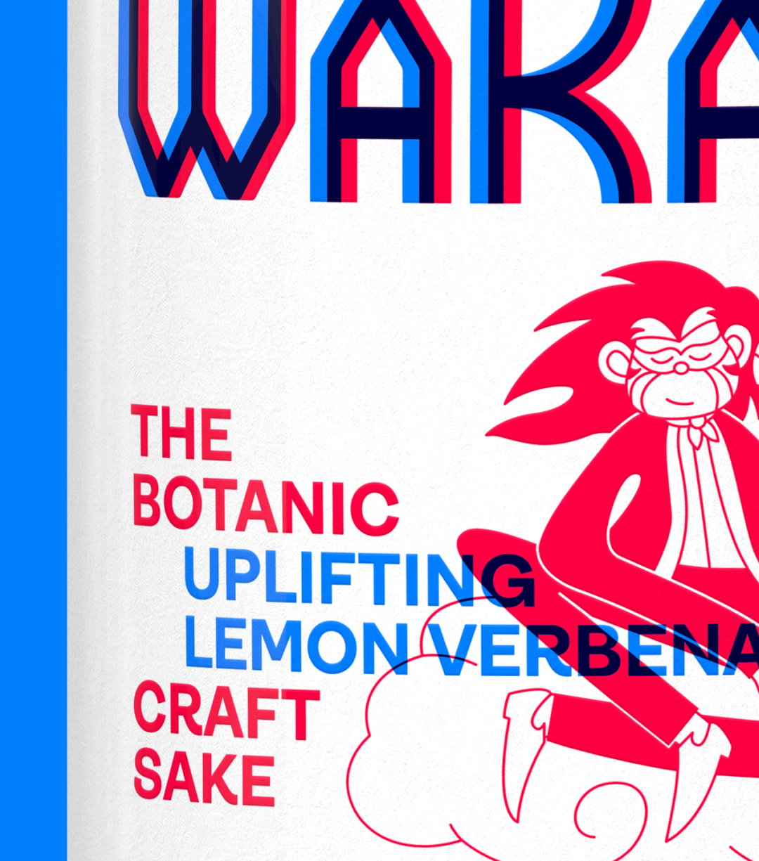
Our Friends in London: Wakaze. (Copyright © Our Friends in London, 2020)
Our Friends in London: Wakaze. (Copyright © Our Friends in London, 2020)
Our Friends in London: Wakaze. (Copyright © Our Friends in London, 2020)
Our Friends in London: Wakaze. (Copyright © Our Friends in London, 2020)
Our Friends in London: Wakaze. (Copyright © Our Friends in London, 2020)
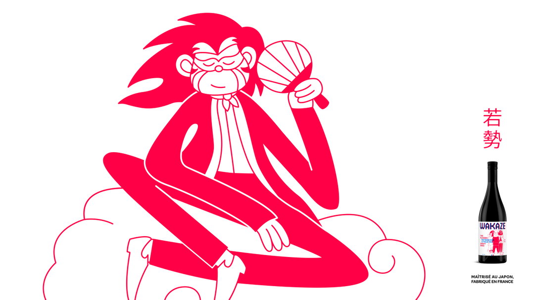
Our Friends in London: Wakaze. (Copyright © Our Friends in London, 2020)
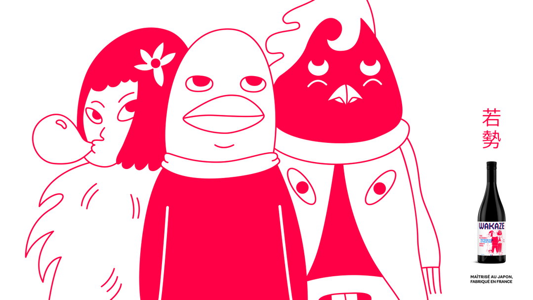
Our Friends in London: Wakaze. (Copyright © Our Friends in London, 2020)
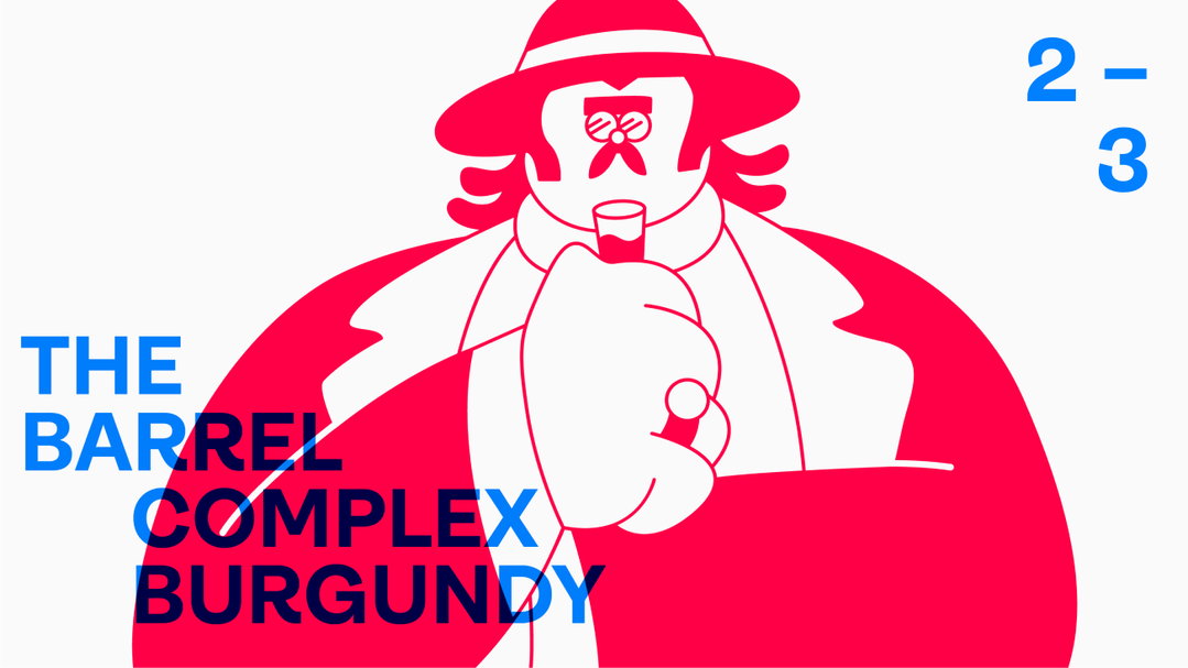
Our Friends in London: Wakaze. (Copyright © Our Friends in London, 2020)
Share Article
Further Info
About the Author
—
Ayla is a London-based freelance writer, editor and consultant specialising in art, photography, design and culture. After joining It’s Nice That in 2017 as editorial assistant, she was interim online editor in 2022/2023 and continues to work with us on a freelance basis. She has written for i-D, Dazed, AnOther, WePresent, Port, Elephant and more, and she is also the managing editor of design magazine Anima.

