Launch Recite Me assistive technology
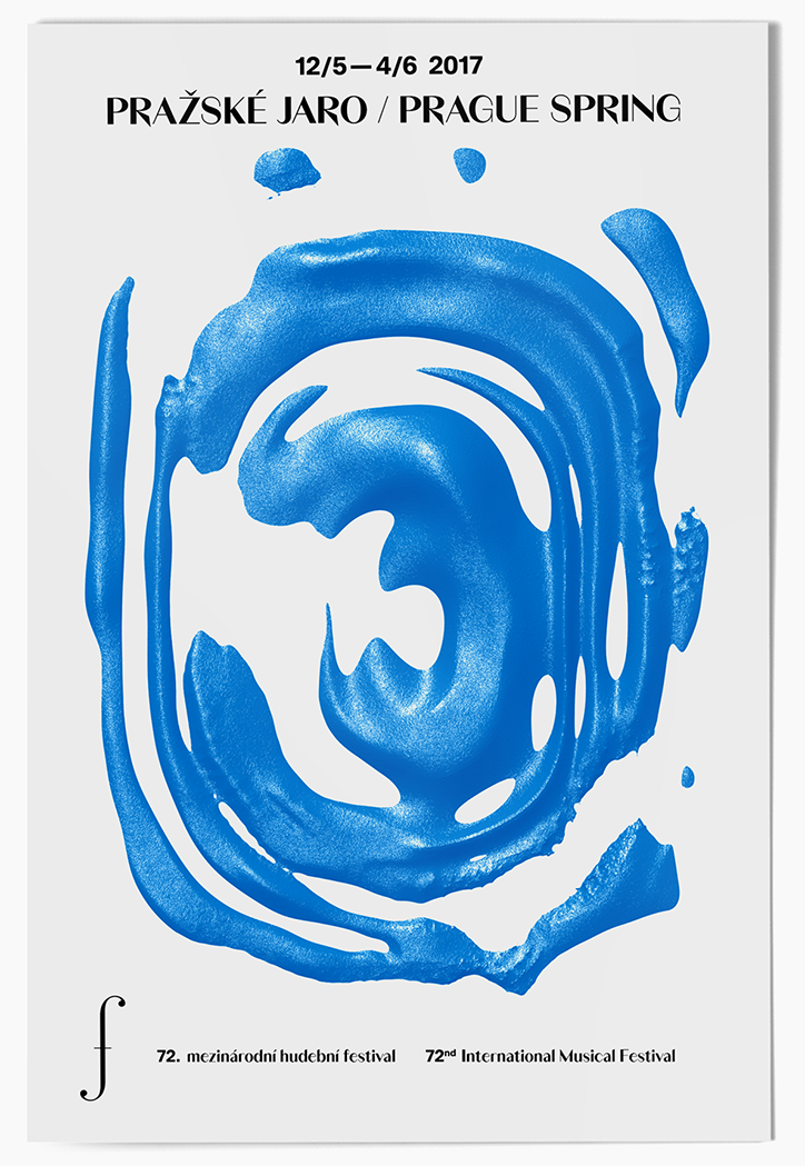
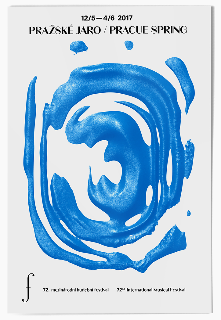
A poster for the “Pražské Jaro / Prague Spring” festival, dated “12/5–4/6 2017”. A thick, textured swirl of bright blue paint dominates the centre of the white page. Text at the bottom reads “72. mezinárodní hudební festival” and “72nd International Musical Festival”, accompanied by a musical f-clef symbol.

Parallel Practice applies its geometric aesthetic to posters and publications

—
Date
26 January 2017

Prague-based studio Parallel Practice has updated its portfolio with a wealth of publication and poster work. The studio is formed of designers Michal Landa and Jan Brož, and the pair often collaborate with other designers such as Martin Groch and Jan Novák, and Jan Horčik for his custom typefaces.

Parallel Practice has kept its geometric aesthetic, which we highlighted in our post about them last May. In this update, the studio has focused on integrating text with striking visuals to create minimal yet engaging work. Stand out projects include a pair of concept posters for the Prague Spring Music Festival, an exhibition poster for a group show in Prague and a publication with Jan Novak that cleverly tells a sci-fi noir story through a graphic design and typography manual.
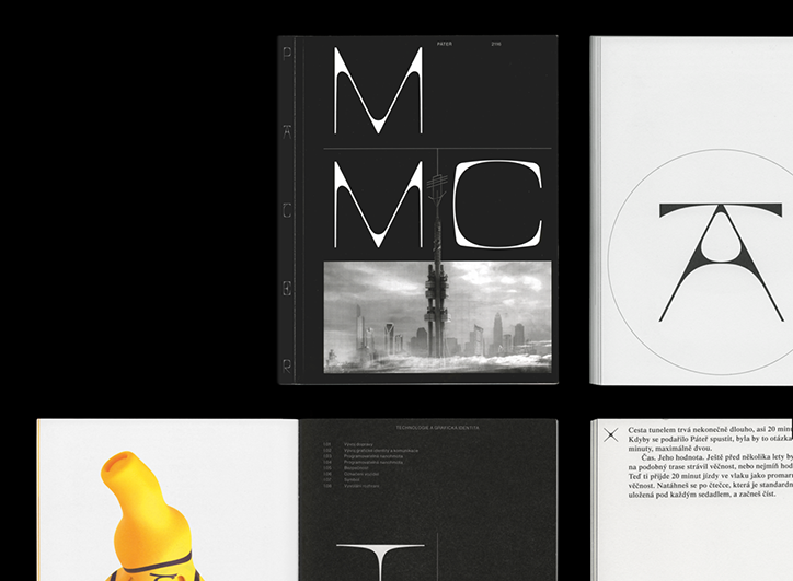
A collection of pages and covers from a black and white publication. One cover features a bold, stylised “MC” logo above a grainy photograph of a city skyline.
Above

Jan Novák and Parallel Practice: Pater
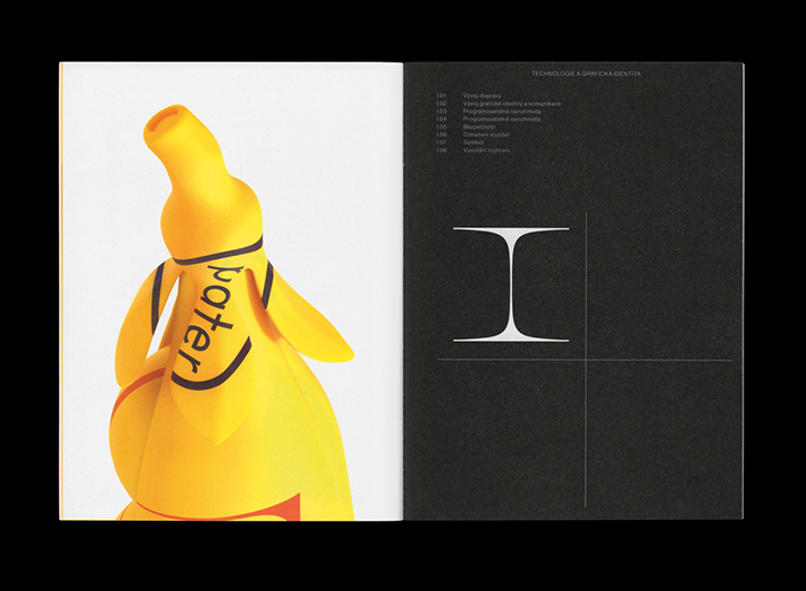
An open book shows a yellow, abstract sculpture on the left page and a black page on the right. The black page features a white, serif capital “I” and a list of numbered headings.
Above

Jan Novák and Parallel Practice: Pater
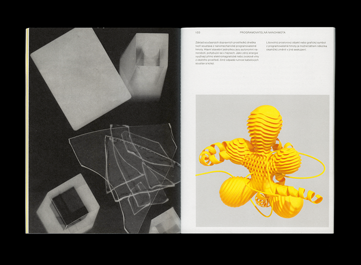
An open book shows a black and white spread of abstract geometric shapes on the left. The right page features a 3D render of a bright yellow, ribbed organic form with swirling, tentacle-like extensions.
Above

Jan Novák and Parallel Practice: Pater
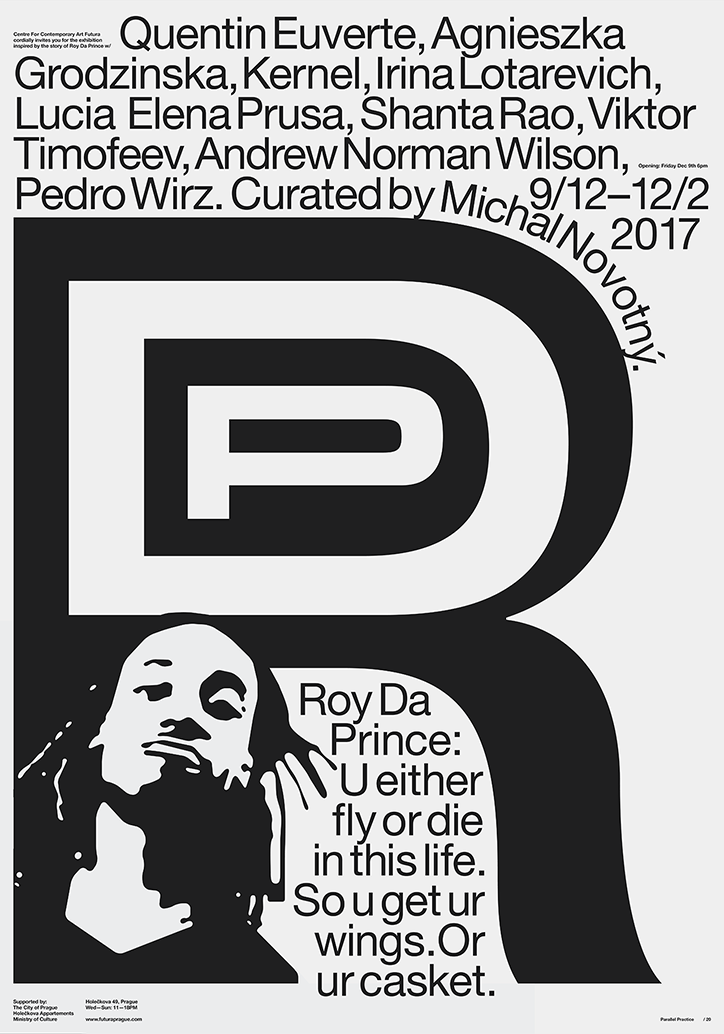
A black and white typographic poster for an exhibition featuring a list of artists and the text “Curated by Michal Novothy”. A large, stylised letter “R” dominates the centre, with a high-contrast portrait of Roy Da Prince below. A quote reads, “U either fly or die in this life. So u get ur wings. Or ur casket.”
Above

Parallel Practice

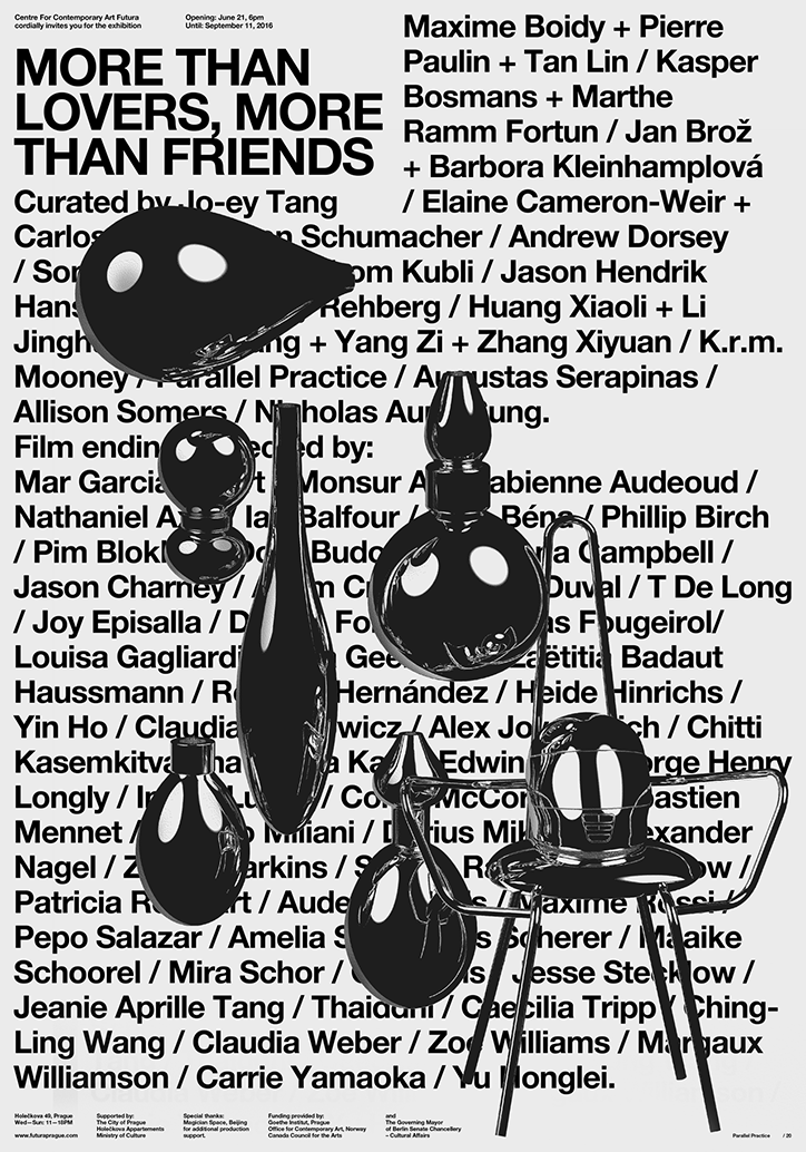
A black and white typographic poster for an exhibition titled “More than lovers, more than friends”. The text is layered behind a series of glossy, black 3D rendered shapes that resemble oversized droplets or pebbles.
Above

Parallel Practice

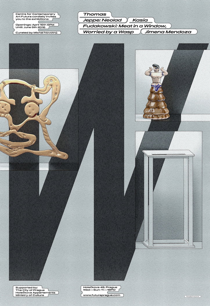
A graphic poster for an exhibition at the Centre for Contemporary Art Futura. A large, dark grey “M” is layered behind a gold abstract sculpture and a figure standing on a stack of brown bowls. Text at the top lists artists including “Thomas Jeppe”, “Kasia Fudakowski” and “Jimena Mendoza”.
Above

Parallel Practice

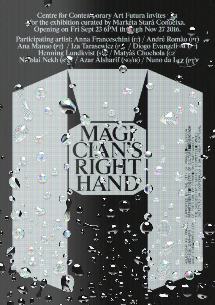
A poster for an exhibition titled “Magician’s Right Hand”. The text is layered over a grey geometric shape and a black background, both covered in realistic water droplets. The top of the poster invites viewers to an exhibition curated by Markéta Stará Conceiça, opening 23 September 2016. A list of participating artists follows, including Anna Franceschini and André Romão.
Above

Parallel Practice

Share Article

About the Author

Rebecca Fulleylove

—

Rebecca Fulleylove is a freelance writer and editor specialising in art, design and culture. She is also senior writer at Creative Review, having previously worked at Elephant, Google Arts & Culture, and It’s Nice That.

It's Nice That Newsletters

Fancy a bit of It's Nice That in your inbox? Sign up to our newsletters and we'll keep you in the loop with everything good going on in the creative world.