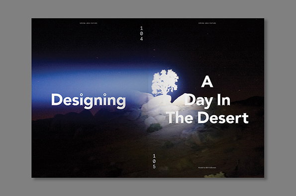
Publication: Richard Turley's story of a magazine dedicated to a desert music festival
Richard Turley is one of the most respected designers around, lauded by the industry and the design press for his funny, daring and creative approach in helping revive the fortunes of Bloomberg Businessweek. But when It’s Nice That approached him about an article for Printed Pages looking at this part of his career he was reticent. “To be honest with you,” he told us, “I have a slight anxiety that everyone must be bored shitless about me whining on about those covers.”
Instead he wondered, would we be interested in the fact that he was about to start work on iconic music magazine ’SUP and its special issue commemorating a festival held in the Californian desert? Yes. Yes we would.
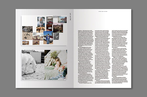
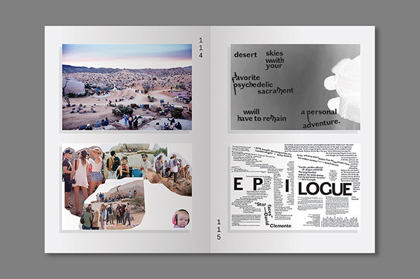
And so we got to tell the exclusive story about how Richard and his Bizweek colleagues Emily Keegin and Tracy Ma went about producing this amazing record of last year’s A Day In The Desert; a new kind of festival held in the mindbending surroundings of the Joshua Tree National Park.
It is a graphic design story in a way with talk of typefaces and layouts but it also drills down to the very core issue surrounding magazines; in what ways can the medium best capture the stories we are trying to tell?
Buy the new issue of Printed Pages right here!!
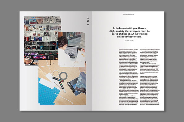
Printed Pages Spring 2014: Designing A Day In the Desert
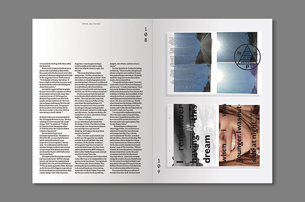
Printed Pages Spring 2014: Designing A Day In the Desert
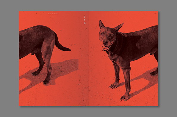
Printed Pages Spring 2014: Designing A Day In the Desert
Printed Pages Spring 2014: Designing A Day In the Desert
Share Article
Further Info
About the Author
—
Rob Alderson is a freelance writer, editor and strategist. He was previously editor-in-chief of It’s Nice That and WePresent, and editor of Design Week. He publishes the newsletter Undo, which tries to make sense of how AI is changing design work, the design process and the design industry.