Launch Recite Me assistive technology
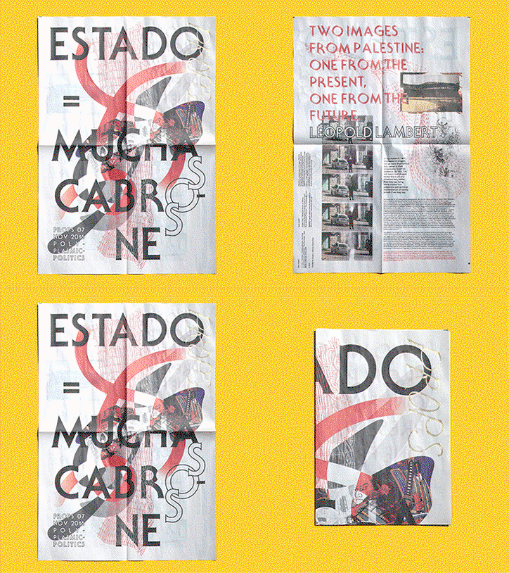
An animation in which two printed pages are displayed against a yellow background. One page features bold typography reading “ESTADO = MUCHA CABRONE”, while the other reads “TWO IMAGES FROM PALESTINE” and “LEOPOLD LAMBERT”.

Props Paper surveys the parallels between artists and scientists, designers and lawyers

—
Date
9 March 2018

Architect, Lucy Siyao Liu and designer, Matthew Bohne first collaborated as undergraduates at Rhode Island School of Design, working on books, posters and various graphic ephemera. Now both based in New York, their collaboration has continued and expanded to include their experimental weekly paper Props. A two-sided broadsheet newspaper, Props Paper aims to “connect creatives from disparate fields in arts and sciences, allowing them to discover new connections via our publication,” the pair tell It’s Nice That.

With 30 issues behind them, connecting relevant topics of art and design with the scientific world, while introducing advances in scientific imaging to artists is at the heart of Props. While studying, Lucy and Matthew noticed that existing art and design journals tended to be formal institutional endeavours: annual publications aimed at those already working within specific disciplines, often thematised. “We were interested in the ad-hoc nature of contemporary practices that slip between categories,” they explain. “The fearlessly collaged practices of animators mapping the brain, artists sampling lichens, graphic designers hacking scanners, historians becoming filmmakers.”

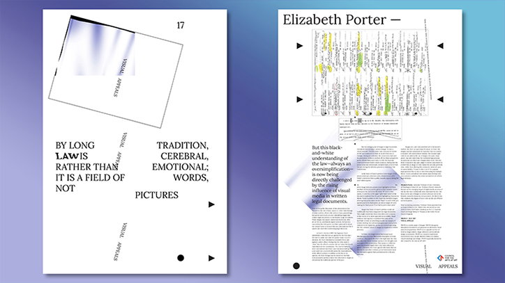
Props Paper provides a space to provoke dialogue on imaging tools, techniques and methods across disciplinary boundaries to “promote the acquisition of visual knowledge”. Each issue of Props focusses on one individual, asking them “What is the role of images in your work?” These individuals range from artists and designers to scientists and curators who share three to five images of their own work or images that inspire them, often producing fascinating outcomes. In issue 17, Lucy and Matthew featured the work of lawyer, Elizabeth Porter. “The image she chose was evidence from a court case that changed the legal discourse on recognising images as legal documents at all,” they explain.

“For many issues, it is the first time that [our contributors] are asked to write about the method of their image-making practice in a direct way,” Lucy and Matthew comment. In the case that their main output is writing – lawyers or curators, for example – all the writing is original and in each issue, the graphics are created by Props founders.

By reaching out to such a broad range of contributors, Props manages to offer an alternative discussion in regards to visual communication. Although it’s easy to find many a graphic designer or visual artist discussing their processes, the significance of images to a lawyer or scientist is much less readily available, yet equally as relevant. With its broad output of visual matter, varying in both content and aesthetics, Props offers a place where the connections between seemingly disparate worlds can come together. Lucy and Matthew describe this unique perspective as a “survey of processes by image-makers, image collectors and accidental image connoisseurs.”
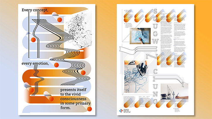
Two graphic posters with a white background and orange and blue accents. The first features flowing, wavy lines and the text “Every concept, every emotion, presents itself to the vivid consciousness in some primary form.” The second is a layout of text and images arranged around the name “Sougw Ngung”.
Above

Props Paper

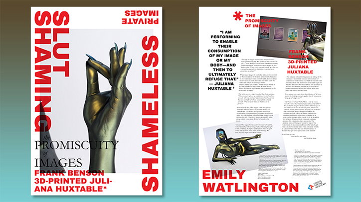
A two-page spread for a publication. The left page features a gold-coloured 3D-printed hand with long blue nails and the title “the PROMISCUITY of IMAGES” by Frank Benson and Juliana Huxtable. The right page contains an article by Emily Watlington, featuring a quote from Juliana Huxtable and images of 3D-printed sculptures.
Above

Props Paper

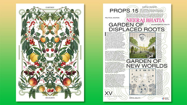
Two pages from a publication. The left page features a symmetrical botanical illustration of fruits and leaves, with the words “EARTHLY” at the top and “DELIGHTS” at the bottom. The right page contains text and images, including the headlines “PROPS 15”, “NEERAJ BHATIA”, “GARDEN OF DISPLACED ROOTS” and “GARDEN OF NEW WORLDS”.
Above

Props Paper

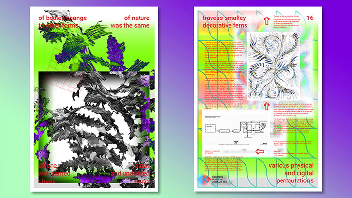
Two posters with vibrant green, yellow and purple gradients. The first features a distorted, monochromatic abstract form with the text “of bodily change to solar forms” and “of nature was the same”. The second contains a detailed line drawing of a fern, technical diagrams and the text “travess smalley decorative ferns” and “various physical and digital permutations”.
Above

Props Paper

Two pages from a publication. The left page features a tilted image and fragmented text including the words “LAW IS RATHER THAN” and “PICTURES”. The right page is titled “Elizabeth Porter –” and contains a dense layout of text and a yellow-highlighted diagram.
Above

Props Paper

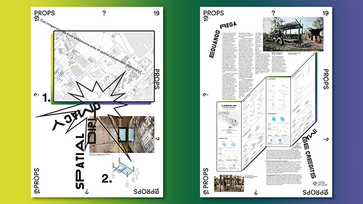
Two pages of a graphic design layout featuring a mix of maps, diagrams and photographs. Bold, distorted typography reads “Spatial Image Diplomacy” across the first page.
Above

Props Paper

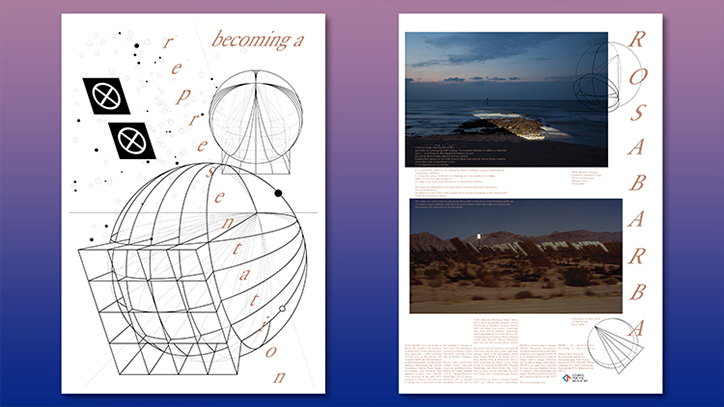
Two pages of a graphic design project. The first page features a technical line drawing of intersecting spheres and cubes with the words “becoming a representation” arranged vertically. The second page shows two landscape photographs of coastal and desert scenes, with the name “Rosa Barbara” printed vertically along the right edge.
Above

Props Paper

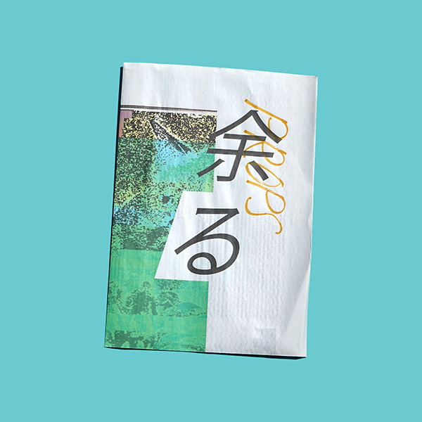
A white booklet featuring a collage of green and blue textured imagery on the left. Large black Japanese characters and a gold cursive word “Props” are layered across the cover.
Above
Left

Props Paper

Right

Props Paper

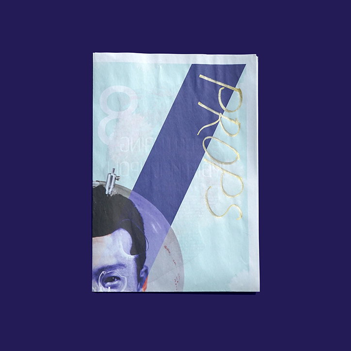
A magazine cover featuring a close-up of a person’s face, partially obscured by a purple overlay. A diagonal blue band cuts across the image, with the word “PROPS” written in gold serif typography.
Above

Props Paper

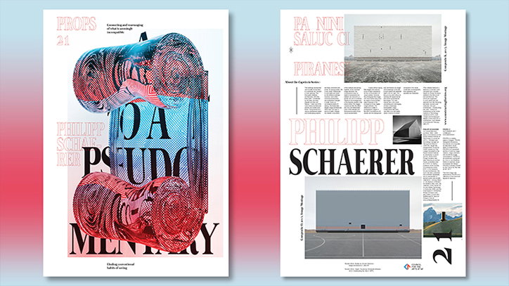
Two pages of a graphic design layout featuring bold typography and architectural imagery. The first page shows a distorted, 3D rendered blue and red shape overlaid with the words “PSEUDO MEMORY”. The second page features the name “Philipp Schaerer” in large type alongside black and white architectural photographs and columns of text.
Above

Props Paper

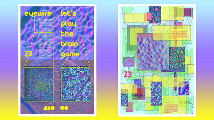
Two posters with a vibrant, digital aesthetic. The first features a wavy purple background with the text “eyewire let’s play the brain game” and two zoomed-in boxes of blue and green cellular patterns. The second is a complex collage of overlapping yellow and purple rectangles, connected by thin green lines.
Above

Props Paper

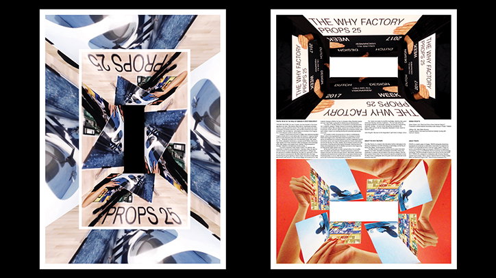
Two posters for “The Why Factory Props 25”. The first features a mirrored, kaleidoscopic collage of architectural fragments and the text “Props 25”. The second shows a similar mirrored composition above a block of text and a red-backed image of hands holding blue and yellow papers.
Above

Props Paper

Share Article

Further Info

About the Author

Ruby Boddington

—

Ruby is Senior Creative at It's Nice That, overseeing our visual output across platforms and projects. Before that, she was associate editor on the editorial team, after joining in September 2017 following graduation from Central Saint Martins.
It's Nice That Newsletters

Fancy a bit of It's Nice That in your inbox? Sign up to our newsletters and we'll keep you in the loop with everything good going on in the creative world.