Pulp Zine asks its readers to rethink what ‘real’ sex is
The queer, DIY-inspired zine from Megan Wallace and Jack Rowe creates an authentic, intimate printed space to explore sexuality and relationality.
Share
“Pulp really was born out of a frustration with the extremely restrictive ways in which sexuality is discussed,” says Scottish, London-based editor and writer, Megan Wallace. They're detailing the birth of Pulp Zine, a newly released, queer zine curating contemporary erotic writing, photography, and art. This frustration was combined with Megan’s experience as a writer on sex and relationships (their MA dissertation at Oxford was on porn, and they’re now the editorial director at Gay Times) as well as a drive to create something new – and necessary. “There is a big diversity of sexual experiences in this zine,” Megan says. “By placing work which explores various sexual and queer identities together within one space, I’m also asking readers to rethink any implicit hierarchies.” Overall, Pulp acts as a catalyst for people to consider what they deem as ‘real’ sex.
When it came to selecting artists to be involved in the zine – the likes of Hidhir Badaruddin, Layla Kosima and Marf Summers – Megan reached out to creatives they already admired rather than an open call, already trusting of their words and works. “I chose the contributors as they each encourage us to really look past the preconceived scripts of sexuality, intimacy and relationality,” Megan explains. This was something they also needed to balance through the zine’s design, a task assigned to Pulp’s other founder, Jack Rowe.
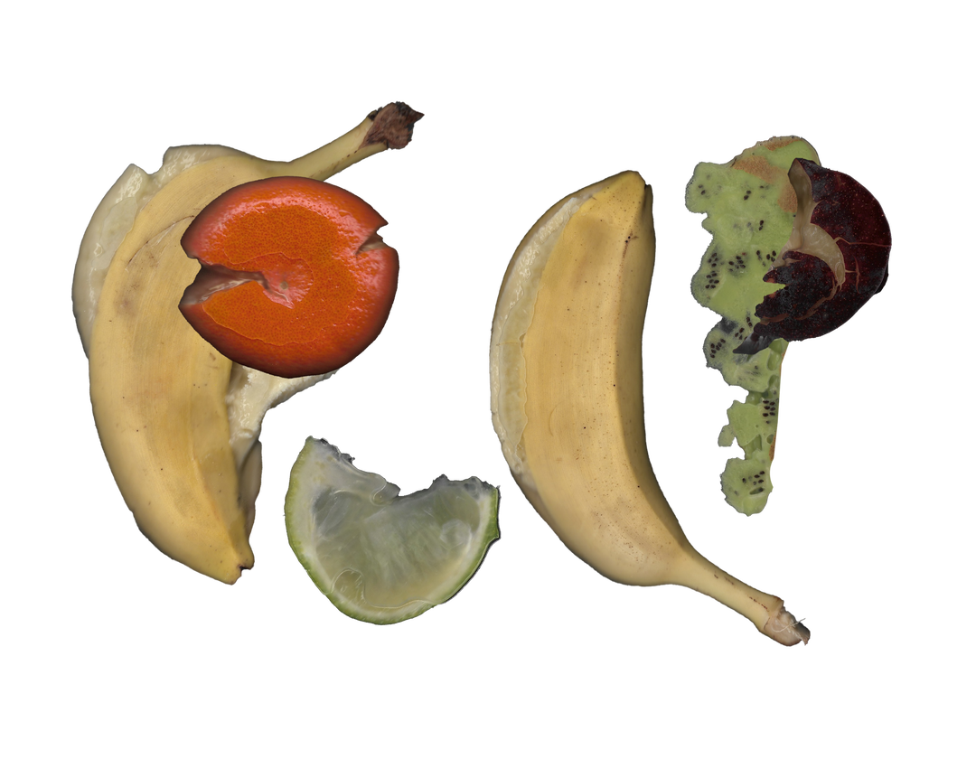
Pulp Zine Logo: Designed by Yosef Phelan (Copyright © Pulp Zine, 2024)
“A big part of Pulp is the design, and I didn’t go to art school so it’s not something I naturally have an understanding of,” Megan says. “I was so, so lucky to meet Jack,” who happened to already be a colleague of Megan’s as Gay Times’ art director, and they bonded over a shared desire to collaborate on a printed project. “We have a similar sex-positive outlook, and in my first week at Gay Times he was telling me about having worked on an NSFW print zine with Adonis [a queer club night],” a zine later catalogued in the British Library. “We also both have a lot of enthusiasm for working at a publication that has such a long history in activism, but which also has a history in soft porn and in gay erotic images.”
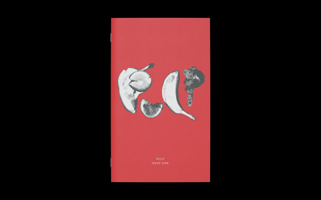
Embracing this context, as well as turning to lesbian pulp novels for inspiration, the designer and art director sought to embrace a raw, proudly DIY aesthetic in Pulp’s design. Jack helped to forged a material and emotional connection to its content in an authentic fashion: “There’s something deeply satisfying about holding an uncoated, tactile zine in your hands,” he says. “In a world where we’re always seeing content through the pixelated screens of our phones (often censored to fit platform rules), the zine offers an unfiltered space for art and words to exist exactly as intended by their creators.”
Jack’s editorial identity balances flourish and flair with format restrictions, such as elongated dimensions to best suit poetry and literature. “Each page has been designed to embody the work it’s displaying,” Jack details, “creating a physical space for readers to explore intimacy and creativity in its purest, uncensored form.” Similarly, Pulp’s use of colour is rich, luscious and on theme. “A recurring red theme ties everything together, evoking romance, passion, darkrooms, and the sensuality of erotica.” While the latter can often come loaded with bold, brash associations, Jack and Megan were keen to approach the design through a slightly softer lens. “The headline typeface, Apris by Schick Toikka, reflects this perfectly,” Jack notes. The flared stems of which evoke rose thorns or vampire teeth, “subtly hinting at the tension between beauty and danger”.
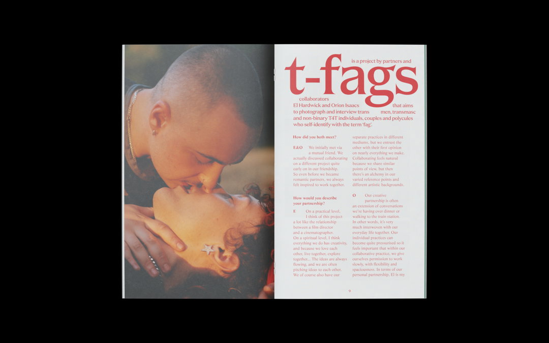
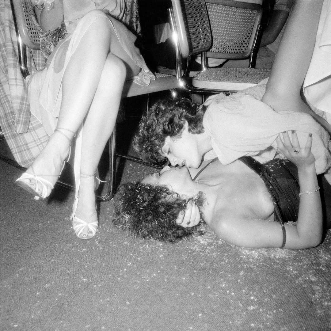
Pulp Zine (Copyright © Pulp Zine, 2024)
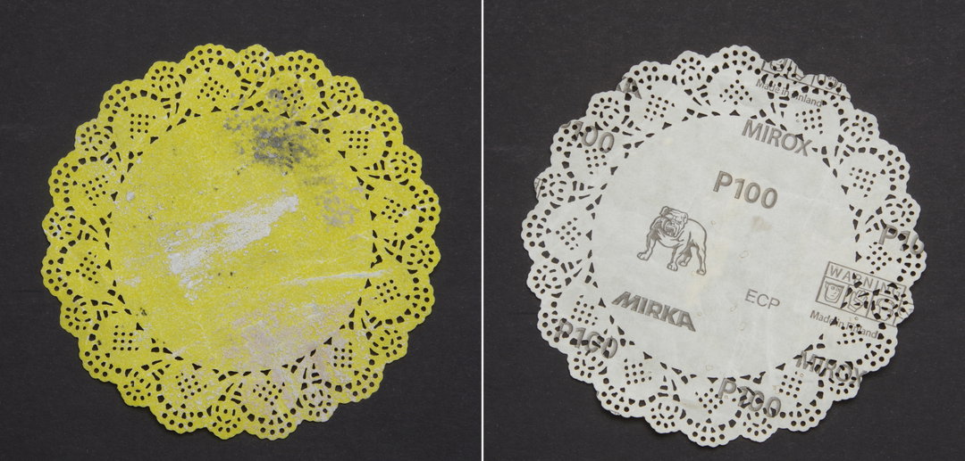
Marf Summers: Sandpaper Doilie (Copyright © Marf Summers, 2024)
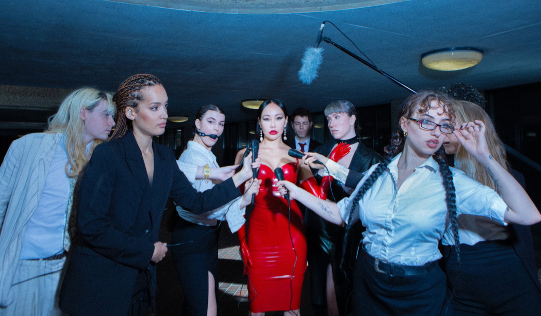
Pulp Zine: Layla Kosima (Copyright © Layla Kosima, 2024)
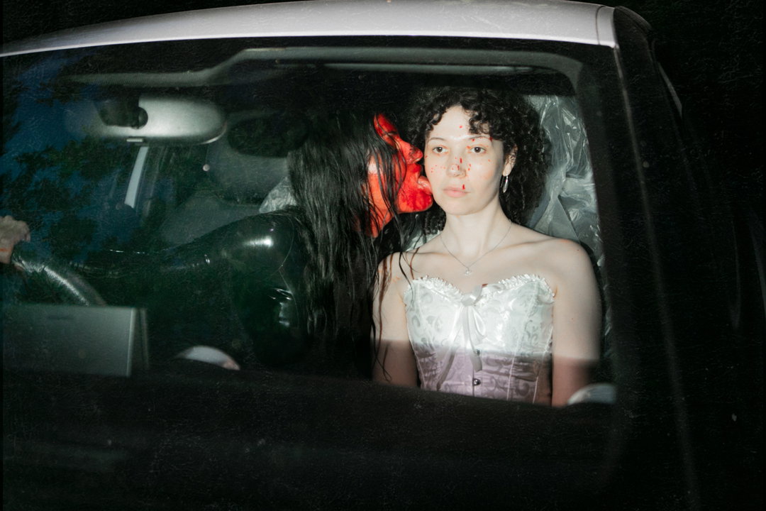
Pulp Zine: Layla Kosima (Copyright © Layla Kosima, 2024)
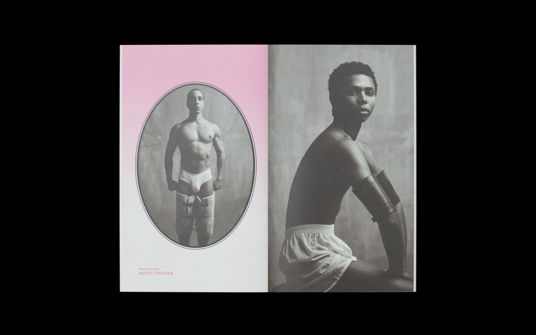
Pulp Zine (Copyright © Pulp Zine, 2024)
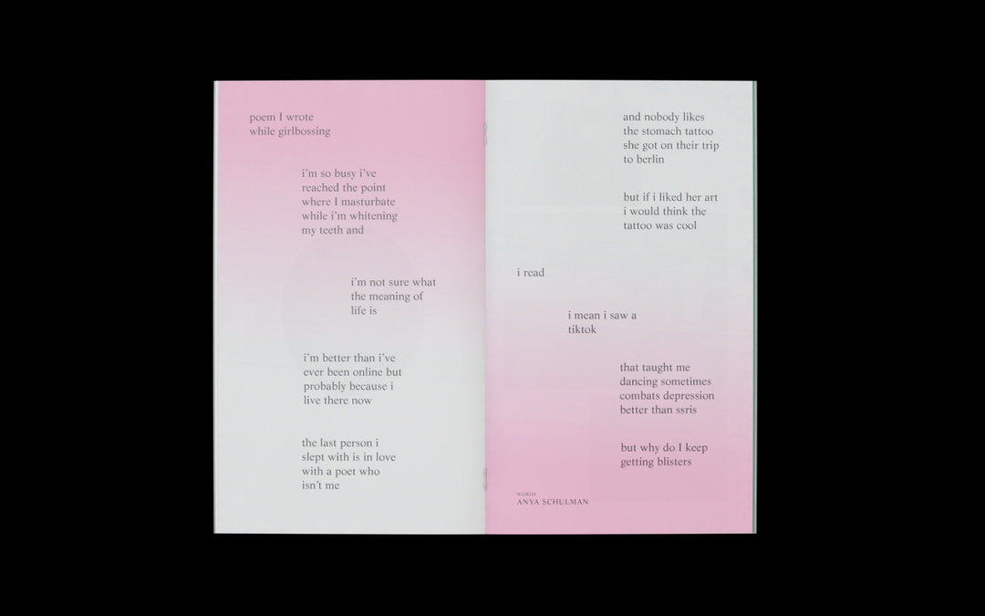
Pulp Zine (Copyright © Pulp Zine, 2024)
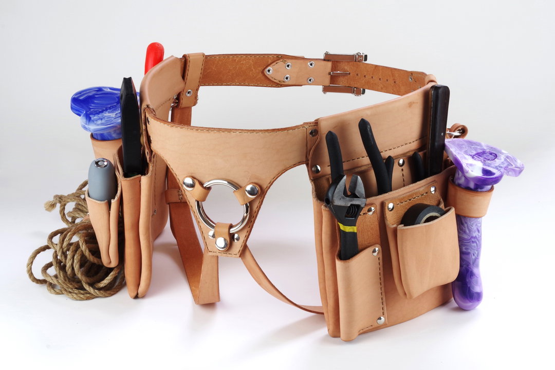
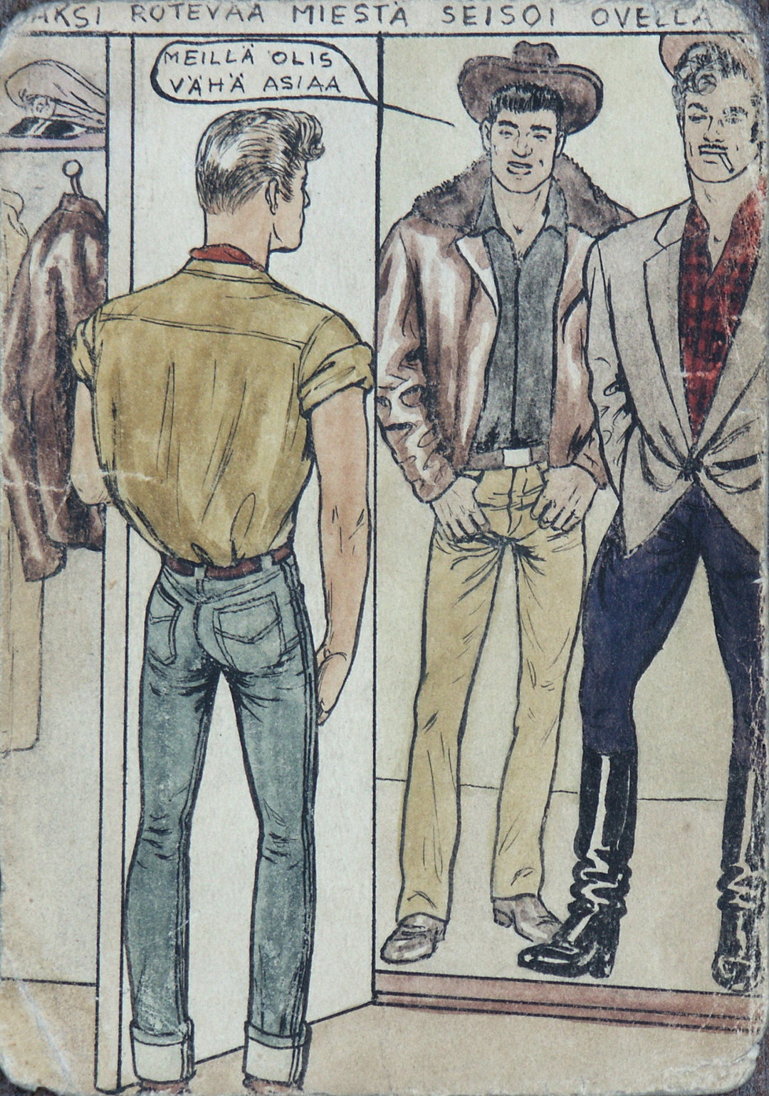
Marf Summers: TOOLbelt (Copyright © Marf Summers, 2024)
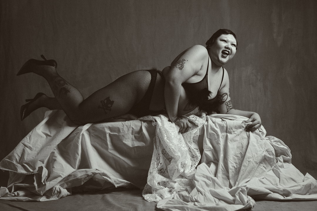
Austn Fischer: Jesters Gender Game (Copyright © Austn Fischer, 2024)
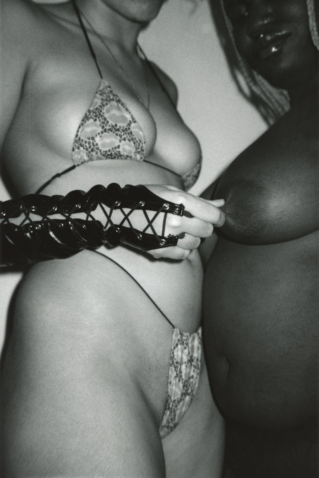
Anna Sampson: Jay and Ebony (Copyright © Anna Sampson, 2024)
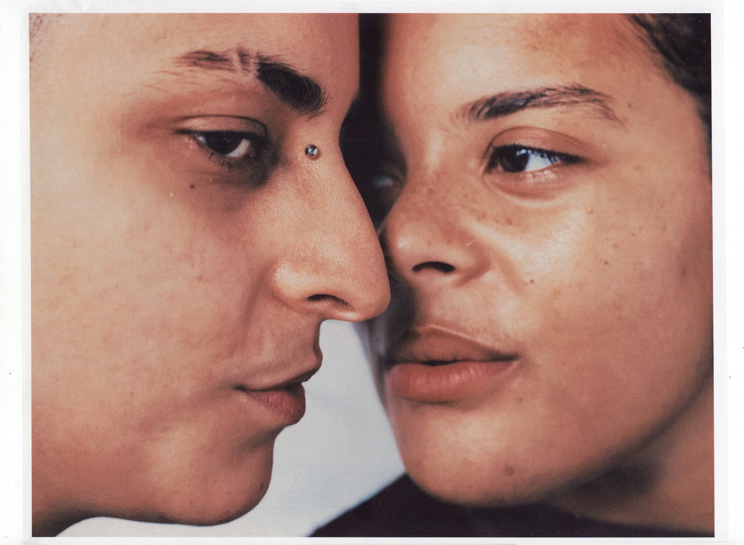
Anna Sampson: Ajamu and An0maly (Copyright © Anna Sampson, 2024)
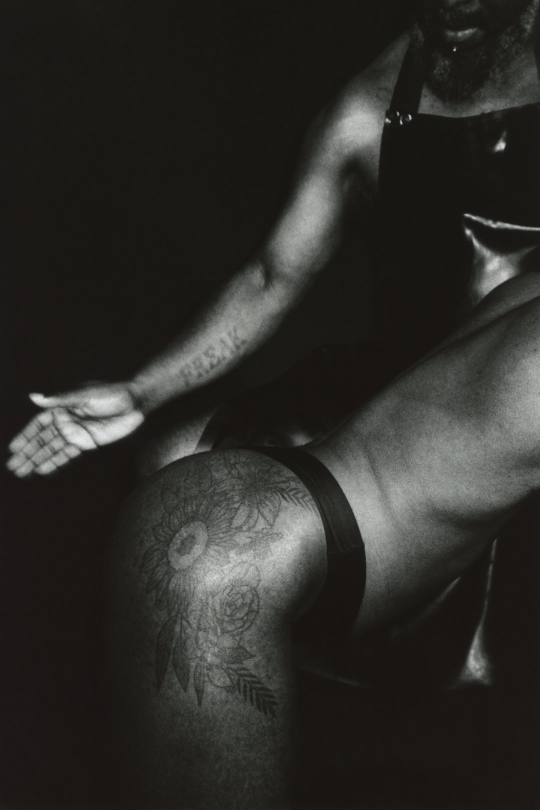
Anna Sampson: Ajamu and An0maly (Copyright © Anna Sampson, 2024)
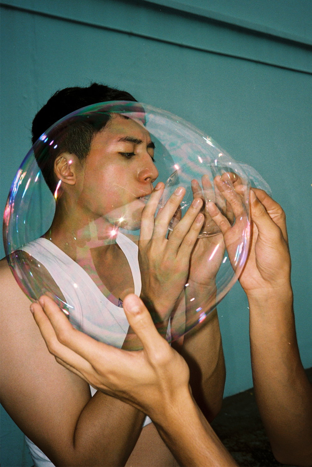
Hidhir Badaruddin: Bubbles (Copyright © Hidhir Badaruddin, 2024)
Hero Header
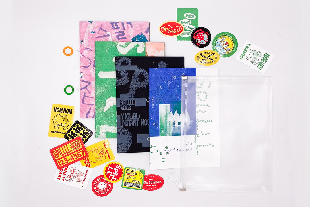
Pulp Zine (Copyright © Pulp Zine, 2024)
Share Article
About the Author
—
Hailing from the West Midlands, and having originally joined It’s Nice That as an editorial assistant in March 2020, Harry is a freelance writer and designer – running his own independent practice, as well as being one-half of the Studio Ground Floor.