Launch Recite Me assistive technology
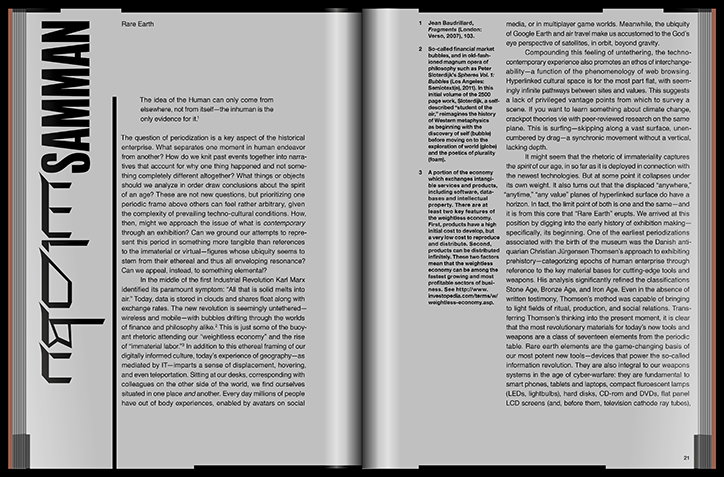
A double-page spread from a book or magazine featuring a dense layout of text. The left page contains a bold vertical title “SAMMAN” and an introductory essay titled “Rare Earth”.

New York-based designer Raf Rennie’s impressive portfolio of editorial projects

—
Date
15 March 2017

New York-based designer Raf Rennie first got into design after playing around on Photoshop when he was 12. “When I got to high school and friends were starting bands, I knew enough to make them their artwork,” he says. Raf has worked on an array of different projects, but is most comfortable in editorial design working across various magazines and publications. The designer has a fairly open approach when it comes to defining his work and style: “I’ve tried thinking of [my style] as a ‘post-structuralist’ aesthetic but I’m more and more thinking of that as a kind of forced nomenclature,” says Raf. “I’m still very much under this idea of structured modernist typography, but always try to bring more into it, some sort of mess and something to break that structure. In my head it’s always taking the narrative or language of one way of thinking and trying to add another discursive voice to it.”

For several years Raf has been working with Canadian arts magazine C Magazine, where he’s the designer and art director. “It’s a great mag and I hope I can help proliferate and make it more known,” he says. “I loved it as an undergrad and doing it now is a dream.” As well as C Magazine, Raf has recently worked with several magazines as part of the LA Art Book Fair including the publishers of Shoplifters, Number 04 which published some of his thesis writing and a series of subtle line drawings he created for WAX Magazine.

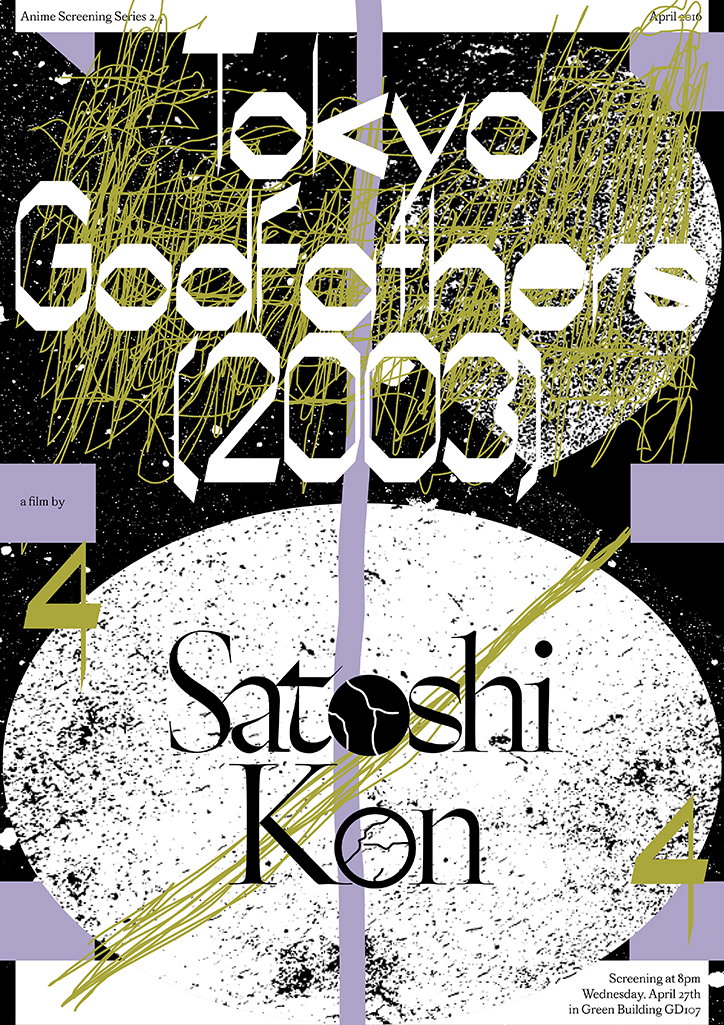
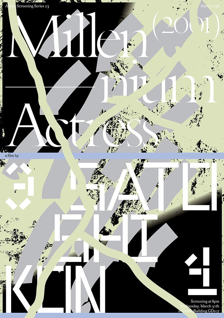
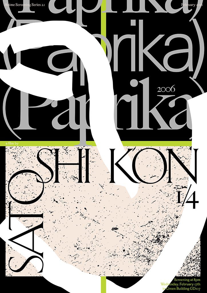
Raf’s work is measured and crisp, paying attention to composition and text placement. Overall his portfolio is fairly monochrome, with a focus on typography as opposed to gimmicks and bright colours. In a series of film screening posters, Raf adds interest and vibrancy by layering different digital textures, shapes and lines to create something that draws the eye in and is still communicative.

“I am trying to always create something that is of value apart from its content – like the design-object is a place for a designer to define themselves not just through content or subject matter,” says Raf. “I see a lot of designers who try to create an identity for themselves by making work that’s all about one thing, but visually they haven’t really developed a distinct identity (especially with work that has to be political or critical).”
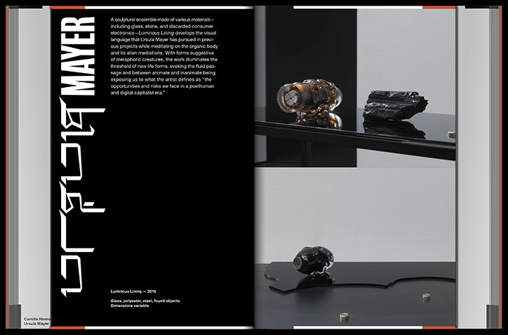
An open book with a black left page and a white right page. The left page features a vertical title reading “Ursula Mayer” and a block of text describing a sculptural ensemble. The right page shows two photographs of dark, organic sculptures resting on reflective black surfaces.
Above

Raf Rennie

A graphic poster for a screening of the film “Tokyo Goofathers (2003)” by Satoshi Kon. Bold white typography is layered over a black background with splattered white circles and energetic yellow scribbles. Text at the bottom lists the screening date as “Wednesday, April 27th” at 8pm in “Green Building GD107”.
Above

Raf Rennie

A typographic poster for a film screening reads “Millennium Actress (2001)”. The title is layered over bold, fragmented shapes in black, grey and pale green. The lower half of the poster features the name “Satelhi Klein” in a heavy, white sans-serif font. Small text at the bottom right lists the screening date as “Wednesday, March 30th” in “Green Building GD107”.
Above

Raf Rennie

A typographic poster for a screening of the film Paprika. The title “Paprika” is repeated in large, overlapping serif type across a black background, partially obscured by a bold, white abstract shape. The director’s name, “Satoshi Kon”, is written in large black letters over a textured cream section. Small text at the bottom provides the screening details: “Wednesday, February 17th” at “Green Building GD107”.
Above

Raf Rennie

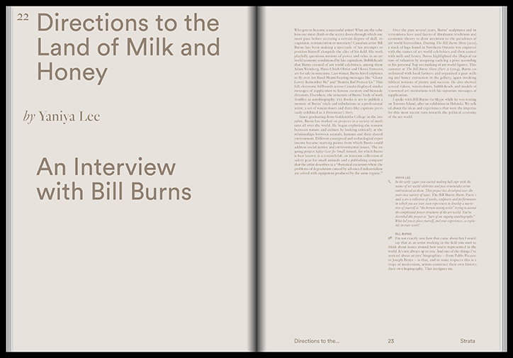
An open magazine spread featuring an interview. The left page contains the title “Directions to the Land of Milk and Honey” by Yaniya Lee, and the sub-headline “An Interview with Bill Burns”. The right page is filled with columns of text.
Above

Raf Rennie

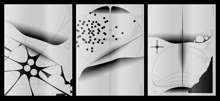
A triptych of three abstract black and white compositions. The panels feature a mix of organic curves, sharp diagonal lines, and clusters of small dots.
Above

Raf Rennie

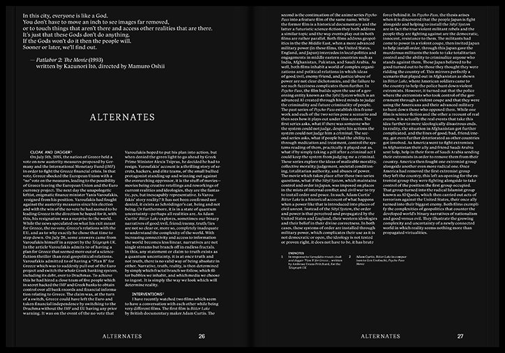
Two pages from a book titled “Alternates”. The left page features a large heading and columns of text, while the right page contains further text and a list of endnotes.
Above

Raf Rennie

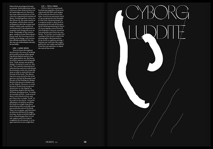
A two-page spread from a book. The left page contains two columns of dense text, while the right page features a large, white abstract shape and the title “Cyborg Luddite” in a thin, white sans-serif typeface.
Above

Raf Rennie

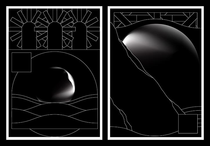
Two black and white digital illustrations featuring abstract, curved shapes and thin white lines. The left image shows a glowing sphere resting on undulating waves beneath a series of geometric arches. The right image depicts a larger, luminous orb partially obscured by a dark, sloping form.
Above

Raf Rennie

Share Article

Further Info

About the Author

Rebecca Fulleylove

—

Rebecca Fulleylove is a freelance writer and editor specialising in art, design and culture. She is also senior writer at Creative Review, having previously worked at Elephant, Google Arts & Culture, and It’s Nice That.


It's Nice That Newsletters

Fancy a bit of It's Nice That in your inbox? Sign up to our newsletters and we'll keep you in the loop with everything good going on in the creative world.