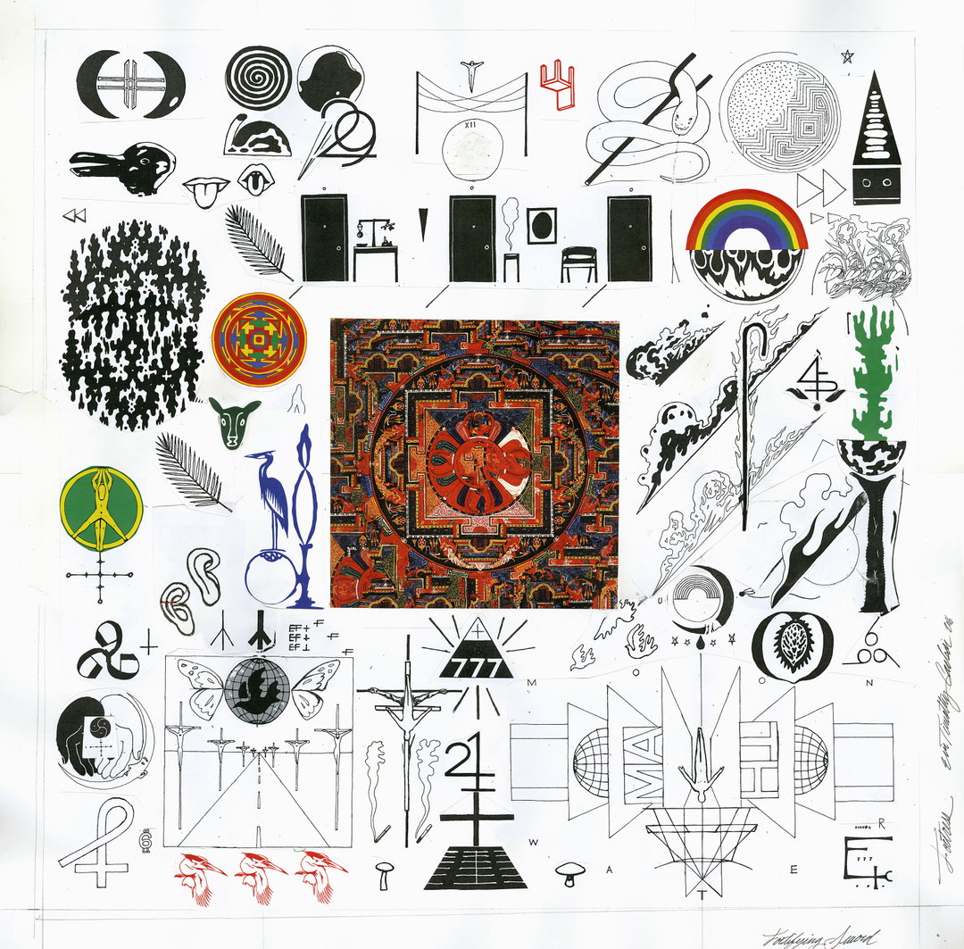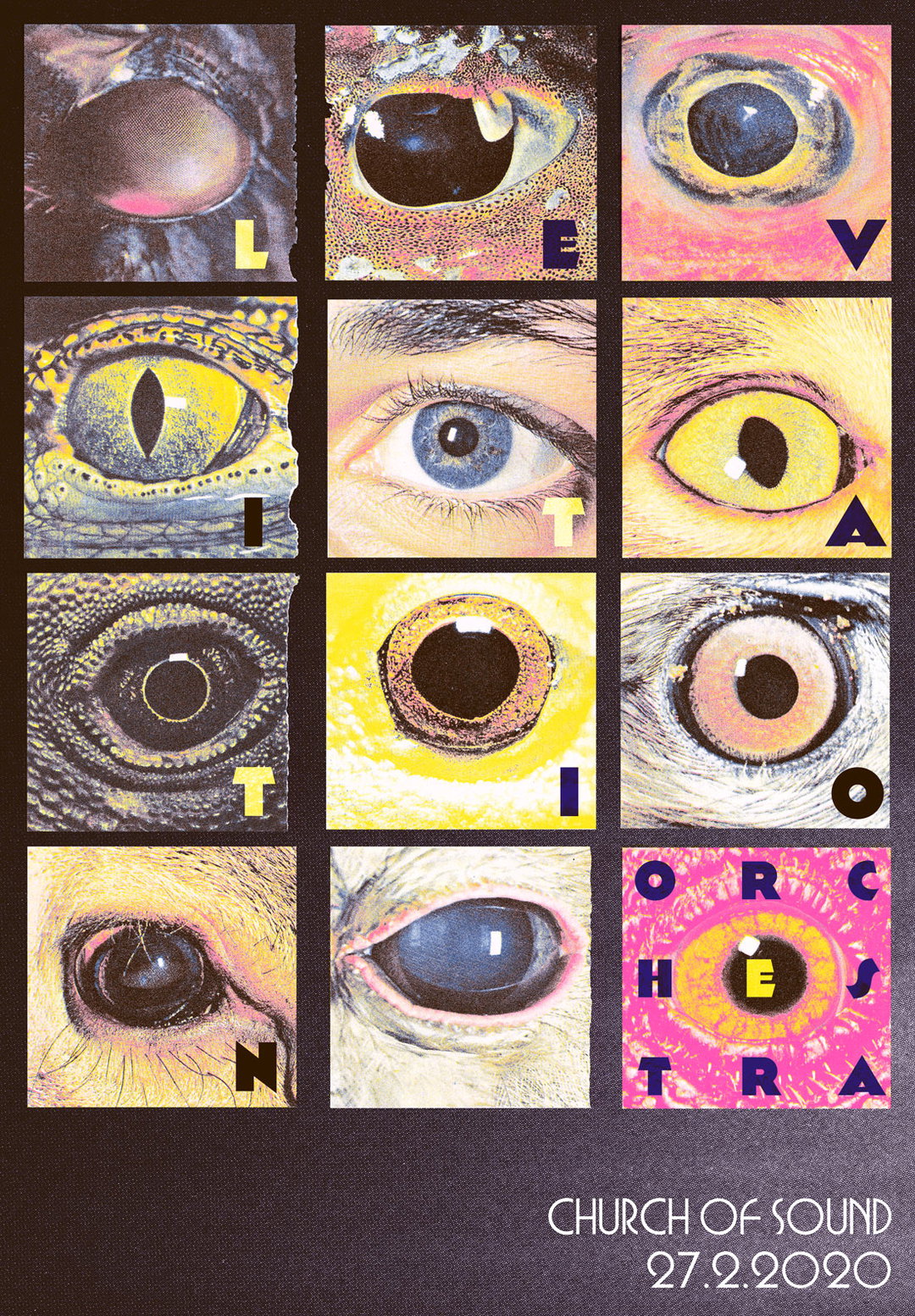
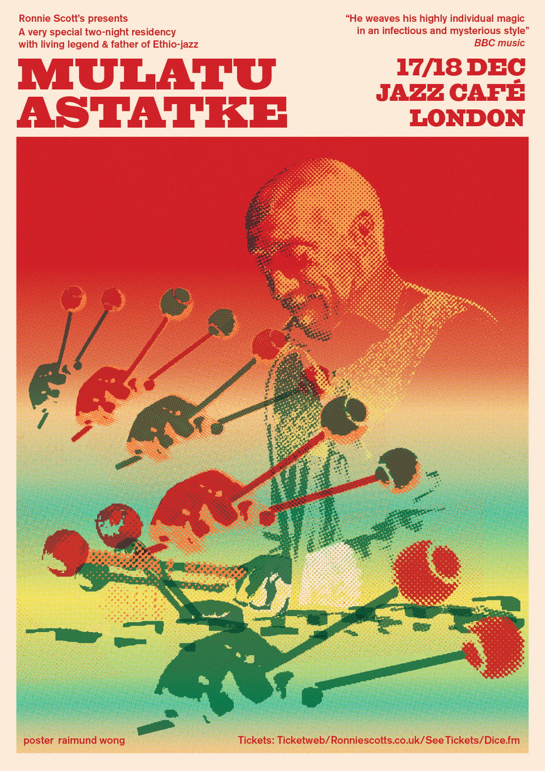
Raimund Wong visually translates the personality of music through graphic design
The London-based graphic designer draws parallels between his creative process and making music.
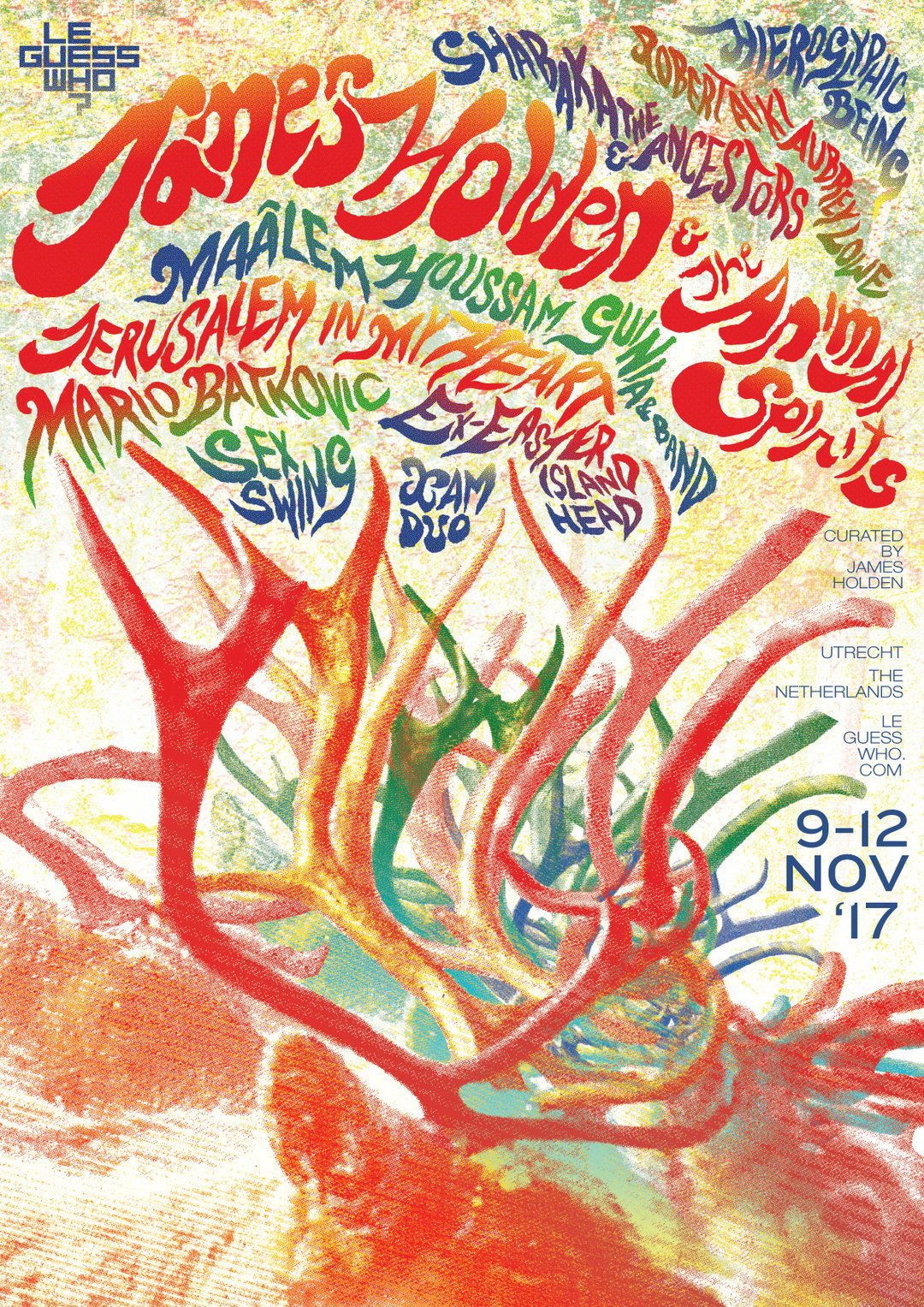
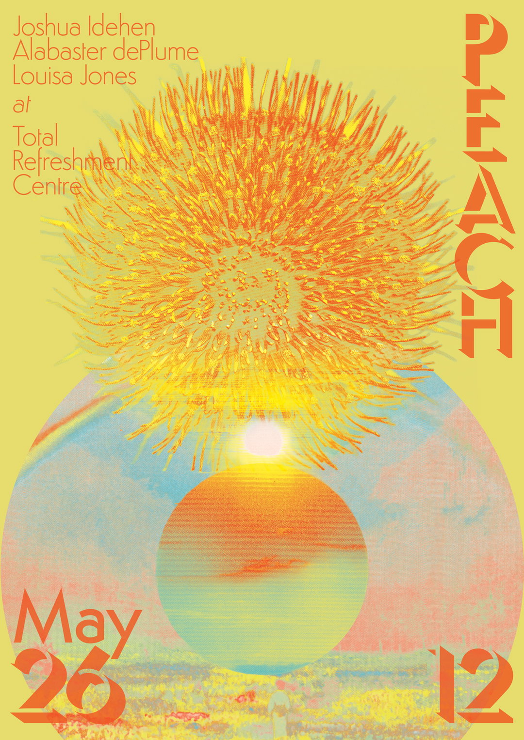
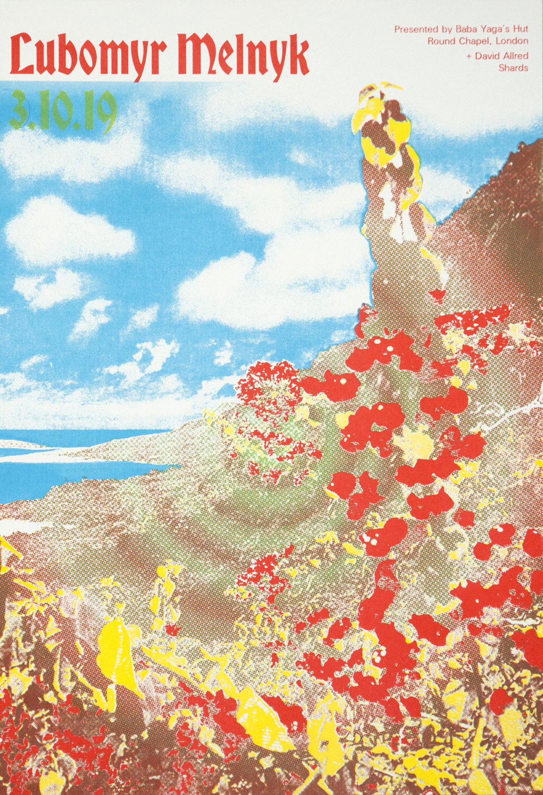
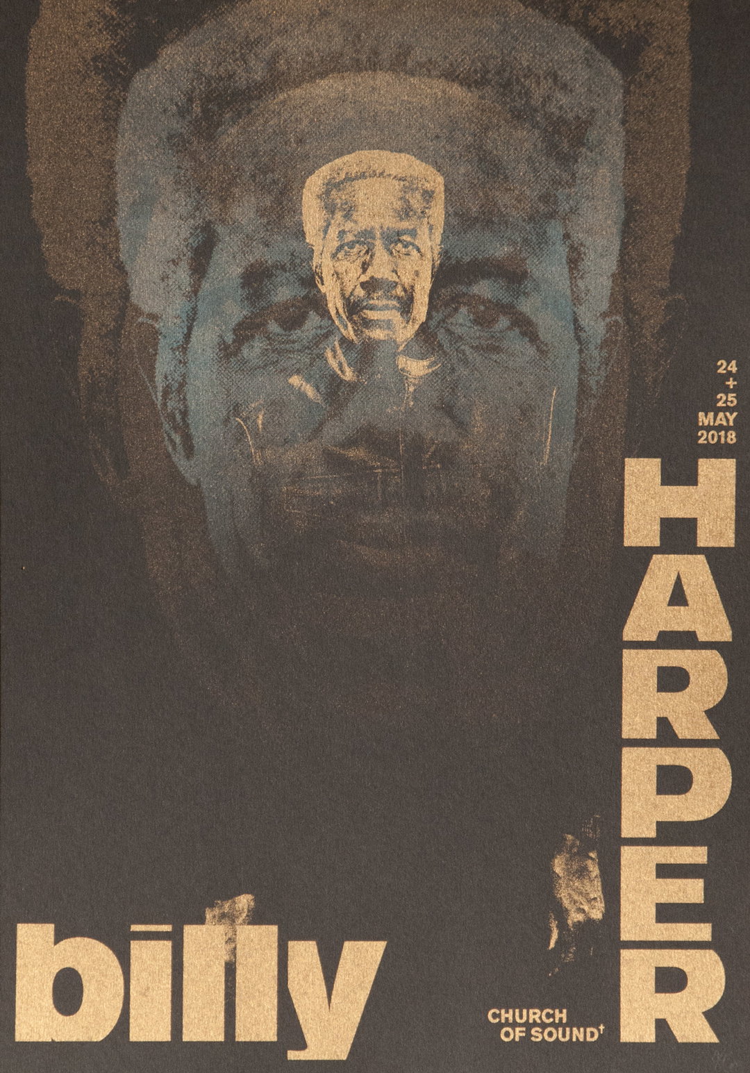
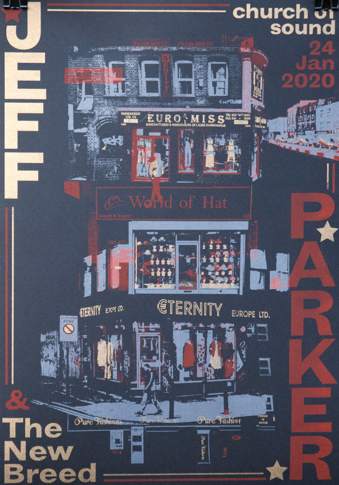
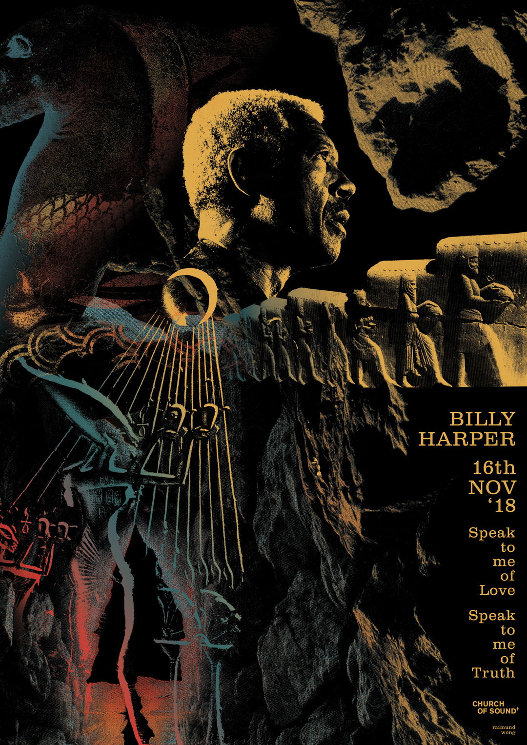
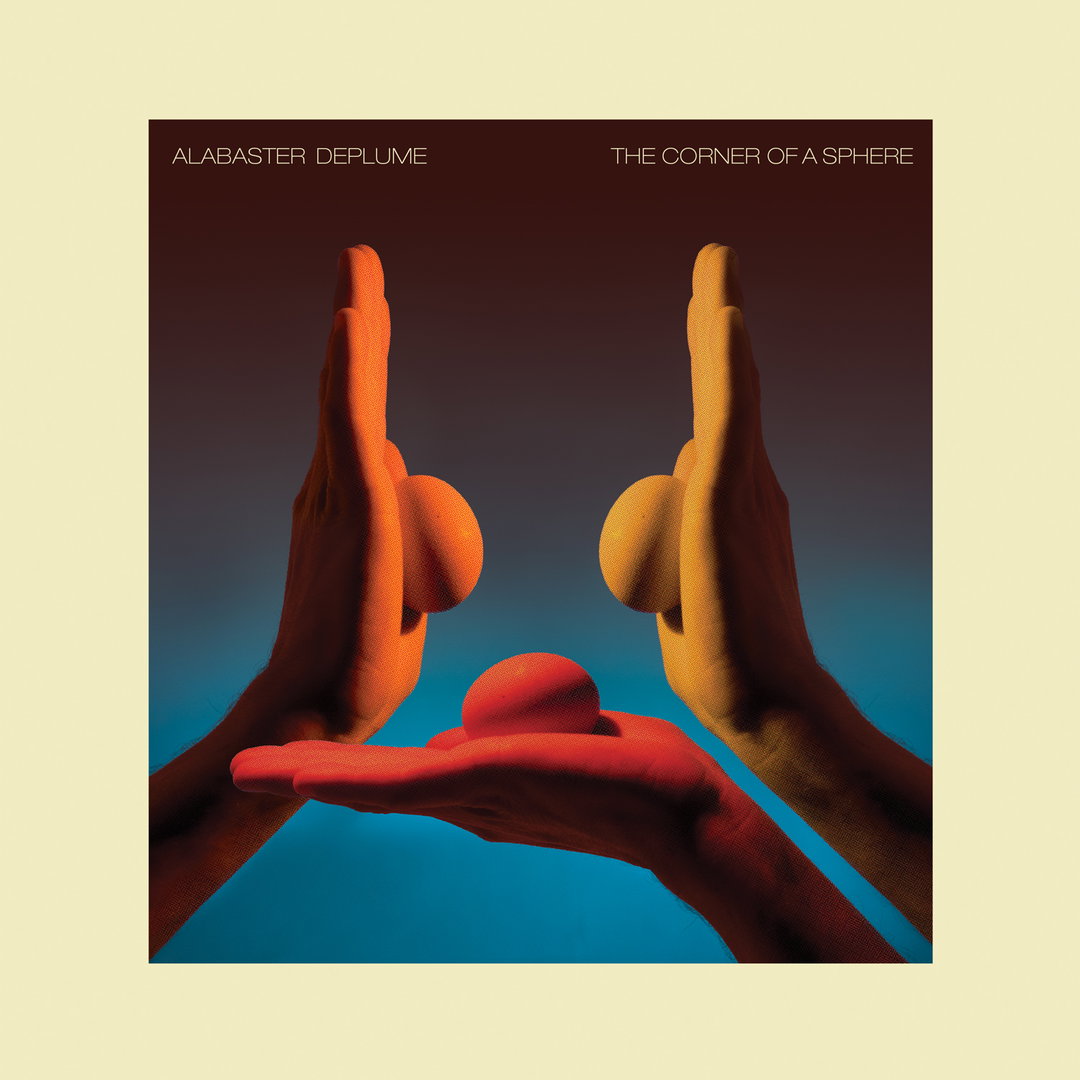
Raimund Wong doesn’t just consider himself a graphic designer, but also a worker in music. Originally from Hong Kong, the designer relocated to the UK in the late 90s to study fine art printmaking at the university of Brighton, and has been based here ever since. Now, he predominantly produces visuals for the music industry, without the heavy metal-lettering or metallic gradients however. Instead, the London-based designer draws on his background in print, playing with the layering of inky colours, through Risograph printing for example.
His work has been seen plastered on the walls of Ronnie Scott’s, across jazz festivals, album covers and the Total Refreshment Centre in Stoke Newington, just to name a few. But back in the beginning, Raimund first got into design out of a necessity. “I started putting on gigs, parties and small festivals from 2010 and onwards, and was looking for a way to make striking flyers or artworks without having to spend too much time drawing,” he tells It’s Nice That, “playing with existing material seemed like a natural choice.”
Since then, found and archival material has continued to serve as the designer’s main starting point. Over time, he’s honed in on his practice, developing a clarity of thought through busy compositions and lettering, but for Raimund, the best part of it all, was making friends with the bands and promoters. “In comparison to the fine art world, the social aspect of music and the immediacy of how it is shared in a live setting appealed to me,” he continues. It didn’t matter that he lacked prior knowledge of the musicians or the instruments, it was all about the buzzing atmosphere and the emotion in experiencing the music.
It’s an energy Raimund translates through all his print based designs, enhanced by the frequent use of Risograph printing and its fuzzy duo-tone edges. It’s a process he discovered not long ago back in 2018, which he has since used with a healthy dose, particularly in regards to his work with the young jazz movement. The scene “provides an insatiable audience and a wider context for the way the work is seen and consumed,” adds Raimund. “I never imagined I’d go back to some form of printmaking, but this year, I’ve been working on Riso poster designs more than anything else and it has reinforced a certain way of thinking behind my work by its limitation of colours.”
Raimund Wong
This limitation is a constant source of inspiration to Raimund, putting across the personality of the music as the design’s central intentions. “There is a connection between classic eras of record-making and the way their artworks were designed,” explains Raimund. The artworks were committed to print with a sense of simplicity, focusing primarily on the essence of the music. And in the designer’s mind, this way of working echoes how in the past, musicians utilised the limitations of analogue recording to their advantage.
Every now and again, he looks for inspiration in certain movements – ukiyo-e, zine culture and the original psychedelic poster scene to name a few. But on the whole, he leaves a lot of his decisions down to intuitive randomness. “I often insist on seeing through seemingly nonsensical directions in hopes of solution appearing out of thin air.” He turns inwards in the hopes of finding a universal mode of expression, something he is still working on alongside some sound work from the last couple of years. It’s no surprise that he’s come to work with sound himself, given he is around it all the time. What is more, through this experimentation with cassette tape loops and four-track tape recorders, Raimon has found a lineage between this work and his graphic design.
Coming full circle, Raimund finally goes on to say, “They share an aesthetic borne out of chance and imperfections through mechanical reproduction.” Both manipulate and layer found materials to create a new experience, and slowly, as he’s developed these two ways of working, the music has gradually become Raimund’s “main creative output.” Currently, it serves as a counterpointing companion to the graphic work, and he’s working on an album with Chestnutt (Snapped Ankles) which is currently in the pipeline. Elsewhere, he’s hosting a regular new show on Soho Radio, designing another edition of the Japanese Avant-Garde and Experimental Film Festival, and working with a Chicago-based record label International Anthem on some new material.
GalleryRaimund Wong
Share Article
About the Author
—
Jynann joined It’s Nice That as an editorial assistant in August 2018 after graduating from The Glasgow School of Art’s Communication Design degree. In March 2019 she became a staff writer and in June 2021, she was made associate editor. She went freelance in 2022.