Paper shredders and desk fans are some of the more banal things Raw Color turns into head-turning visual installations for its experimental research around colour. The Dutch design studio, led by Christoph Brach and Daniera ter Haar, has been invited to stage a solo show at The Aram Gallery for London Design Festival (opening 19 September) which promises a look at their cross-disciplinary approach. Here, the pair discuss choosing colours like flavours, and how they use self-initiated projects to support their client work.
How would you describe your approach to using colour?
We have personal preferences and combinations we like. For example we rather like a muddy kind of mustard yellow than a sunny bright yellow. The muddy one has a nicer complexity, maybe you can compare it with flavour. Something sweet might taste boring but by adding a bit of salty or sour flavour, it makes the taste deeper and richer. This is what we like in colours too. Of course we also look at what a project needs. We are working on a rug series where many things are considered: how does it fit into an interior, how does it fit the brand? And of course how do we stay true to our own feeling and preferences?
What insights about colour has your research given you?
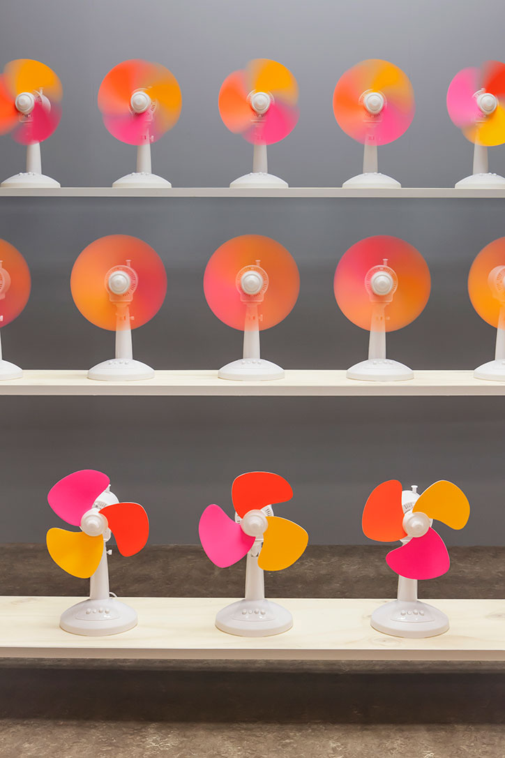
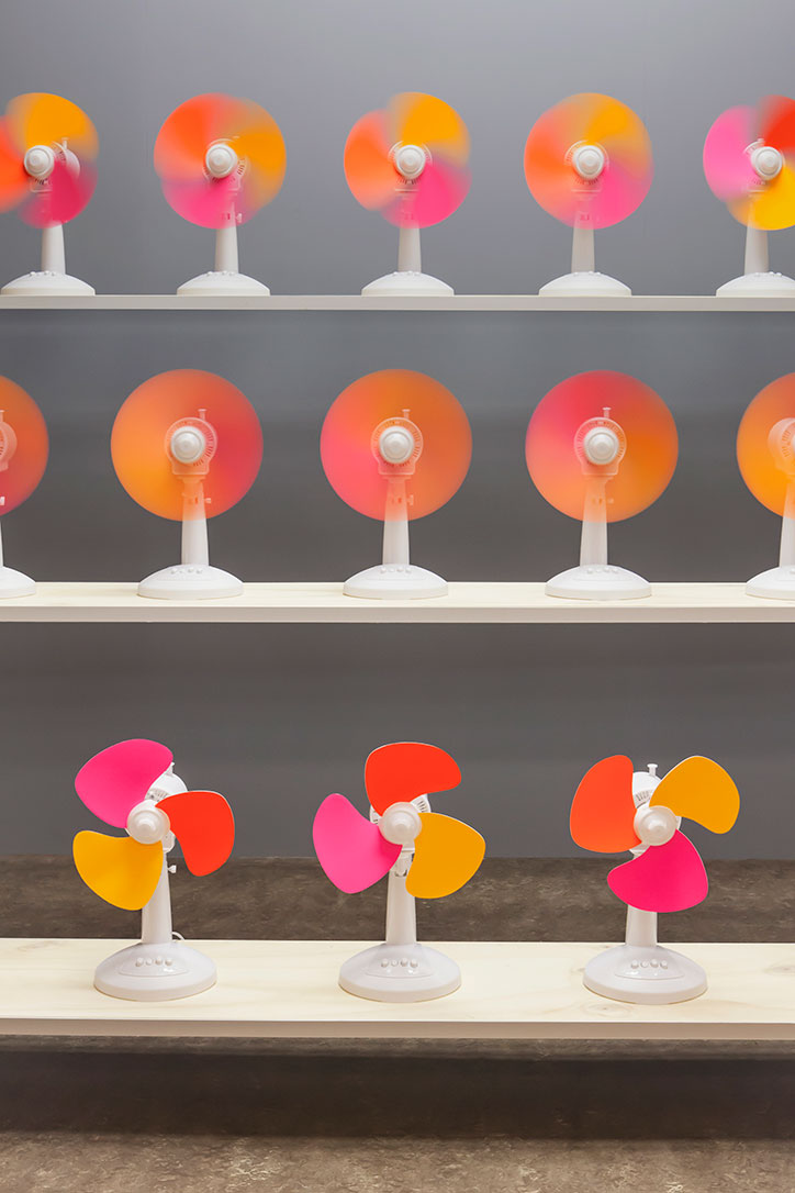
This depends on the project. The Fans and Chromatology taught us a lot about the behaviour of colour and movement. From the Index collection we’ve learned how yarns blend and behave if you weave. Overall this gives a nice understanding of the medium or topic of colour from very diverse angles.
The show is a mix of self-initiated projects and client work. How do you get the balance right?
Well the balance is hard to maintain, since our projects commissioned by clients have grown a lot since we started. We are very grateful for this, it’s what you hope for as an emerging studio – to be able to work for the real world, real people. Self-initiated projects play an important part in expanding our expertise. We had very few textile commissions before we started our own projects in this field, now we’ve attracted attention from companies interested in collaborating. Same with photography. It also keeps your mind fresh, we can follow our own curiosity and formulate questions that a client would not ask.
How do you keep your approach consistent between 2D and 3D work?
This is something that evolves very naturally. Right now we’ve got quite a few 3D commissions, art direction and exhibition design jobs. It’s a nice combination of our graphical expertise and feeling for material and tactility. In this way, creating an exhibition is not so different from creating the setting for say, a photoshoot.
Raw Color – Blend runs from 19 September – 29 October 2016 at The Aram Gallery, London. The exhibition is made possible by Creative Industries Fund NL.
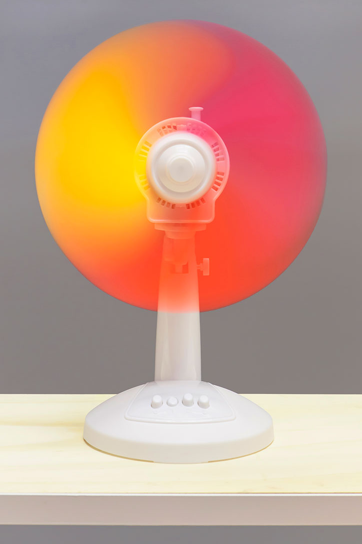
Raw Color: The Fans
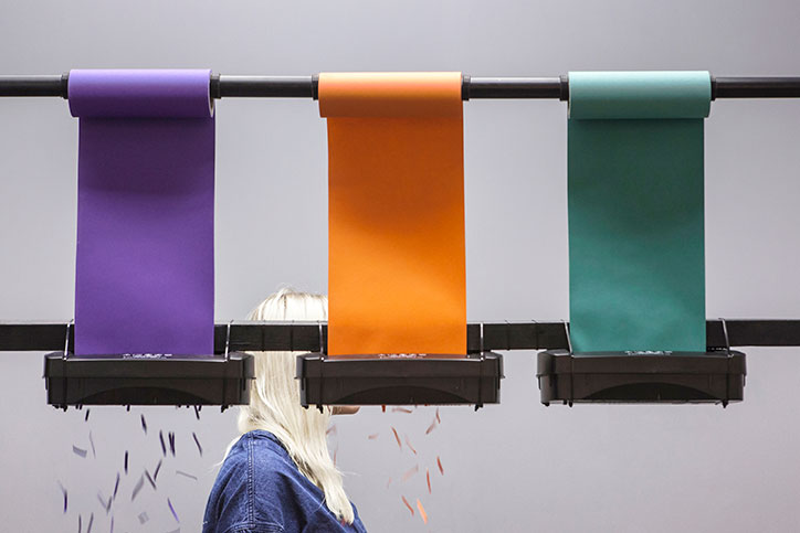
Raw Color: Chromatology
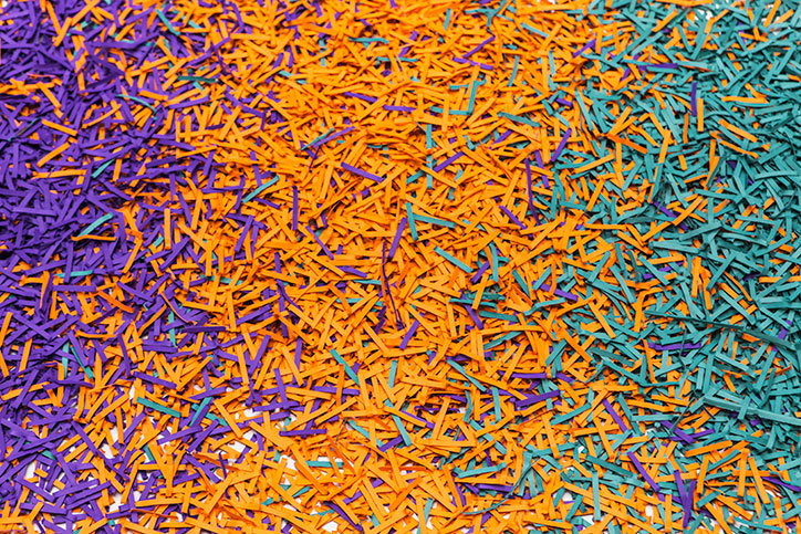
Raw Color: Chromatology
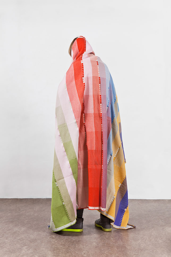
Raw Color: Index
Raw Color: Index
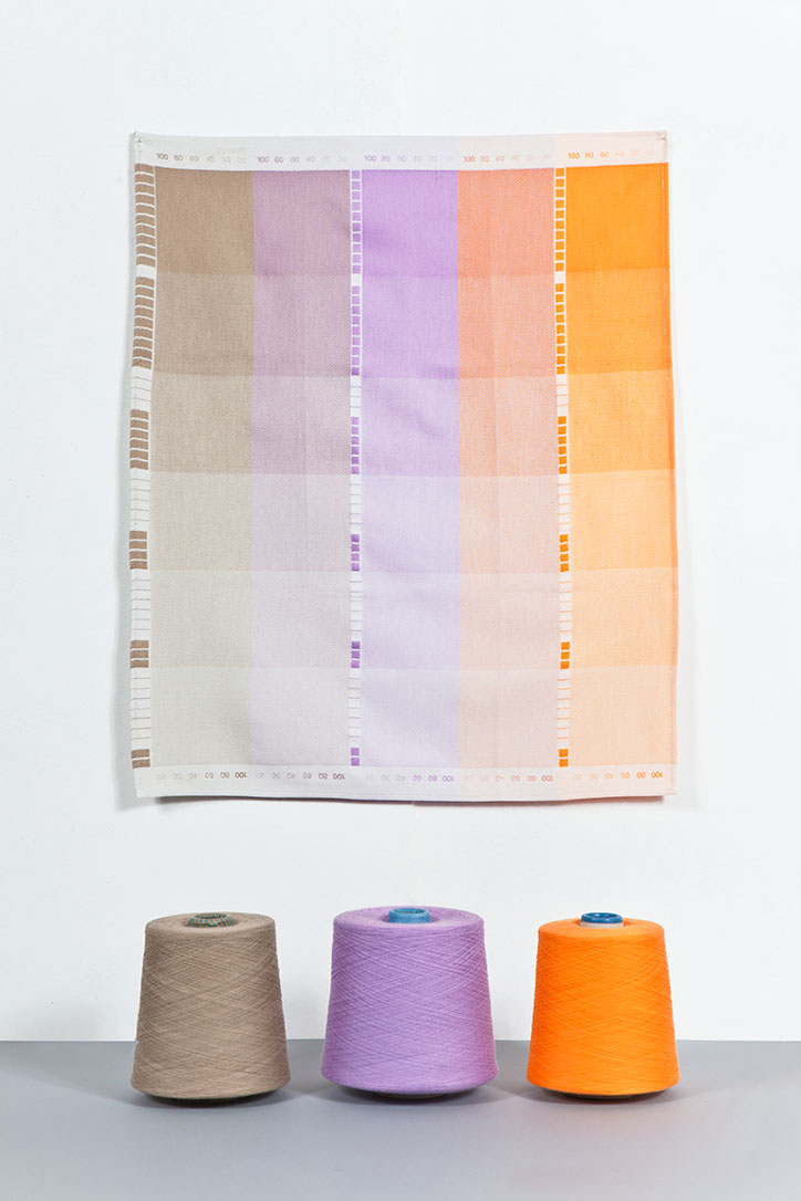
Raw Color: Index
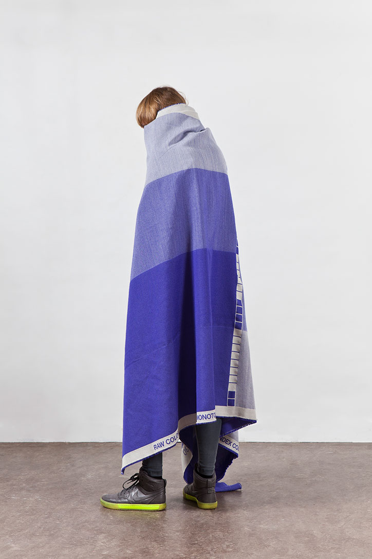
Raw Color: Index
Raw Color: Index
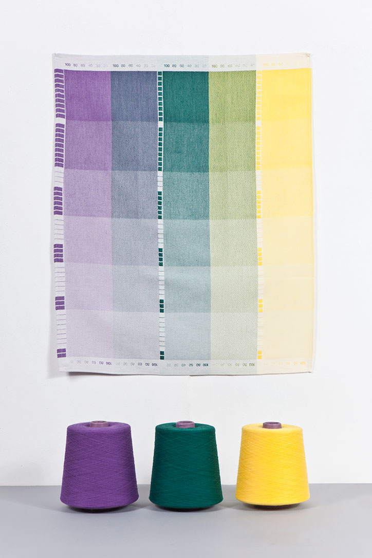
Raw Color: Index
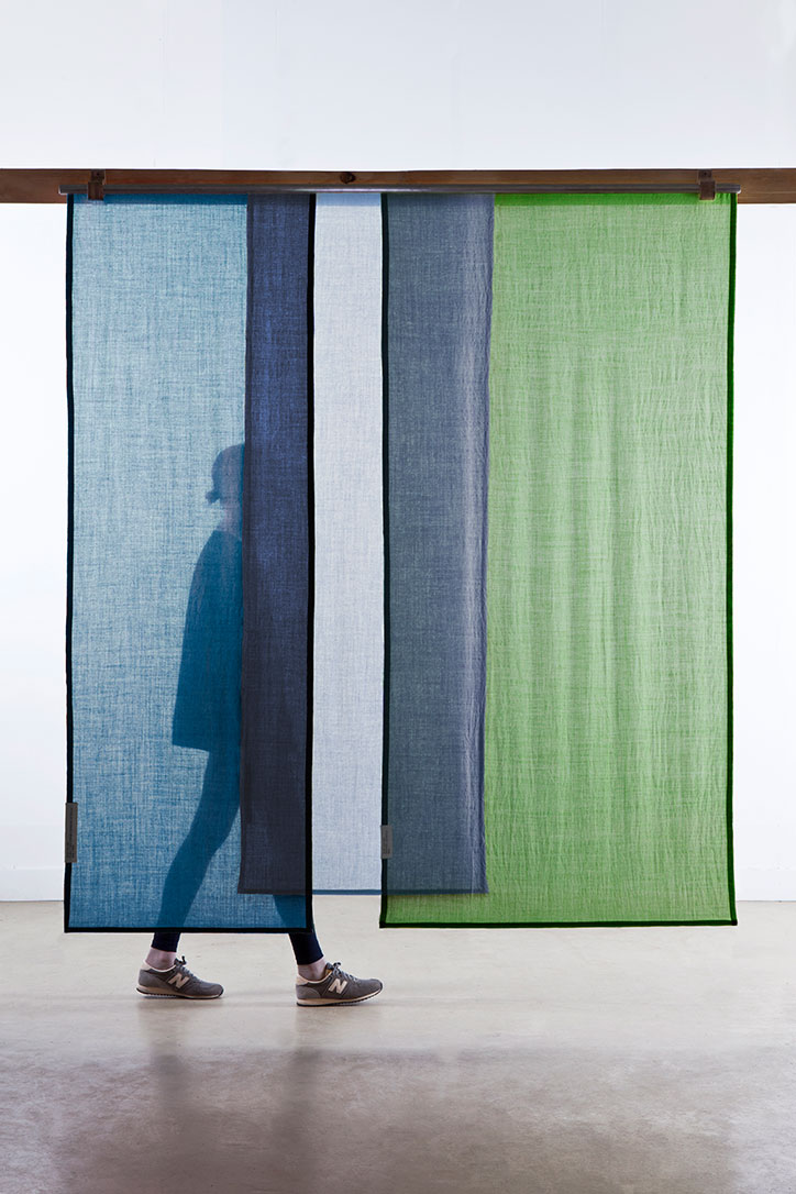
Raw Color: Tinctorial Textiles
Raw Color: Tinctorial Textiles
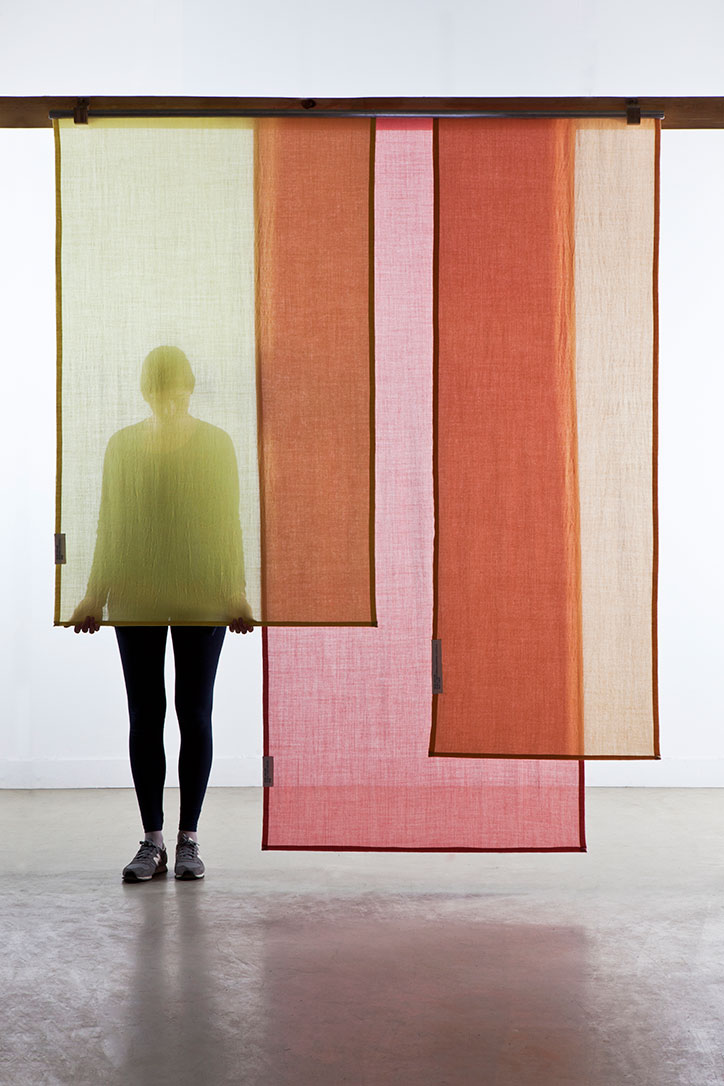
Raw Color: Tinctorial Textiles