Rejane Dal Bello on using graphic design to talk about hard topics in a joyful way
London-based Brazilian designer Rejane Dal Bello creates bold, typographic identity systems that aim to communicate complex ideas in their simplest form. So when we realised we hadn’t written about her for eight whole years, we knew it was time for a catch up.
When we last spoke to Rejane she was working at Studio Dumbar in the Netherlands, where she was part of the team for nine years before moving to London for a job at Wolff Olins. Finding it wasn’t quite the right fit, she decided to set up her own studio in 2014 and now works closely with another independent designer, Chrysostomos Naselos. When projects require more than one pair of hands they’ll collaborate, pulling in a network of other creatives, strategists and photographers. “I’m not really interested in being a ‘proper studio’, I like to be the person that works on a project from beginning to end,” Rejane tells It’s Nice That.
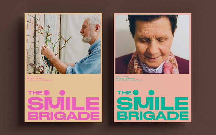
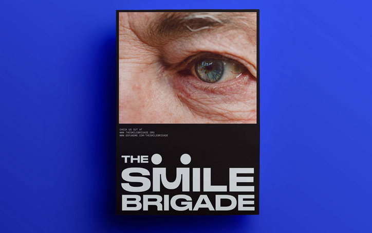
Back when she worked for other studios, Rejane spent a lot of her spare time creating identities and campaigns for not-for-profits. Now her portfolio is packed with work for charities, community organisations and companies generally bringing good into the world. Recent projects have included an identity for The Smile Brigade, an organisation that aims to inject joy into elderly people’s lives through events like karaoke, cupcake afternoons and workshops (where Rejane herself volunteers), and for Brazilian company Sesc Av Paulista. One of the largest not-for-profits in Brazil, it runs low-cost courses from technology to embroidery and more than 120,000 people come through its doors every week. “They help people to get educated and to transform themselves so they don’t necessarily need to go through university and can still be able to pay the bills,” she says.
The identity hinges on two typefaces, a straight, sensible sans serif, and a more experimental display font based around bold shapes. “The typography reflects a transformation,” says Rejane. “When you go to a course you transform yourself, so the typography itself has changed shape to be quite different.” The design needed to be bold but also accessible given that the organisation is used by kids and the elderly alike.
Her self-initiated book series Dr Giraffe helps parents talk to their children about illness, and for 14 years she’s helped Peruvian hospital Paz Holandesa with all their visual needs. “I come from a family of doctors, so talking about death and sick people is a normal part of my life.” It was her pro bono work for Paz Holandesa that convinced Studio Dumbar to enlist her for their rebranding of the Dutch Alzheimer Foundation. Her design focuses around a bespoke typeface with a joyful secondary colour palette and photography.
“Alzheimer Foundation has so many layers to it; it’s about the disease but at the same time it is a company that needs to give hope and compete in the market, so it has to be bold.” Just as Alzheimer’s starts in the cortex of the brain, the type is less clear at the centre of the letters. “I created this alphabet that sometimes you can read well but sometimes you can’t, because that’s how the disease progresses until you have no meaning in front of you anymore, just texture. I think that’s where designers can come in, to look at a difficult topic and to see that bridge between it and the world.”
Studio Rejane Dal Bello: The Smile Brigade
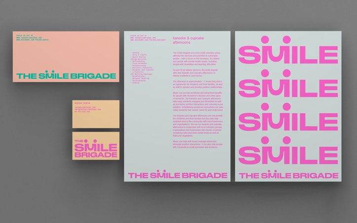
Studio Rejane Dal Bello: The Smile Brigade
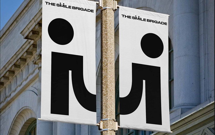
Studio Rejane Dal Bello: The Smile Brigade
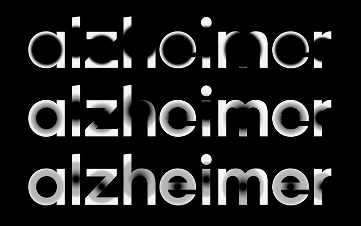
Rejane Dal Bello and Studio Dumbar: Alzheimer Foundation
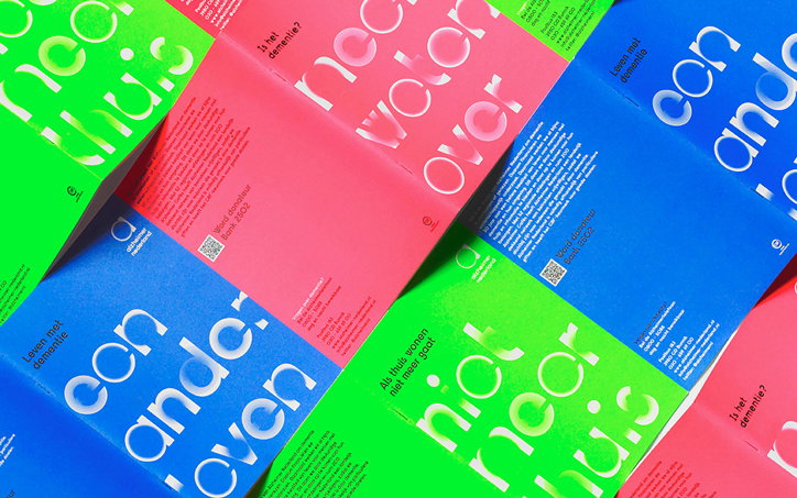
Rejane Dal Bello and Studio Dumbar: Alzheimer Foundation
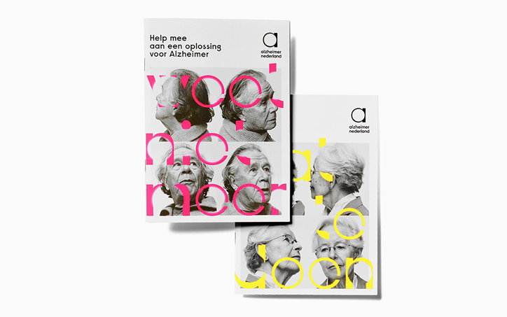
Rejane Dal Bello and Studio Dumbar: Alzheimer Foundation
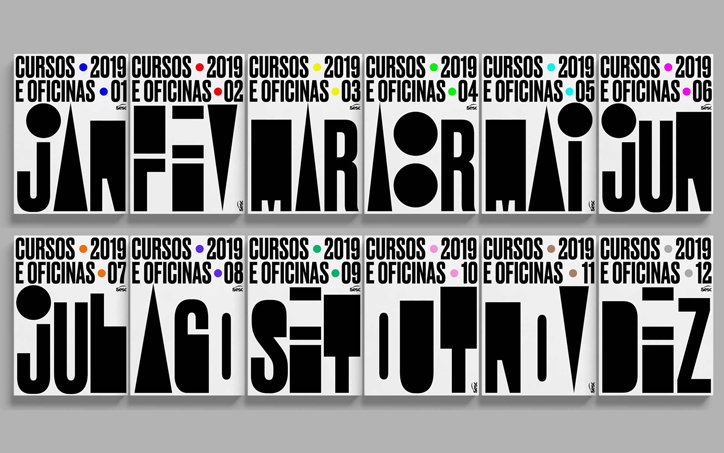
Studio Rejane Dal Bello: Sesc Av Paulista
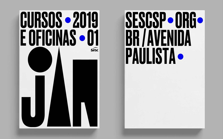
Studio Rejane Dal Bello: Sesc Av Paulista
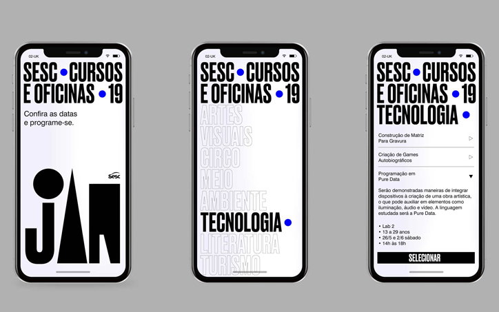
Studio Rejane Dal Bello: Sesc Av Paulista
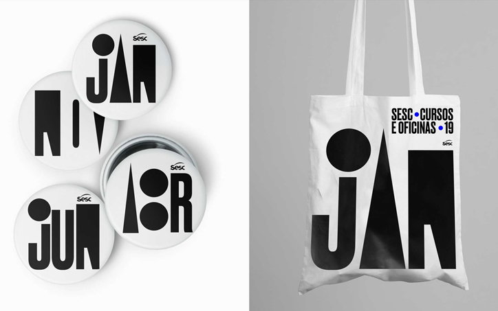
Studio Rejane Dal Bello: Sesc Av Paulista
Share Article
Further Info
About the Author
—
Laura is a London-based arts journalist who has been working for It’s Nice That on a freelance basis since 2016.