Review of the Year: Some perfect publications from 2013
It’s been a big year for independent publishing; either it was dying a terrible death or giving birth to incredible new titles, falling under the pressure of a global financial crisis or turning into another industry that’s somehow managed to survive. The only thing that was clear was that nobody understood what the hell was going on –especially so-called experts – and so we all had to just grit our teeth and hope that people would buy our magazines. To celebrate the sort-of-survival of ink on paper here’s some of our favourite titles to spring up anew or weather the storm of 2013.
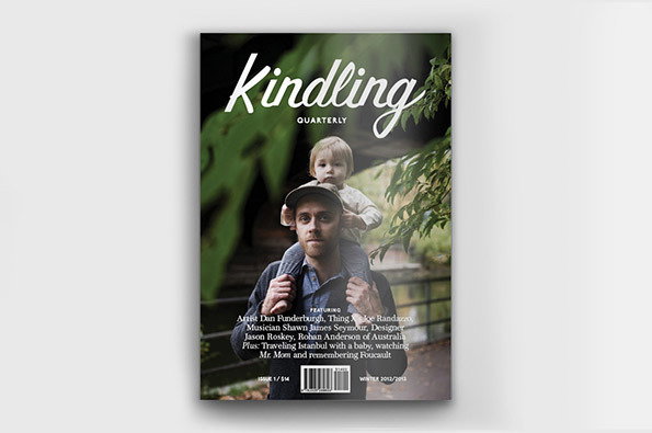
Kindling Quarterly
Dads get neglected in the day-to-day of life. We don’t call them, we don’t write to them, we don’t really celebrate Father’s Day with anything that even looks like serious commitment. They don’t have their noisy online forums, experience custodial rights that are patchy at best and are forced to do the rubbish bits of childhood like attending football matches in the rain (at least that’s what stereotypes have taught me). But then Kindling came along and taught us that dads are cool dudes and deserving of much more respect than we ever really show them. Also they like Foucault.
www.itsnicethat.com/articles/kindling-quarterly
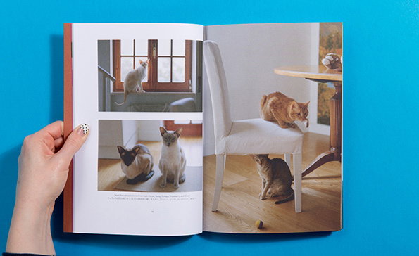
Cat People
Cat people is ingenious in that it takes a truism that applies to the internet (and thus to the world at large) and then applies it to a magazine. That truth? That people go absolutely batshit crazy for cats – they just love those guys and their furry little clawed hands. Needless to say there was much oohing and ahhing over this new title (and doubtless some purring too) which was surprisingly full of great editorial.
www.itsnicethat.com/articles/cat-people
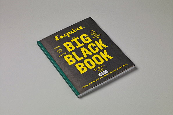
Esquire: The Big Black Book
What do stylish men need apart from big watches, big houses and chicks with big… intellects? They need a magazine that tells them where to by the best brogues, the finest oxford shirts and the locations of all the best cocktail bars in the land. They also need to know who the big players are in contemporary culture and exactly how their merino wool cardigans are made. Esquire knew this was what stylish men wanted more than anything and put together their Big Black Book in recognition of that fact. It does EXACTLY what it needs to do in terms of editorial and feels glorious when you hold it in your hands too. Huge success!
www.itsnicethat.com/articles/esquire-big-black-book
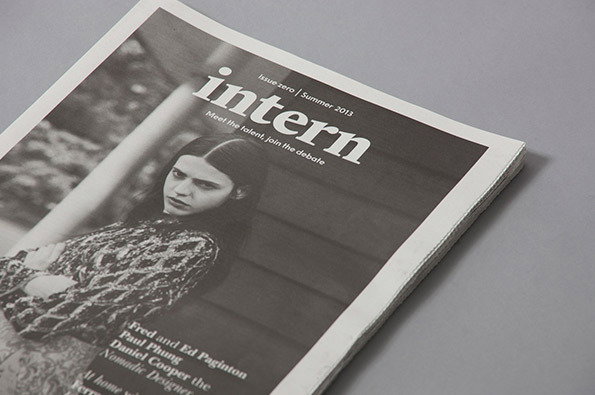
Intern Magazine
If you’ve not read about or read a copy of Intern this year then you must’ve had your head buried in the sand. Alec Dudson has been on a one-man mission to transform the face of internships in the UK and abroad with his exciting new magazine and a Kickstarter campaign that absolutely blew up. There’s more debate raised within its pages than I could feasibly summarise in this text so I would urge you to seek it out and buy a copy. You won’t be sorry you did.
www.itsnicethat.com/articles/intern-magazine
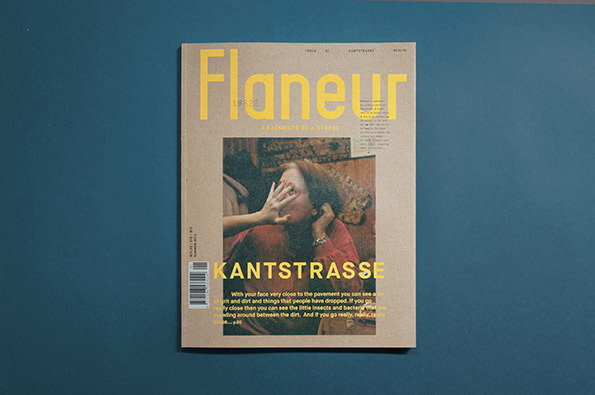
Flaneur Magazine
There are magazines that focus on one country or one city, but Flaneur is the first to focus its attention on just one street. The inaugural issue focussed on Berlin’s famous Kantstrasse through writers, artists, designers and photographers, resulting in an editorial direction that managed to be surprisingly broad for such a limited subject. It also looked utterly stunning.
www.itsnicethat.com/articles/flaneur-magazine
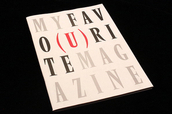
magCulture: My Favourite Magazine
If anyone knows about magazines it’s magCulture’s Jeremy Leslie, and this year, instead of just championing the magazines of others he produced his own title. My Favo(u)rite Magazine profiled the favourite printed titles of some of the industry’s biggest names at the likes of NME, Anorak, Harper’s Bazaar, Port, Eye and Bloomberg Businessweek. Plus it was all for a good cause. Two thumbs up!
www.itsnicethat.com/articles/my-favourite-magazine
Share Article
About the Author
—
James started out as an intern in 2011 and came back in summer of 2012 to work online and latterly as Print Editor, before leaving in May 2015.