Launch Recite Me assistive technology
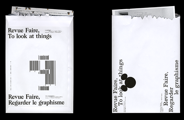
Two white envelopes featuring bold black typography. One reads “Revue Faire, To look at things” and “Revue Faire, Regarder le graphisme”, with a large, abstract barcode design in the centre.

The bi-weekly magazine analysing graphic design as "a meeting point of many disciplines"

—
Date
29 March 2018

Revue Faire, produced by Sacha Leopold and François Havegeer of Syndicat and Empire Books, is a magazine about graphic design that adopts an “analytical and critical posture” with regards to the medium’s forms and activities. Having worked as designers for years, the pair felt there was a lack of critical publications dedicated to the dissection of graphic design and initiated Revue Faire as a means of widening the conversation.

Published bi-weekly in both English and French, Revue Faire focusses on one subject per issue – inviting an author to discuss this theme. “We want Revue Faire to offer a range of subjects, ones that you might be aware of in your own discipline,” Sacha and François tell It’s Nice That. Ranging from the discussion of printing techniques to type design to exhibition design, each issue connects a “historical reference to a major subject”, analysed in the present day.

In its ninth issue for example, the publication was handed over to Theirry Chancogne, a teacher. For his iteration, Thierry focussed on the typeface Mitim, designed by Radim Pesko. Mitim is “a typeface design that extends to become a self-reflexive artistic and typographic project. An alphabet that evolves and adapts to the cycle of appearances of a publication in the form of a suite.” As well as typesetting the issue in a custom version of Mitim, Sacha and François were also able to provide each subscriber with a specimen of the font and a custom envelope.

In order to produce a magazine every two weeks, the pair has to plan issues months in advance. As a result, so far, every contributing author has been someone they have crossed paths with or collaborated with in the past: “Some are designers, some are historians, some are teachers, curators, journalists or, sometimes, all of those things.” Now in its second year, Revue Faire will extend its list of contributors to include international authors, increasing the breadth of its topics even further.

To accompany the variety of subjects being written about, Sacha and François design each issue accordingly. Although often employing a similar aesthetic – text heavy, with scanned imagery layered together – each issue has a distinct tone of voice. Revue Faire is both visually engaging because of its unique, untamed design but its heart is in its content. “In a way, Revue Faire is exactly what graphic design is – a meeting point of many disciplines,” Sacha and François remark. As a magazine that was born because of a field they deemed as lacking, Revue Faire has given Sacha and François the chance to share their interests and vision of what graphic design was, is and should be.
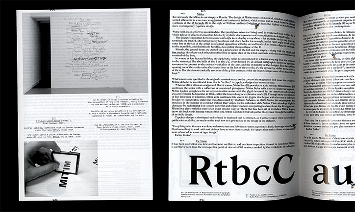
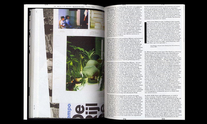
An open book showing a layout of text and images about typography. One page features a hand holding a smartphone over a printed word, while the opposite page contains dense columns of text and a large typographic sample reading “RtbcCau”.
Above

Revue Faire

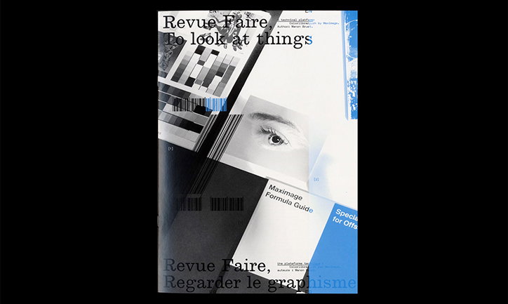
A magazine cover featuring a collage of black and white imagery, including a close-up of an eye and geometric patterns. Text at the top reads “Revue Faire” and “To look at things”, while the bottom reads “Revue Faire, Regarder le graphisme”.
Above

Revue Faire

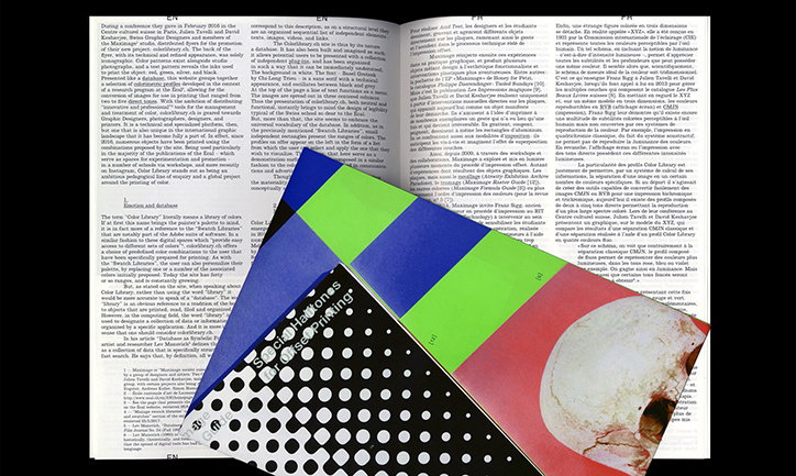
A printed brochure with a bold, colourful cover is laid over a page of dense academic text. The cover features a grid of bright green, blue, red and orange blocks, alongside a black section with white polka dots.
Above

Revue Faire

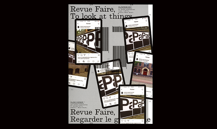
A collage of smartphone screens displaying Instagram posts over a light grey background. The screens show a bold, black and white typographic design with the repeated letters “PaPa”. Large text at the top and bottom reads “Revue Faire, To look at things” and “Revue Faire, Regarder le g”.
Above

Revue Faire

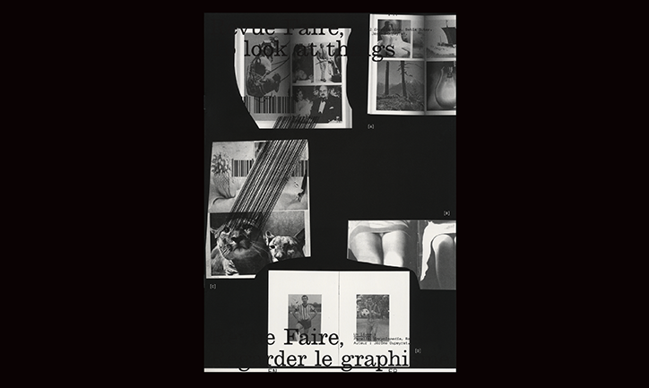
A collage of black and white printed fragments and photographs arranged on a black background. Overlaid white text reads “vue faire, look at things” at the top and “e Faire, gerder le graphi” at the bottom.
Above

Revue Faire

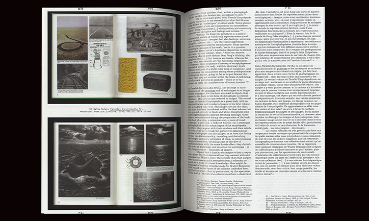
An open book shows a layout of text and images. The left page features a series of small, surreal photographs and illustrations, including a coiled snake and a ship in a storm.
Above

Revue Faire

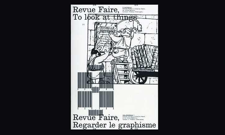
A black and white collage featuring a vintage illustration of two figures by a wooden cart. Bold text at the top reads “Revue Faire, To look at things”, while the bottom reads “Revue Faire, Regarder le graphisme”. A large, distorted barcode is laid over the central image.
Above

Revue Faire

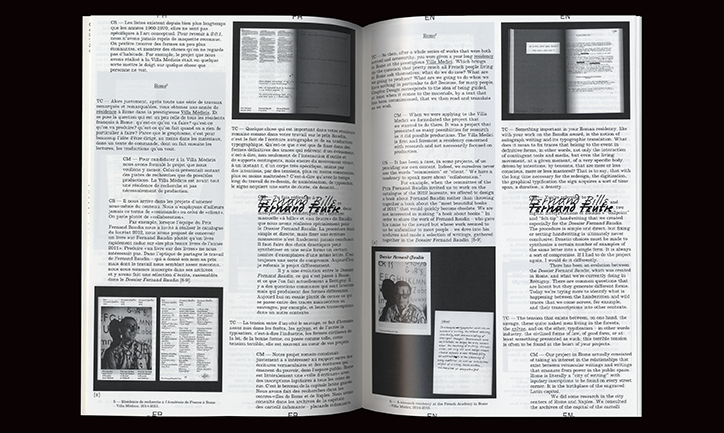
An open magazine showing two pages of a text-heavy layout. The pages feature columns of text in French and English, accompanied by black and white photographs and the handwritten name “Fernando Bacote”.
Above

Revue Faire

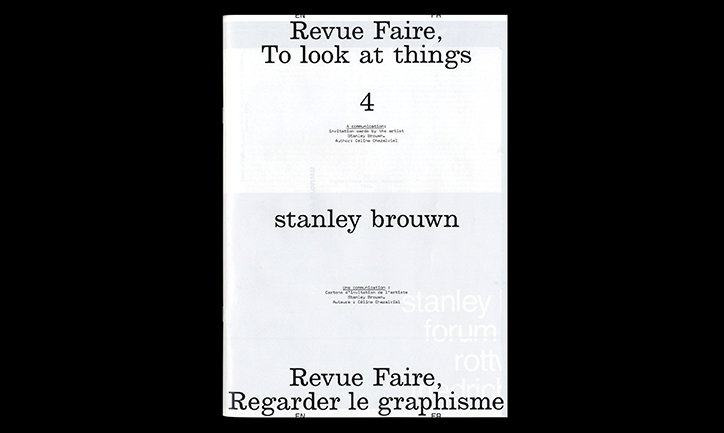
A white publication cover with black typography. It reads “Revue Faire, To look at things” and “stanley brown”, with the number “4” centered above.
Above

Revue Faire

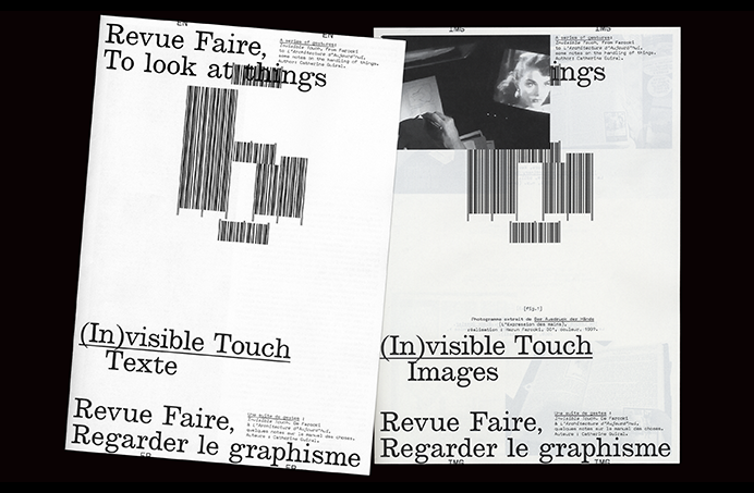
Two copies of a publication titled “Revue Faire,” featuring a minimalist black and white layout. The covers display a fragmented, striped geometric shape and the phrases “(In)visible Touch Texte” and “(In)visible Touch Images”.
Above

Revue Faire

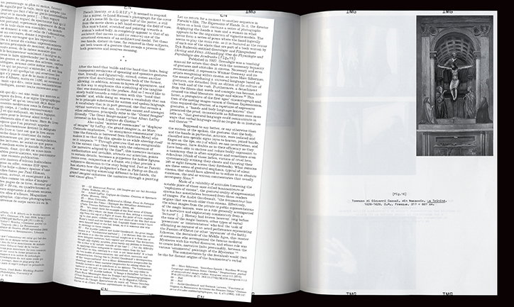
An open book showing a page of dense academic text alongside a black and white photograph. The image depicts a classical sculpture of a figure with wings, set within an architectural niche.
Above

Revue Faire

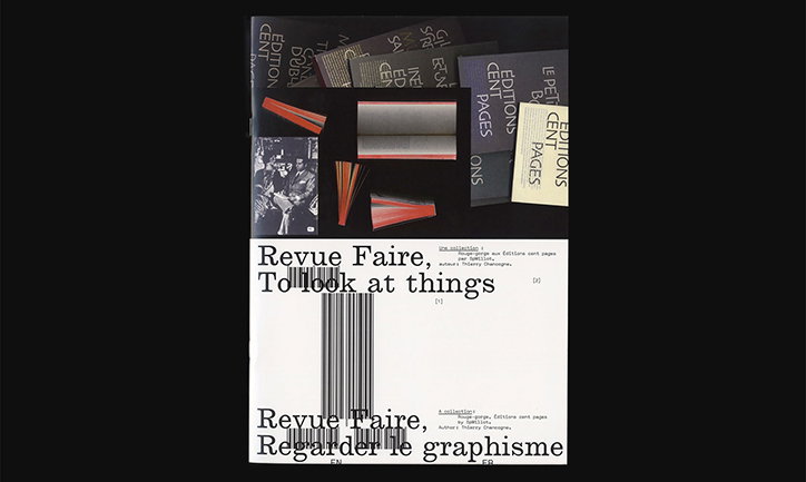
The cover of a publication featuring a collage of grey and black graphic elements and red paper strips. The white lower half contains the titles “Revue Faire, To look at things” and “Revue Faire, Regarder le graphisme” separated by a large barcode.
Above

Revue Faire

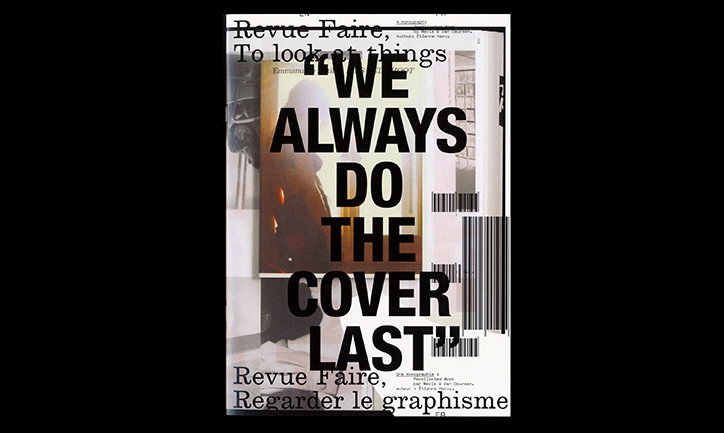
A collage-style book cover featuring fragmented images and text. Bold black typography across the centre reads “WE ALWAYS DO THE COVER LAST”.
Above

Revue Faire

An open book showing a layout of text and images. One page features a collage of photographs, including people in a room and a close-up of a green sculpture.
Above

Revue Faire

Share Article

Further Info

About the Author

Ruby Boddington

—

Ruby is Senior Creative at It's Nice That, overseeing our visual output across platforms and projects. Before that, she was associate editor on the editorial team, after joining in September 2017 following graduation from Central Saint Martins.
It's Nice That Newsletters

Fancy a bit of It's Nice That in your inbox? Sign up to our newsletters and we'll keep you in the loop with everything good going on in the creative world.