




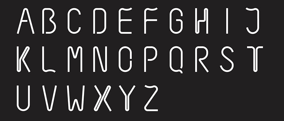
Graphic Design: Sean Rees designs a dartboard typeface for studio competition
For a while our studio was centred around a dartboard and the daily doses of arrow-based psychodrama gave us a new rhythm to our working lives. For some studios it’s ping-pong, for others it’s table football but these kinds of activities unite work-colleagues by playing them off against each other, and act as a good valve through which to release creative tensions.
Creative consultancy Purpose is no different, and for them like us their vice is darts. But not content with informal matches, they have a hotly-contested league, and to mark this year’s showpiece designer Sean Rees decided to create a bespoke typeface inspired by the dartboard and a series of posters to help ramp up the anticipation.
“For a long time I’ve admired the character of the wire numbers surrounding our studio dartboard,” he said. "There’s something about the physicality of the bent-wire, ugly yet beautiful, that’s very appealing. Maybe the hours spent playing in front of it has burnt them into my retina.
“The characters reflect the quirks of the wire numbers – a single monoline completes each character, accompanied by a ‘hanging-line’ wire further reflecting the dart board.”
We like this typeface a lot and we have a huge amount of respect for any studio which takes darts as seriously as this, so this is pretty much a bullseye as far as we’re concerned.
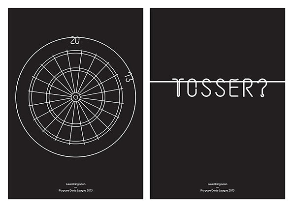
Sean Rees: Dartboard Typeface for Purpose
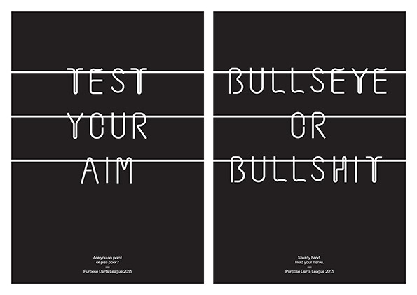
Sean Rees: Dartboard Typeface for Purpose
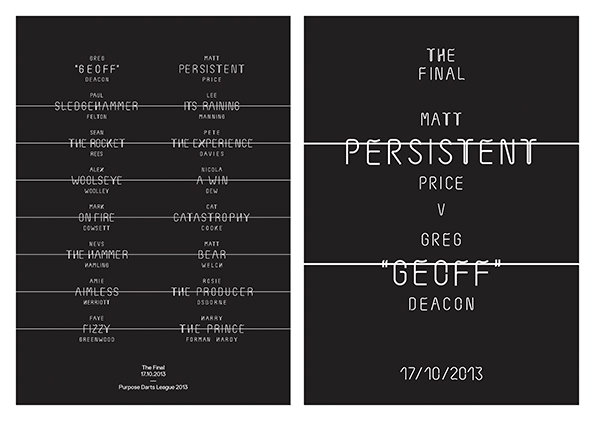
Sean Rees: Dartboard Typeface for Purpose
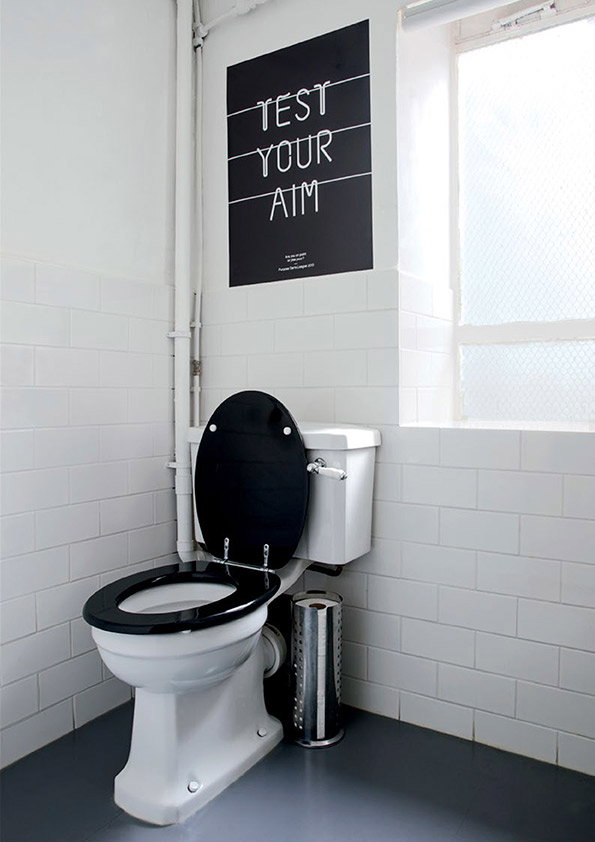
Sean Rees: Dartboard Typeface for Purpose
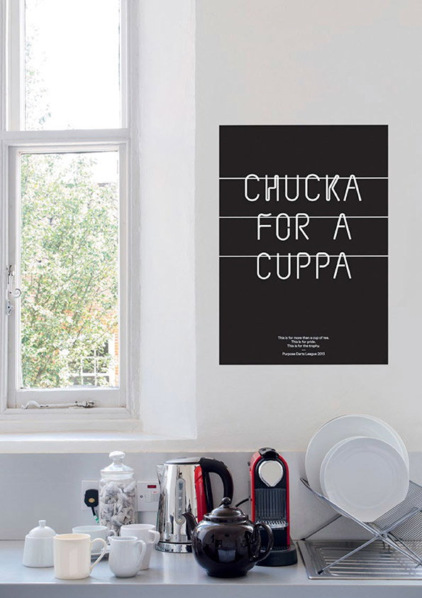
Sean Rees: Dartboard Typeface for Purpose
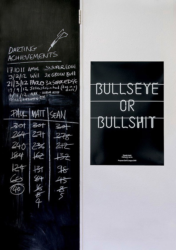
Sean Rees: Dartboard Typeface for Purpose
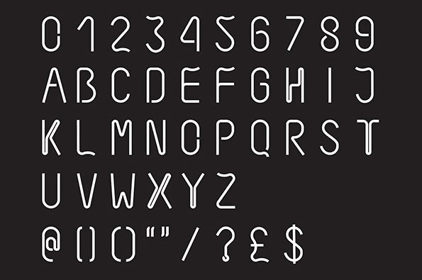
Sean Rees: Dartboard Typeface for Purpose
Share Article
Further Info
About the Author
—
Rob Alderson is a freelance writer, editor and strategist. He was previously editor-in-chief of It’s Nice That and WePresent, and editor of Design Week. He publishes the newsletter Undo, which tries to make sense of how AI is changing design work, the design process and the design industry.



