Launch Recite Me assistive technology
A collection of black and white promotional cards for an art fair. The bold typography reads “collect” and “The International Art Fair for Contemporary Objects”, listing the Saatchi Gallery as the venue.

Spin challenges preconceptions about craft with a new identity for Collect

—
Date
12 October 2016

“It’s something of a personal mission,” says Tony Brook, founder of Spin. “The idea of making people reassess what craft is. I’m edging more and more towards the possibilities of what happens when you make things by hand, it’s a different way of doing things. Too many people think craft is a wooden boat made from lollipop sticks.”

Spin has rebranded Collect, the international art fair founded in 2004 by the Crafts Council. The five-day event is held at the Saatchi Gallery in London and exhibits ceramics, glass, jewellery, wood, metal and textiles from established and emerging artists and makers selected by a panel of experts. Spin was tasked with developing a new identity for the fair to be used online, in print, wayfinding and venue dressing and across an advertising campaign. “They wanted an identity with that was international and had an upmarket feel,” says Tony. “Our response is based around the happy accident that there are two ‘l’s in the word collect, and a collection has to be more than one thing.”

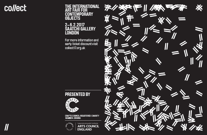
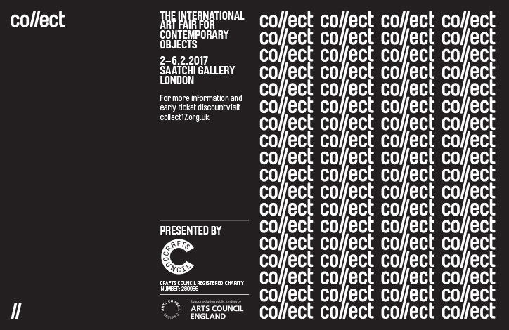
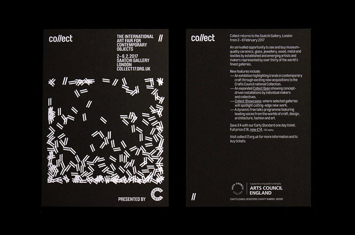
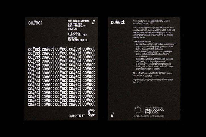
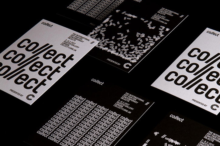
The new identity, developed by Tony and design director Claudia Klat, uses a crisp sans serif typeface and Spin was keen to keep the foundations of the identity as pure as possible, reducing everything to just the essentials. The double l motif becomes a graphic tool that creates textures and patterns across the promotional materials. “The initial work we did was about surprising people and making something cool,” explains Tony. “Whatever people think about craft, it probably isn’t that.”
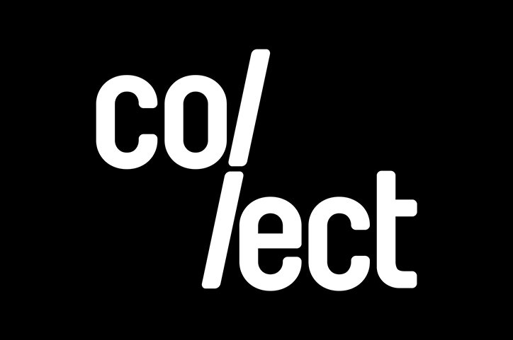
White typography on a black background reads “co/ /ect”. The text is split across two lines, with two forward slashes separating the letters.
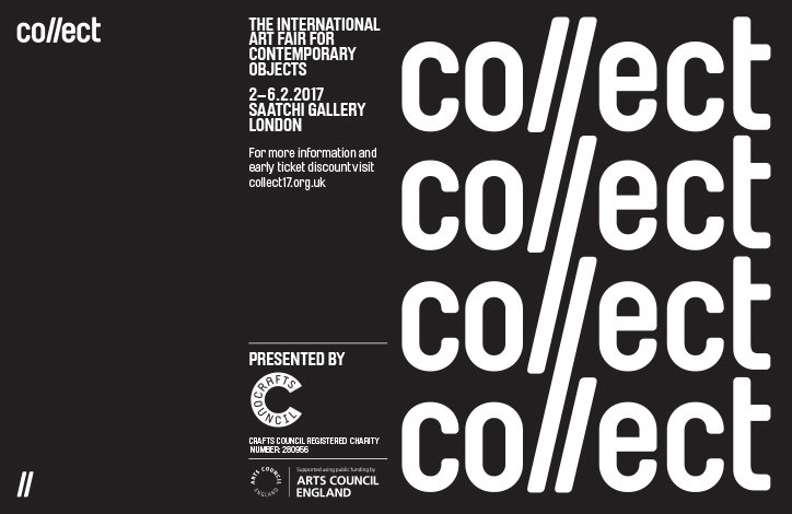
A black and white poster for an art fair. Bold white text on the right reads “collect” repeated four times, with a forward slash separating the “co” and “lect”. Text on the left reads “The International Art Fair for Contemporary Objects”, listing the dates “2–6.2.2017” and the venue “Saatchi Gallery London”. The bottom section notes the event is presented by the Crafts Council and supported by Arts Council England.
Above

Spin: Collect identity

A black and white poster for “collect”, the international art fair for contemporary objects. Text lists the dates “2–6.2.2017” at the Saatchi Gallery in London, alongside the website “collect17.org.uk”. The right side of the image features a dense, abstract pattern of small white lines and hash marks. Logos for the Crafts Council and Arts Council England appear at the bottom.
Above

Spin: Collect identity

A black and white poster for an art fair. The left side features the word “collect” and the centre lists “The International Art Fair for Contemporary Objects” at the Saatchi Gallery, London, from 2–6 February 2017. The right side is filled with a repeating grid of the word “collect”.
Above

Spin: Collect identity

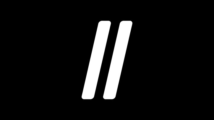
Two thick, white parallel lines lean to the right against a solid black background.
Above

Spin: Collect identity

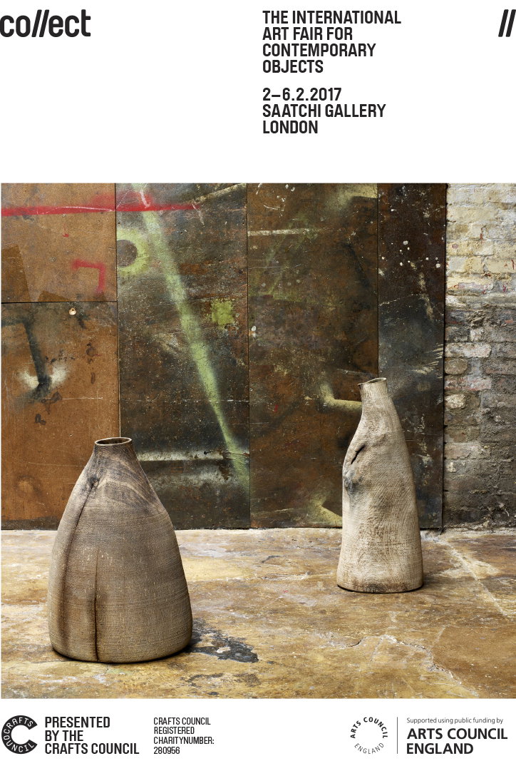
A poster for the Collect art fair featuring two large, textured ceramic vessels on a concrete floor. They stand against a backdrop of weathered, industrial metal panels and a brick wall. Text at the top reads “collect” and “The International Art Fair for Contemporary Objects”, with the dates “2–6.2.2017” and “Saatchi Gallery London”. The bottom of the poster credits the Crafts Council and Arts Council England.
Above

Spin: Collect identity (photography by Angela Moore)
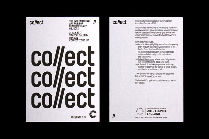
Two white cards for the “Collect” international art fair. The first card features the word “collect” repeated three times in a bold, black typeface. The second card contains event details and a logo for “Arts Council England”.
Above

Spin: Collect identity

Two black promotional cards for the “Collect” art fair. One card features a white abstract pattern of scattered lines and the text “The International Art Fair for Contemporary Objects”. The second card contains a detailed event description and the Arts Council England logo.
Above

Spin: Collect identity

Two black promotional cards for the “Collect” art fair. One card features a grid of the word “collect” repeated in white, while the other contains detailed event information and the “Arts Council England” logo.
Above

Spin: Collect identity

White bold text on a black background reads “collect”. The two “l” characters are slanted to the right.
Above

Spin: Collect identity

Share Article

Further Info

About the Author

Owen Pritchard

—

Owen joined It’s Nice That as Editor in November of 2015 leading and overseeing all editorial content across online, print and the events programme, before leaving in early 2018.


It's Nice That Newsletters

Fancy a bit of It's Nice That in your inbox? Sign up to our newsletters and we'll keep you in the loop with everything good going on in the creative world.