Launch Recite Me assistive technology
A graphic with a light green centre and a darker green border filled with white sprinkles. Text in the centre reads “Studio Audience”, “It’s Nice That Weekly Podcast” and “Series 4 Episode 3”.

Studio Audience: Big magazine redesign chat plus Nokia and Assange

—
Date
6 September 2013

So here we go again with the beats, if by beats you mean 23 minutes of art and design discussion in a podcast format. You did? Great! Set yourself up for the weekend and treat both brain cells and ear drums simultaneously. WARNING: Contains some hardcore graphic design chat. Please proceed with caution.

You can subscribe via iTunes here or listen via the SoundCloud link above.
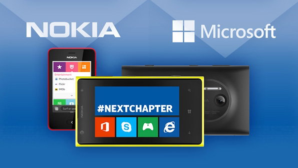
The Nokia and Microsoft logos sit above a group of mobile devices against a blue background. A central screen displays the hashtag “#NEXTCHAPTER” above a row of app icons.

First up this week we looked at Microsoft’s four billion pound take over of Nokia’s mobile phone division and pondered if this means they can now compete with Apple, we also talked about Julian Assange’s appointment onto the Raindance Film Festival jury and welcomed the new Volvo tricks ads (below).
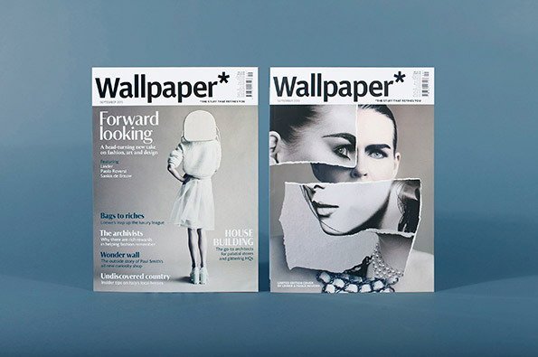
Two covers of Wallpaper magazine stand side by side against a blue background. The left cover features a person in a white dress and a white head covering under the headline “Forward looking”. The right cover shows a fragmented portrait of a person’s face, created from torn pieces of paper.
Above

John Morgan Studio: Art Review September 2013
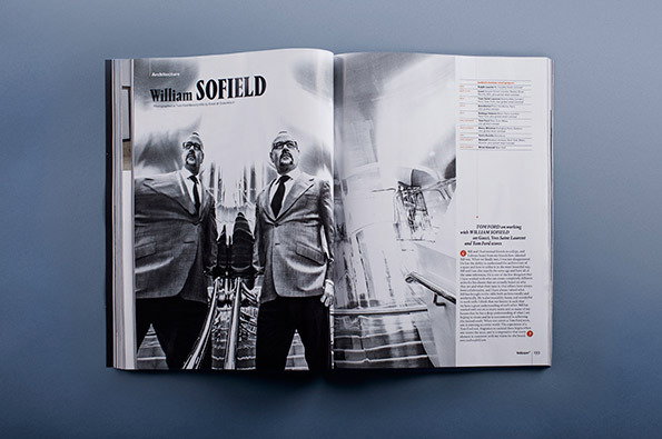
An open magazine features a black and white photograph of two people in suits and glasses. A bold headline reads “William SOFIELD”.
Above

John Morgan Studio: Art Review September 2013
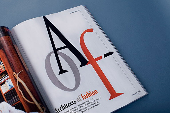
An open magazine displays a bold typographic spread with the letters “A”, “O” and “F” overlapping in black, grey and red. Below the letters, a headline reads “Architects of fashion”.
Above

John Morgan Studio: Art Review September 2013
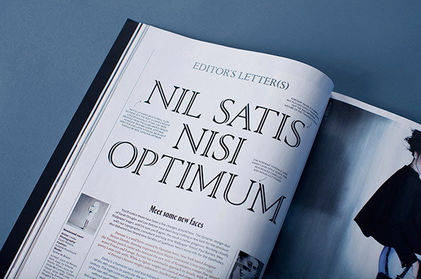
An open magazine displays an editor's letter with the large, serif headline “NIL SATIS NISI OPTIMUM”. Below the title, a section titled “Meet some new faces” includes a small black and white photograph of a person.
Above

John Morgan Studio: Art Review September 2013

This week the entire second section was spent discussing magazine redesigns, based on the new looks for Art Review and Wallpaper* rolled out in their most recent issues.
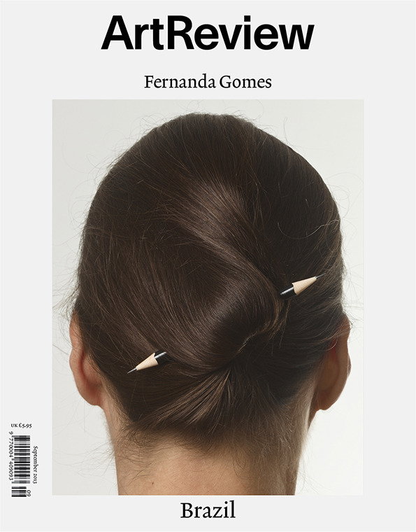
The cover of Art Review magazine features a person seen from behind with their hair tied in a bun. Two pencils are used as hairpins to hold the style in place. The text “Art Review”, “Fernanda Gomes” and “Brazil” appear around the image.
Above

Wallpaper* September 2013

Share Article

About the Author

Rob Alderson

—

Rob Alderson is a freelance writer, editor and strategist. He was previously editor-in-chief of It’s Nice That and WePresent, and editor of Design Week. He publishes the newsletter Undo, which tries to make sense of how AI is changing design work, the design process and the design industry.


It's Nice That Newsletters

Fancy a bit of It's Nice That in your inbox? Sign up to our newsletters and we'll keep you in the loop with everything good going on in the creative world.