Launch Recite Me assistive technology
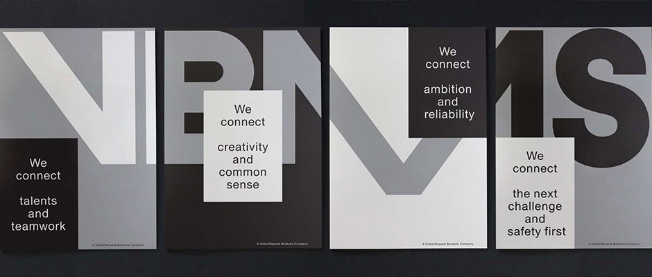
Four posters featuring bold, oversized letters in grey, white and black. Each poster includes a white or black block of text starting with the phrase “We connect”.

Studio Dumbar nails the identity for a pretty conservative industrial client

—
Date
14 May 2015

It’s all very well championing identity work for a cool club night or a hipster restaurant, but it’s more interesting to come across really impressive design for, how shall we say, less glamorous clients. And they don’t come much less glamorous than VolkerWessels Boskalis Marine Solutions, or VBMS, which specialises in “subsea power cable installation” (mmm, sexy). So it’s great to see the ever-excellent Studio Dumbar create a new look for the new company which was formed by the coming together of two existing entities.

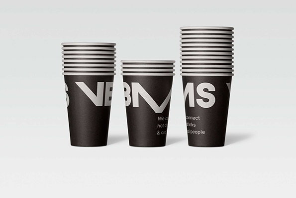
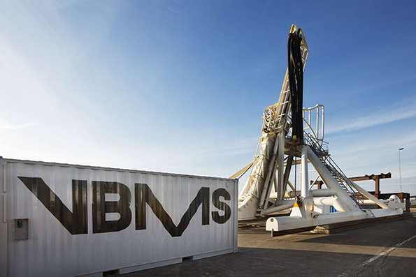
The Dumbar team wanted to retain and combine the previous companies’ “hard-earned equity” but create something that felt fresh and future-facing and it looks like they’ve succeeded in style. The simple device of the wordmark’s “M” dipping below the baseline is a communicative nod to VBMS’ core business and the black and muted silver colour palette feels solid and restrained. Perhaps the best measure of this identity is its ability to work across not just print and digital but shipping containers and coffee cups, a pretty versatile range of applications.
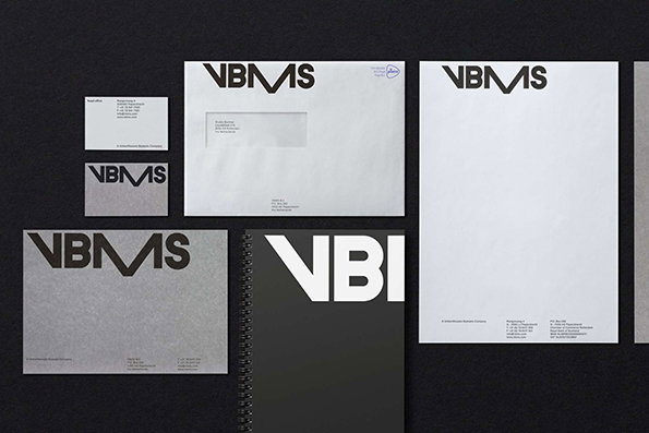
A corporate identity suite for “VBM S” laid out against a dark grey background. The set includes a business card, envelope, letterhead and a spiral-bound notebook, all featuring a bold black and white logo.
Above

Studio Dumbar: VBMS

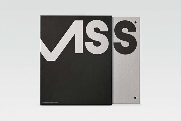
A black book cover features the word “VSS” in large, bold white letters. The first letter is cropped by the left edge, and a second silver cover with a black “S” sits behind it.
Above

Studio Dumbar: VBMS

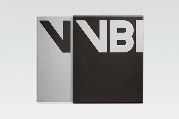
Two books stand side by side against a plain grey background. The covers feature bold, oversized typography that reads “VNBI”, split between a silver and a black surface.
Above

Studio Dumbar: VBMS

Three stacks of black paper cups against a plain grey background. Bold white lettering wraps around the cups, including the letters “V”, “B”, “M” and “S”.
Above

Studio Dumbar: VBMS

A white shipping container features a large black logo that reads “NBMS”. Behind it, a tall, white industrial crane structure stands against a clear blue sky.
Above

Studio Dumbar: VBMS

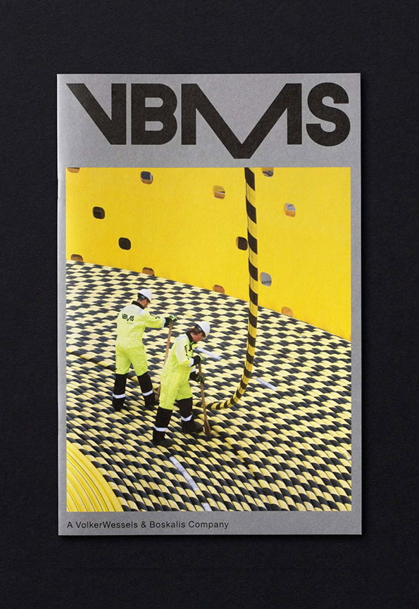
A magazine cover featuring the bold wordmark “VBMS” at the top. Below, two people in yellow high-visibility gear work on a black and yellow checkered surface against a bright yellow wall. Small text at the bottom reads “A VolkerWessels & Boskalis Company”.
Above

Studio Dumbar: VBMS

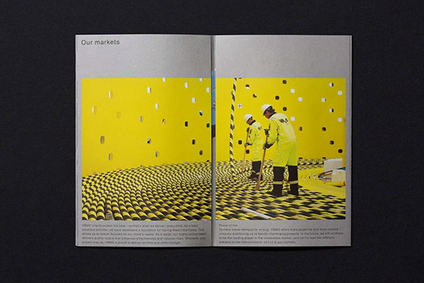
An open brochure shows a spread titled “Our markets”. A large photograph across both pages depicts two people in yellow protective gear standing on a black and yellow checkered floor within a bright yellow room.
Above

Studio Dumbar: VBMS

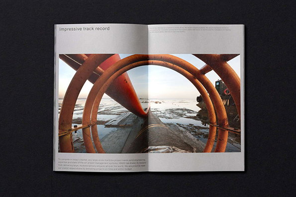
An open brochure shows a wide photograph of large, orange industrial pipes curving over a frozen, icy landscape. The left page features the headline “Impressive track record” above the image.
Above

Studio Dumbar: VBMS

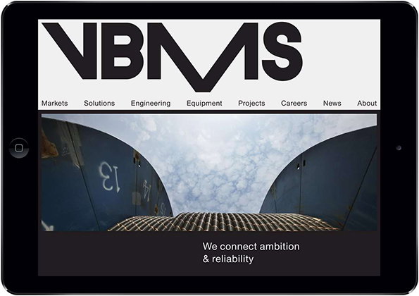
A tablet displays the Nbms website, featuring a bold black logo on a white background. Below a navigation menu, a wide image shows a low-angle view of industrial structures against a cloudy sky, with the text “We connect ambition & reliability”.
Above

Studio Dumbar: VBMS

Share Article

About the Author

Rob Alderson

—

Rob Alderson is a freelance writer, editor and strategist. He was previously editor-in-chief of It’s Nice That and WePresent, and editor of Design Week. He publishes the newsletter Undo, which tries to make sense of how AI is changing design work, the design process and the design industry.


It's Nice That Newsletters

Fancy a bit of It's Nice That in your inbox? Sign up to our newsletters and we'll keep you in the loop with everything good going on in the creative world.