Unfinished paintings and forgotten photographs: Swim magazine showcases exclusively unseen work
We are used to seeing the final outcomes of projects here at It’s Nice That. The chosen selection of photographs, the final edit of a film or the one spot illustration utilised from many options. It’s rarer, however, that we get to see all of the thoughts and sketches which go into making these final outcomes, and even less often that we see the projects which have been discarded altogether.
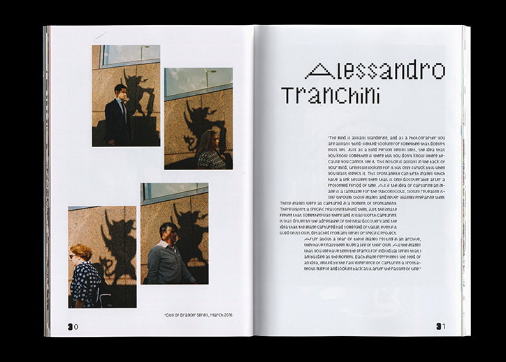
In its second beautifully experimental issue, Swim magazine tackles exactly this, showcasing exclusively unseen work from established and up-and-coming creatives. We caught up the magazine’s editor Daniel Milroy Maher, to hear more about the latest issue, created alongside Archie Nock and Samuel White, both graphic designers and Thomas Peter Corbishley, a photographer.
It’s Nice That: When and why did Swim come about?
Daniel Milroy Maher: Swim was born almost three years ago out of a desire to showcase our friends’ work. This idea was nothing ground-breaking, but we really treasured the notion of genuine collaboration: building a collective of artists, designers and writers who could help each other. Additionally, after working with bigger names, the thought of seeing our friends side-by-side on the page with artists we had always admired sounded great.
Swim magazine: Issue 02
INT: Where does the name come from?
DMM: The name comes from the phrase “sink or swim”. I think as a young creative, you are very aware of the need to keep yourself afloat during those early days. You have to rely on your own drive to keep you going, and that can be tough. Having a collective of likeminded people around you can lighten that load, however. That’s what we’re striving to create through the magazine.
INT: How did you decide on the theme for the second issue?
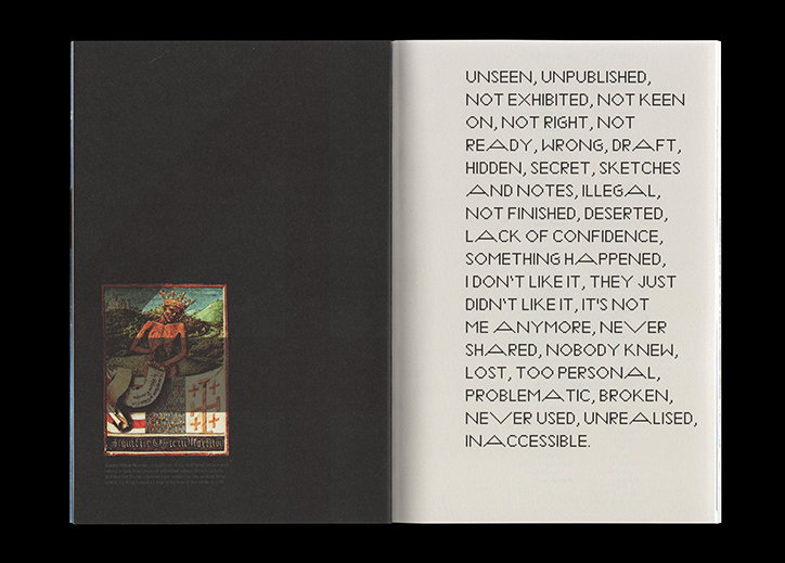
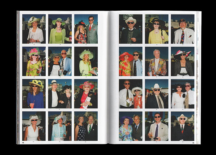
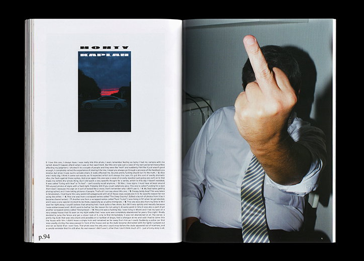
DMM: The theme for this second issue stemmed from thoughts around unseen work. Often artists will have huge archives full of work that has never been used or shown. Whether it’s rejected drafts, a surplus of photographs left over from shoots or unfinished paintings, they’re abandoned without reaching their full potential. The idea of finding these and giving them a place in this issue really intrigued us.
Why do you think everything that gets lost in a creative’s process is so important, or interesting, to showcase?
DMM: We can be our own worst critics, and so much unrealised work is left behind as a result of this. It interested us to see the projects and pieces that the artists felt just weren’t good enough. In some cases, it revealed a vulnerability of sorts.
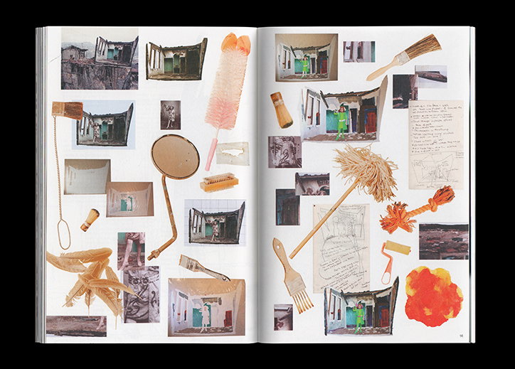
Sketches and plans were similarly intriguing because they provided an insight into the artists’ process that was otherwise inaccessible. It felt similar to the guilty pleasure of looking into other people’s houses: it’s fascinating because you don’t often get the chance to do it and it can tell you a lot about them.
Swim magazine: Issue 02
INT: Tell us more about how the design of the publication reflects this theme…
Archie Nock and Samuel White are Swim’s design duo. We had discussed how we wanted the physical features of the magazine to reflect the concept behind it. Which led us to using exclusively unfinished typefaces that had been abandoned by their designers due to failed pitches for projects or a host of other reasons. Some were also simply at a stage of half completion, missing the upper or lower case.
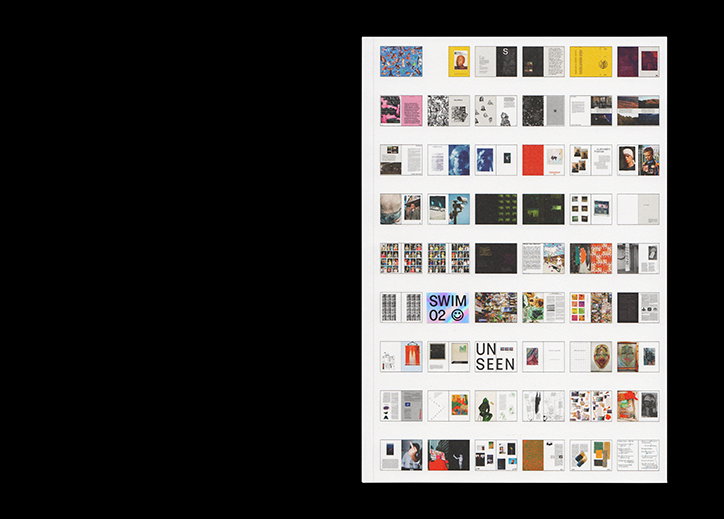
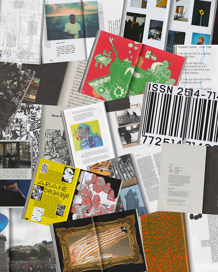
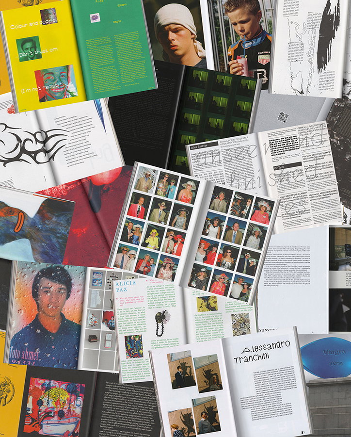
This idea of unused, unfinished or unseen work inspired the cover design too, which is comprised of all the spreads from this issue. We took the magazine’s contents, which were literally and figuratively unseen – because they’re hidden inside the publication and because they’re made up of artists’ unseen work – and put them on the front.
INT: Could you tell us about a few contributions in more detail?
DMM: We chose to include Caroline Achaintre’s because we saw an opportunity to document a side of her work that is never normally seen – the reverse side. These tufted objects display clear beauty from the front, but we found that from behind there was a rougher, more raw beauty, which we loved.
Christian Newell’s sketchbook is a work of art in itself. The detailed and intricate drawings and musings are amazing to read through and look at in context with the finished work. It’s easy to forget how much time and research goes into every painting and publishing these pages was a great way to showcase that.
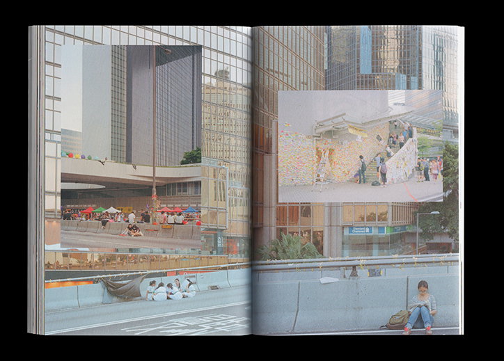
Stratos Kalafatis & Antonis Theodoridis are Greek photographers who had been documenting the 2015 refugee crisis. It had been a project in progress prior to the issue becoming global news, after which the pair decided their coverage would be lost in the sea of reports and halted their efforts. There was a sad irony in the abandonment of photographs of people that had abandoned their countries.
Swim magazine: Issue 02
Swim magazine: Issue 02
Swim magazine: Issue 02
Swim magazine: Issue 02
Swim magazine: Issue 02
Swim magazine: Issue 02
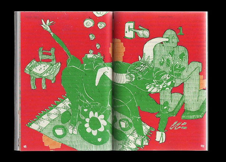
Swim magazine: Issue 02
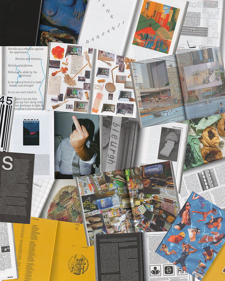
Swim magazine: Issue 02
Share Article
Further Info
About the Author
—
Ruby is Senior Creative at It's Nice That, overseeing our visual output across platforms and projects. Before that, she was associate editor on the editorial team, after joining in September 2017 following graduation from Central Saint Martins.