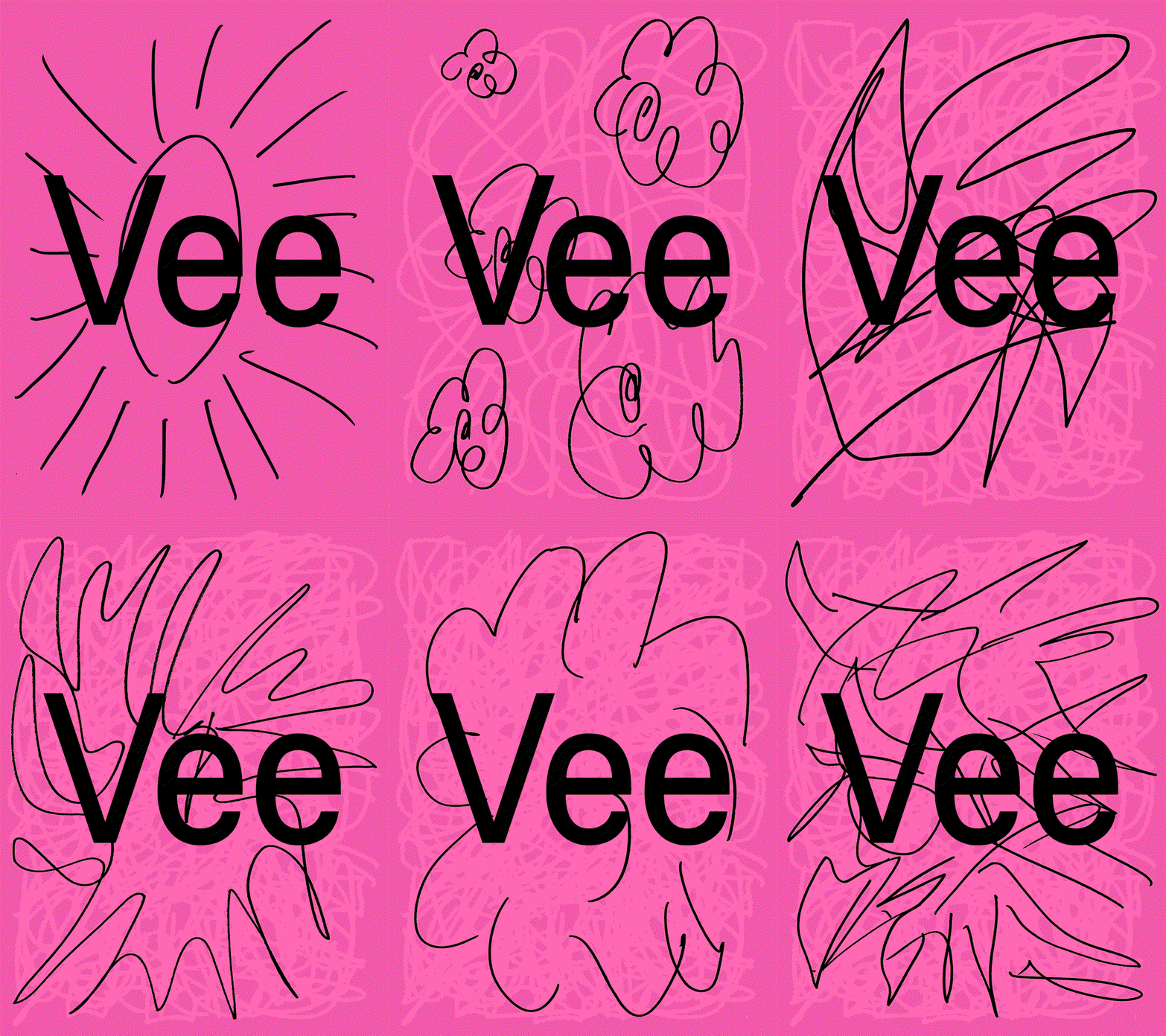
Perfection, begone! Laura Pappa and Tüpokompanii’s new typeface is all about letting yourself be bad at something
When the foundry set out on this typographic revival, they knew something would get lost in translation – so they chose to embrace it, and the results are much more interesting.
Way back in 2022, Aimur Takk and Andree Paat, founders of Estonia-based type foundry Tüpokompanii taught a four-month type design course at Alma Mater, the Estonian Academy of Arts. One participant to the programme was designer Laura Pappa, who decided to take on the daunting task of a typographic revival and design her own sans serif inspired by Bauer Type Foundry’s 1907 Venus. It’s a typeface that was popular throughout the first half of the twentieth century and a set of glyphs that Laura had regularly turned to in her own design work. A long time favourite, you might say.
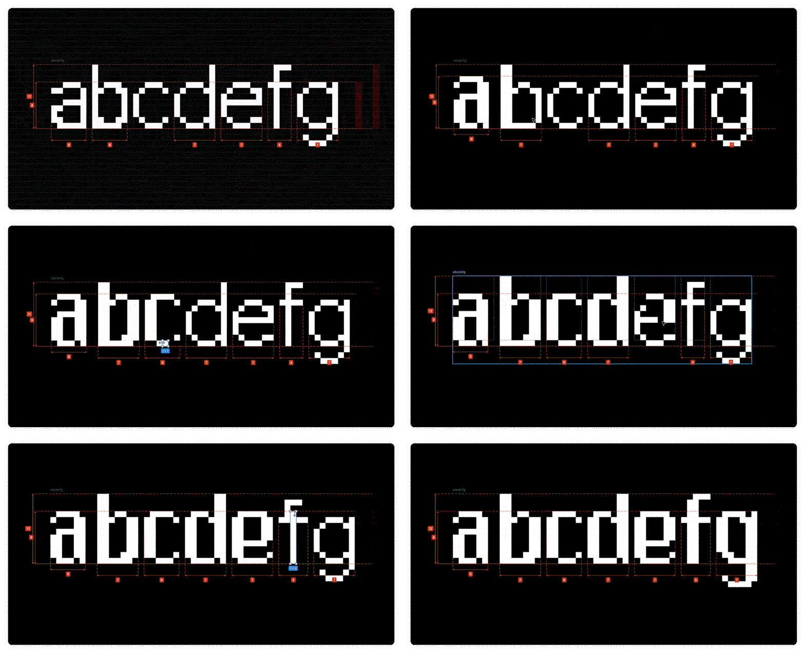
After the course at Alma, with the first cut of the typeface under her belt (which she’d named Vee), Laura reached out to Tüpokompanii to develop the project into a working font. As soon as they took it on, it was quite clear at the studio that this wouldn’t be “a traditional revival”, Andree tells us. Interpreting Laura’s drawings which had been loosely based on screenshots of the digital version of Venus (a translation of the original metal type itself!), Andree and Aimur knew that something “would get lost in translation” along the way, Aimur says. Instead of resisting this, the pair “embraced it”, mistakes included, all in true Tüpokompanii style. Rather than analysing the technical details of Venus up close, the designers focused in on these sketches of Laura’s instead: “We wanted to see what choices she had made independently and push those further,” says Andree.
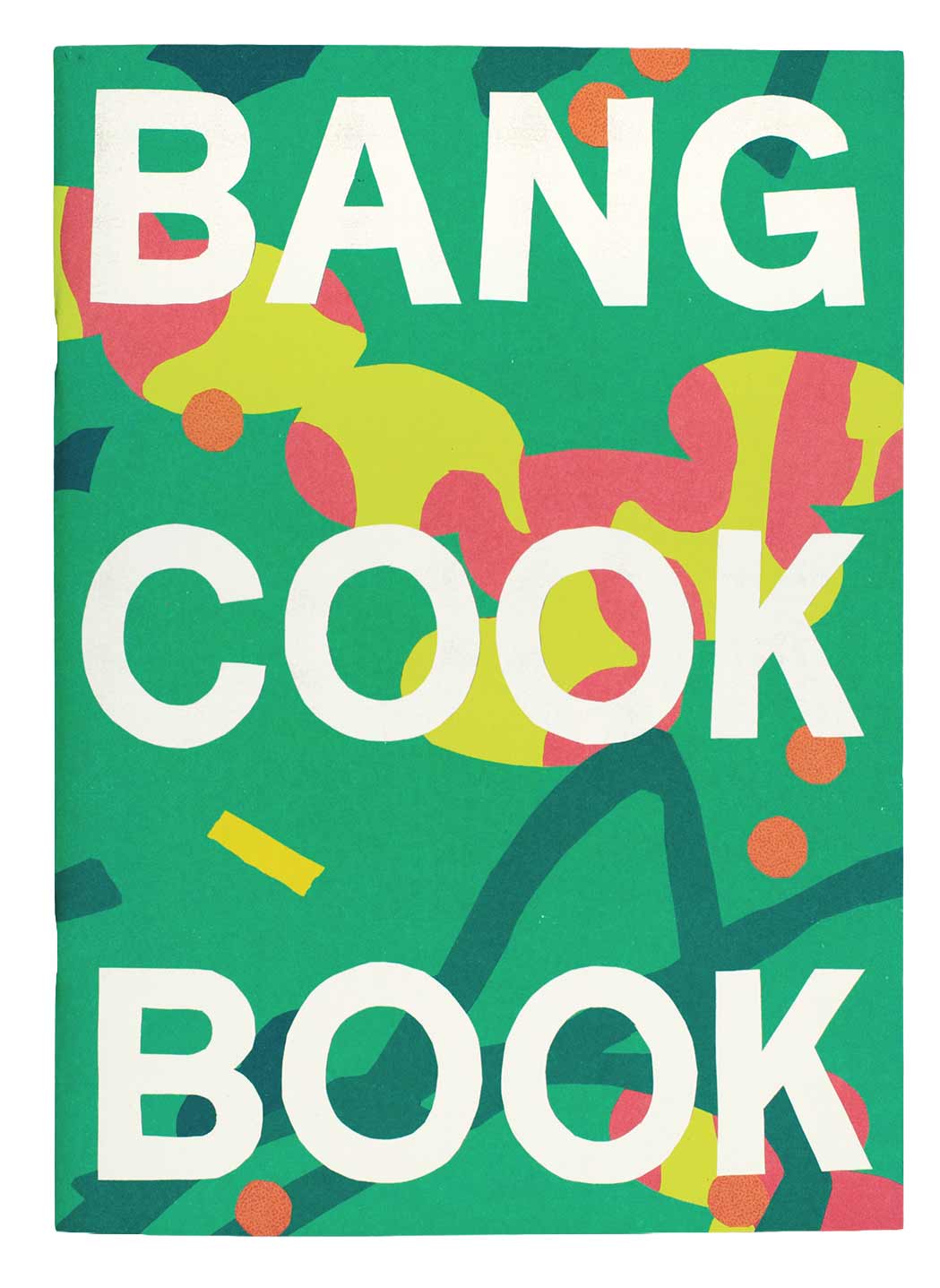
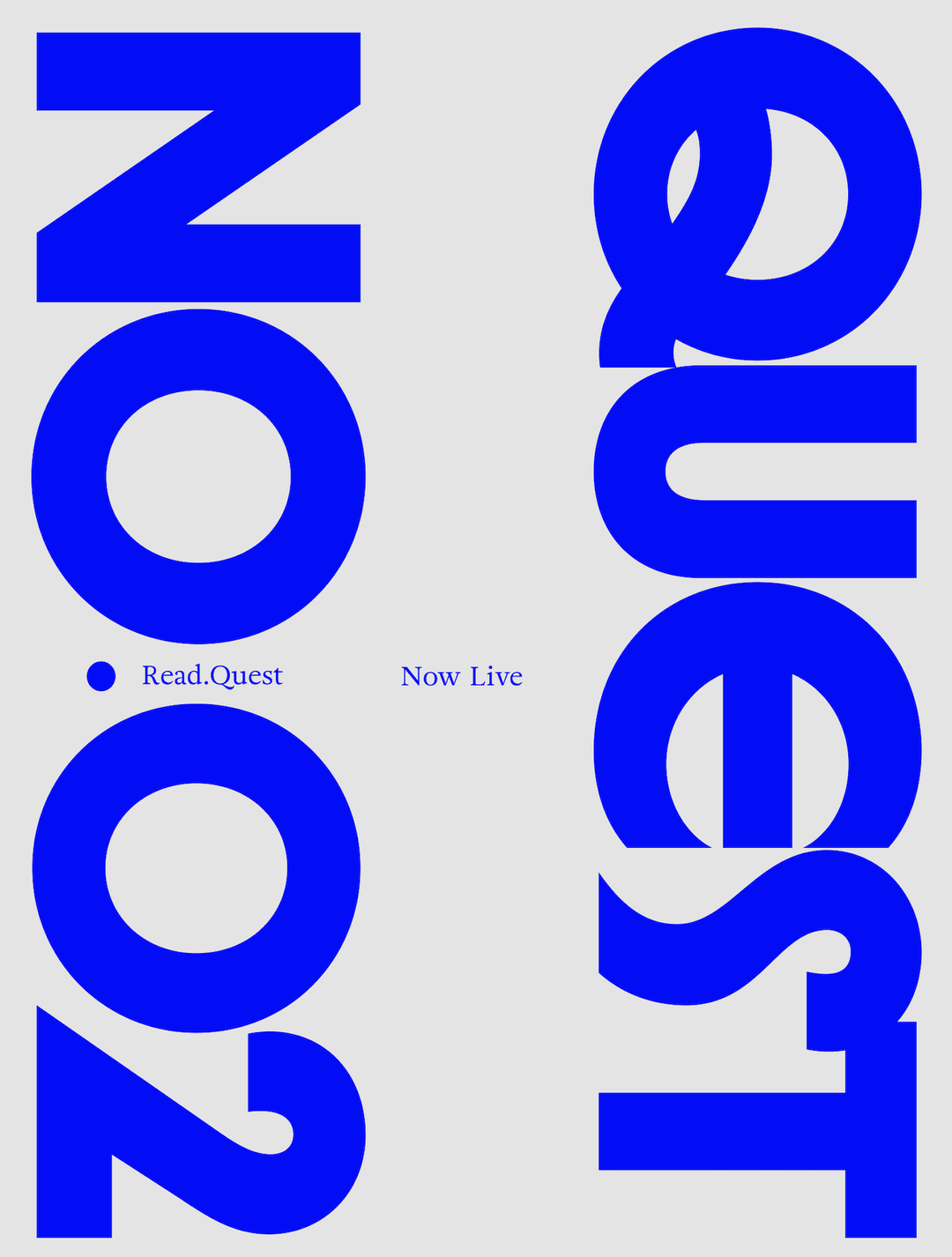
Tüpokompanii: Vee typeface (Copyright © Tüpokompanii, 2026)
Tüpokompanii: Vee typeface (Copyright © Tüpokompanii, 2026)
Tüpokompanii: Vee typeface (Copyright © Tüpokompanii, 2026)
The resulting typeface certainly draws inspiration from Venus – it references its high-waisted capitals, varied terminals ending at irregular angles and slightly condensed lowercase forms, giving it a warm, handcrafted feel. But it also brings with it (like any successful ode to old letterforms) some new qualities of its own. “The aim was something simple and friendly, balancing her slightly raw, amateurish forms with more traditional letterforms,” says Aimur. “We also wanted to retain Laura’s instinct for bold, unpolished shapes alongside the elegance of Venus,” he says. “Vee could be considered Venus’ younger, more mischievous sister.”
To accompany the release, the type foundry launched a publication in close collaboration with Laura titled: Let yourself be bad at things, which contains a conversation between the designers about the origins of the type foundry and the unconventional creative processes that are embedded in its typefaces. “Together, we reflected on the development of Vee through the lens of amateurism, experimentation and curiosity,” says Andree.
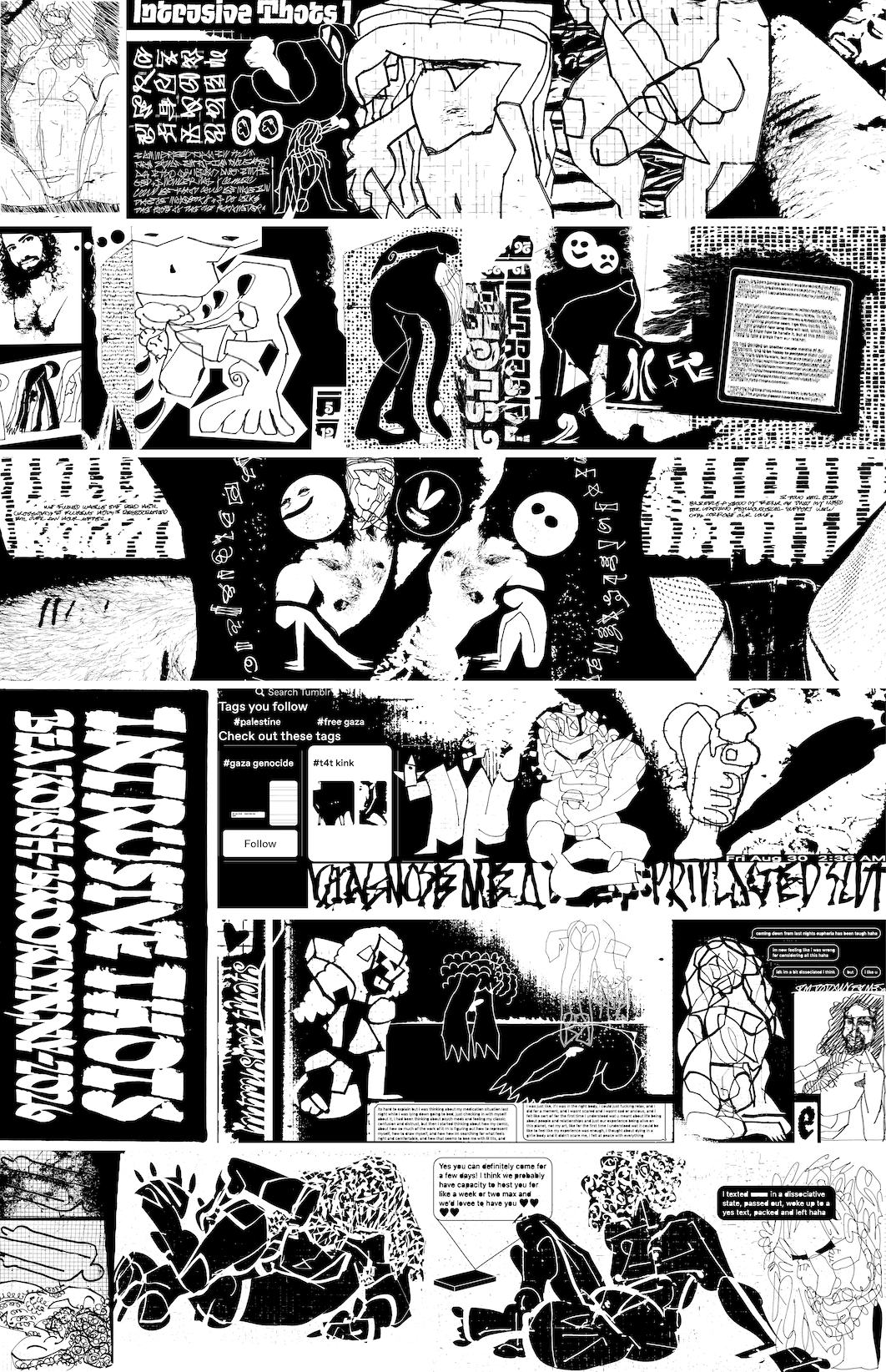
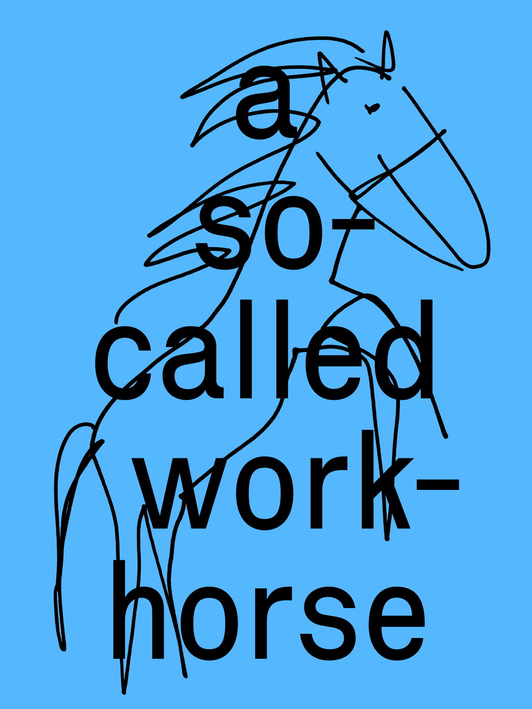
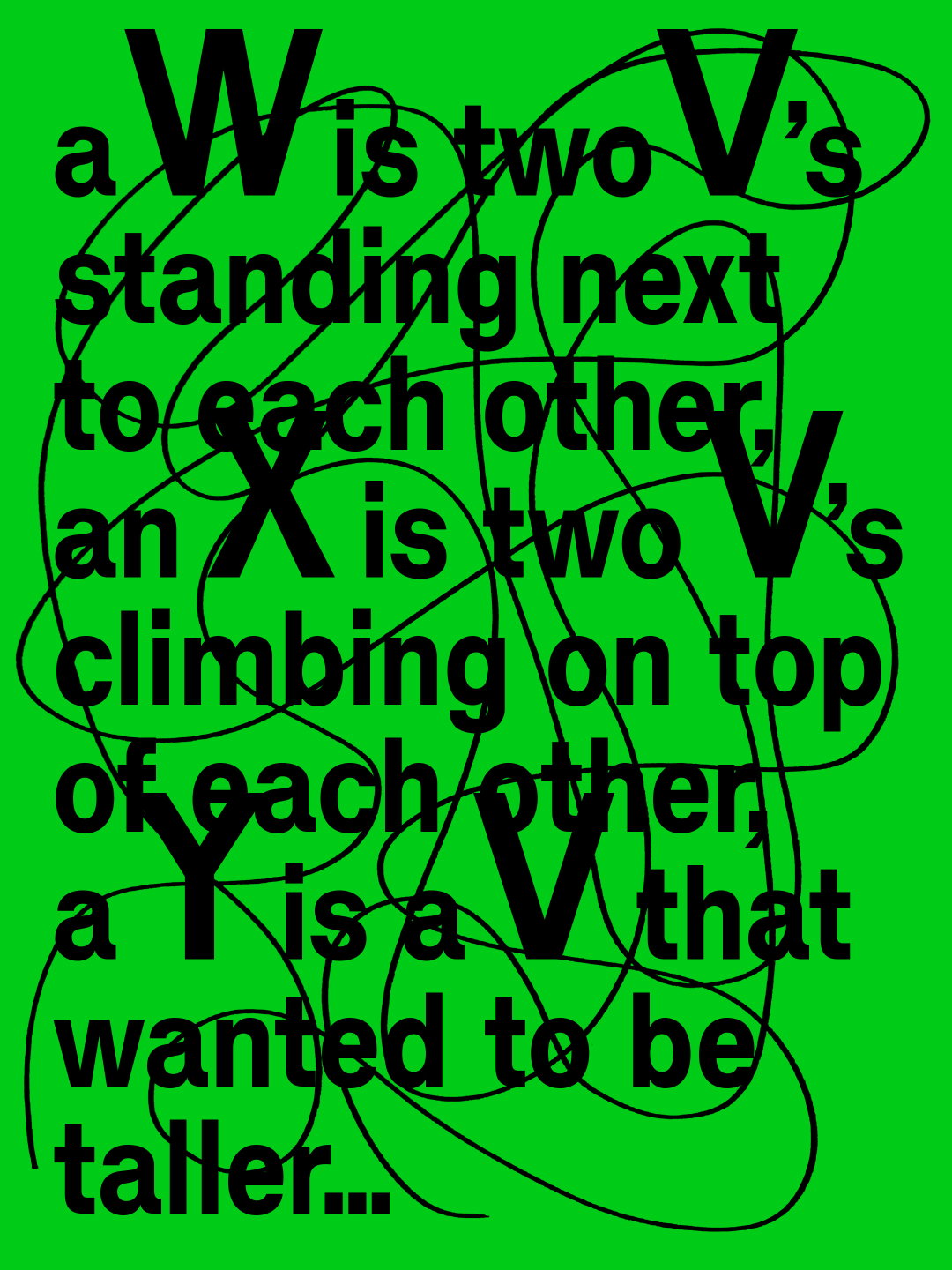
The publication acts as a printed specimen for Vee but also provides something more than just showcasing the typefaces function. Whilst we do get to see Vee’s final five cuts in this printed object, the publication’s design is also full to the brim with fun and playful elements – type runs off in all different directions across spreads and letterforms sit atop wonderfully naive illustrations. “Laura has never considered herself much of a drawer, so including her drawings felt fitting. Her crooked horse and three jolly flowers appear alongside 25 drawings paired with snippets from our conversation,” Aimur says. This silliness neatly connects the project’s title with the publication’s visual language: Let yourself be bad at things. “Its theme reflects our foundry’s interest in experimentation, uncertainty and finding paths outside traditional methods,” Andree ends.
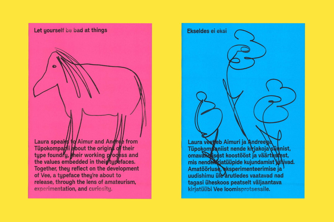
Tüpokompanii & Laura Pappa: Let yourself be bad at things (Copyright © Tüpokompanii & Laura Pappa, 2026)
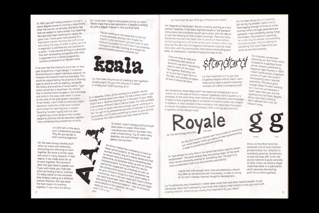
Tüpokompanii & Laura Pappa: Let yourself be bad at things (Copyright © Tüpokompanii & Laura Pappa, 2026)
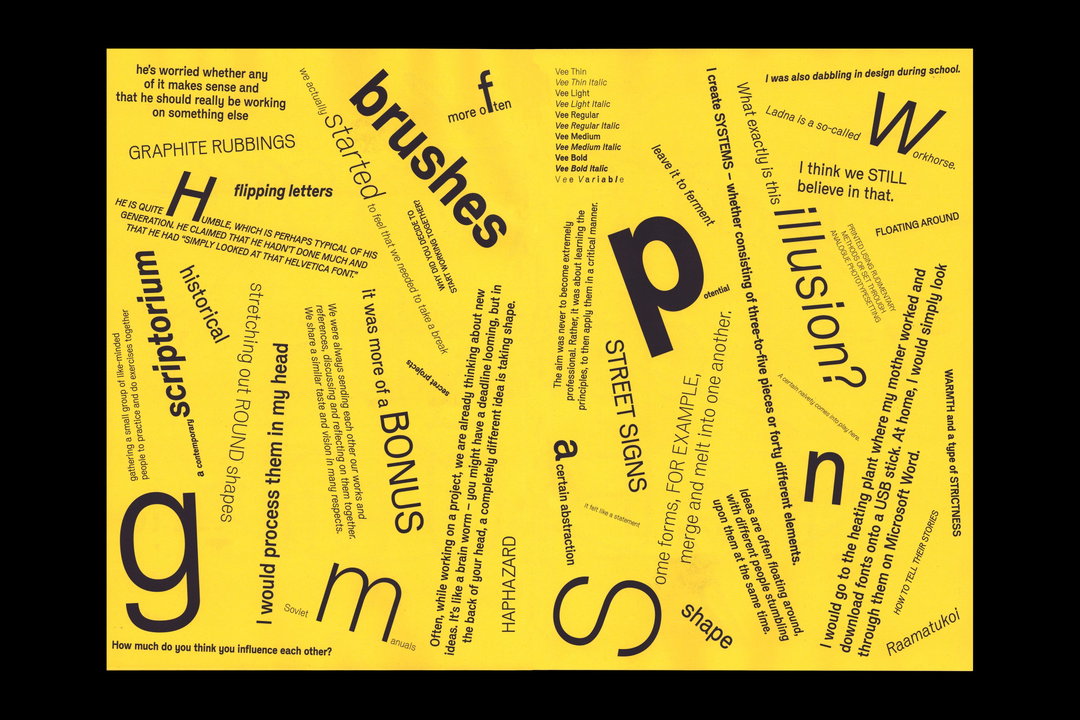
Tüpokompanii & Laura Pappa: Let yourself be bad at things (Copyright © Tüpokompanii & Laura Pappa, 2026)
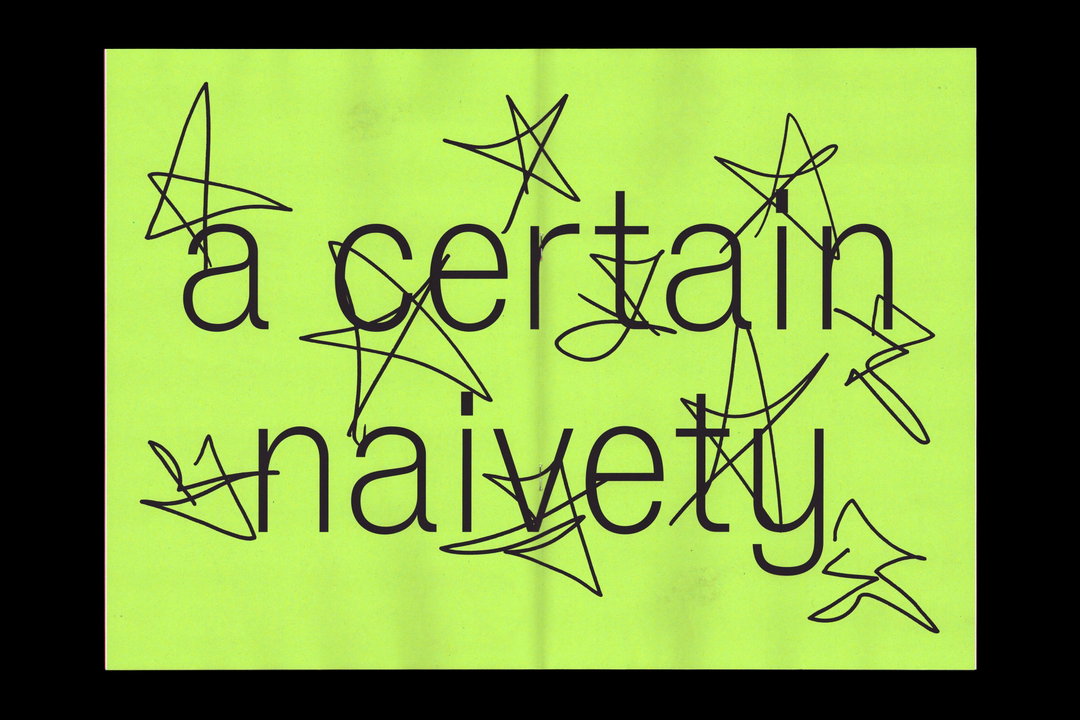
Tüpokompanii & Laura Pappa: Let yourself be bad at things (Copyright © Tüpokompanii & Laura Pappa, 2026)
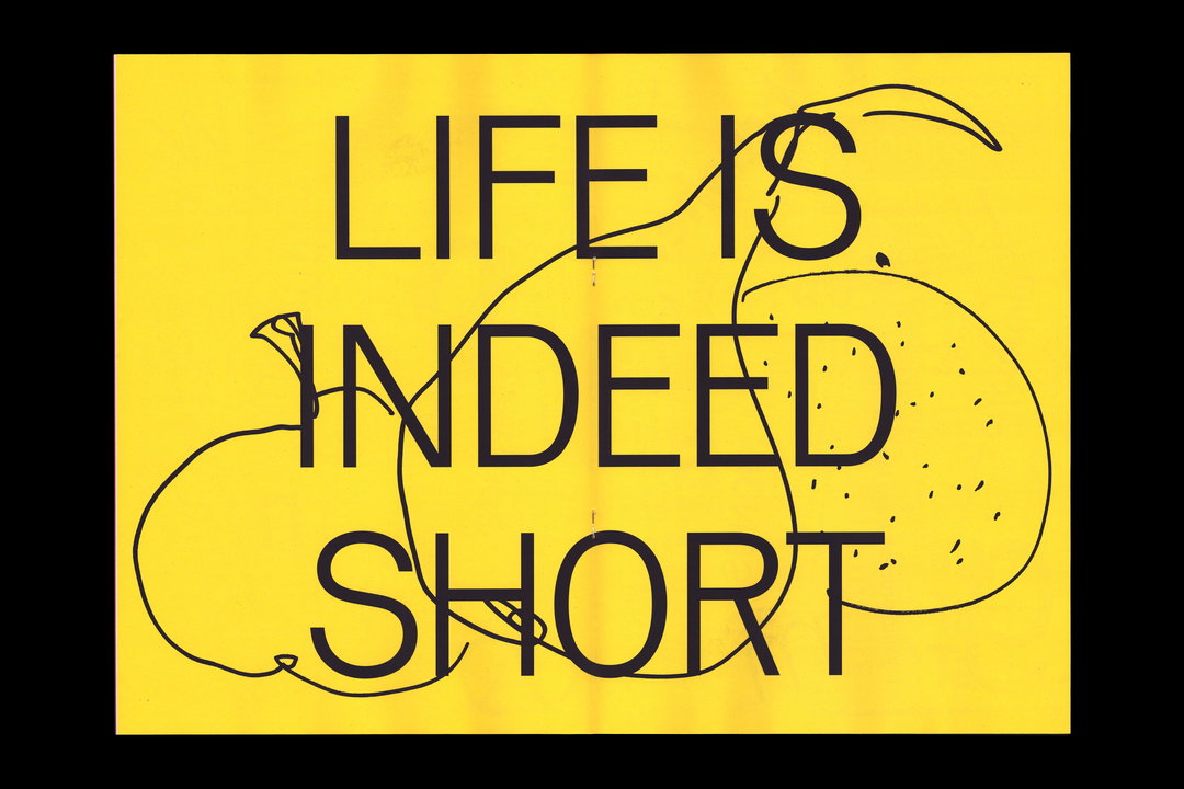
Tüpokompanii & Laura Pappa: Let yourself be bad at things (Copyright © Tüpokompanii & Laura Pappa, 2026)
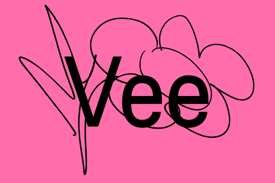
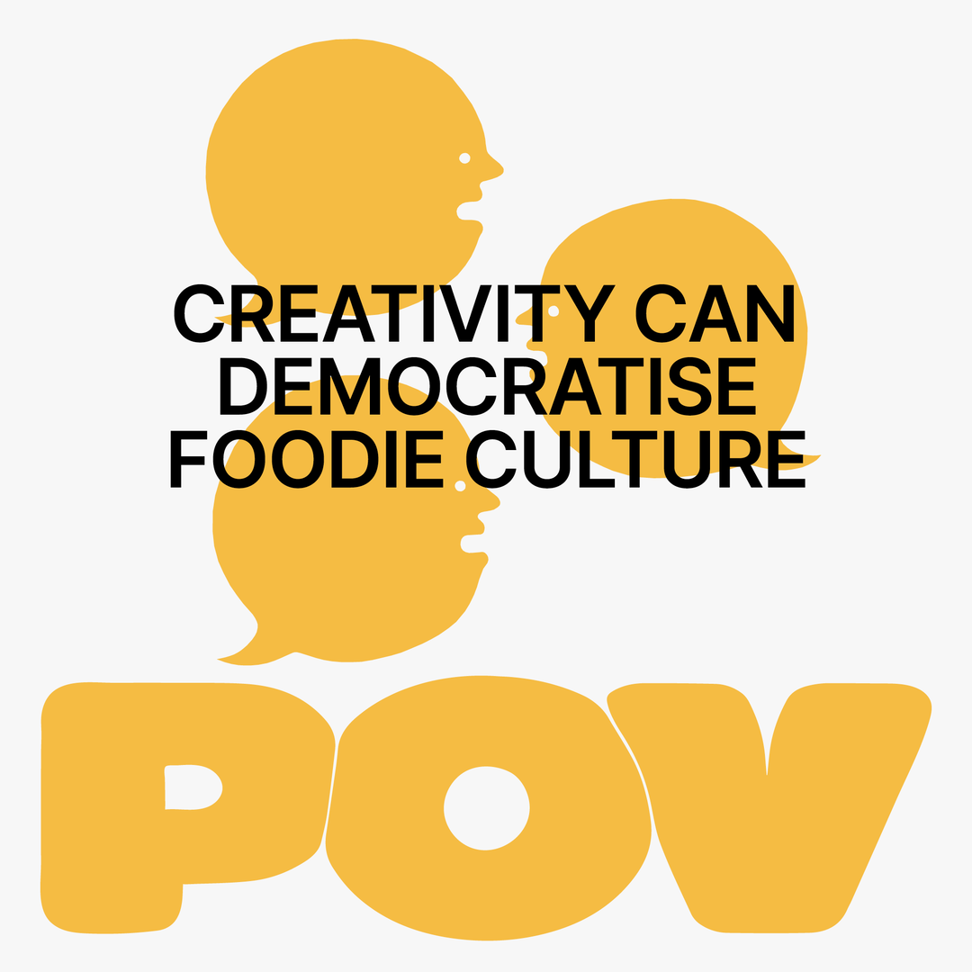
Tüpokompanii: Vee typeface (Copyright © Tüpokompanii, 2026)
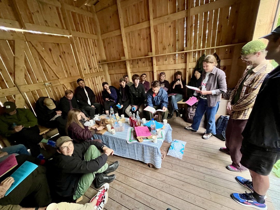
Tüpokompanii & Laura Pappa: Let yourself be bad at things book launch (Copyright © Tüpokompanii & Laura Pappa, 2026)
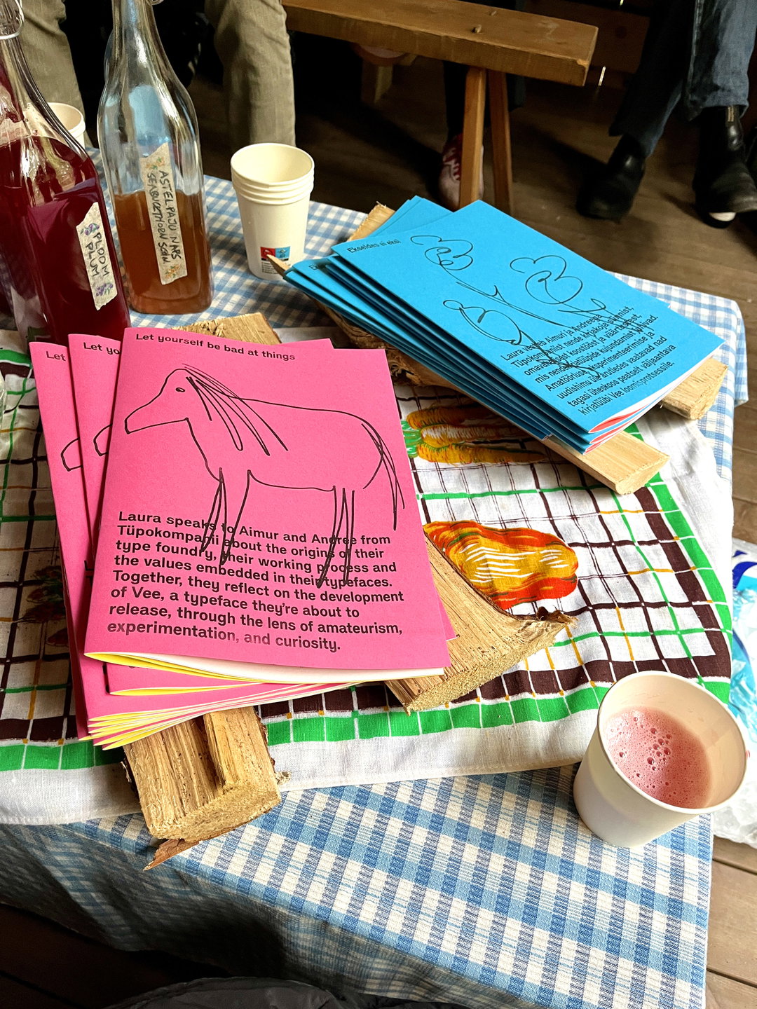
Tüpokompanii & Laura Pappa: Let yourself be bad at things book launch (Copyright © Tüpokompanii & Laura Pappa, 2026)
Hero Header
Tüpokompanii: Vee typeface (Copyright © Tüpokompanii, 2026)
Share Article
About the Author
—
Ellis Tree (she/her) is a staff writer at It’s Nice That. She joined as a junior writer in April 2024 after graduating from Kingston School of Art with a degree in Graphic Design. Across her research, writing and visual work she has a particular interest in printmaking, self-publishing and expanded approaches to photography. ert@itsnicethat.com
To submit your work to be featured on the site, see our Submissions Guide.