Launch Recite Me assistive technology
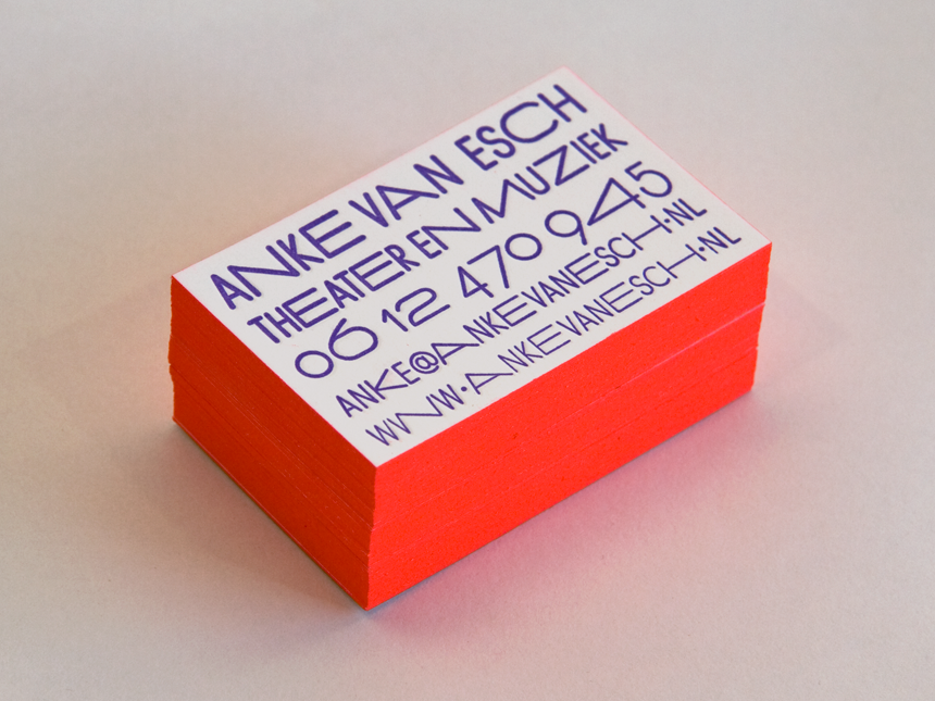
A stack of bright orange business cards on a plain white surface. The top card features purple text that reads “Anke van Esch”, “Theater en Muziek” and contact details.

Come and meet Team Thursday — the friendliest design duo in Europe!

—
Date
3 October 2012

There are only a handful of designers in the world who would send a video of them politely introducing themselves and asking you to have a look at their work, and Team Thursday are one of those few. Two very smiley girls from Rotterdam with a – thankfully – very impressive graphic design portfolio make up this charming pair, who have produced huge amounts of consistently brilliant work for a range of interesting clients. With almost too much goodness going on in their studio alone, Loes and Simone of Team Thursday also lend their enviable skills to others by putting on seminars to students.Three cheers for Team Thursday!
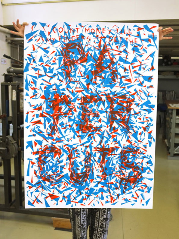
A person holds up a large poster featuring a chaotic arrangement of red and blue geometric shards. At the top, a line of red text reads “COUNT MONEY TILL”.
Above

Team Thursday: Papercuts – poster

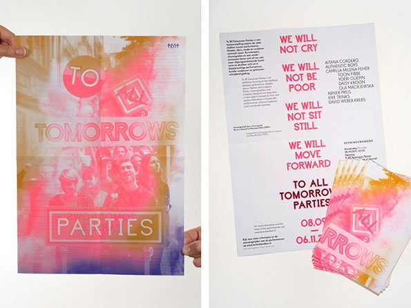
Two versions of a poster for “To All Tomorrows Parties”. One shows a group of people behind a translucent layer of pink and orange gradients, with the title and the word “PARTIES” in a bold box. The other version is a white page featuring a list of names and a manifesto that begins “WE WILL NOT CRY”.
Above

Team Thursday: All Tomorrow’s Parties identity
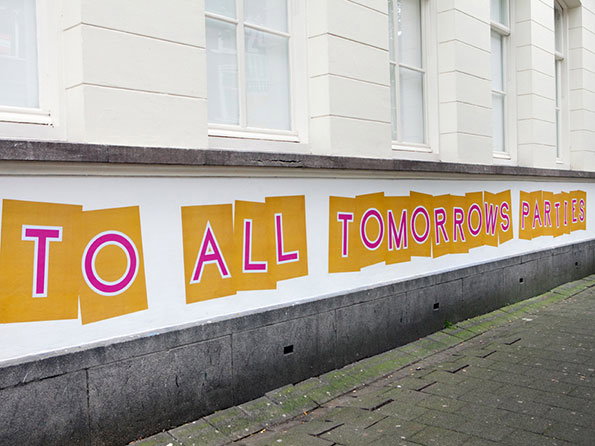
Large yellow posters are pasted along the white base of a building, reading “TO ALL TOMORROWS PARTIES” in pink capital letters. The posters are slightly overlapped and set against a grey stone plinth and pavement.
Above

Team Thursday: All Tomorrow’s Parties identity
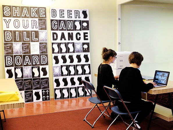
Two people sit at a desk working on laptops in a bright room. Behind them, two large black and white posters feature bold text reading “SHAKE YOUR BILL BOARD” and “BEER CANS DANCE”.
Above

Team Thursday: Facing Pages Visual Identity
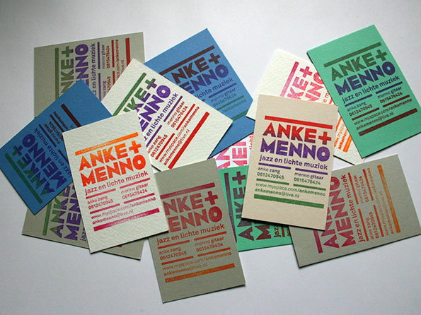
A scattered pile of business cards in various colours, including blue, green, grey and white. Each card features the red and green text “Anke + Menno” above the phrase “jazz en lichte muziek”.
Above

Team Thursday: Anke + Menno visual identity
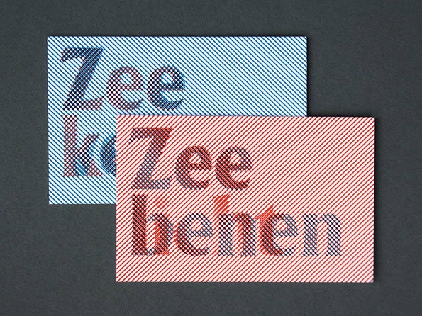
Two rectangular cards with diagonal stripes overlap on a dark grey background. One card is blue and white, and the other is red and white, both featuring the words “Zee benen” in a bold, distorted typeface.
Above

Team Thursday: Zeelicht/Zeeventig visual identity

Share Article

About the Author

Liv Siddall

—

Liv joined It’s Nice That as an intern in 2011 and worked across online, print and events, and was latterly Features Editor before leaving in May 2015.

It's Nice That Newsletters

Fancy a bit of It's Nice That in your inbox? Sign up to our newsletters and we'll keep you in the loop with everything good going on in the creative world.