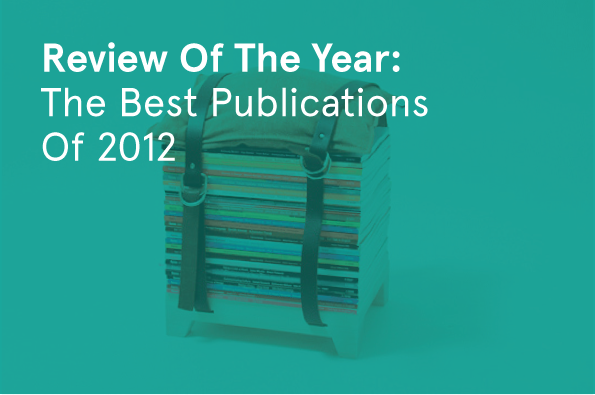
Mmmmmmm printed loveliness – it's our favourite publications of 2012
Here at It’s Nice That we get the most enormous amount of books sent our way. Sometimes we ask for them and sometimes people just send them over out of the goodness of their heart. How ever they arrive on our doorstep we’re always incredibly grateful to receive them – we flipping love books you see – and to show how much we appreciate it we thought it’d be nice to look at some of our absolute favourites from the past 12 months; the ones that really grabbed our attention.
The variety of material on display is astounding, and ranges form gourmet cuisine to outlandish footwear, serious graphic design to utter filth. Whatever your tastes, we guarantee there’ll be something here that you’ll definitely want to add to your library, even if it is just so you can brag about how terrifically well-read you are.
Praline: Polpo
Praline: Polpo
Praline: Polpo
Praline: Polpo
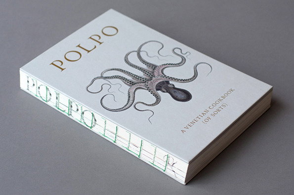
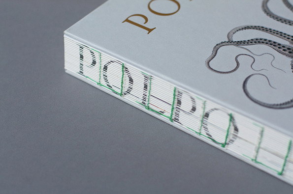
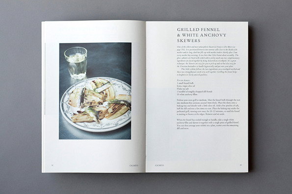
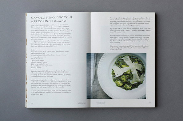
This year we discovered that a few of us here in the studio are pretty keen on culinary experimentation. We like to spend our evenings faffing about with weird ingredients because it’s more fun than beans on toast. That said, there’s also a number of us who eat beans on toast for lunch each day. While we’ll never agree on the benefits of ready meals over home-cooked food, we were all agreed that Praline’s design for Polpo, the London restaurant’s first cookbook, set a new standard in culinary design. Goodbye overused hand-lettering and fake coffee cup rings, hello crisp, sexy and dynamic design!
www.itsnicethat.com/articles/praline-polpo

Brendan Monroe: Islands
Brendan Monroe: Islands
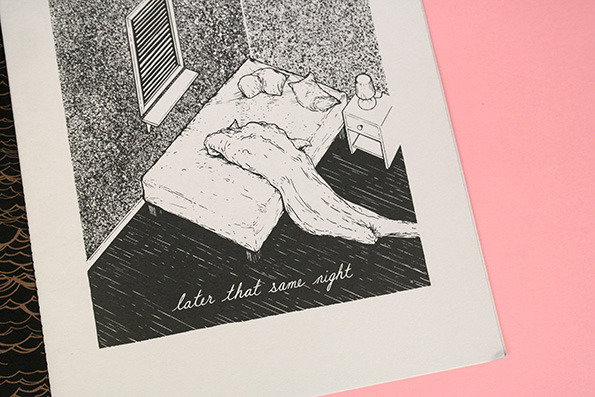
Brendan Monroe has only ever sent us two things in the post. The first was over a year ago, and was one of the finest pieces of illustration we’ve ever laid eyes on; a beautiful abstract story about a journey through the dimensions of space and time. Then things went quiet. When Islands emerged in our mailbox a whole year later – another wordless journey thorough a couple’s inter dimensional exploration – we were ecstatic to hear from Brendan again and unsurprisingly thrilled to see more of his illustrated offerings in the flesh. As Liv said at the time, it’s one of the nicest things anyone’s ever sent us.
www.itsnicethat.com/articles/brendan-monroe-islands
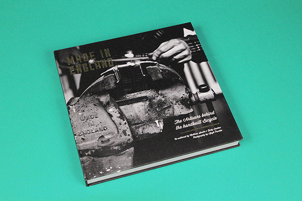
Ricky Feather and Matthew Sowter: Made In England
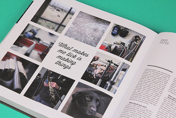
Ricky Feather and Matthew Sowter: Made In England
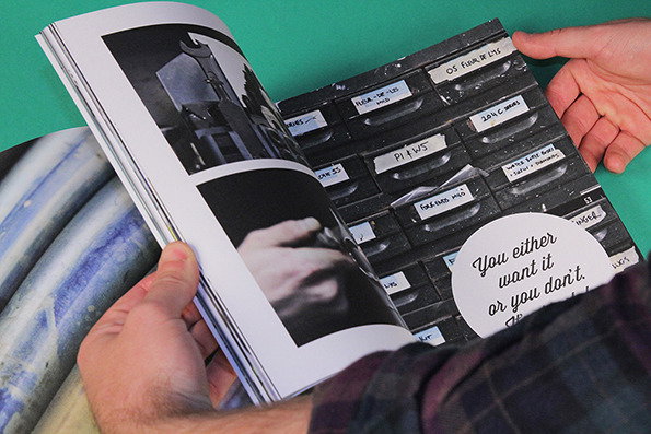
Ricky Feather and Matthew Sowter: Made In England
Made In England is a comprehensive journey through the workshops of some of the finest independent, hand-made frame builders of Britain. It’s written by two guys who make their living designing and building bikes themselves, so you can guarantee the content’s spot on. The photography too is second to none, and offers a wonderful insight into this remarkable traditional craft. If you enjoy bikes, design or both then this is one book you really should own.
www.itsnicethat.com/articles/made-in-england
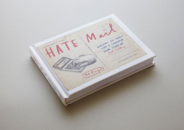
Mr Bingo: Hate Mail
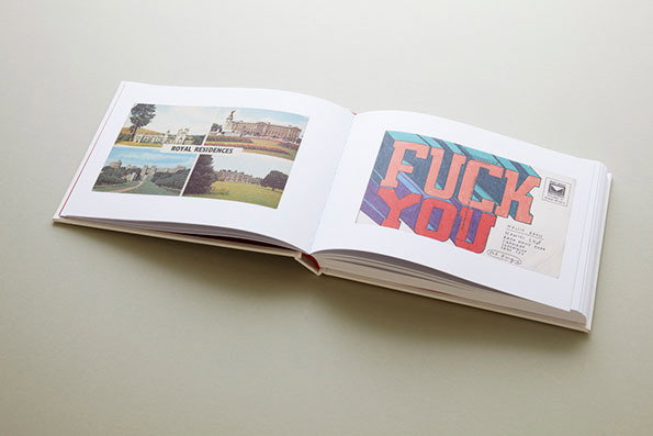
Mr Bingo: Hate Mail
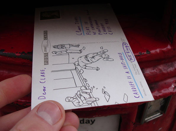
Mr Bingo: Hate Mail
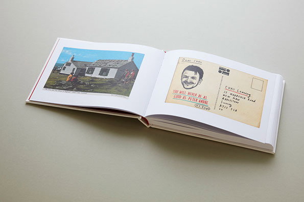
Mr Bingo: Hate Mail
It’s a well-known fact that Mr Bingo is a rude little sh*t, but we can’t help but love him for it. This year, however, he took his obnoxiousness to stratospheric new heights with his Hate Mail project, a campaign of postal abuse that saw hundreds of people up and down the country paying hard cash to be insulted by mail. Penguin picked up on it, made it into a book, and the rest is history. Perfect reading for your downstairs toilet.
www.itsnicethat.com/articles/mr-bingo-hate-mail-1
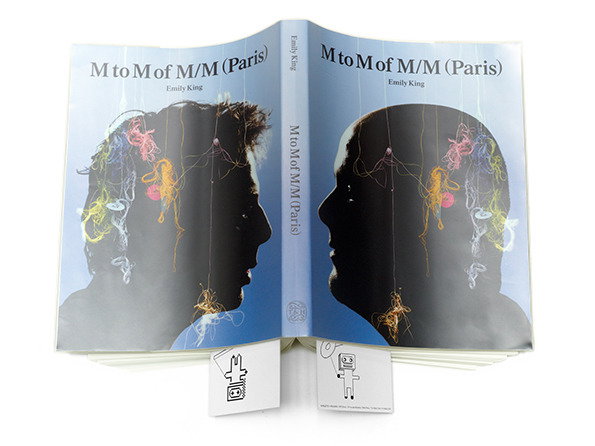
Emily King: M to M of M/M Paris
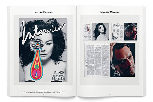
Emily King: M to M of M/M Paris
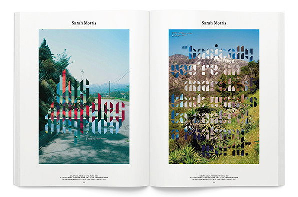
Emily King: M to M of M/M Paris
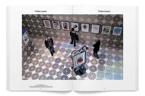
Emily King: M to M of M/M Paris
Emily King’s biopic of legendary French studio M/M Paris is a monolithic volume of exquisite design. It explores M/M’s story in depth, from early days as cocky young upstarts to latter years as the most influential and pioneering faces in French graphic design. For sheer volume and scale this is one book we just couldn’t ignore this year. It’s SOOOO impressive.
www.itsnicethat.com/articles/emily-king-m-to-m-m-slash-m
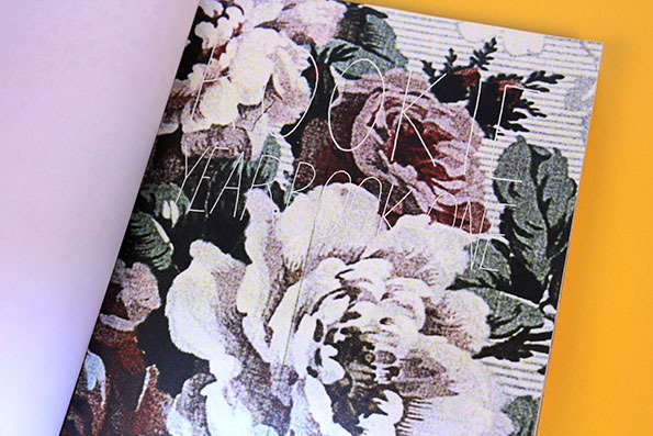
Tavi Gevinson: The Rookie Yearbook 2012
Tavi Gevinson: The Rookie Yearbook 2012
Tavi Gevinson: The Rookie Yearbook 2012
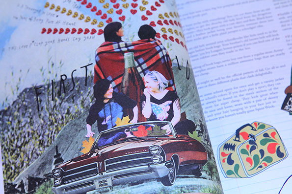
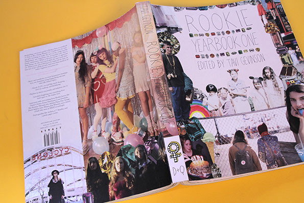
We love Tavi Gevinson. She’s one of the brightest, most articulate people we’ve ever come across and she’s still about 10 years younger than anyone else we know. We also have a lot of love for Rookie, a magazine that makes J17 (does J17 even exist anymore?) and Teen Vogue look like a pile of rubbish compiled by a confused mum desperately trying to placate their teenage daughter. Take note confused mums, Rookie is the magazine your daughter has been waiting for, and The Rookie Yearbook is the only yearbook they’ll ever need to read.
www.itsnicethat.com/articles/we-interview-some-of-the-brains-behind-the-sqeal-worthy-rookie-yearbook
Jonny Ryan and Frederic Fleury: War and Penis
Jonny Ryan and Frederic Fleury: War and Penis
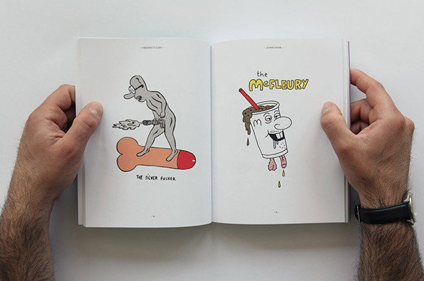
Jonny Ryan and Frederic Fleury: War and Penis
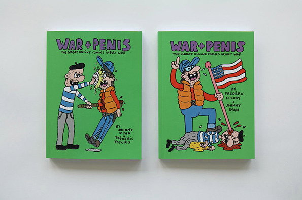
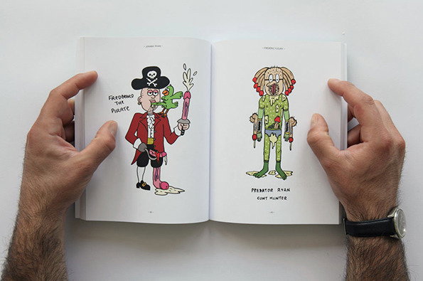
Jonny Ryan and Frederic Fleury’s War and Penis started as a selection of illustrated insults shared between friends. It never really progressed beyond that, until it found a publisher and worldwide distribution. Even so, it’s still just a bunch of crude knob drawings and surreal sex scenes, but we confess it’s had us in stitches on more occasions than we’d really like to admit. Hooray for smut!
www.itsnicethat.com/articles/jonny-ryan-frederic-fleury-war-and-penis
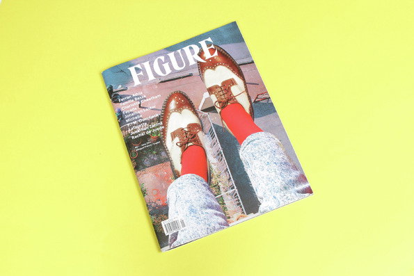
Figure Magazine: Issue One
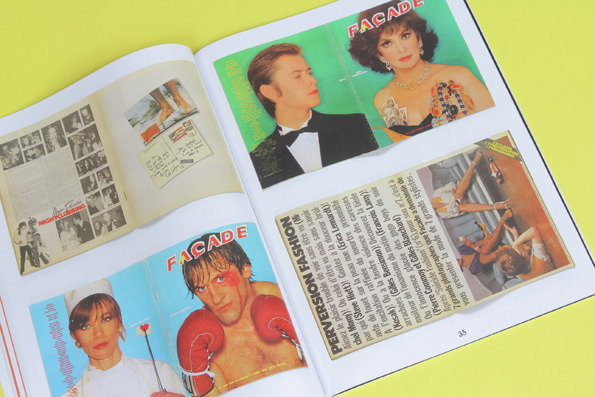
Figure Magazine: Issue One
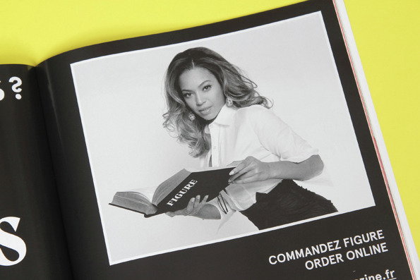
Figure Magazine: Issue One
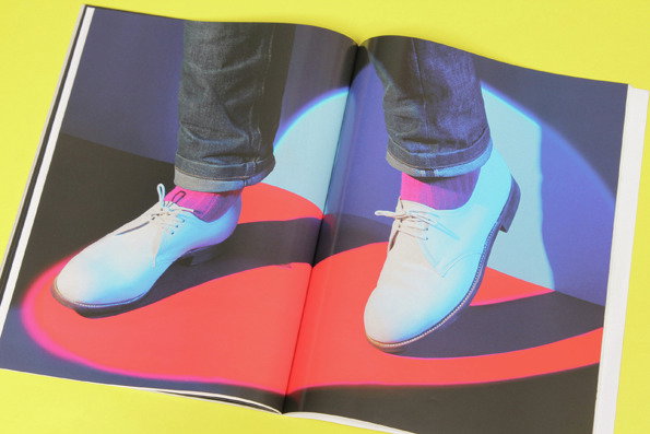
Figure Magazine: Issue One
Figure magazine had probably the best cover image of any magazine we saw this year; a stylish pair of two-tone brogues hanging from a balcony. It was also written in both English and French. For those two reasons it makes it onto this list. Oh, and the content was great. But look at those brogues!
www.itsnicethat.com/articles/figure-magazine

Brighten the Corners and Anish Kapoor: Zumtobel Annual Report

Brighten the Corners and Anish Kapoor: Zumtobel Annual Report

Brighten the Corners and Anish Kapoor: Zumtobel Annual Report

Brighten the Corners and Anish Kapoor: Zumtobel Annual Report
Designed in collaboration with Anish Kapoor, Brighten the Corners’ annual report for lighting giant Zumtobel became the benchmark by which all future annual reports will be judged. Comprised of two books – one a beautifully designed breakdown of the company’s vital statistics, the other a visual treat of complex lithographic printing that uses colour in ways we never thought possible – this is one of the most ambitious print projects we’ve seen in our whole lives, let alone this year.
www.itsnicethat.com/articles/brighten-the-corners-annual-report
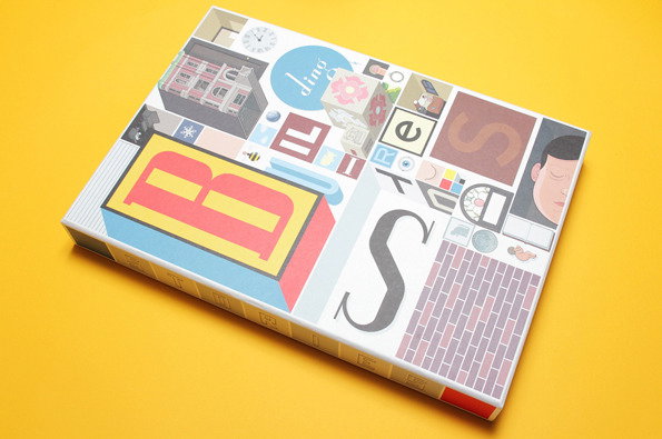
Chris Ware: Building Stories
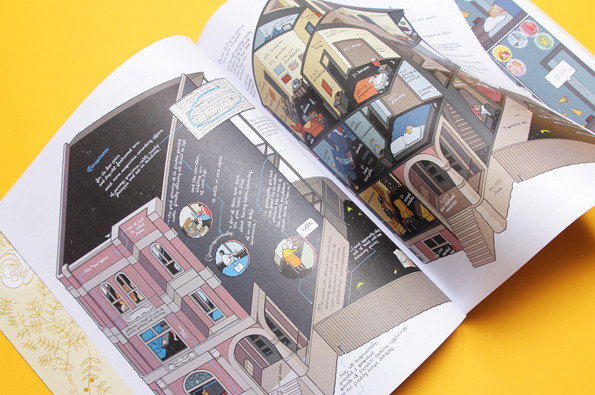
Chris Ware: Building Stories
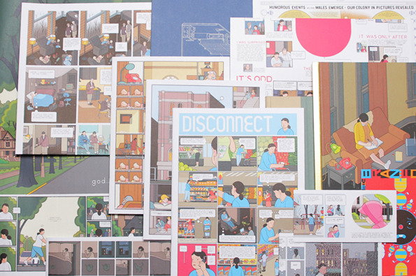
Chris Ware: Building Stories
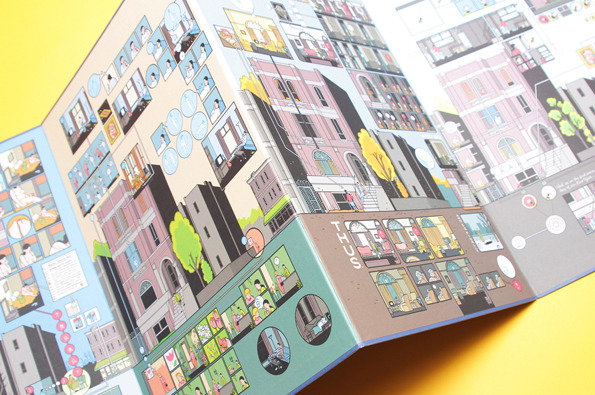
Chris Ware: Building Stories
Chris Ware has made me feel insignificant and worthless for as long as I’ve known about his work. The cartooning legend is arguably the greatest draughtsman alive and has single-handedly changed the way people look at and appreciate comics – and he doesn’t even like his own work. As a budding illustration student Ware’s talent intimidated me more than any other and with the release of Building Stories, a magnum opus that’s taken him ten years of hard graft, he instantly confirmed his status as the greatest comic book artist alive. Will anything ever top this remarkable book? Maybe, one day. But I’ll probably be dead by then so it won’t bother me in the slightest.
www.itsnicethat.com/articles/chris-ware-building-stories
Share Article
Further Info
About the Author
—
James started out as an intern in 2011 and came back in summer of 2012 to work online and latterly as Print Editor, before leaving in May 2015.