Launch Recite Me assistive technology
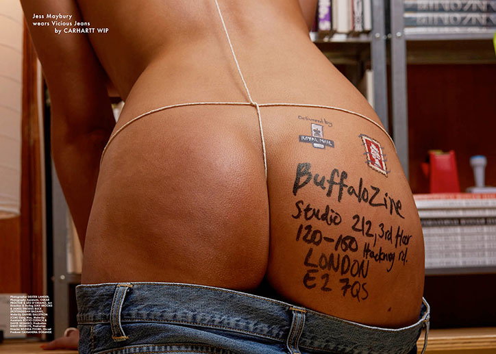
A person is photographed from behind, wearing blue jeans pulled down to reveal their buttocks. Their skin is marked with a handwritten address for “BuffaloZine” in London, complete with a “Royal Mail” stamp and a postage sticker.

The fifth issue of Buffalo zine welcomes you inside the magazine’s Hackney Road office (some NSFW)

—
Date
4 May 2017

In a world filled with angst and uncertainty, the ever-evolving Buffalo zine represents a glistening chameleon of possibility. Trends go one way and Buffalo marches resolutely off in the opposite direction. It’s a formula that works: five issues in and we’re still hooked. So when the Buffalo team started posting the covers of their new issue — featuring Pamela Anderson shot by Reto Schmid, Charles Jeffrey and Andrew Logan by Brett Lloyd, Lennon Gallagher by Tom Johnson and “models” by Adrián González-Cohen, all shot directly outside Buffalo’s Hackney Road office — on Instagram, we got straight in line to find out more from the magazine’s editors Adrián González-Cohen and David Urquiza.

The entire fifth issue of Buffalo zine was shot in and around your office on Hackney Road. Tell us why.

Adrian: With Buffalo we’ve always been very homemade style, low key, doing the magazine with the things we had around, photocopy machines bought second hand, cutting and pasting, stalking artists by e-mail… We wanted to go back to basics with this issue. Also we were very inspired by our building, doing an issue about the place we were today, instead of leaving an imaginary projection, specially influenced by the social networks. The inspiration came from the Wikipedia entry about the sentence ‘Buffalo buffalo buffalo buffalo buffalo buffalo buffalo buffalo’. Apparently its the longest grammatically correct sentence you can make using only one word. We wanted to do an issue very about being, not projecting. Its quite out of trend, which is something that really relaxes us. We’re quite proud we got something pretty honest. The teams really embraced being part of a place, giving their vision about it, in a genuine way.

David: Our AW16 issue was the first one we published with our new biannual calendar schedule in mind. After the launch of that issue in October, suddenly it was almost the end of the year and we were running out of time to make a decision on the them of the SS17 issue. We were pondering over different ideas, and we kind of wanted to do something easy and without too much sweat. Also doing an issue were the focus was somehow on ourselves and the place were we work. About our office/building, where we spend more time than in our homes, was a bit unexpected, like venturing in a direction where we hadn’t gone before. We liked that. And it happens to be a pretty whimsical place that never ceases to surprise friends and contributors that come to visit us. We had an eureka moment thinking that making the whole issue without leaving our building would be easy and uncomplicated… Nonsense! It’s been the most difficult issue ever.

Between Pamela Anderson, Judy Blame, Hans Ulrich Obrist and David Bailey it’s a pretty packed-out issue. Which feature that excites you most?

Adrian: I personally love the David Bailey interview by our deputy editor Liam Hess. Its so joyful that almost feels fictional. I’m quite pissed off he finally decided not to pose for one of the covers though – but if Bailey says no, its NO.

David: Meeting David Bailey when he came around for his interview was quite an encounter. He’s walking contradiction. He’s a gentleman but definitely not an easy one to deal with – he’s cocky but charming. He doesn’t give a fuck about anything but he cares about people. I think the interview in the issue is great and after that I started to see his work in a new light. He really is a walking piece of history.

Buffalo Zine is known for constantly reinventing itself with every issue. What are the design innovations for issue six?

Adrian: We treated many images and texts in a quite crazy process of scanning and photocopying and scanning again. To get a faded, used, repeated feeling about it. Its not neat at all. Its quite dirty, but also we tried to do something simple.

David: This is an XL format issue (A3 size). Photography looks really epic at that scale and the larger page size allows for a more “relaxed” and uncrowded layout than previous issues. And as you’ll see, we also wanted this issue to have a shabby and dusty look, like the building itself.

Back to the issue’s theme: what is the best thing about working in the East End? And the worst?

Adrian: The best is we live close to our places, and is quite good for meetings with contributors since most of them hang around and have their studios here. Can’t think of anything bad, actually. Of course that is expensive, like London is in general.

David: Best: I guess it’s the habitat of some exciting human fauna. Worst: The housing situation.

By keeping your focus firmly fixed on Buffalo’s immediate surroundings for this issue, what have you learned?

Adrian: Hosting is exhausting. Better to dine outside.

What does the future look like for Buffalo Zine?

Adrian: We just started working on the next issue and its going to be really cool. Very different, as usual.

David: I wanna say it looks like sex on the beach (the cocktail) on a warm summer evening but the reality is it looks very busy!
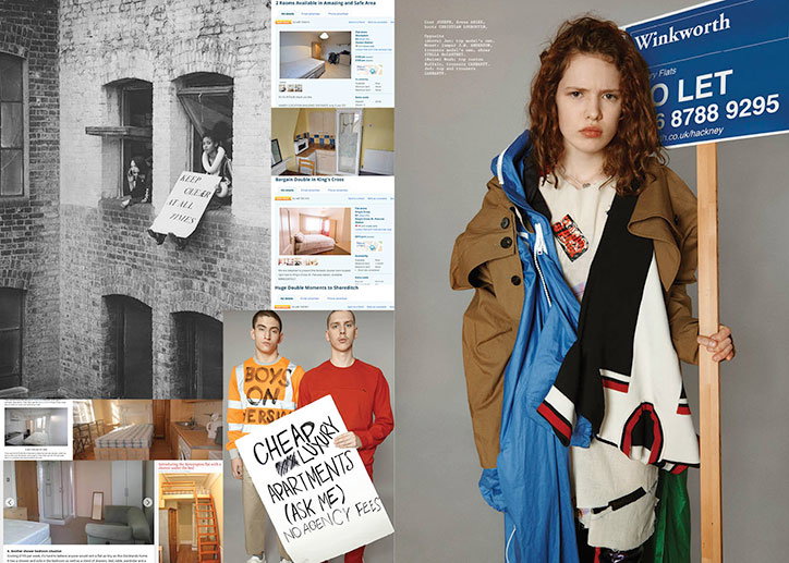
A collage featuring a person in oversized, layered clothing standing next to a blue “Winkworth” estate agent sign that reads “TO LET”. To the left, a series of images show a brick building with a sign saying “KEEP CLEAR AT ALL TIMES” and screenshots of online rental listings. Two people stand together holding a handmade sign that reads “CHEAP LUXURY APARTMENTS (ASK ME) NO AGENCY FEES”.
Above

Buffalo Zine

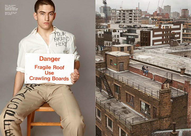
A person sits on a wooden stool, holding a white sign that reads “Danger Fragile Roof Use Crawling Boards”. They wear a white shirt with “YOUR BRAND HERE” written on the chest and trousers with black lettering. Beside this, a wide shot shows two people sitting on a flat, grey rooftop overlooking a city skyline.
Above

Buffalo Zine

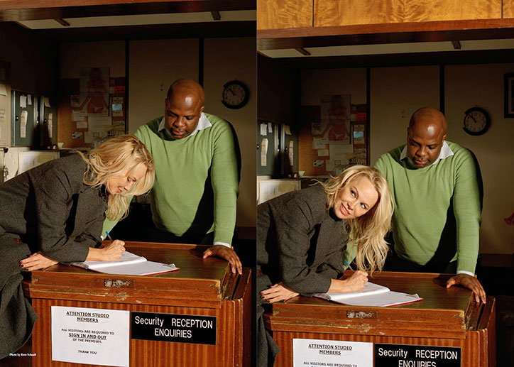
Two people stand at a wooden reception desk in a dimly lit office. A person in a grey blazer leans over to sign a guest book while another person in a green jumper looks on. A sign on the desk reads “Security Reception Enquiries” and “Attention Studio Members”.
Above

Buffalo Zine

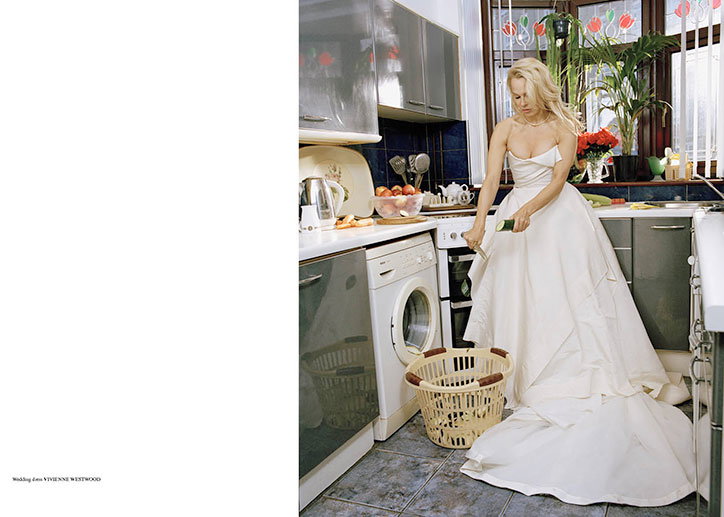
A person in a voluminous white wedding dress stands in a domestic kitchen. They hold a green cleaning cloth and wipe down a white countertop next to a washing machine and a laundry basket.
Above

Buffalo Zine

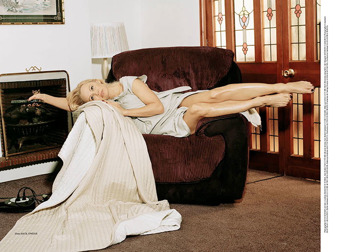
A person in a white dress reclines across a large, brown corduroy armchair. They are draped in a quilted white blanket that spills onto the carpeted floor.
Above

Buffalo Zine

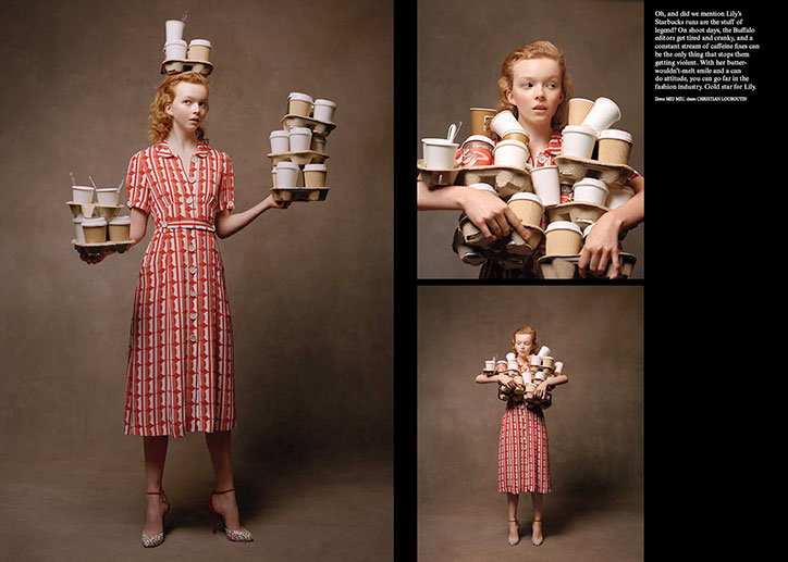
A person in a red and white checked dress balances stacks of coffee cups on their head, arms and hands. A column of text to the right describes the scene as a “gold star for Lily”.
Above

Buffalo Zine

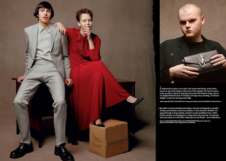
Two people pose together in a studio. One wears a light grey suit and black shoes, while the other wears a long red dress and black flats, resting a foot on a cardboard box. To the right, a second image shows a person in a black jacket holding a black leather wallet with a gold anchor emblem. Text below describes the people and the vintage clothing they are wearing.
Above

Buffalo Zine

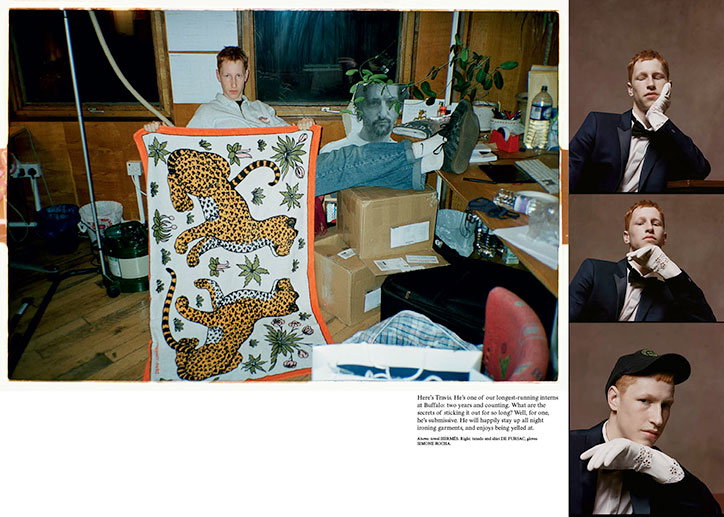
A magazine spread featuring a series of photos of a person with red hair. On the left, they hold up a white fabric panel featuring two illustrated leopards. To the right, three smaller portraits show them in a dark suit and a black cap.
Above

Buffalo Zine

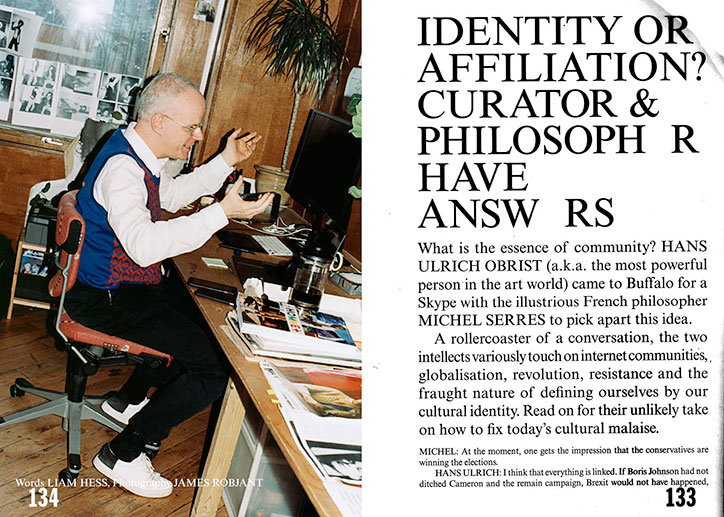
A person sits at a wooden desk in a cluttered office, gesturing with their hands while looking at a computer screen. To the right, a magazine spread features a bold headline that reads “IDENTITY OR AFFILIATION? CURATOR & PHILOSOPH R HAVE ANSW RS”.
Above

Buffalo Zine

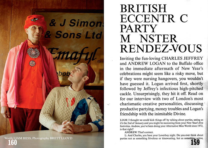
Two people pose in front of a shop window for “& J Simon & Sons Ltd”. One wears a bright red outfit with a matching hat and a long pink scarf, while the other wears a patterned cream jumper and a red beanie. To the right, a magazine spread features the headline “BRITISH ECCENTRIC PARTY MONSTER RENDEZ-VOUS” above an interview.
Above

Buffalo Zine

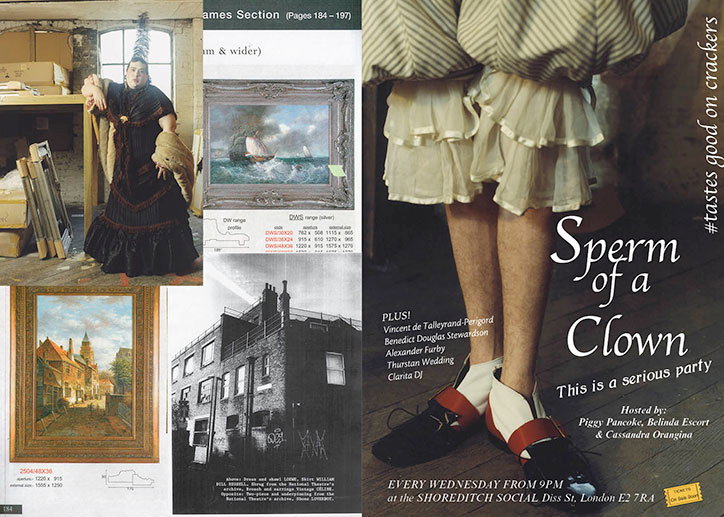
A collage of images and text promoting an event titled “Sperm of a Clown”. The layout includes a person in a theatrical costume, two paintings, and a black and white photo of a building. The right side features a close-up of a person's legs in ruffled white bloomers and black shoes with red accents. Text reads “Sperm of a Clown” and “This is a serious party”, listing hosts and the venue, Shoreditch Social.
Above

Buffalo Zine

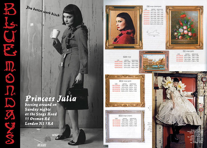
A black and white photograph of a person dressed as a stern office worker, holding a coffee cup and a briefcase. Text beside them reads “Princess Julia bossing around on Sunday nights at the Stage Head”. The right side of the page shows a product catalogue for picture frames, featuring various artworks and a person in a voluminous white dress.
Above

Buffalo Zine

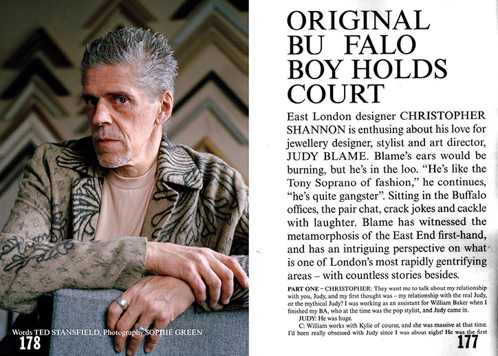
A portrait of Judy Blame wearing a patterned jacket, looking thoughtfully to the side. Beside the image, a magazine article begins with the headline “Original Buffalo Boy Holds Court”.
Above

Buffalo Zine

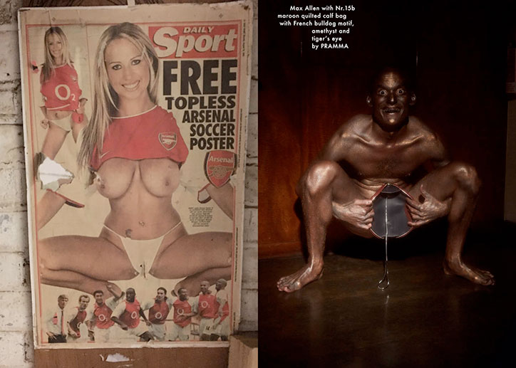
A diptych showing two images. On the left, a vintage “Daily Sport” magazine cover features a person in a red Arsenal shirt and white underwear, with the headline “FREE TOPLESS ARSENAL SOCCER POSTER”. On the right, a person with metallic bronze skin sits in a similar pose, holding a small handbag between their legs.
Above

Buffalo Zine

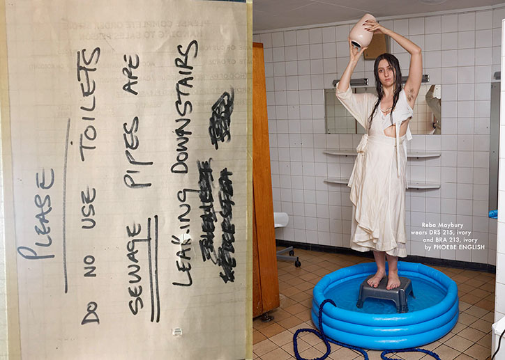
A diptych showing a handwritten sign and a person in a bathroom. The sign reads “Please do no use toilets sewage pipes are leaking downstairs”. Beside it, a person in a long ivory dress stands on a small step stool inside a blue inflatable pool, holding a ceramic vase above their head.
Above

Buffalo Zine

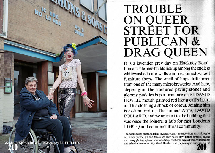
A person in a wheelchair and a drag queen stand together outside a brick building. The drag queen wears a sequined skirt, a graphic T-shirt and bright blue hair. To the right, a magazine article begins with the headline “Trouble on Queer Street for Publican & Drag Queen”.
Above

Buffalo Zine

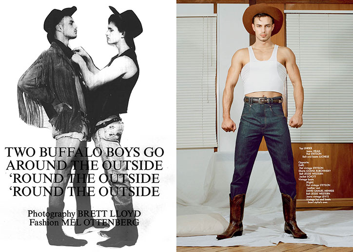
Two images side by side. On the left, a black and white photo shows two people in cowboy hats and western wear, facing each other. Text below reads “TWO BUFFALO BOYS GO AROUND THE OUTSIDE” followed by the phrase “ROUND THE OUTSIDE” repeated twice. On the right, a person stands in a white crop top, dark blue jeans and brown cowboy boots. They wear a wide-brimmed brown hat and stand against a backdrop of white blinds and wood panelling.
Above

Buffalo Zine

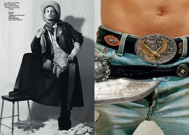
A black and white photo of a person dressed in a stylised cowboy outfit, wearing a wide-brimmed hat and a long coat. They lean against a stool in a studio setting. Beside this is a close-up of a person wearing light blue jeans and a black leather belt with a large, ornate gold eagle buckle.
Above

Buffalo Zine

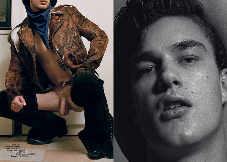
A diptych featuring two images of a person. On the left, they crouch wearing a brown leather jacket, a blue neck scarf, and black thigh-high boots. On the right, a black and white close-up portrait shows them looking directly at the camera.
Above

Buffalo Zine

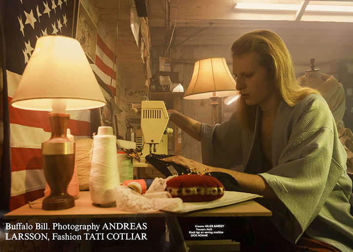
A person wearing a light blue kimono uses a sewing machine at a wooden desk. A lamp and spools of thread sit beside them, with a US flag hanging in the background.
Above

Buffalo Zine

Share Article

About the Author

Bryony Stone

—

Bryony joined It's Nice That as Deputy Editor in August 2016, following roles at Mother, Secret Cinema, LAW, Rollacoaster and Wonderland. She later became Acting Editor at It's Nice That, before leaving in late 2018.
It's Nice That Newsletters

Fancy a bit of It's Nice That in your inbox? Sign up to our newsletters and we'll keep you in the loop with everything good going on in the creative world.