Launch Recite Me assistive technology
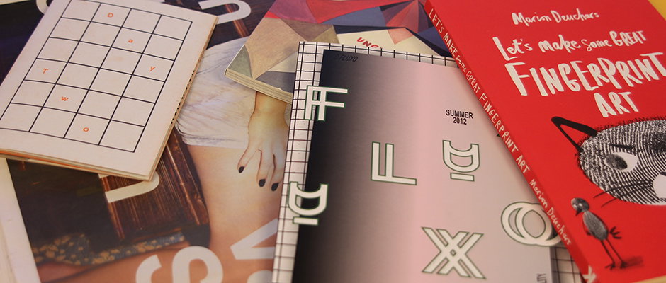
A collection of art books and notebooks are scattered across a surface. A red book on the right reads “Let’s make some great FINGERPRINT ART”, featuring an illustration of a cat and a bird.

Things takes centre stage once again with zines, magazines graphics and finger printing

—
Date
15 September 2012

It’s Saturday, it’s the weekend and that can mean only one more thing – form an orderly queue ladies and gentlemen because Things is here and this week it is looking as glorious as ever! With zines, magazines, graphic design and finger printing we really are treating you…
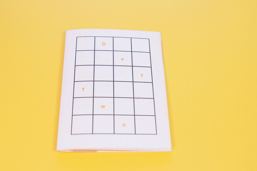
A small white booklet lies open on a bright yellow background. A grid on the page contains the letters “D”, “a”, “y” and “T”, “w”, “o” scattered across the cells.
Above

Thomas Coombes & Tessa Edmondson: Dayzine Day Two
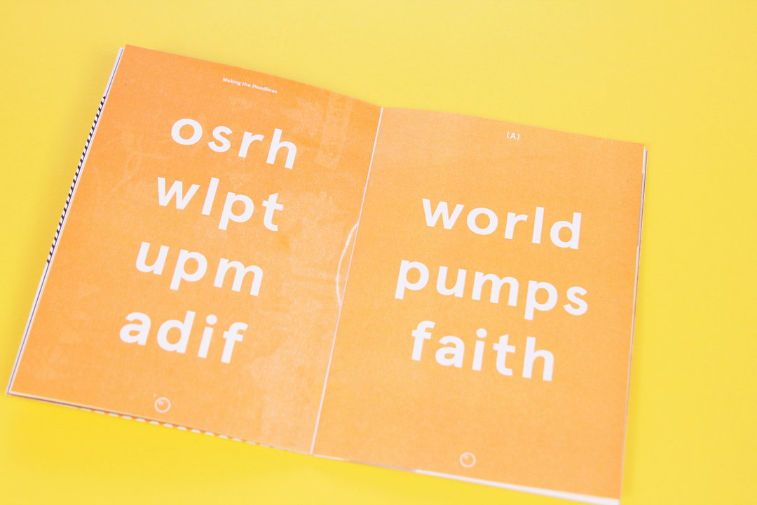
An open orange booklet laid against a yellow background. The left page shows four lines of jumbled white letters, while the right page reads “world pumps faith”.
Above

Thomas Coombes & Tessa Edmondson: Dayzine Day Two

An open book laid flat against a yellow background. The left page features a black and white photograph of a person standing with arms crossed, while the right page shows a textured image overlaid with a block of text titled “Consider Your Mood”.
Above

Thomas Coombes & Tessa Edmondson: Dayzine Day Two

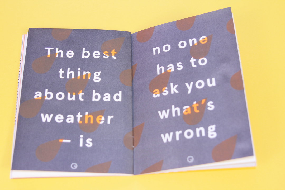
An open book with a purple background and brown leaf patterns. The white text reads “The best thing about bad weather – is no one has to ask you what’s wrong”.
Above

Thomas Coombes & Tessa Edmondson: Dayzine Day Two

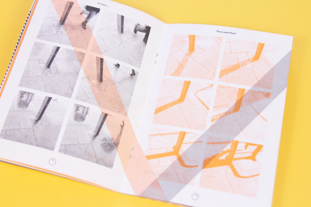
An open book on a yellow background shows two pages of photographic grids. The left page is titled “A story...” and the right “The Lamp Post”, with both pages overlaid by a translucent, diagonal strip of red and grey.
Above

Thomas Coombes & Tessa Edmondson: Dayzine Day Two

Thomas Coombes & Tessa Edmondson: Dayzine Day Two
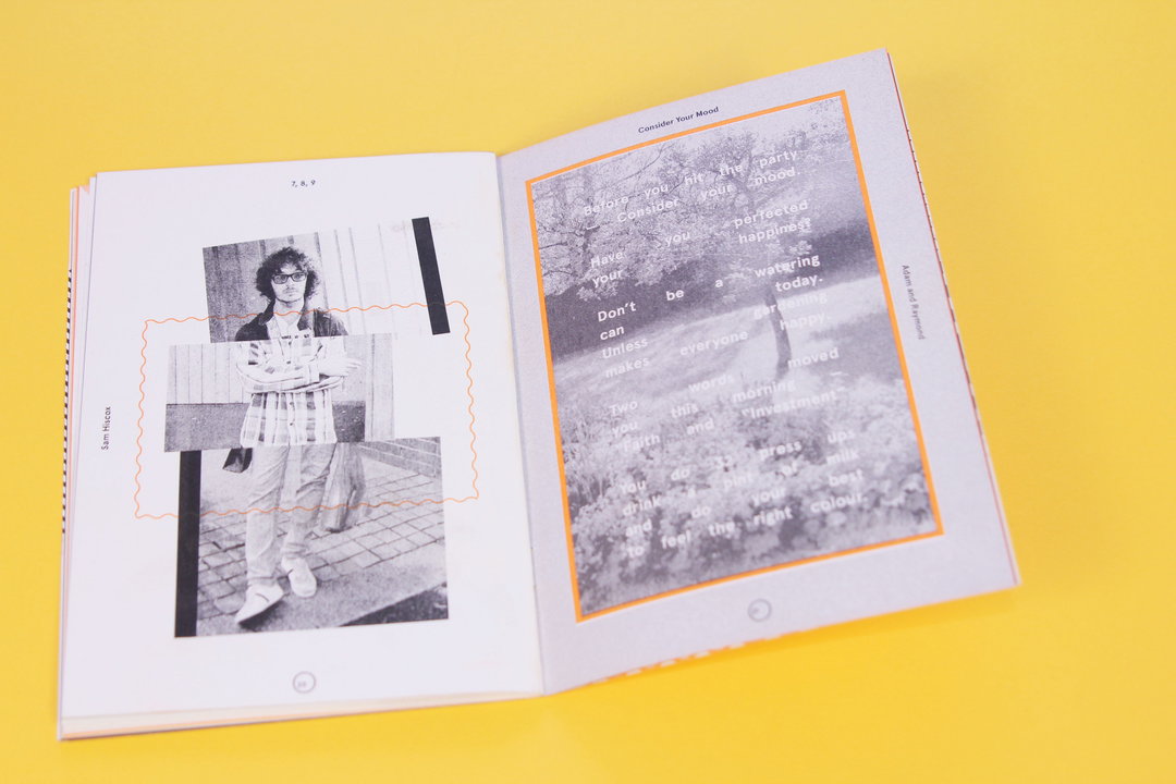
Aren’t zines just great? Miniature books of goodness, lovingly made in truly creative and original ways – what’s not to like? So when this wonderfully handsome zine came through our door this week we went all a bit weak at the knees. But while the luminous graphics hidden inside are enough to make it truly fantastic in its own right, it is the concept behind the zine that makes it not just brilliant but REALLY brilliant. With each issue being the collaborative result of a whole host of talented creatives coming together over a one day workshop, each zine is naturally inspired by the events surrounding the 24 hours in which the collaborators meet. Fantastic!
www.dayzine.co.uk
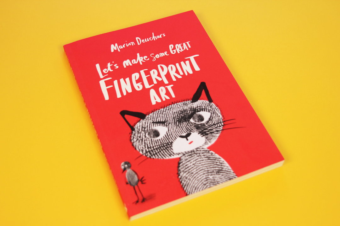
A red book cover titled “Let’s make some GREAT FINGERPRINT ART” by Marion Deuchars. The cover features an illustration of a cat and a small bird created from black and white fingerprints.
Above

Marion Deuchars: Let’s Make Some great Fingerprint Art
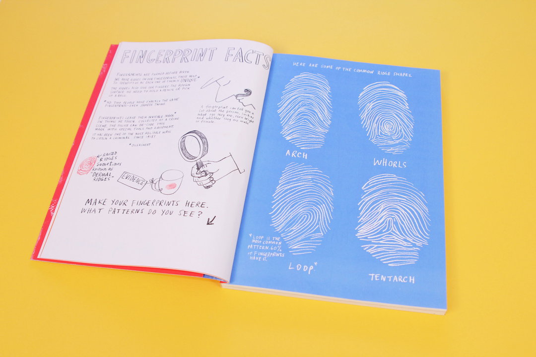
An open book on a yellow background. The left page, titled “Fingerprint Facts”, contains handwritten notes and a small illustration of a hand holding a magnifying glass over a fingerprint. The right blue page shows four white diagrams of fingerprint patterns labelled “Arch”, “Whorls”, “Loop” and “Tentarch”.
Above

Marion Deuchars: Let’s Make Some great Fingerprint Art

An open book with bright red pages on a yellow background. One page features a white sugar skull illustration decorated with colourful fingerprints, while the opposite page shows a white mask with simple red details.
Above

Marion Deuchars: Let’s Make Some great Fingerprint Art

Marion Deuchars: Let’s Make Some great Fingerprint Art
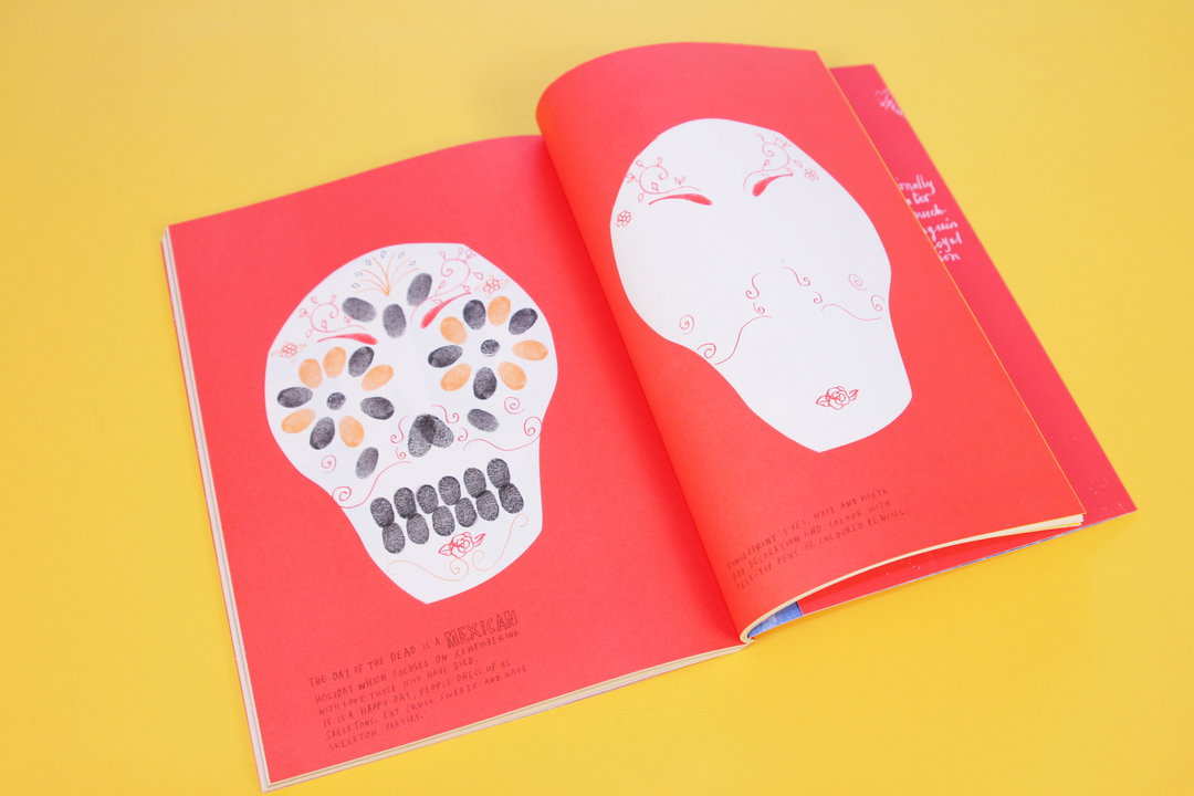
This book is pretty great in the fact that it pretty much does exactly what it says on the tin. Out with paintbrushes and in with finger tips, the book guides you through making some GREAT fingerprint art through pages upon pages of beautifully drawn illustrations. I’m not quite sure if the book it directed at children or at adults but I know for one, my fingertips shall be doing plenty of creative things this weekend. This is a fine follow-up to Marion’s previous book so she’s charmed us twice in book form now.
www.mariondeuchars.com
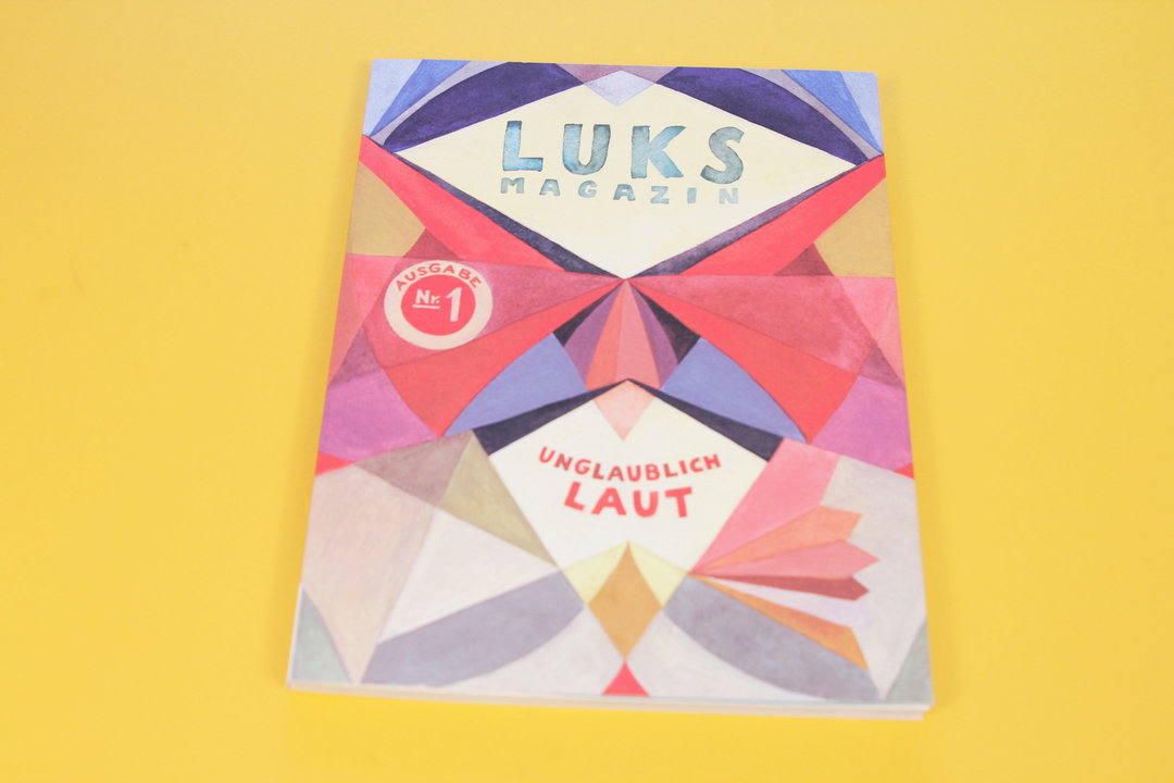
The cover of Luks Magazin features a symmetrical, geometric composition of colourful shapes in red, blue and purple. The title “LUKS MAGAZIN” sits at the top, with a red circular badge reading “AUSGABE Nr. 1” and the phrase “UNGLAUBLICH LAUT” below.
Above

HAW-Hamburg students: Luks Magazine – Unglaublich Laut
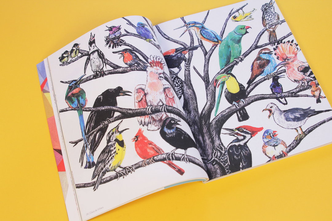
An open book displays a detailed illustration of various colourful birds perched in a network of black sketched branches. The birds are rendered in a vibrant, painterly style against a plain white background.
Above

HAW-Hamburg students: Luks Magazine – Unglaublich Laut

An open children's book featuring pencil illustrations and handwritten German text. One page shows a swirling grey pattern around a white circle, while the opposite page depicts a birdhouse.
Above

HAW-Hamburg students: Luks Magazine – Unglaublich Laut

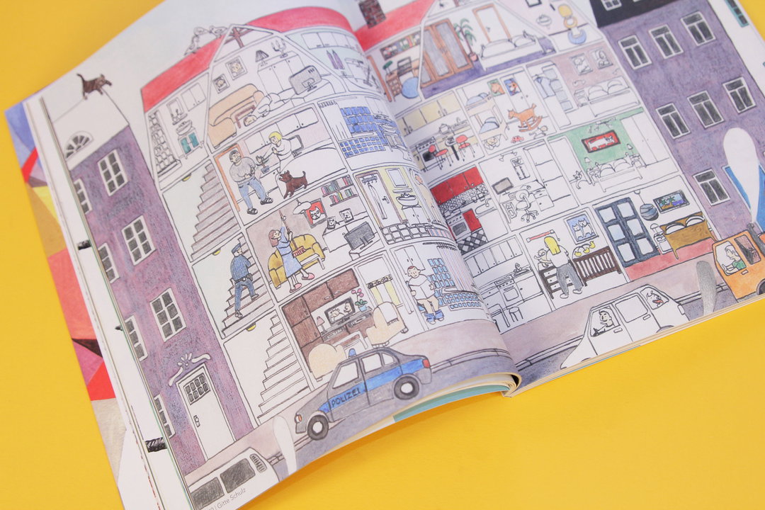
An illustration in an open book shows a cross-section of a multi-storey apartment building. Various people are seen in their rooms, while a blue police car parked outside reads “Polizei”.
Above

HAW-Hamburg students: Luks Magazine – Unglaublich Laut

HAW-Hamburg students: Luks Magazine – Unglaublich Laut
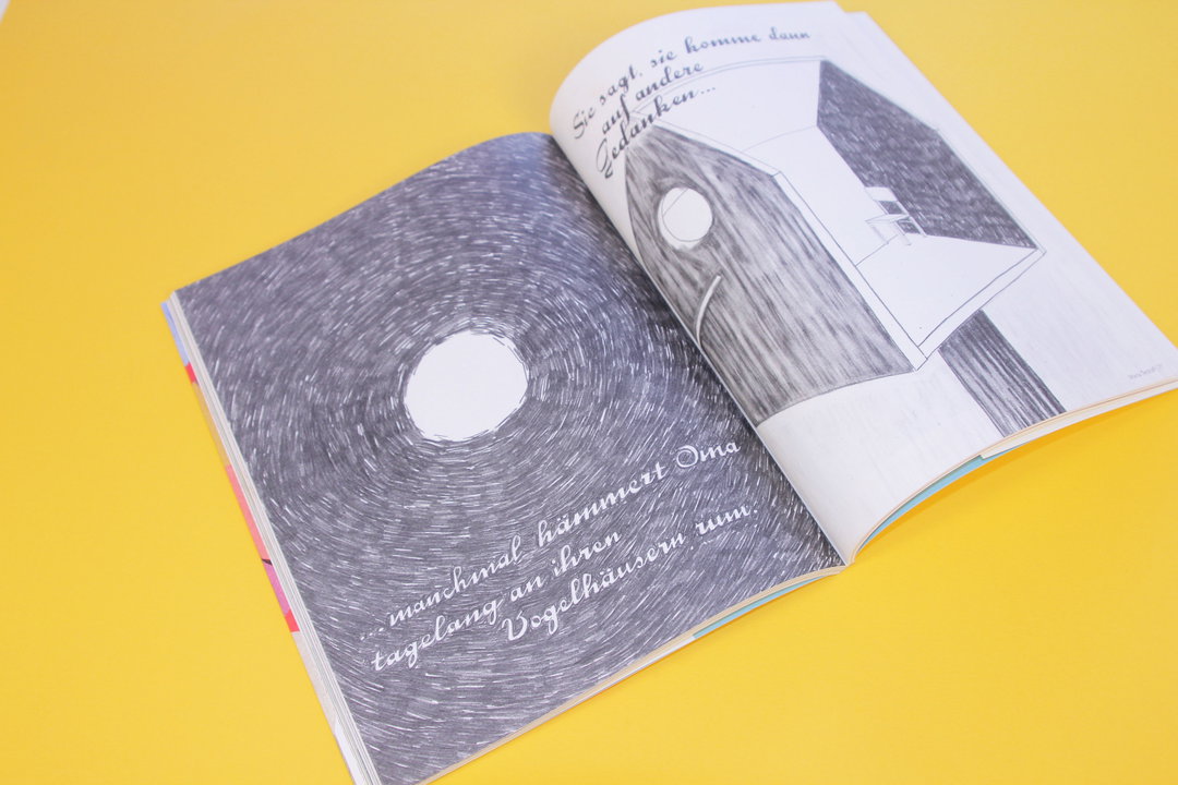
I’m not a German speaker by any stretch of the imagination so admittedly the first few pages of the German publication _Luks Magazine _had me all a bit baffled but skip the first few pages (or not if you are a German speaker or even just a dab hand at Google Translate…) and you’ll be dazzled with pages of illustrative delights. Produced and published by 10 German illustration students, the magazine is based around the title of “Unglaublich Laut” meaning incredibly loud and shows off quite what a talented bunch these students are.
www.luksmagazin.de
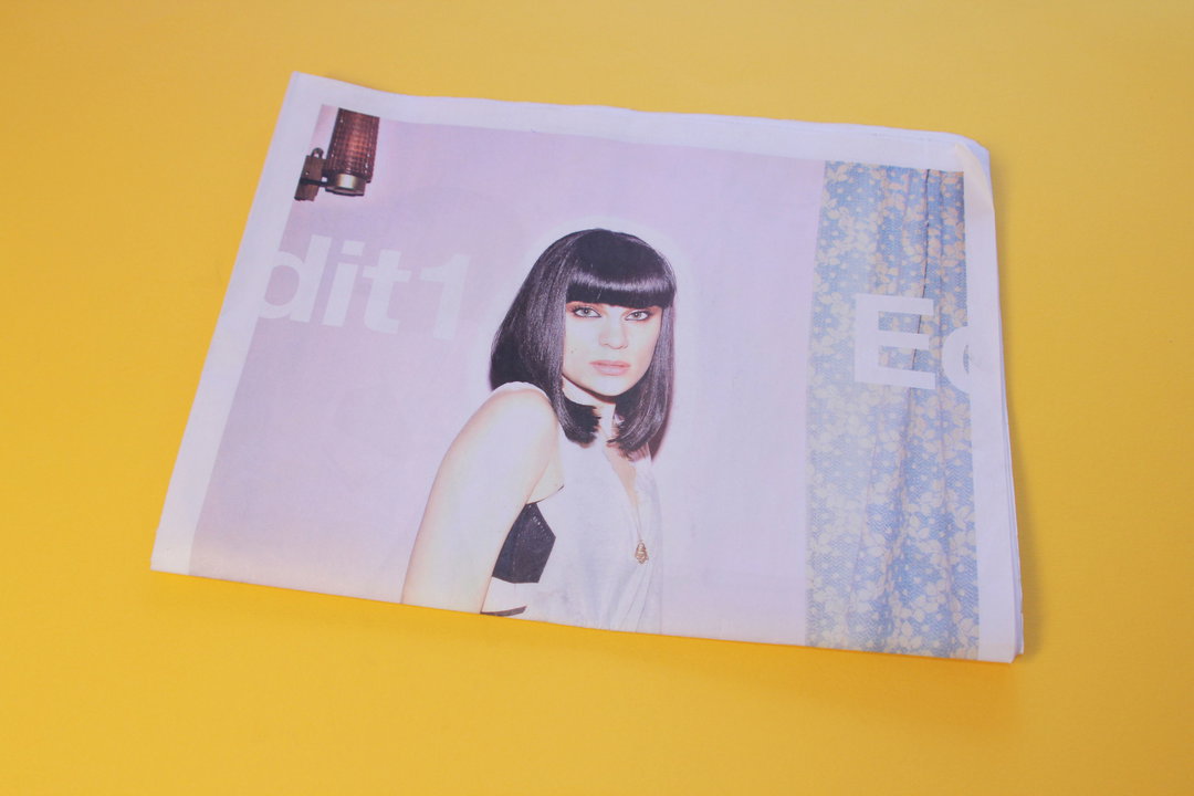
A person with a dark bob and blunt fringe looks at the camera. They are featured on a printed page laid against a bright yellow background.
Above

Tom van Schelven: Edit1

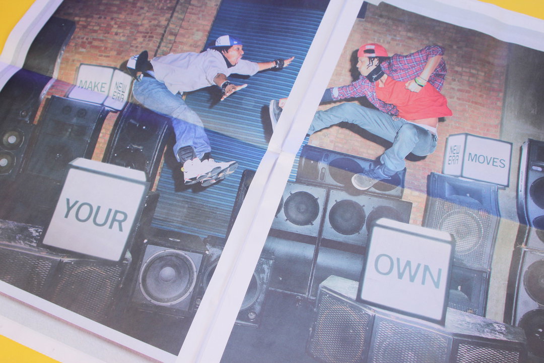
Two breakdancers perform in front of a wall of large black speakers. Between them, white blocks display the words “YOUR”, “OWN” and “MOVES”.
Above

Tom van Schelven: Edit1

A collection of printed photographs are taped to a white wall. The images include a person on a boat in a bright blue sea and a close-up of a person in a car at night.
Above

Tom van Schelven: Edit1

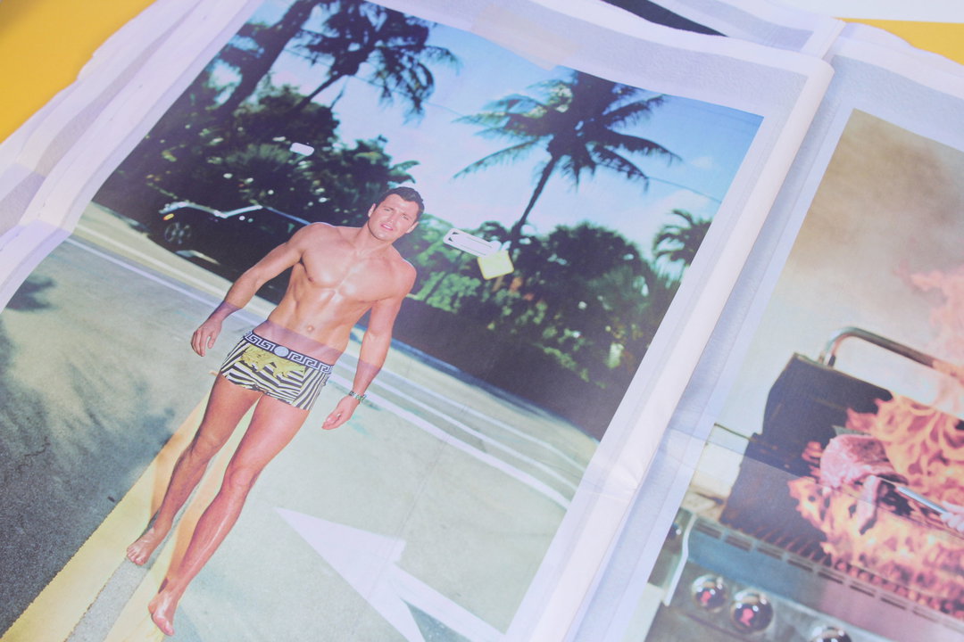
A shirtless person in striped swim shorts stands on a paved path. Palm trees and a blue sky form the background of the photograph, which is printed on a sheet of paper.
Above

Tom van Schelven: Edit1

Tom van Schelven: Edit1
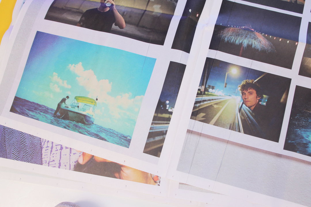
If you are a great photographer working with great success in fashion and advertising why ever would you not publish a collection of your favourite work over the last year in the form of a gigantic A2 sized newspaper?! Well Tom van Schelven couldn’t quite think of a reason not to and so that is exactly what he did, and featuring a pretty amazing selection of celebrities in all sorts of weird of wonderful places and poses, this one is a winner.
www.van-schelven.com
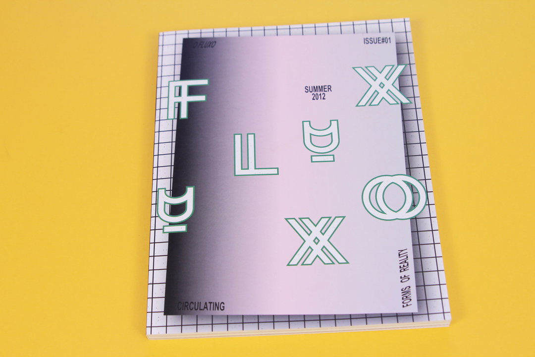
A magazine cover on a yellow background features a gradient from black to light purple. Stylised green letters spell “FLUXO” across the page, accompanied by the text “SUMMER 2012”, “ISSUE#01” and “FORMS OF REALITY”.
Above

André Moreira: O Fluxo

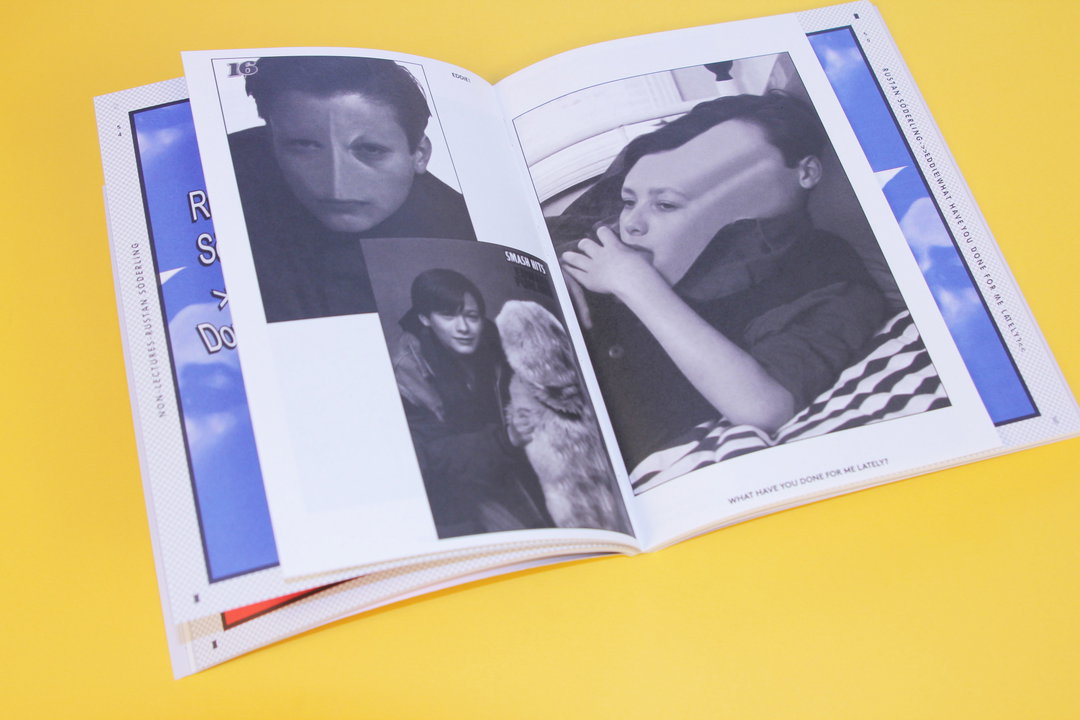
An open zine on a yellow background features black and white photographs of people. One page shows a close-up portrait and a person with a dog, while the opposite page shows a person resting their chin on their hand. Small text at the bottom reads “WHAT HAVE YOU DONE FOR ME LATELY?”.
Above

André Moreira: O Fluxo

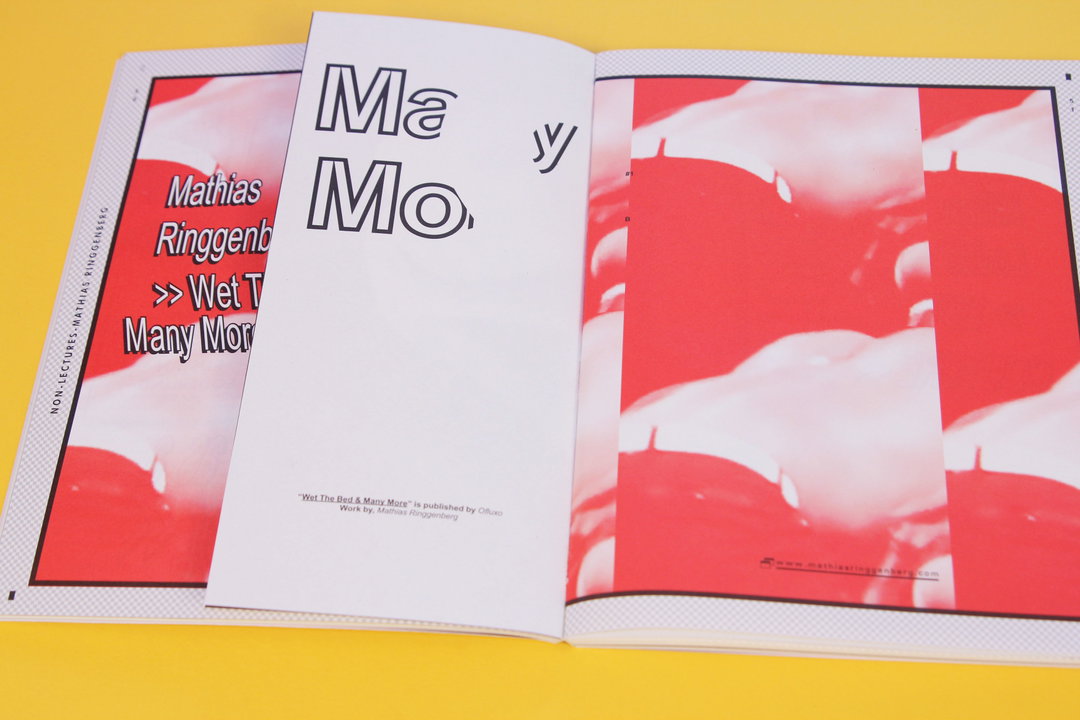
An open book displays a layout of red-tinted photographs and bold typography. The right page features a grid of abstract red images, while the left page reads “Mathias Ringgenberg” and “Wet The Bed & Many More”.
Above

André Moreira: O Fluxo

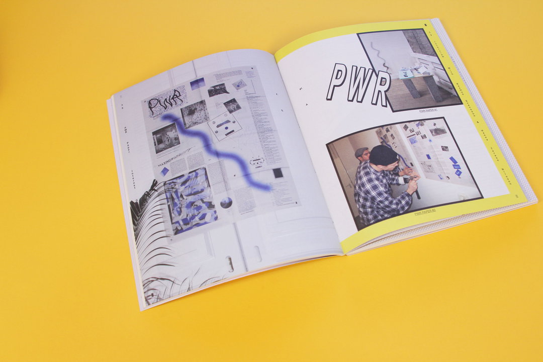
An open magazine lies on a bright yellow surface. The pages feature a layout of photographs, diagrams and the bold text “PWR”.
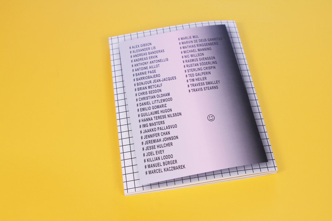
A small notebook with a grid-patterned cover lies on a yellow background. Two columns of names, each preceded by a hashtag, are printed in black on the front cover.
Above

André Moreira: O Fluxo

O Fluxo: Issue One

Limited editions are alway rather exciting so when a limited edition of new magazine O Fluxo came through our door we got a good, good feeling. The magazine is practically bursting with beautiful graphics and design and with the odd feature thrown in for good measure and we are big fans. Being a collaborative effort, the magazine explores, “the boundries of new media technology and how they are being inserted into reality as a way of expressing artistic or graphic statements”. But whilst that may seem to be a bit of a mouthful to get your head around, take one flick through the magazine and I assure you, the results are a dream!
www.ofluxo.net
Share Article

Further Info

About the Author

Anya Lawrence

—

It's Nice That Newsletters

Fancy a bit of It's Nice That in your inbox? Sign up to our newsletters and we'll keep you in the loop with everything good going on in the creative world.