Launch Recite Me assistive technology
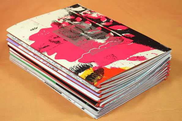
A stack of magazines rests on a plain orange surface. The top cover features a bold, abstract design in pink, black and white.

Lovely new publication from Under Consideration celebrates print perfection

—
Date
26 April 2013

If you too have an obsession with print that verges on the unhealthy, then chances are you’ll have come across Under Consideration’s network of sites. Across For Print Only, Brand New, Art of the Menu and Quipsologies the design studio/publishers run by Bryony Gomez-Palacio and Armin Vit share their passion for all things print. Now this online platform has taken the obvious but very welcome step of producing its own publication, UC.Quarterly, which presents a selection of some of the best bits of the blogs.

The work is presented with no explanatory text, just a link to the original article because the new title is intended “not as a comprehensive report but a heavily-packed, assorted collection of projects worth exploring on each own’s time.”

The hand-bound covers of the first issue are made using reclaimed makeready and test sheets from printers; a nice touch reflecting the tome’s raison d’être.

A close-up of a stack of magazines, showing the edges of the pages and red spines. The focus is sharp on the middle of the pile, with the top and bottom blurring.
Above

Under Consideration: UC. Quarterly Issue 1
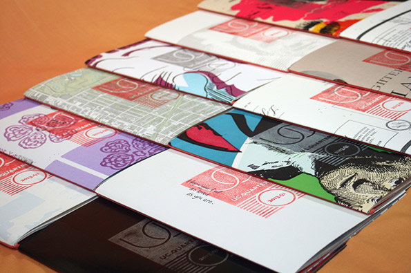
A row of magazines with varied cover designs is laid out on an orange surface. Each cover features a red circular logo containing the text “UC QUARTERLY”.
Above

Under Consideration: UC. Quarterly Issue 1
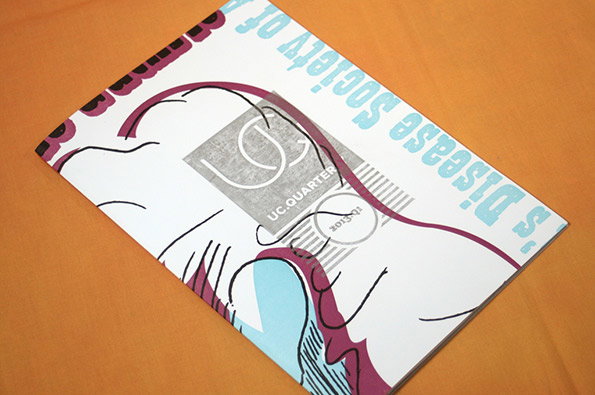
A magazine cover featuring a stylised line drawing of a face in profile. Blue typographic text reads “’s Disease Society of”, while a grey square contains the words “UC.QUARTER” and “2013-01”.
Above

Under Consideration: UC. Quarterly Issue 1
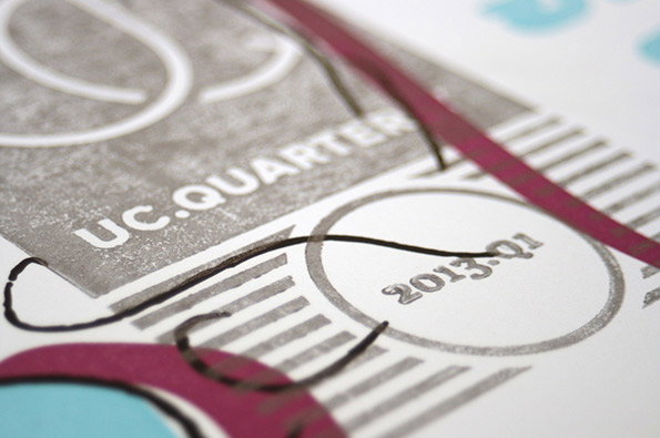
A close-up of a printed publication featuring grey and purple graphic elements. Legible text includes “UC.QUARTER” and “2013.Q1” inside a circle.
Above

Under Consideration: UC. Quarterly Issue 1
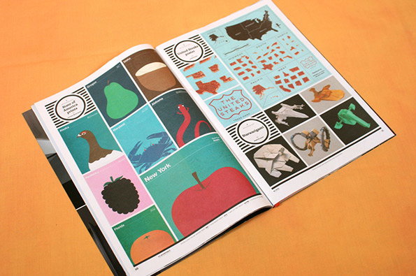
An open book displays a series of colourful illustrations. One page features a grid of fruit and animals paired with US state names, including a large red apple for “New York”. The opposite page shows a map of the US and a logo that reads “The United Steaks”.
Above

Under Consideration: UC. Quarterly Issue 1
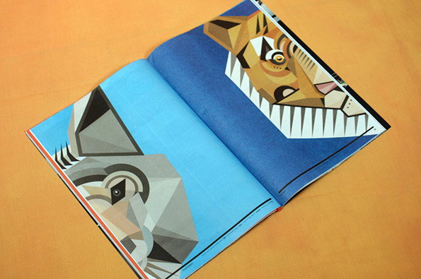
An open magazine shows two geometric illustrations of cats facing each other across the spread. One cat is rendered in shades of grey and white, while the other is orange and brown.
Above

Under Consideration: UC. Quarterly Issue 1
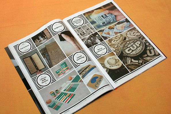
An open portfolio book displays a grid of graphic design projects on a bright orange surface. The pages feature various brand identities, including menus, business cards and a collection of circular “Mr Cup” logos.
Above

Under Consideration: UC. Quarterly Issue 1
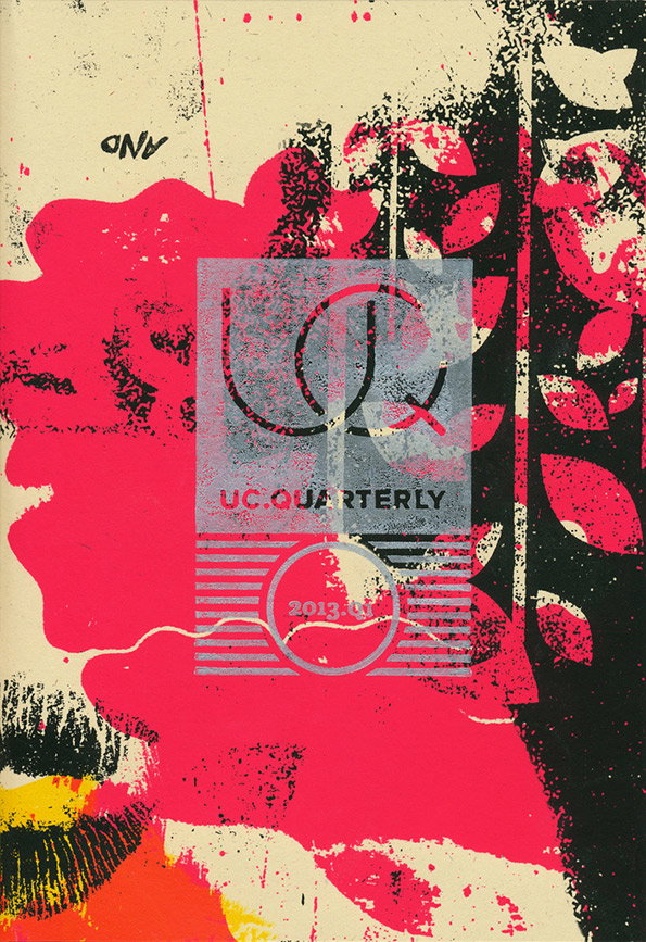
A collage-style cover for “UC Quarterly” featuring bold splashes of pink and black ink on a cream background. A semi-transparent grey rectangle in the centre contains the text “UC QUARTERLY” and the date “2013”.
Above

Under Consideration: UC. Quarterly Issue 1 Cover
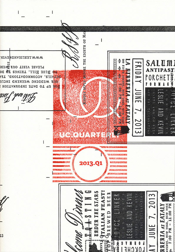
A collage of wedding stationery and menus featuring red and white graphic elements. Legible text includes “Friday June 7, 2013” and “La Birreria at Eataly”.
Above

Under Consideration: UC. Quarterly Issue 1 Cover
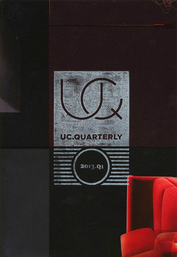
A magazine cover with a dark, moody background. A central white square features a stylised “UQ” logo and the text “UC.QUARTERLY”, with “2013.Q1” printed below. A bright red armchair is partially visible in the bottom right corner.
Above

Under Consideration: UC. Quarterly Issue 1 Cover
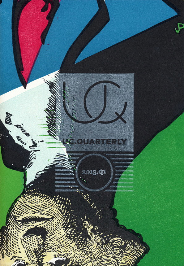
A collage featuring a stylised, etched portrait of a person at the bottom. A grey square is laid over the centre, containing a logo and the text “UC.QUARTERLY” and “2013.Q1”.
Above

Under Consideration: UC. Quarterly Issue 1 Cover
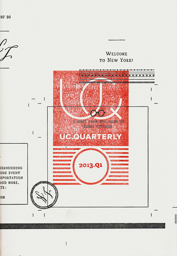
A graphic layout in red and black on a white background. Central text reads “UC.QUARTERLY” and “2013.Q1”, with a smaller note stating “A note from the desk of Terry Pickren”.
Above

Under Consideration: UC. Quarterly Issue 1 Cover

Share Article

About the Author

Rob Alderson

—

Rob Alderson is a freelance writer, editor and strategist. He was previously editor-in-chief of It’s Nice That and WePresent, and editor of Design Week. He publishes the newsletter Undo, which tries to make sense of how AI is changing design work, the design process and the design industry.
It's Nice That Newsletters

Fancy a bit of It's Nice That in your inbox? Sign up to our newsletters and we'll keep you in the loop with everything good going on in the creative world.