Launch Recite Me assistive technology
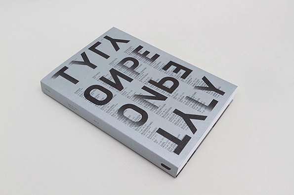
A hardcover book lies flat against a plain white background. The cover features bold, oversized black lettering that reads “ТУГЛ”, “ОИРЕ”, “ОНЬЭ” and “ЛТУЛ” laid over a background of smaller, dense text.

Graphic Design: New Unit Editions book celebrates type as graphic solution

—
Date
16 July 2013

Any new release from Unit Editions (Tony Brook and Adrian Shaughnessy’s design publishing powerhouse) is always cause for celebration here at It’s Nice That towers, but their newest offering has got us particularly excited. Type Only does what it says on the tin (cover) – celebrating the design trend for using typography unaccompanied by illustration or photography.

As the publishers say: “Type Only explores the communicative and emotive power of type when used in isolation. The book identifies this use of type as a growing and influential contemporary trend, but it also looks at the historical antecedents of this sort of work.”

So ranging from the Dadaists and Futurists through modernism, post-modernism and right up to contemporary trends, the book showcases visually arresting manifestations of this desire to let type speak for itself.

The book takes as its starting point the bold assertion by British design group 8vo that type “could be the core ingredient of a graphic solution” and sets about backing it up with a host of brilliant, beautiful and well-chosen examples. Design geeks of all stripes will probably want to pre-order this one right away…
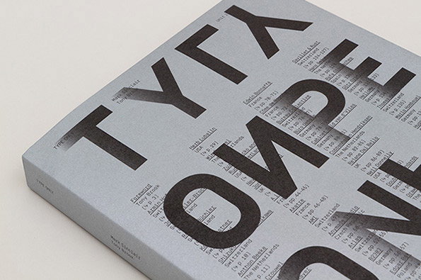
A hardcover book with a light grey cover features the words “TYPE ONLY” in large, bold, black lettering. The letters are layered over a detailed table of contents listing various names and page numbers.
Above

Unit Editions: Type Only

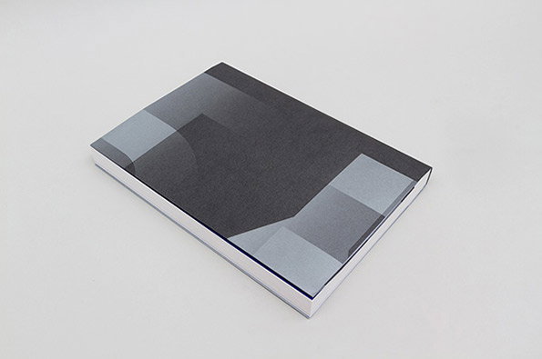
A thick, square book lies flat against a plain white background. The cover features a minimalist abstract design in shades of grey and charcoal.
Above

Unit Editions: Type Only

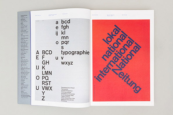
An open book showing two pages of typographic design. The left page features the alphabet in lowercase and uppercase letters, with the word “typographie” set in the centre. The right page is a red block with the words “lokal national international National Zeitung” arranged in a diagonal, intersecting layout.
Above

Unit Editions: Type Only

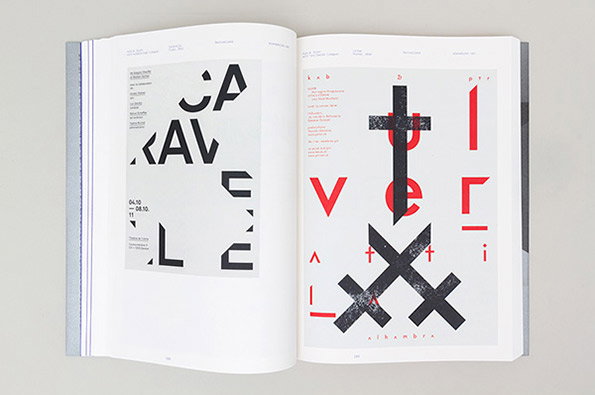
An open book shows two pages of bold, experimental typography. The left page features black fragmented letters and the dates “04.10. – 08.10. 11”, while the right page uses red and black characters and the word “alhambra”.
Above

Unit Editions: Type Only

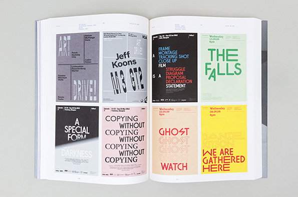
An open book displays a grid of eight graphic posters in various colours. The designs feature bold typography, including names such as “Jeff Koons” and titles like “The Falls” and “Ghost Watch”.
Above

Unit Editions: Type Only

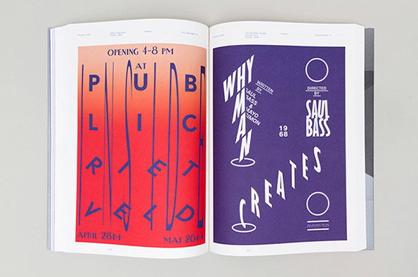
An open book displays two graphic posters side by side. The left page shows a red and orange gradient poster with distorted blue lettering that reads “PUBLIC”. The right page features a purple poster with white typography for the film Why Man Creates, credited to Saul Bass.
Above

Unit Editions: Type Only

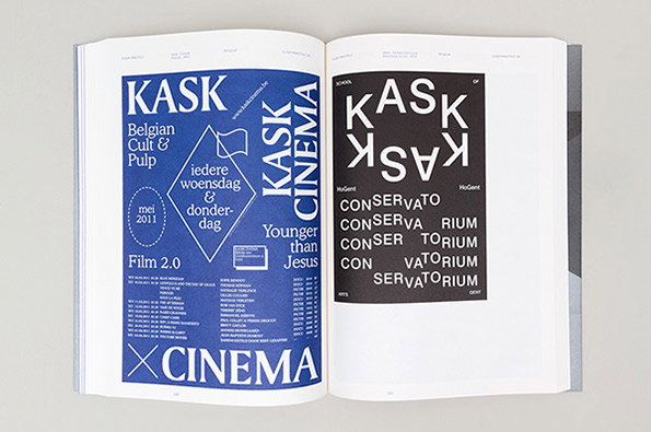
An open book showing two pages of graphic design. The left page is blue with white text reading “KASK CINEMA” and “Belgian Cult & Pulp”, while the right page is black and white with a bold, mirrored “KASK” logotype.
Above

Unit Editions: Type Only

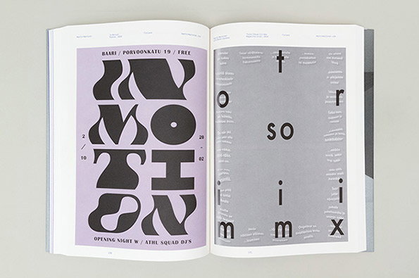
An open book shows two contrasting graphic design spreads. The left page is lilac with bold, distorted black typography that reads “MOTION”, while the right page is grey with a minimalist, scattered layout of letters and small text.
Above

Unit Editions: Type Only

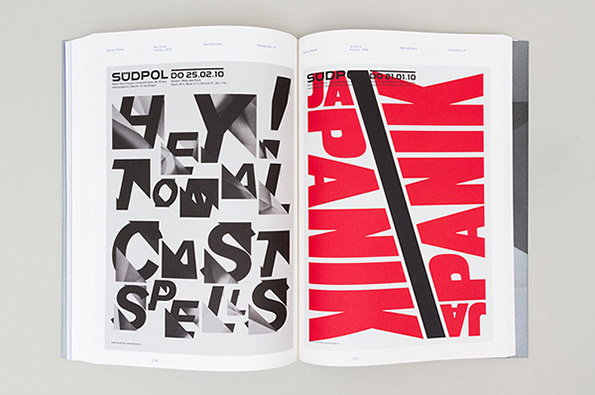
An open book shows two pages of bold, experimental typography. The left page features black and white distorted lettering that reads “HEY YOU CAST SPELLS”, while the right page displays the word “JAPANIK” repeated in red and black.
Above

Unit Editions: Type Only

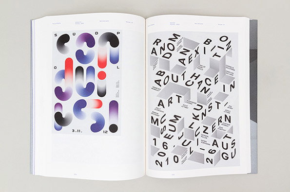
An open book displays two pages of graphic design. The left page features a poster with bold, rounded 3D shapes in purple, red and white, with the date “3.11.12” at the bottom. The right page shows a grid of 3D white cubes with black letters scattered across their surfaces.
Above

Unit Editions: Type Only

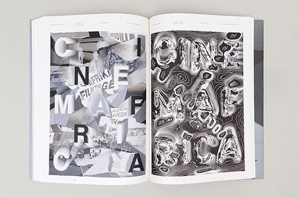
An open book shows two contrasting typographic spreads. The left page features a fragmented, architectural collage of letters spelling “CINEMA AFRICA”, while the right page shows the same words rendered in a distorted, liquid-like 3D style.
Above

Unit Editions: Type Only

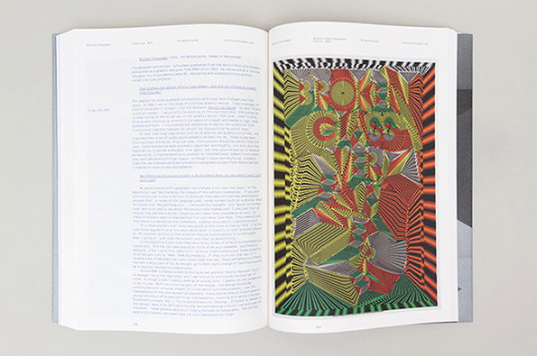
An open book shows a page of text alongside a vibrant, psychedelic illustration. The artwork features distorted, colourful patterns and the words “BROKEN GLASS” in bold, warped lettering.
Above

Unit Editions: Type Only

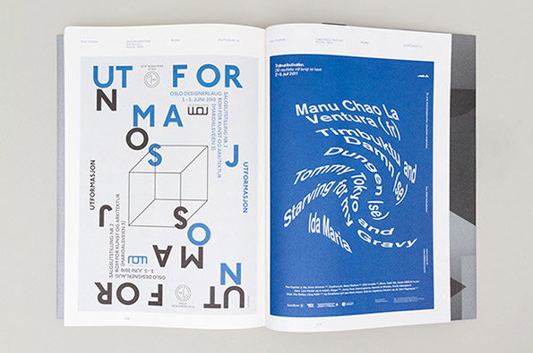
An open book showing two graphic posters. The left page features a white poster with blue and black typography and a 3D cube illustration, while the right page shows a blue poster with white text arranged in a swirling circular pattern.
Above

Unit Editions: Type Only

Share Article

About the Author

Rob Alderson

—

Rob Alderson is a freelance writer, editor and strategist. He was previously editor-in-chief of It’s Nice That and WePresent, and editor of Design Week. He publishes the newsletter Undo, which tries to make sense of how AI is changing design work, the design process and the design industry.

It's Nice That Newsletters

Fancy a bit of It's Nice That in your inbox? Sign up to our newsletters and we'll keep you in the loop with everything good going on in the creative world.