Stamps, labels, and codes: Vrints-Kolsteren draws on transport and industry to rebrand a pizza restaurant on the move
Evolving out of a humble food truck into an award-winning restaurant, NotR’s new identity draws on the feeling of being in motion.
Over the years, Napoli on the Road has evolved out of a humble neighbourhood pizza truck into an award-winning restaurant with three outposts across London. This story of movement and transformation became the starting point for its new identity, developed by Antwerp-based studio Vrints-Kolsteren. “It felt very natural,” says co-founder Vincent Vrints, “not just in the literal sense of being ‘on the road’, but in the way the business itself has continually moved forward and changed.”
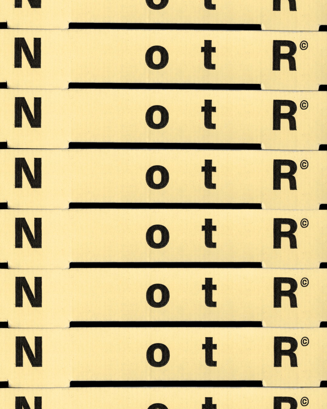
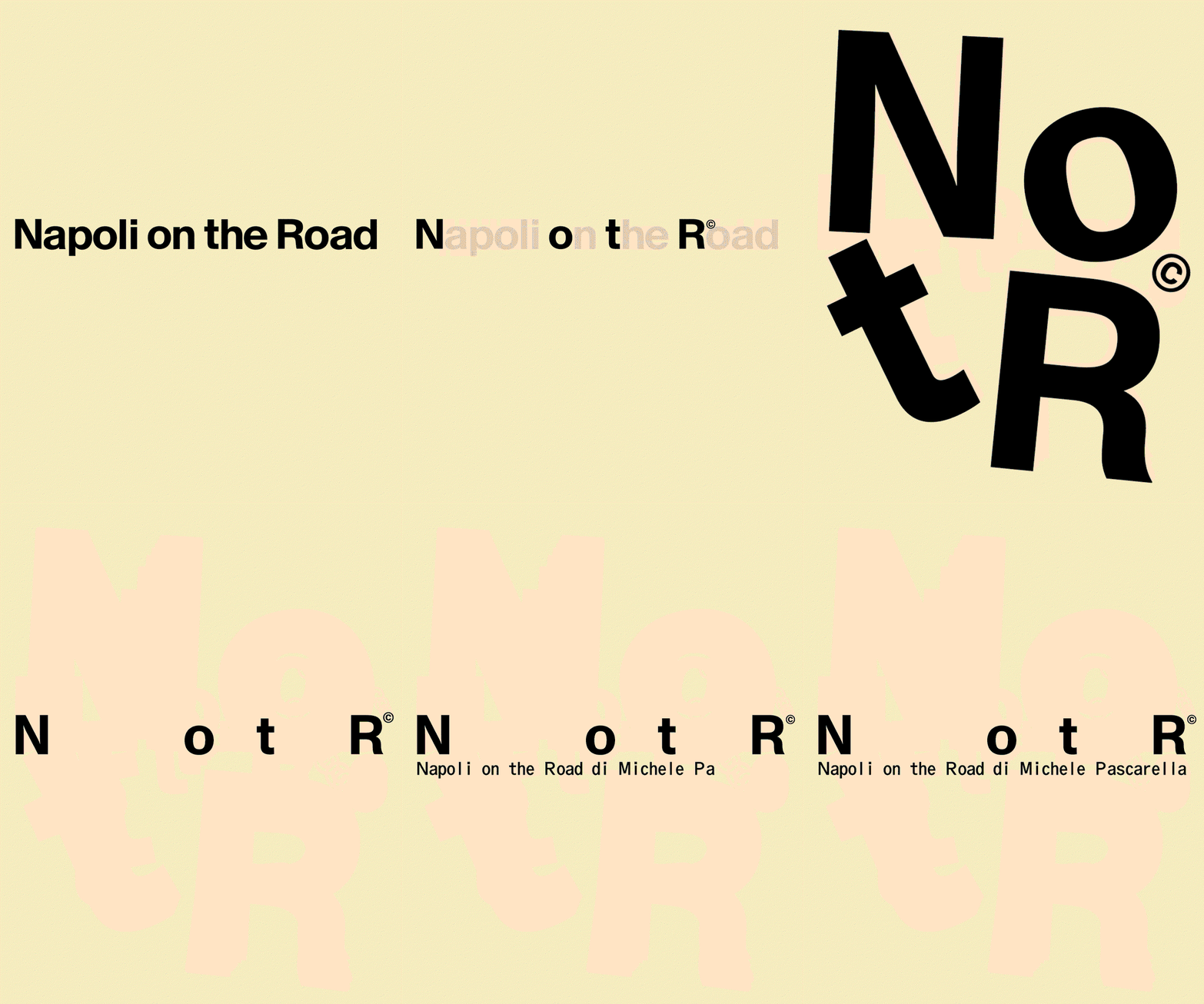
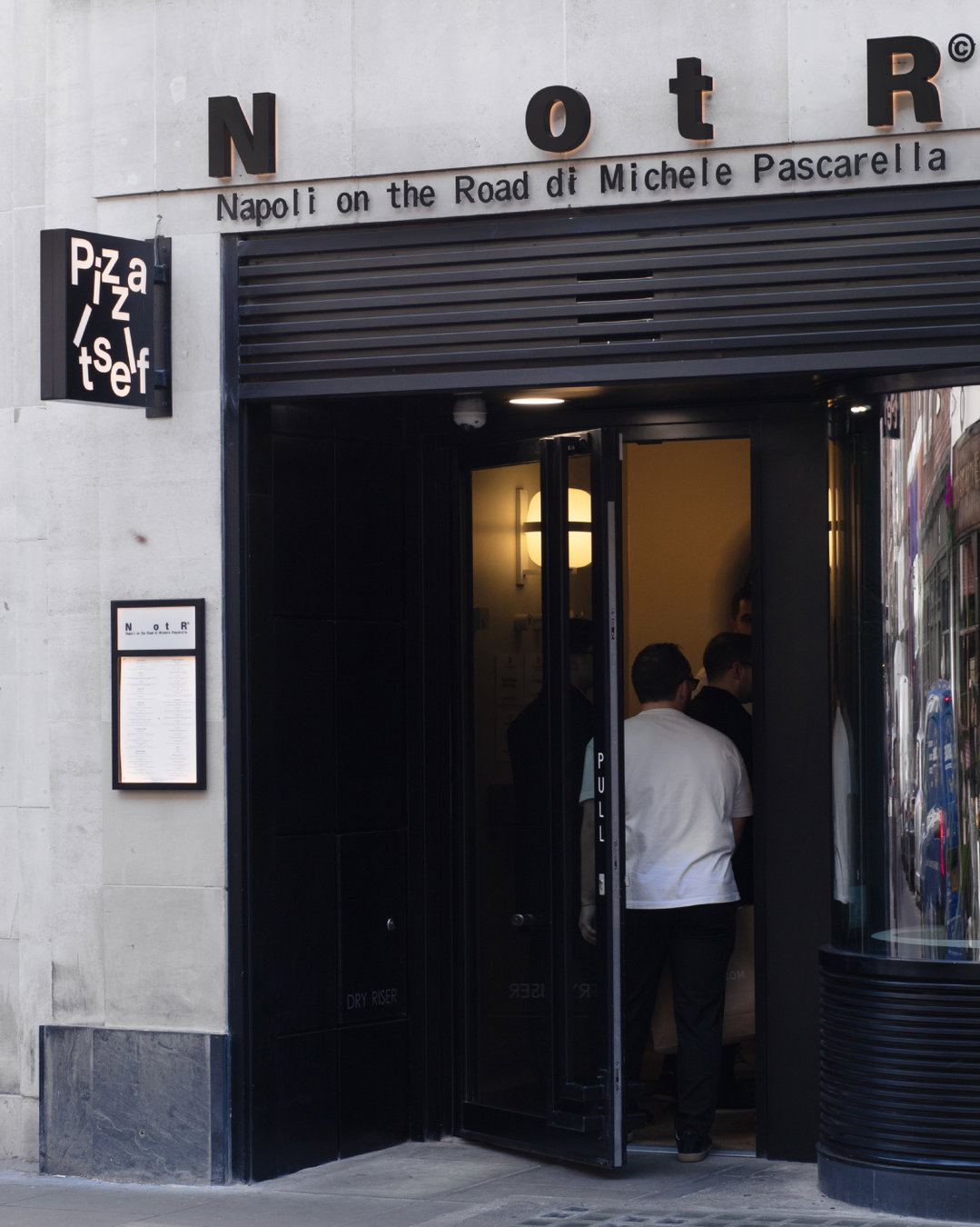
The new identity captures that sense of progression while still feeling connected to where it all began. First came the reduction of ‘Napoli on the Road’ to ‘NotR’. “We stripped the name back to its essential elements, removing what was no longer necessary, adds fellow co-founder Naomi Kolsteren. But the space between the letters still references what has disappeared. So the history isn’t erased, it’s still present in the identity in a more subtle way.”
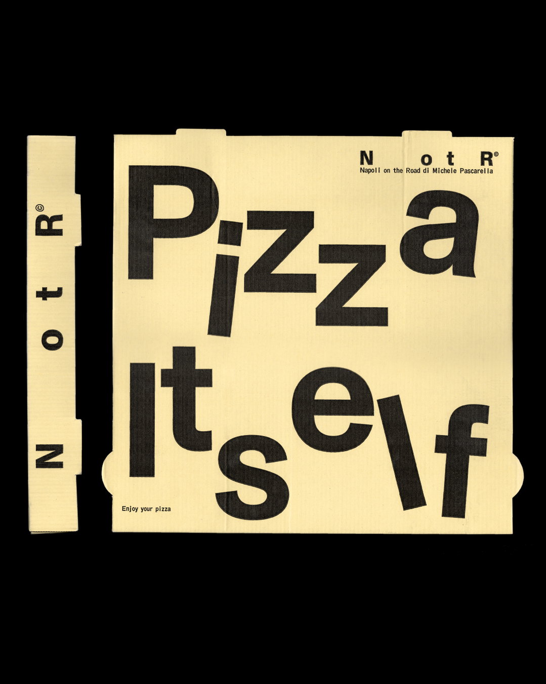
Vrints-Kolsteren: NotR identity (Copyright © Vrints-Kolsteren, 2026)
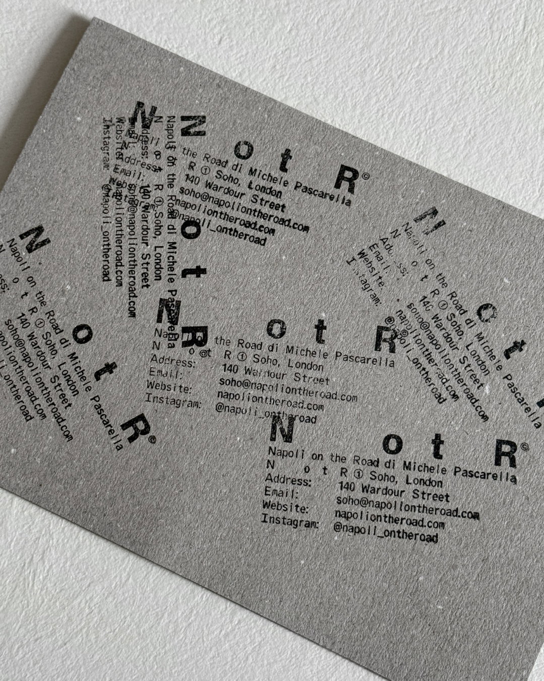
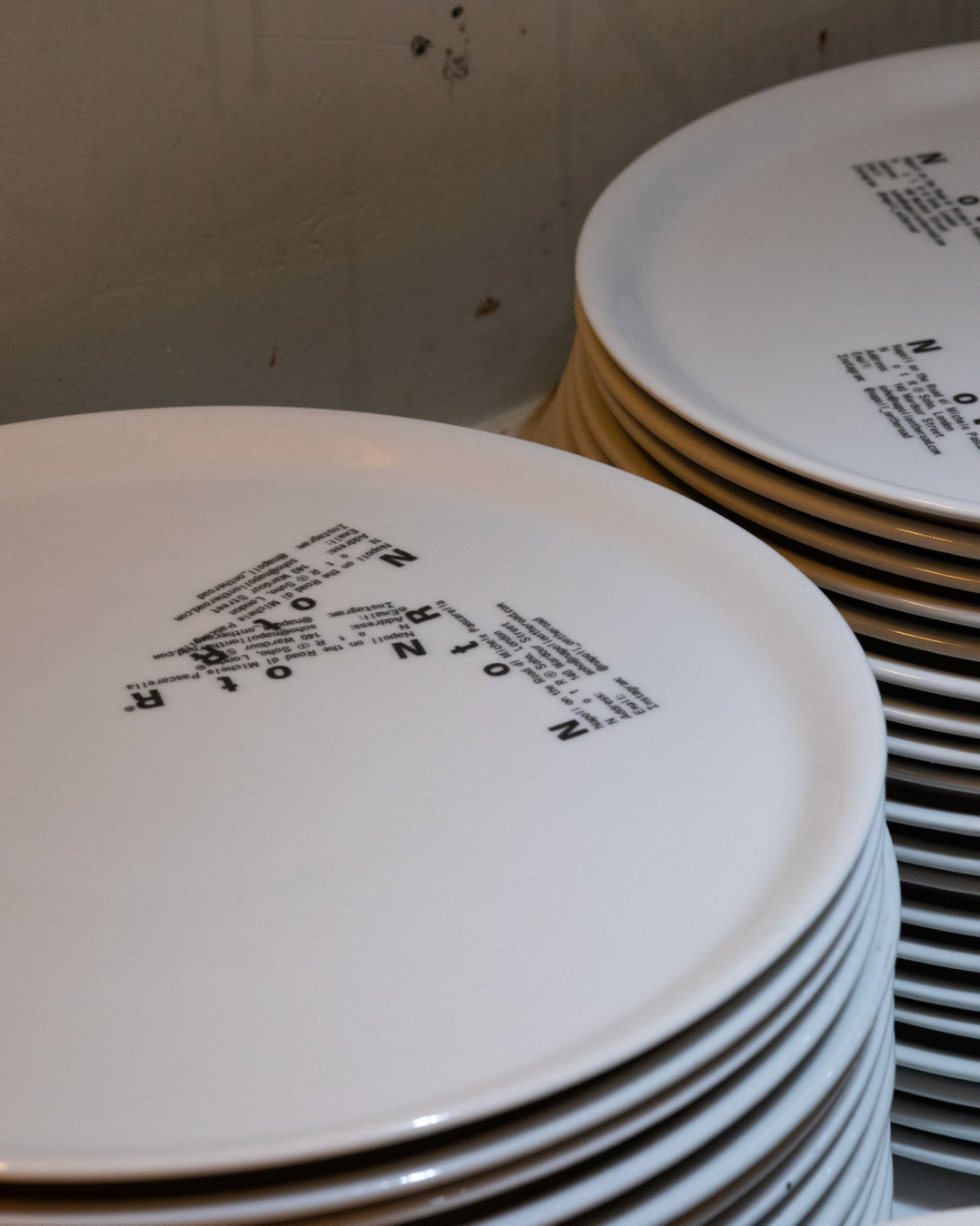
There were also certain tropes the studio wanted to avoid and move on from. The obvious colours, illustrations and scripts associated with Italian restaurants, for example. Instead, they looked for references within transport, shipping and industry, like stamps, labels and codes. “These felt like interesting ways of communicating the idea of being ‘on the road’,” says Vincent. “The spacing between the letters isn’t meant to represent a literal geographical distance, but rather the feeling of being in motion: travelling, transitioning and moving between.” The smaller lock-ups, stamp-like applications, and the monospaced typeface also reference the functional world of labels, codes and logistics.
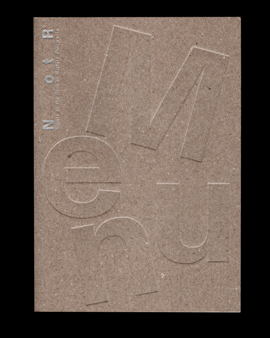
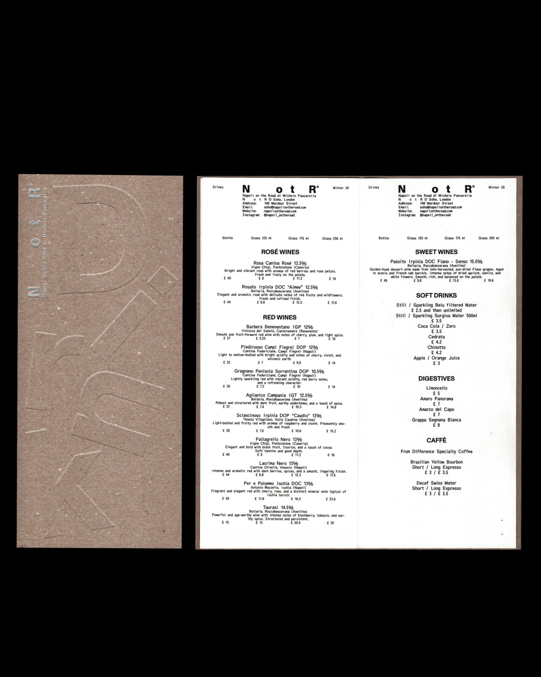
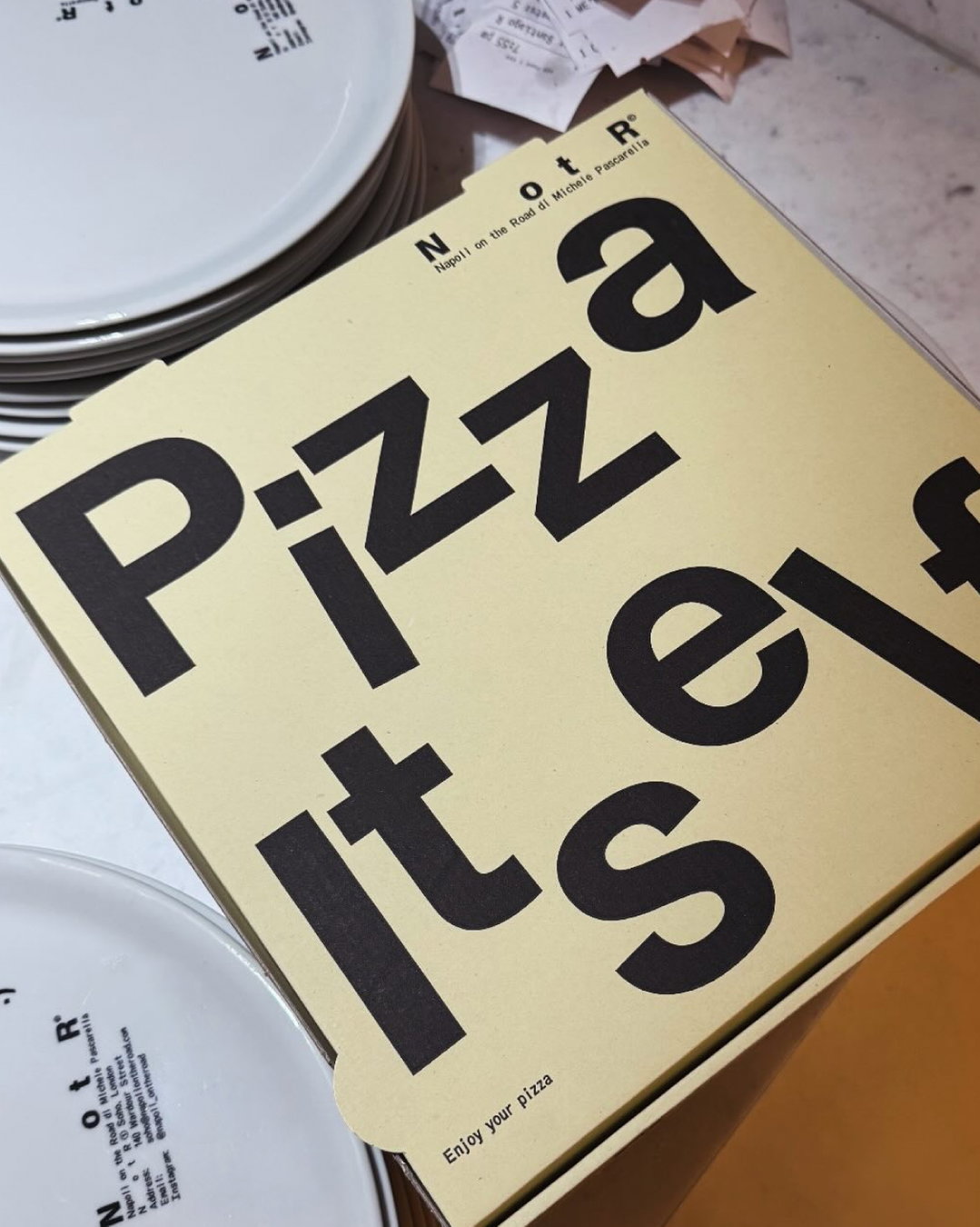
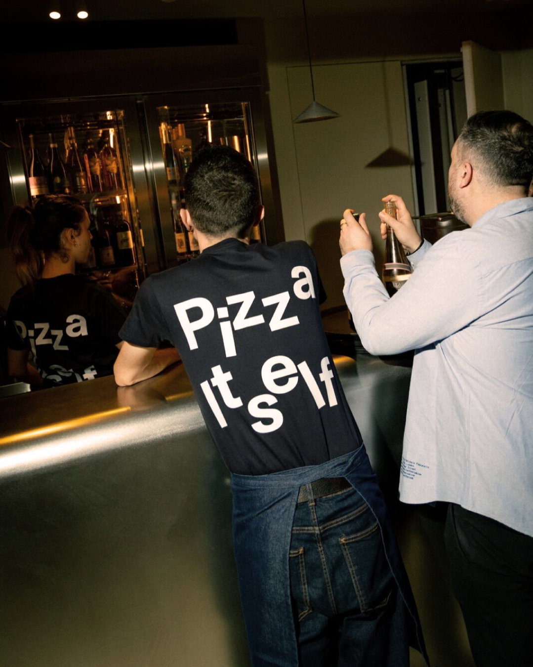
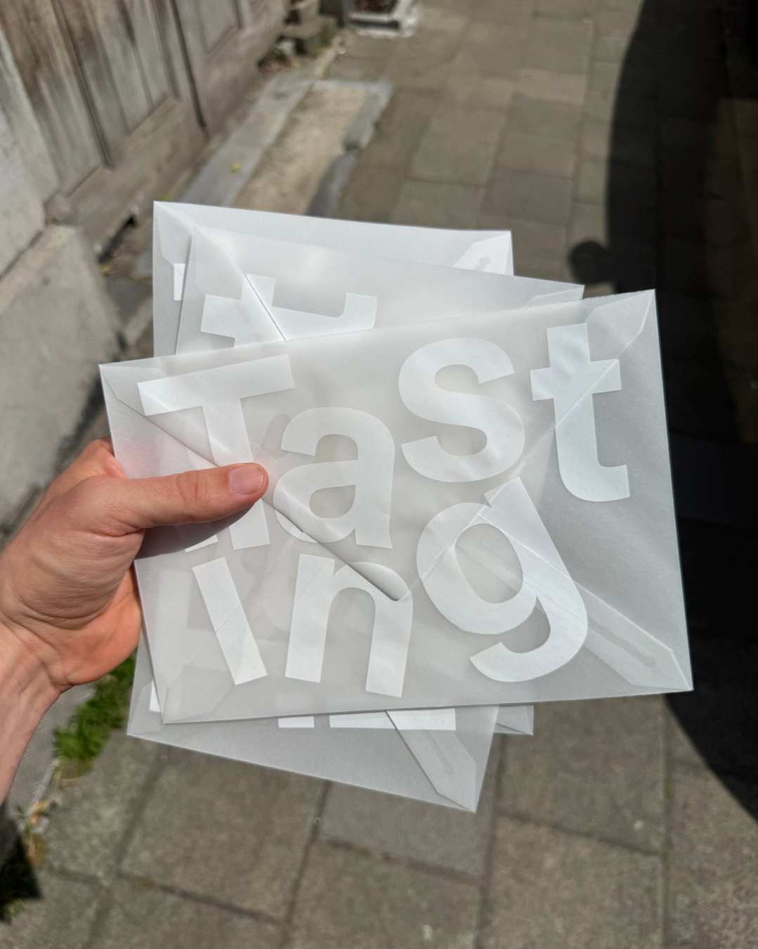
These references easily lent themselves to print elements too, informing the menus, packaging and uniforms. “The pizza box was particularly interesting because it’s such a familiar object,” Naomi says. “We really wanted it to feel like another expression of the identity, something with its own graphic presence.”
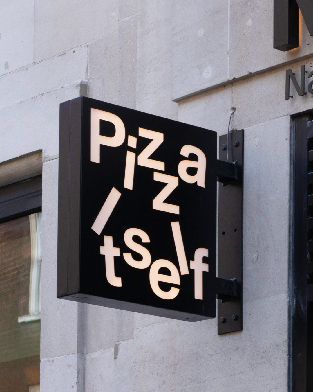
NotR also has ambitions for the brand to reach further into the world of fashion, music, art and culture, so the identity needed to feel at home in those realms too. “We wanted the result to feel minimal, confident and contemporary, and to have enough flexibility to exist beyond hospitality,” they say. “The brand had reached a point where it had become much bigger than its original concept. It has developed its own world around food, but also music, architecture, fashion, art, travel and culture. So there was an opportunity to create an identity that could express that broader ambition, rather than positioning it simply as another pizzeria.”
GalleryVrints-Kolsteren: NotR identity (Copyright © Vrints-Kolsteren, 2026)
Hero Header
(Copyright © Vrints-Kolsteren, 2026)
Share Article
Further Info
About the Author
—
Marigold Warner is a British-Japanese writer and editor based in Tokyo. She covers art and culture, and is particularly interested in Japanese photography and design.