Launch Recite Me assistive technology
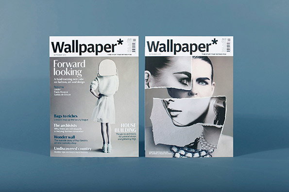
Two copies of Wallpaper magazine stand side by side against a blue background. The left cover features a person in a white dress and a headline that reads “Forward looking”, while the right cover shows a fragmented, collaged portrait of a person.

Graphic Design: Wallpaper* unveil redesign under new creative director

—
Date
13 August 2013

If we were a suburban busybody, we’d spend a great deal of our time consumed by nosiness about what number 27 was doing to their lawn or how number 41 afforded TWO new cars last year. We’re not suburban busybodies (mercifully – it must be exhausting) but we are magazine publishers and as such we are always keen to have a snoop at what others in the industry are up to, and never more so than when a major title undergoes a redesign.

For its September issue the team at Wallpaper* have done just that. At the heart of the changes are two new typefaces – Portrait described as a “sharply elegant Latin serif” and Darby " a humanist sans serif which will replace Plakat (Graphik) which has been used in the title since 2007. Interestingly creative director Sarah Douglas told Creative Review that it was the “differing personalities” of fonts once released into the public domain which is behind the typographic changes.

Meanwhile the layout has been refined to create pages that editor-in-chief Tony Chambers says are defined by a “fresh, sophisticated, modern elegance” in a bid to facilitate “longer and more indulgent reads” while a higher quality paper stock also seeks to harness the qualities of the printed medium more effectively. Nicolas Roope of Poke London and Marc Kremers were brought in to oversee the polishing up of the magazine’s online offering.

It feels like a step in the right direction for one of our sector’s most iconic names and proof that Sarah has stamped her mark on the design since replacing Meirion Pritchard earlier this year.
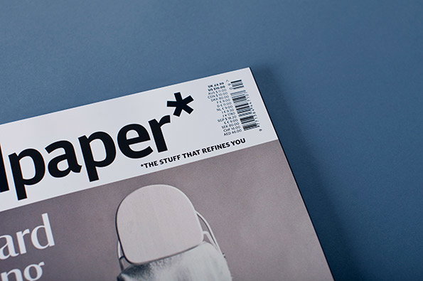
A close-up of a Paper magazine cover against a blue background. The masthead reads “paper*” with the tagline “THE STUFF THAT REFINES YOU” below it.
Above

Wallpaper* September 2013

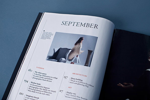
An open magazine page titled “SEPTEMBER” features a photograph of a person in a white outfit standing beside a grey armchair. Below the image, a contents list includes sections for “FASHION”, “ARCHITECTURE” and “ART”.
Above

Wallpaper* September 2013

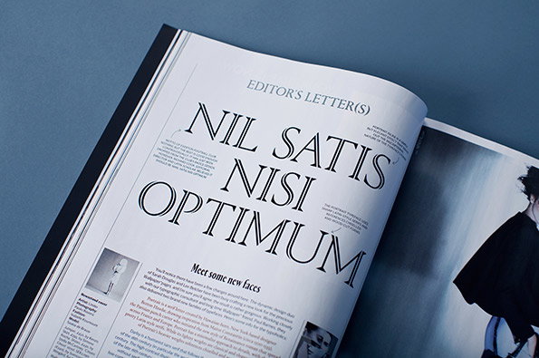
An open magazine displays a page titled “EDITOR’S LETTER(S)”. Large, serif typography reads “NIL SATIS NISI OPTIMUM”, with smaller columns of text and a section titled “Meet some new faces”.
Above

Wallpaper* September 2013

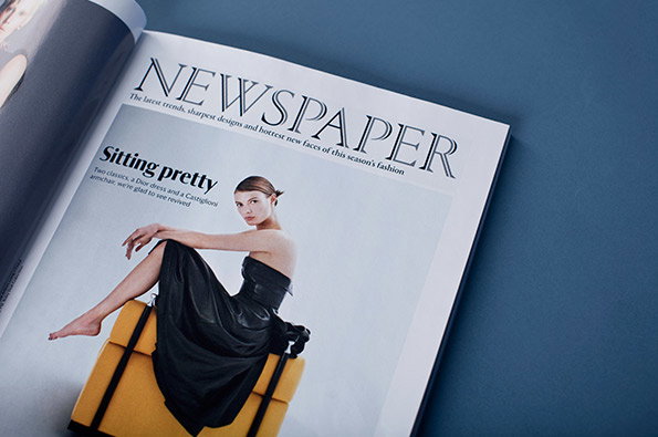
An open magazine page features a person in a black strapless dress reclining on a yellow armchair. The headline reads “Sitting pretty”, under a large masthead that says “NEWSPAPER”.
Above

Wallpaper* September 2013

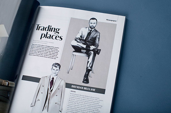
An open magazine page features a black and white illustration of a person in a sharp suit sitting on a stool. The headline reads “Trading places”, with a smaller caption below that reads “Measuring some of the fashion world’s latest transitions”.
Above

Wallpaper* September 2013

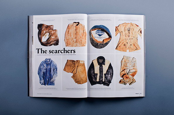
An open magazine spread titled “The searchers” displays a grid of eight weathered garments and accessories. The items, including boots, jackets and a cap, appear worn and stained in shades of brown, blue and cream.
Above

Wallpaper* September 2013

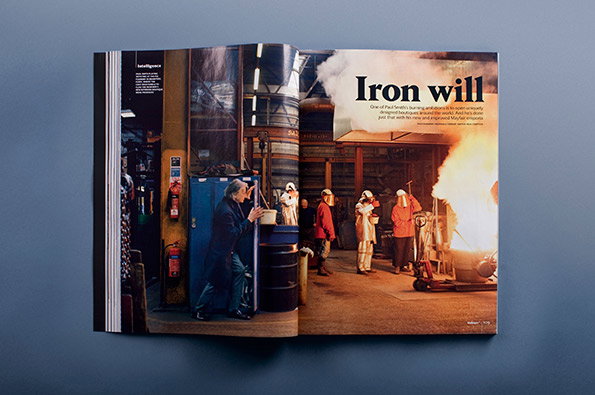
An open magazine spread shows a photograph of a foundry. A person in a dark coat looks on as other figures in protective gear work near a glowing, molten furnace. A headline reads “Iron will”.
Above

Wallpaper* September 2013

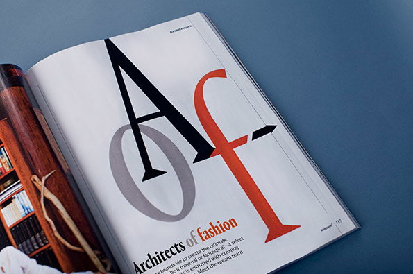
An open magazine page features a bold typographic layout with the letters “A”, “O” and “F” overlapping in black, grey and red. Below the letters, a headline reads “Architects of fashion”.
Above

Wallpaper* September 2013

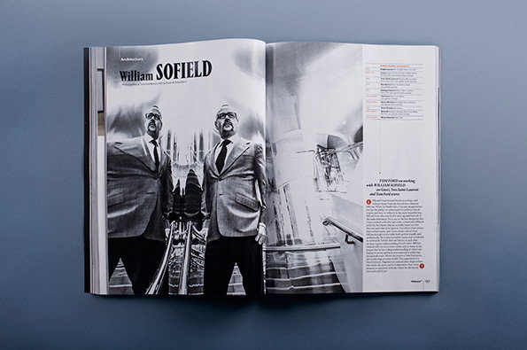
An open magazine spread featuring a black and white photograph of two people in suits. The left page carries the headline “William SOFIELD”.
Above

Wallpaper* September 2013

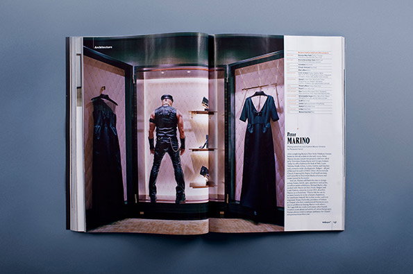
An open magazine spread shows a photograph of a high-end wardrobe. A person stands with their back to the camera between two hanging black dresses. To the right, a column of text features the name “Peter Marino”.
Above

Wallpaper* September 2013

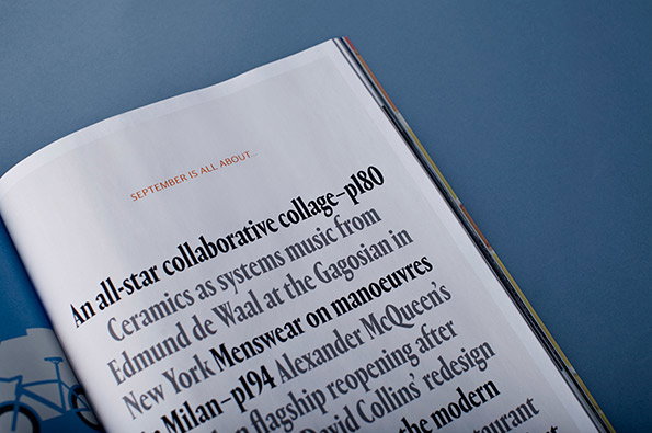
A close-up of an open magazine page against a blue background. The text lists upcoming features, including “An all-star collaborative collage–p180” and “Ceramics as systems music from Edmund de Waal at the Gagosian”.
Above

Wallpaper* September 2013

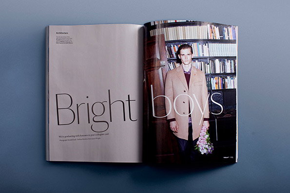
An open magazine spread features a person wearing a long beige coat and holding a bouquet of flowers. They stand in front of a large bookshelf, with the words “Bright boys” laid over the pages in a thin, elegant typeface.
Above

Wallpaper* September 2013

Share Article

Further Info

About the Author

Rob Alderson

—

Rob Alderson is a freelance writer, editor and strategist. He was previously editor-in-chief of It’s Nice That and WePresent, and editor of Design Week. He publishes the newsletter Undo, which tries to make sense of how AI is changing design work, the design process and the design industry.

It's Nice That Newsletters

Fancy a bit of It's Nice That in your inbox? Sign up to our newsletters and we'll keep you in the loop with everything good going on in the creative world.