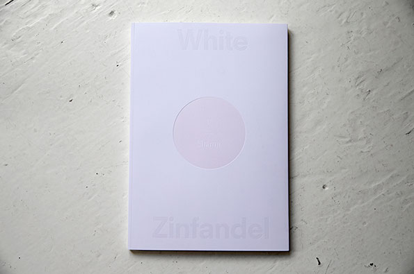
The fantastic White Zinfandel magazine follows a recipe fit for the gods
White Zinfandel is created from a very simple recipe but, like all of the most delectable things, it’s the added touches – the hint of this and dash of that – which make it a chef’s special at the publishing dinner table. Essentially, it’s a magazine about food and culture. It looks at “what happens when creative people, across disciplines and media, get asked to make art about food.” But the sheer complexity of each issue sets it apart.
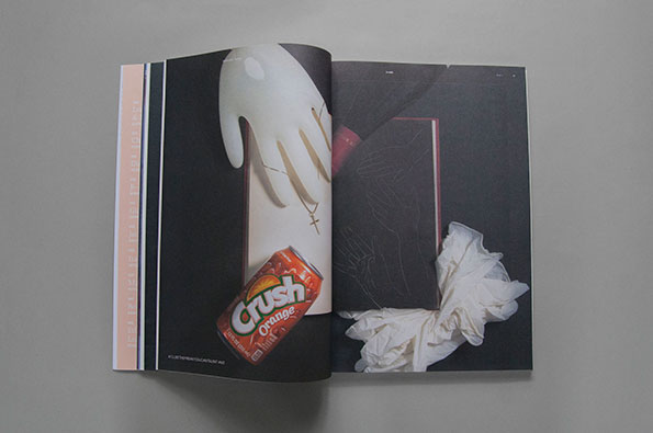
Take the current issue, moulded around the theme of “Shame” and inspired by the story of former French President Francois Mitterand’s last meal. "Knowing he was dying, he decided he would eat the rare and illegal delicacy, the ortolan, a tiny French songbird eaten almost to extinction. The captured ortolan is force-fed millet, drowned in armagnac, plucked and stripped of its feet and a few other tiny parts. Once roasted, the diner takes the bird whole into their mouth, and covers their head with a napkin to “shield your shame from God.”"
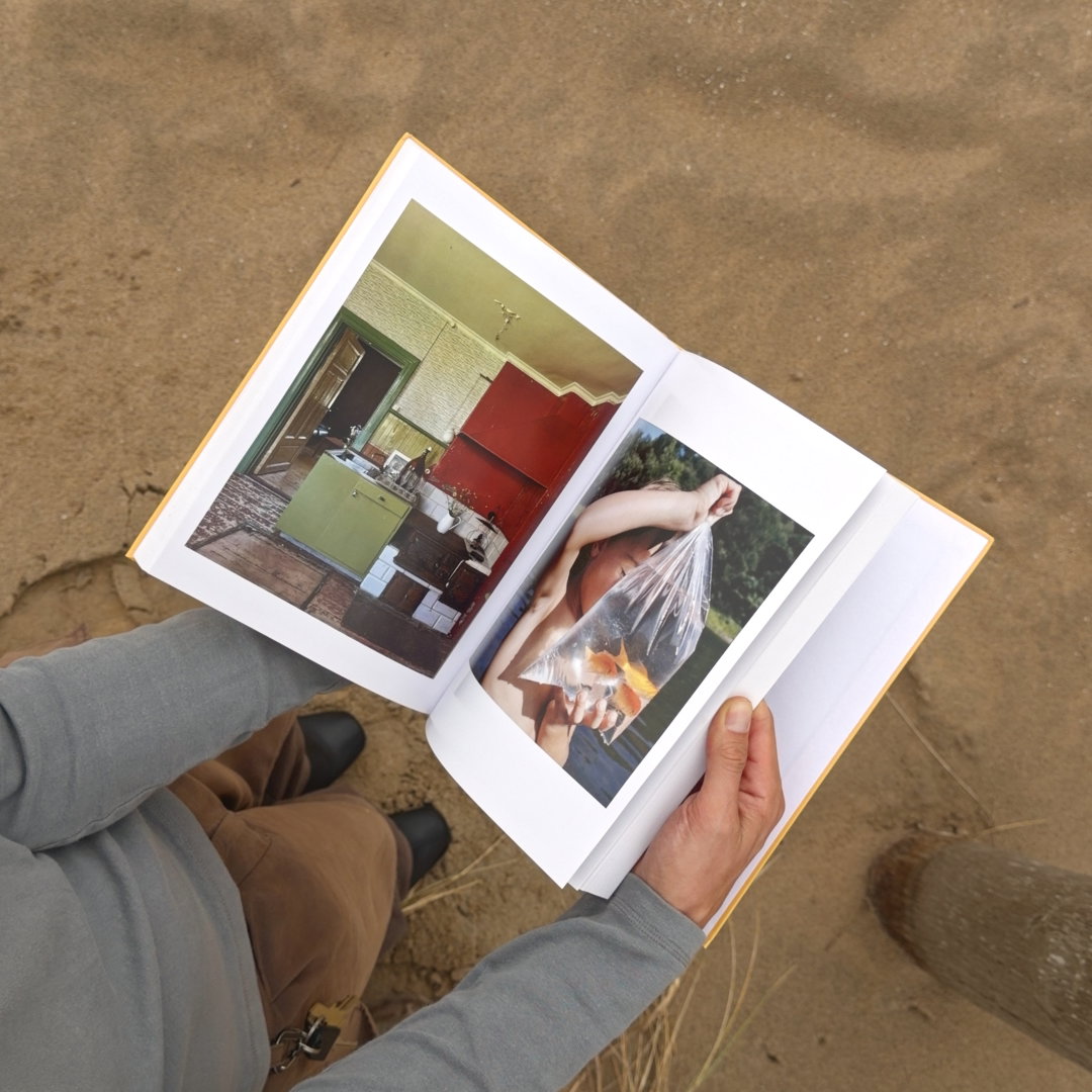
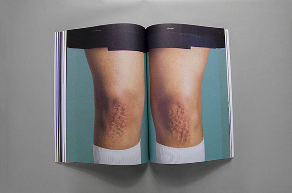
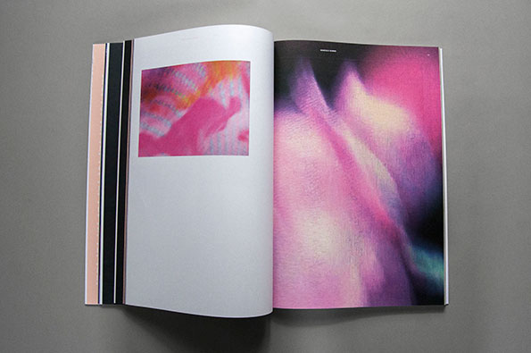
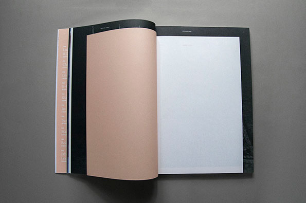
With such a starting point – sounding more like the legendary feasts of the Greek myths than modern history – could W/—— Projects’ magazine be anything but divine? The story seeps into aspects of content and design: editor Jiminie Ha says the napkin “inspired us to fold the smaller pages into the issue, as little napkins that the reader has to move to show the shame-inspired art.”
"Knowing he was dying, he decided he would eat the rare and illegal delicacy, the ortolan, a tiny French songbird eaten almost to extinction."
Jiminie Ha
White Zinfandel: Issue #5
White Zinfandel: Issue #5
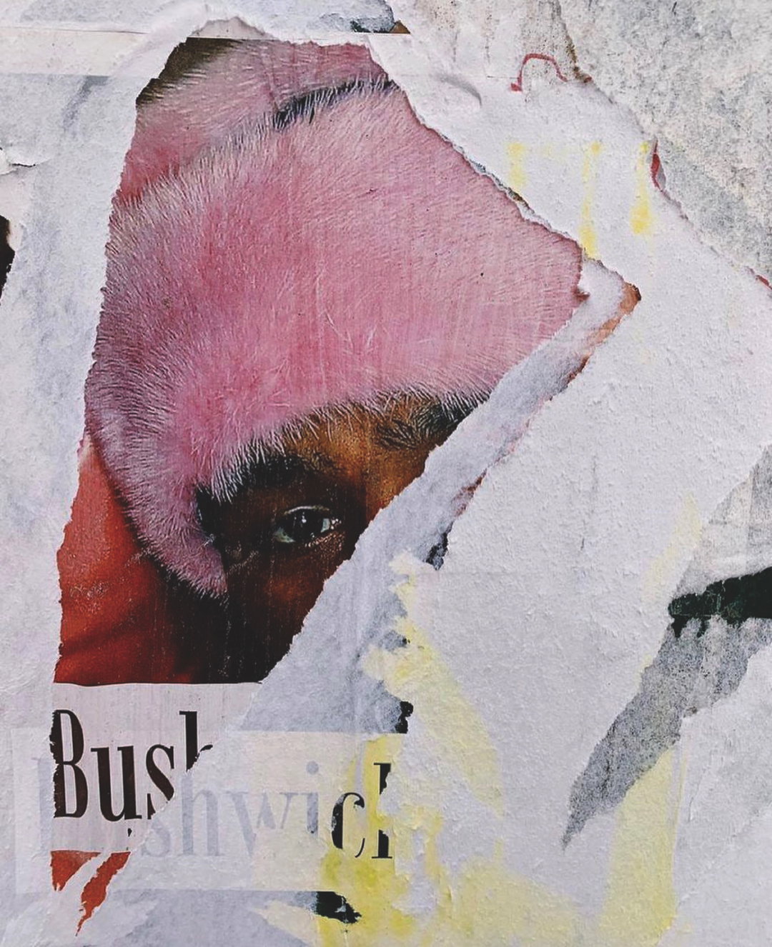
Unfortunately, the Great British weather has thwarted our attempts to test this out, but apparently “the cover of the issue actually blushes, turning from white to pink when exposed to sunlight thanks to some fancy UV-sensitive ink.” And, in case you were wondering how these ingenious editors could possibly find a shameful (or shameless) typeface, here’s how: “The issue was typeset in a a font called Joanna, which Eric Gill named after his daughter—a fact that only starts to bring the heat into your cheeks when you look into Gill’s history and realise that the famous sculptor and typographer was also a notorious creep who kept detailed notes on his sexual abuse of his children, incest with his sister and even sex with his dog in his personal diaries.”
White Zinfandel: Issue #5
White Zinfandel: Issue #5
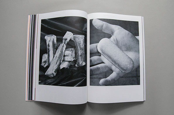
With such an intense focus on theme each issue takes on a truly individual flavour; in the case of issue #4 each magazine literally had a bite taken out of it, “which required the team in Berlin to go chomp down on the magazines at the printers.” Jiminie says “we don’t require a one-to-one interpretation and actually very much enjoy when the theme begins to veer off into other conceptual tangents. We don’t review restaurants or chefs, we don’t really discuss the artists’ favourite dishes and it’s increasingly becoming more of a limited edition art book rather than a publication. We stick to 500 copies per issue and each issue has been in unique editions, sometimes within the theme as well.”
"The cover of the issue actually blushes, turning from white to pink when exposed to sunlight thanks to some fancy UV-sensitive ink."
Jiminie Ha
Jiminie says “pulling an issue together is a lot like curating a group show and we like to balance the group by having up-and-comers mixed in with established artists.” To launch each issue they host an event – a conceptual dinner or cocktail party – formed by chefs and mixologists around the central theme.
Jiminie has so far plucked his themes from her unconventional childhood growing up in France without a television, nurtured by parents who were “subconscious hippies” and nourished with “weird art films like David Lynch films, Babette’s Feast and La Grande Bouffe.” After issues centred around the themes of “food”, “TV dinners”, “food fights” and “La Grande Bouffe”, my appetite’s been whetted for the next serving of this biannual publication.
White Zinfandel: Issue #5
White Zinfandel: Issue #5
White Zinfandel: Issue #5