




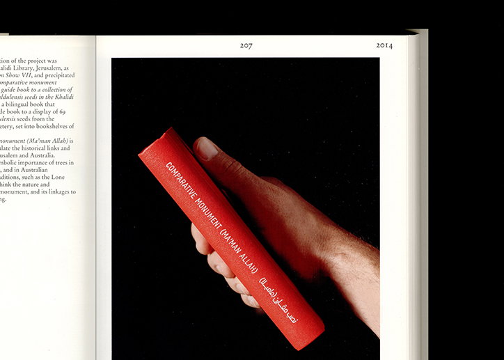
Ziga Testen Studio creates work that is "bit boring but with just enough eccentricity to make it interesting"
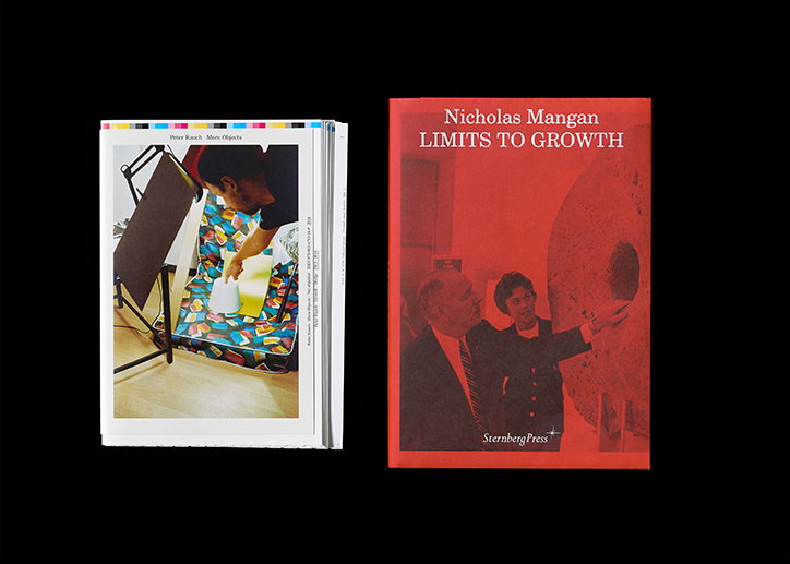
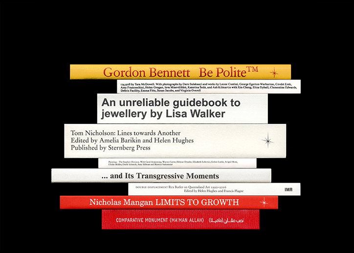
Although stating that his work is not typographically-led, Ziga Testen of Ziga Testen Studio does allow typography to form the backbone of every project. “It provides a foundation,” he tells us, “a framework upon which I then proceed to build a project but rarely does it take the centre stage, it usually disappears into the background.” It’s on this last point that most of Ziga’s work hangs; his portfolio full of functional, understated, yet beautiful editorial projects which place emphasis on the work.
Originally from Slovenia, Ziga is now based in Melbourne having spent some years in-between in the Netherlands. Working on bigger projects as part of Public Office, he’s been working under Ziga Testen Studio on “very specific, usually small projects where I can work closely with the client in a collaborative way,” for over ten years. “I aim to create work that doesn’t impress too much but – at least not design wise,” he tells us. “If anything, visually I like to think of my work as a little bit boring but with just enough eccentricity to make it interesting.” As most of his clients are artists or cultural clients, his focus is on translating a distinctive body of work onto the printed page: “I want first and foremost to give a voice to the work, project or artist, whatever it is about and whatever it, or they, has to say.”
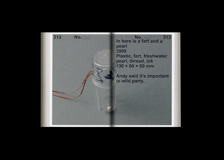
It’s imagery, and materials which help him achieve this he explains: “The craftsmanship of the execution and attention to detail is very important to me as well, and I go to great lengths in choosing a paper that feels just right and a typeface or typefaces that fit the project conceptually but are also legible and don’t stand out too much.” Often, Ziga will spend significant time pinning down a composition or sequence of images, often finding himself “commissioning new work or being involved closely in how work, subjects, objects or projects are documented, presented and mediated.” As a result, many of his projects harbour such close working relationships, that Ziga will go on to collaborate with his clients, producing projects and artworks together.
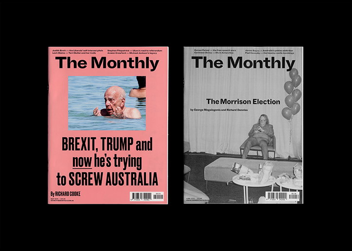
Ziga Testen Studio and Public Office: The Monthly
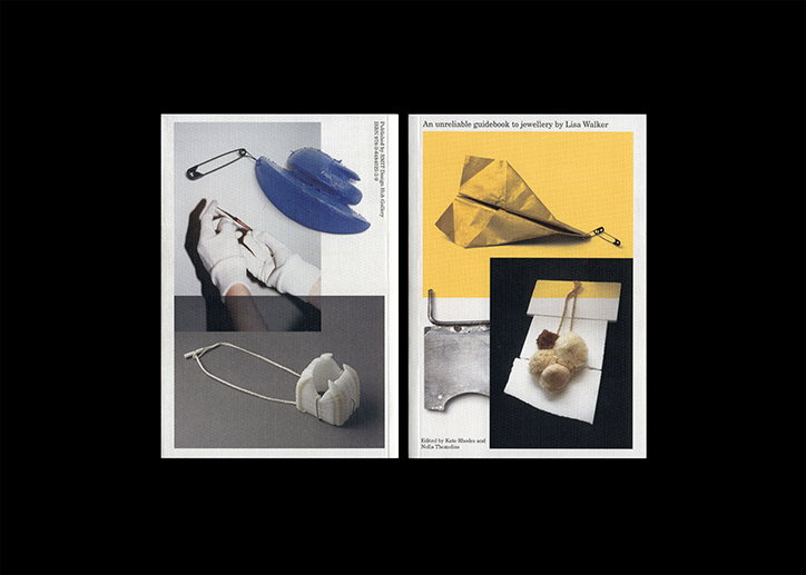
While most of Ziga’s portfolio consists of monographs, artists books or exhibitions such as Sasa J. Maechtig: Systems, Structures, Strategies or An unreliable guidebook to jewellery by Lisa Walker, Ziga drew our attention towards a slightly different project of his titled The Monthly. Made in collaboration with Public Office, The Monthly is a publication put out by Schwartz Media, a small media company based in Melbourne, that covers politics, society and culture, published on a monthly basis.
“Editions of the books we work on rarely surpass 1,000 copies and while they do sometimes sell out like Sasa Maechtig’s book, their reach is not huge,” Ziga explains. “In that sense working in that field seems a little bit of a bubble sometimes. Design wise you can be often quite radical but there is little accountability in terms of return from sales for example.” The Monthly is therefore so different because of its scope and audience but also because “the design, especially the design and content of the covers actually sell copies and the magazine depends on sales.”
Ziga and Public Office’s design, therefore, had to take on the task of making the publication attractive to an audience, especially in Australia’s fairly hostile Murdoch-dominated media landscape. “For me personally this project has also been an exploration of what contemporary Australia is,” Ziga weighs in. “Through this project, similarly as with working with artists, I get to learn a lot about the culture here.”
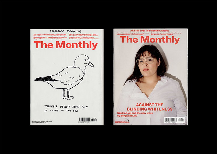
Ziga Testen Studio and Public Office: The Monthly
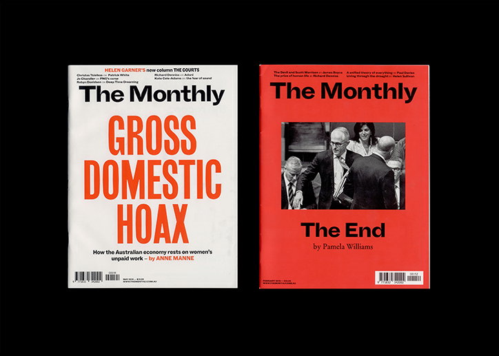
Ziga Testen Studio and Public Office: The Monthly
Ziga Testen Studio
Ziga Testen Studio
Ziga Testen Studio
Ziga Testen Studio
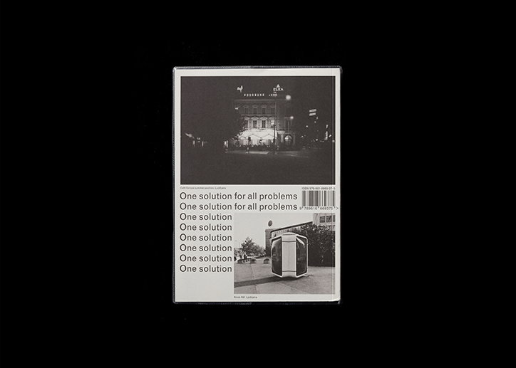
Ziga Testen Studio
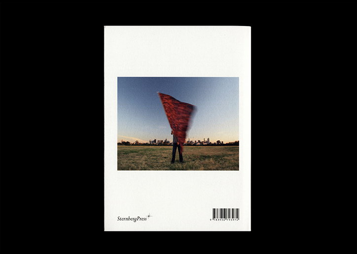
Ziga Testen Studio
Share Article
Further Info
About the Author
—
Ruby is Senior Creative at It's Nice That, overseeing our visual output across platforms and projects. Before that, she was associate editor on the editorial team, after joining in September 2017 following graduation from Central Saint Martins.


