- Words
- Olivia Hingley
- —
- Date
- 12 October 2026
- Tags
David Rudnick on the “borderline impossible” process of designing a bespoke blackletter typeface for Arsenal
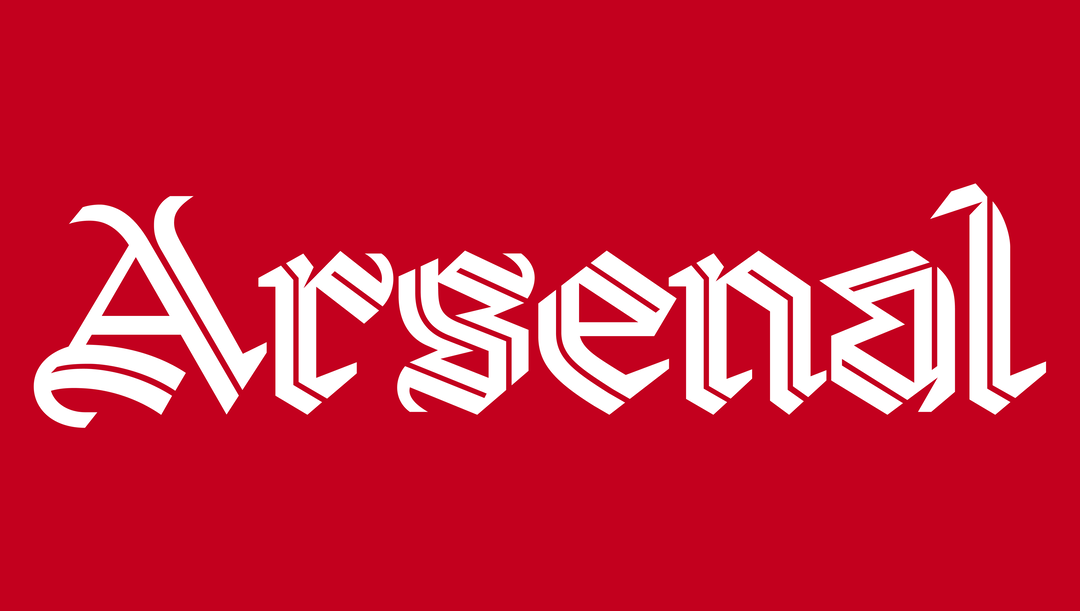
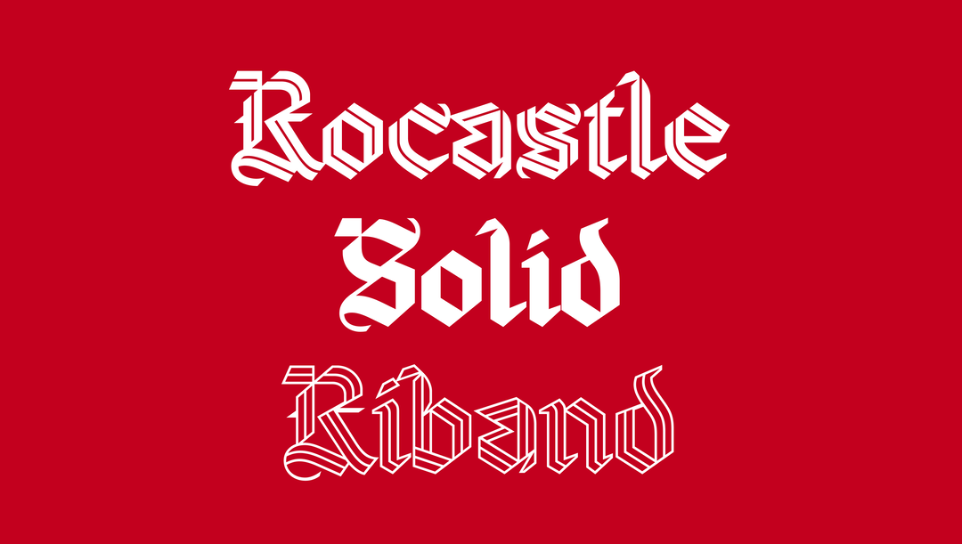
For the past four years, the designer has been building a hand-drawn, three-weight type family that pays homage to one of the most beloved players in Arsenal’s history: David Rocastle. Here, It’s Nice That sits down with David and Arsenal Creative Studio lead Johnnie Campbell to get behind the scenes of the mammoth project.
Share
Share
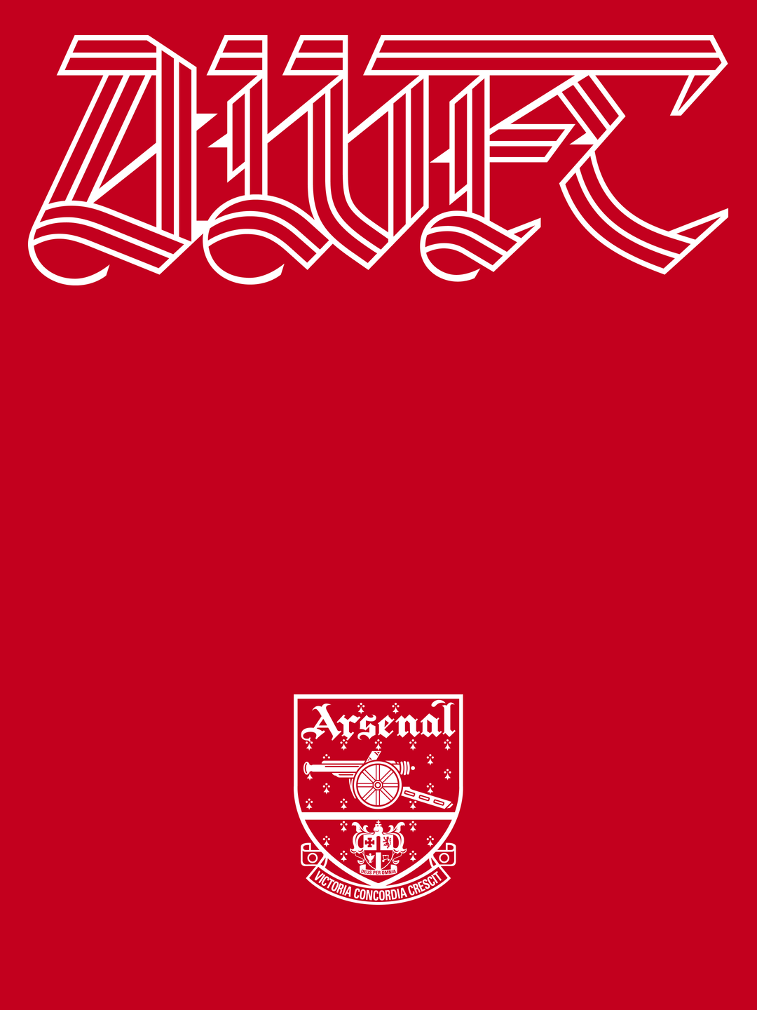
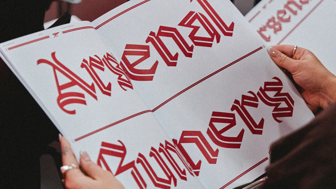
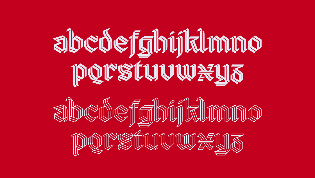
Designing for football poses a unique challenge. Not only do you have to consider such a vast cross-section of applications – screens, clothing, stadium walls and much more – but also the many millions of supporters that will see it, and need to identify with it. This is exactly what faced designer David Rudnick when he embarked upon Rocastle, a bespoke three-weight blackletter type family made specially for Arsenal Football Club.
The ask was this: How do you make a typeface for when Arsenal shows up in culture? For those moments when football leaves the frenetic energy of the match, when it then collides and harmonises with the worlds of fashion, art, music and more. The answer, for David and Creative Studio lead Johnnie Campbell, was buried in the Arsenal archive; the hoards of memorabilia saved by supporters, the gothic crests, paper season tickets and programmes. The groundwork for such a future-facing typeface had to be born from what came before.
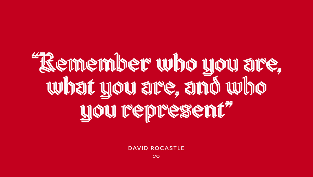
What might have made the challenge a little easier is the fact that David is himself an avid Arsenal supporter, and has worked with the club numerous times before. Rocastle isn’t the result of a six-month brief handed at arm’s length to a creative agency, but a labour of love from a lifelong fan. It’s also named after and dedicated to one of the club’s most legendary players, David Rocastle, more fondly known as Rocky. Joining the club at 15 and playing during the late 80s and early 90s, he made 277 appearances for the club, and fast became a beacon of hard work, humility and loyalty. In 2001, at age 33, he passed away from non-Hodgkin lymphoma. At matches today, you can still hear his name chanted in the stands.
Read on to get the full picture of the years spent researching, hand-drawing, revising and perfecting the Rocastle family, and to find out David’s dream application of the typeface...
This is an edited excerpt of a Q&A that took place between David Rudnick, Johnnie Campbell and It’s Nice That’s associate editor Olivia Hingley at the Design Museum on 9 October 2026 to celebrate the release of Rocastle and exhibition Arsenal by Design which ran 10-11 October.
Rocastle – designed in terrain by David Rudnick with Léa Bruneau
“I knew it was crazy, but that also came from the kind of passion I think you get as a fan – we want to be the best.”
David Rudnick
INT:
Johnnie I’d love to go back to the start and get a bit of the background. Why was a bespoke typeface needed to really complete Arsenal’s current visual universe?
Johnnie Campbell (JC):
The Rocastle typeface was actually born from a much bigger project that we started just over four years ago. We’d updated our brand strategy in 2021/22, with the aim of putting supporters right at the heart of who we are as a club, making them feel pride and belonging in the community of Arsenal. A major part of that work was in the research phase, talking to supporters around the world and realising that whilst we’re predominantly a football club, our reach and impact stretches way beyond the 90 minutes of a match. We roughly mapped into three pillars – Team: Everything associated with the 90 minutes of a match. Community: The club’s connection to its local and global community beyond the 90 minutes. Culture: Where football intersects with fashion, art, music and more.
We then set about a project to update our visual identity, and talking directly to David at the time, we worked out that we needed different ways of speaking within those spaces. One main Arsenal voice, but different tones. Because celebrating a goal at Emirates Stadium is very different to talking about a commercial partnership or a new fashion drop, for example.
That spawned a huge mega brief that lasted four and a half years, where we thought about different typefaces that could give us these different tones, for different areas that the club operates in. Northbank typeface was originally for our Team pillar, Chapman was for Community, and Rocastle was the last piece to that puzzle, for us to show up in culture. However, we actually started all of them together really, so technically Rocastle has been in development for over 4 years.
INT:
Why did you decide to name the typeface Rocastle? Can you tell us a bit more about why this was such an important tribute?
JC:
Speaking truthfully, it was David’s idea so, I’ll let David answer... but I guess when David came to us originally with the name Rocastle, it just felt right – immediately. We knew we were always creating something that was going to be saved for the very best of Arsenal and used to really speak to culture and what makes Arsenal special.
Rocastle – designed in terrain by David Rudnick with Léa Bruneau
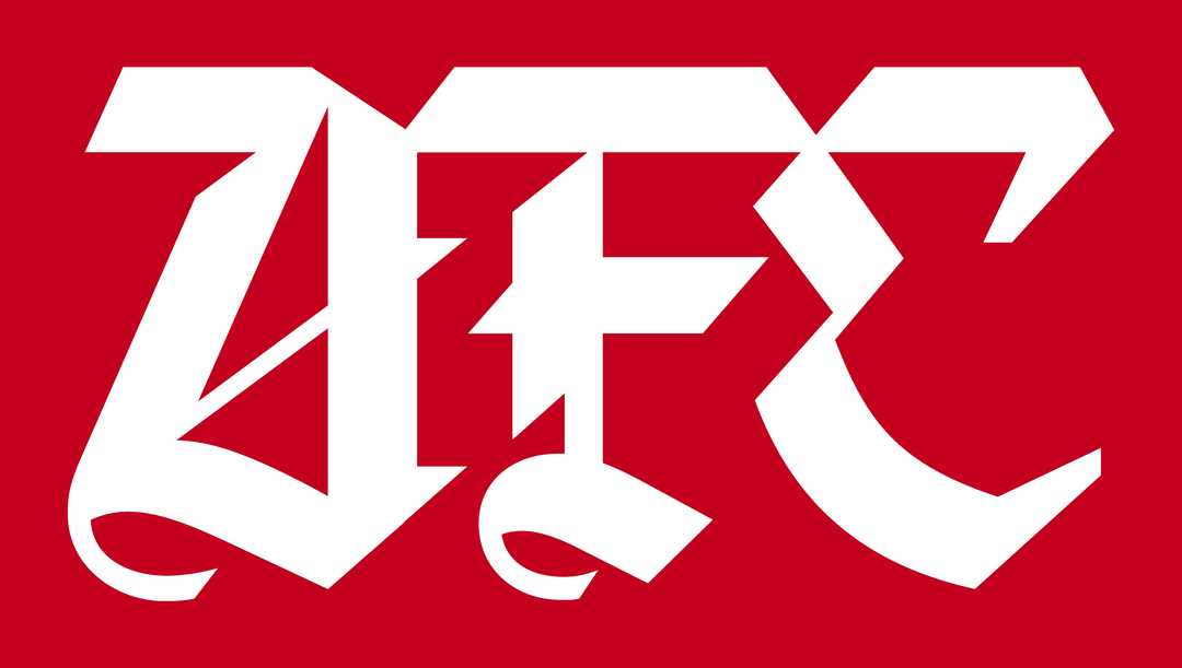
Rocastle – designed in terrain by David Rudnick with Léa Bruneau
David Rudnick (DR):
When I’m designing a typeface, the name is always a really important part. From almost the first letters, there needs to be a name – you need to understand what the typeface is trying to say, what it wants to be and where it wants to go.
When we first started talking about how Arsenal could even have a system, what our voice would be, we realised that one typeface wasn’t going to cut it, nor two typefaces. We have all of these values that we represent, spaces that we show up in, ways in which we need to communicate. You could kind of see the system starting to stretch, almost infinitely out. Starting from the super intensity of the minutes and the seconds of a game and a goal announcement, (which is what the Northbank typeface became), to the time you spend with the club when you’re reading the program, or reading an interview with a favourite player and the kind of architecture that goes around that, which is what Chapman was built for.
But there’s another aspect. With Arsenal, it felt like something that was far bigger and needed to be treated a very different way, where football’s not just about minutes, seconds, or even days, weeks, or months – there’s decades, there’s centuries, there’s lifetimes. Arsenal is a club that really extends so much further than what we just see around us now. There are values which are bigger than us, that have been there since starting out. Nothing spoke more to me to what that eternal idea of the club was and the values than Rocky [David Rocastle].
At the top of this system we needed something completely unique and possibly borderline impossible, typographically. Somehow it had to be this contradiction, that was forever dynamic and new and somehow felt eternal and had always been there; that it somehow felt English, but also transcended that and became universal. Coming back to it, even David’s name, Rocastle – there’s something medieval about the ‘castle’. But who Rocky is – forever modern and of the moment – is just still so incredibly present for every fan. It felt like it had to be that name.
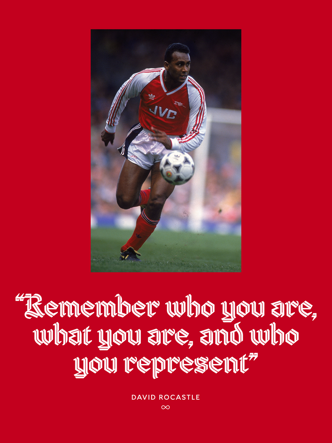
Rocastle – designed in terrain by David Rudnick with Léa Bruneau
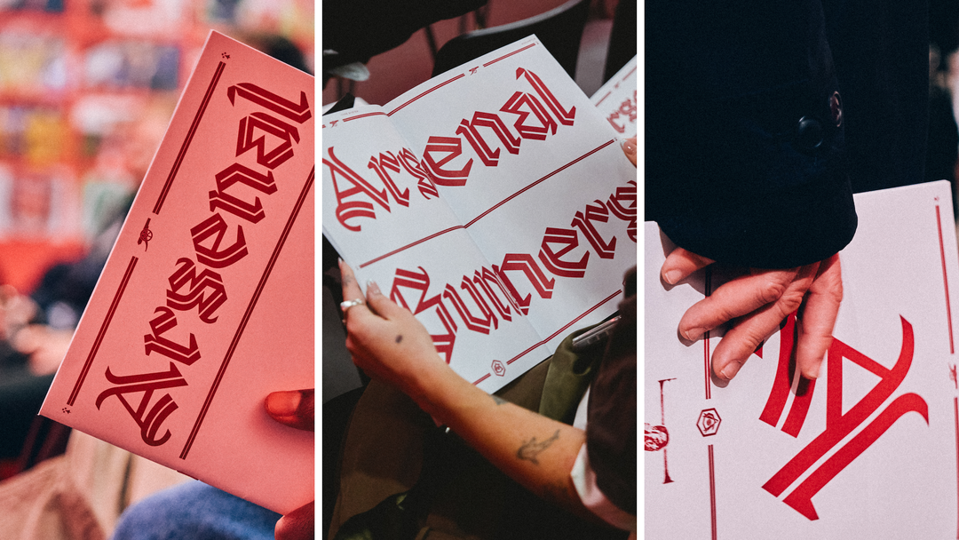
Rocastle – designed in terrain by David Rudnick with Léa Bruneau
“This could never be a gesture that felt egotistical, unnecessarily decorative, or was there to draw attention to it as a complex piece of typography.”
David Rudnick
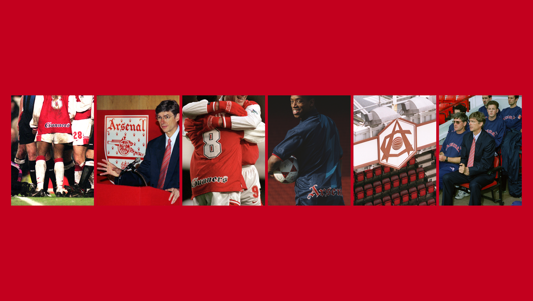
Rocastle – designed in terrain by David Rudnick with Léa Bruneau
INT:
As that interesting intersection of supporter and designer, why did you want to get involved in a project of such scale and such significance? What was the moment that you realised you were taking on this massive quest?
DR:
Well, the club has been unbelievable, because I came to them with a completely crazy idea. I was like, ‘I want to build something no other club could have’. I wanted to build a system that makes Arsenal great forever and could only be Arsenal. To do that, it’s going to take years, we’re going to have to build it piece by piece. I just don’t think there’s almost any other football club in the world that would say yes to that. It’s a totally crazy thing. The hardest part was that it was going to take maybe four or five years, and I couldn’t even show you what it was going to look like. No one’s ever drawn one like this before.
The club supported the vision, and I don’t think I could have done it without Johnnie and James, and all of the team having been there through the crazy five years of revisions this has all taken. I knew it was crazy, but that also came from the kind of passion I think you get as a fan – we want to be the best, and I also want the fans to feel proud of what we have. It wasn’t just something a design agency did in six months for a brief, or the club were like, ‘Oh, we need a marketing campaign, so we need a typeface.’ This was about identity, and I think that’s where it always started.
INT:
It definitely feels like something that could only have come from such a passionate supporter. Johnnie, from your perspective, I can imagine with a project of this magnitude, it’s a fine balance of staying true to Arsenal’s existing visual heritage while also bringing something that is future-facing to the table. How did you ensure this balance?
JC:
I think a lot of research, immersion. What also potentially helps is our ages – being an Arsenal supporter myself, growing up and looking at what I associate the club with. Both diving back into that and trying to find the best moments from our past, but making sure that we’re future-facing and trying to find ways in which we take a creative leap of faith. It felt natural because that’s the identity of the club that I grew up with, right? But yes, it’s that balance of making sure that you’ve done the research and that you’ve got objective truths of what that Arsenal identity means to supporters. And then, obviously, working with an expert who is also a supporter gives you that confidence that you’re taking the right step forward.
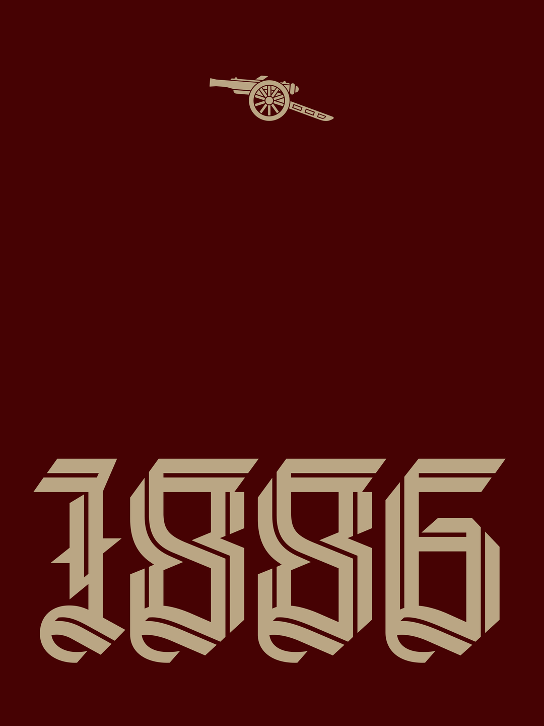
Rocastle – designed in terrain by David Rudnick with Léa Bruneau
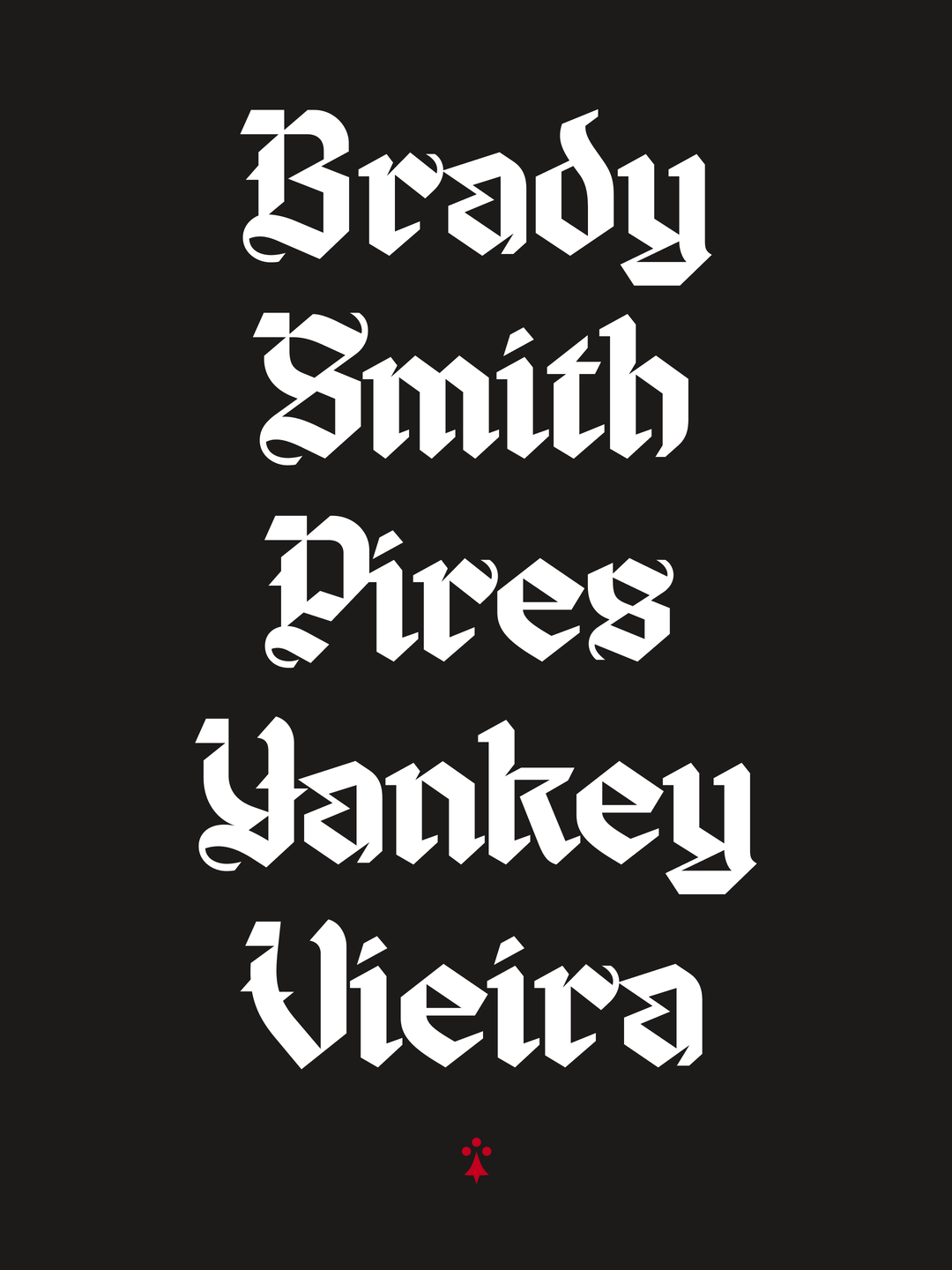
Rocastle – designed in terrain by David Rudnick with Léa Bruneau
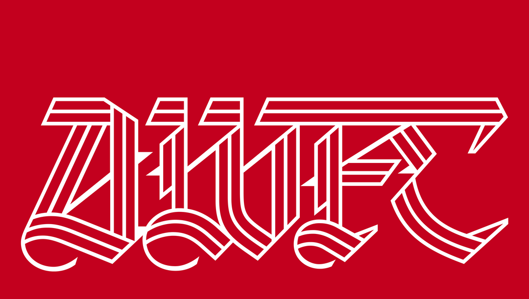
Rocastle – designed in terrain by David Rudnick with Léa Bruneau
INT:
David, you probably know better than anyone now that Arsenal has this massive visual legacy. Can you tell us about some details or some of your research process into Rocastle? What fed into it?
DR:
Well, obviously, there’s the years of my life prior to starting this project where I felt like I was doing research every day! But the volume of material and the things that we got to look at was enormous. I want to say thank you to the supporters, the people who have collected decades’ worth of memorabilia. We have the most incredible visual legacy. Even unbiased as an Arsenal fan, some of the all-time great football kits or visual gestures exist as part of the Arsenal extended universe of graphic cues and marks. There was already so much heritage to draw upon.
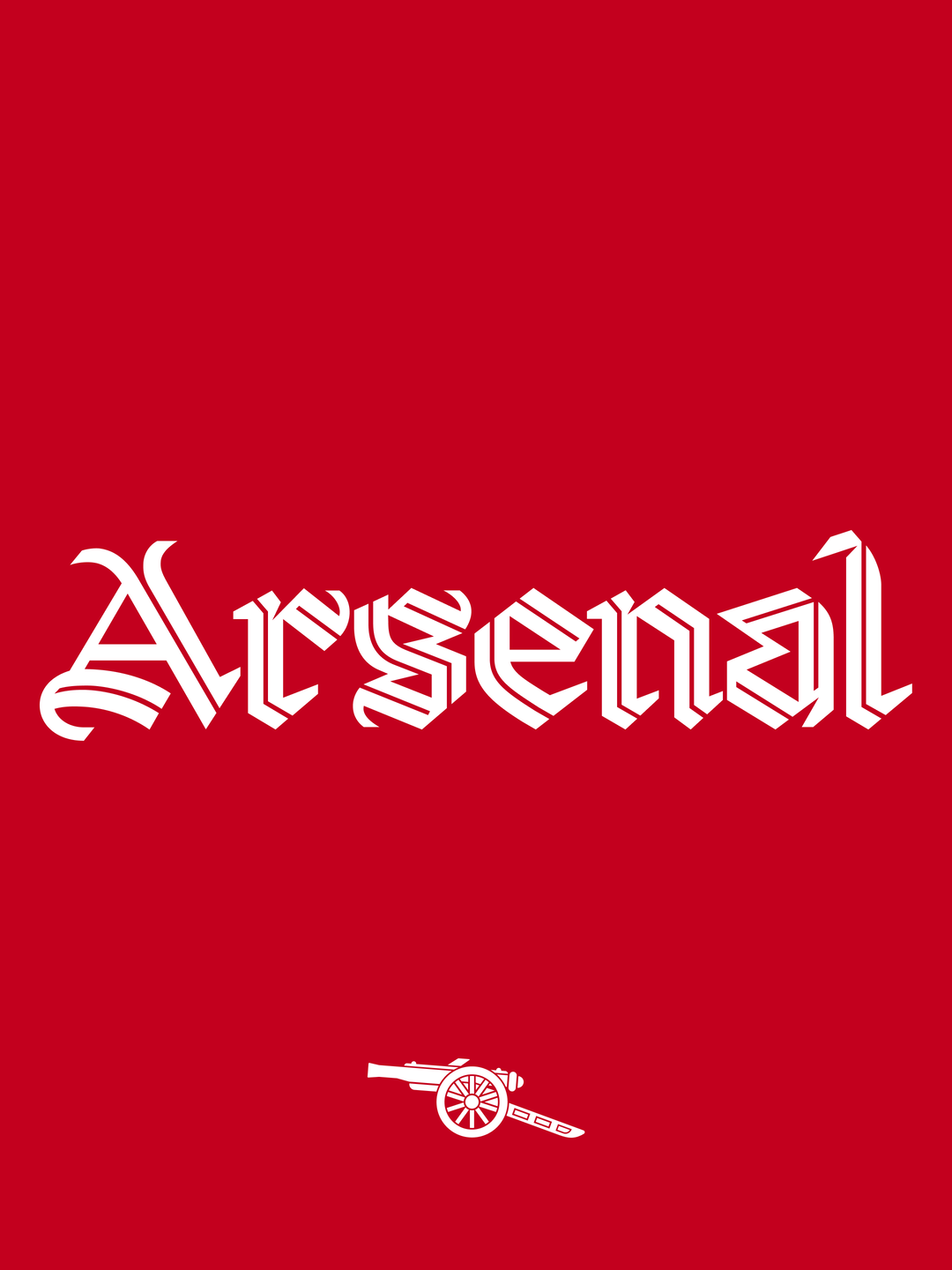
Rocastle specifically, was almost max difficulty, impossible, really. We had a blackletter typeface in our wordmark, we had blackletter letters, but they weren’t a typeface. I wanted to draw one, but it somehow needed to feel modern, it needed to feel English, it needed to feel totally new. And, it had to pull off the magic trick that the millions of people around the world who have seen those letters, hundreds and hundreds of times, have to look at this and feel like it’s something they recognise, and it’s the voice of the club that they love.
We did an enormous amount of research into how blackletter letters are constructed, what the historical forms are, and ultimately we came to a position where pretty much every letter in Rocastle is unique to the system. Which led to a very difficult process and agonising period of years where Johnny would be like, ‘Have you fixed the G yet?’. and we’d show him iteration 2,000 of the G!
I’ll never get a chance, I think, to do a process like that ever again in my life, where we knew that it had to be right, and we knew that also we didn’t have to show anything until we felt it was right. And again, we always had that benchmark – this had to be something that did credit to David Rocastle and represented the club in that way. We had the luxury of being able to actually do the process properly.
“Way beyond the 90 minutes, what we need to do is fill that badge with creativity, pride and identity.”
Johnnie Campbell
INT:
It’s interesting David, because you predominantly work in music and fashion. I was wondering, how does a football project differ? What unique things do you have to consider when entering the football space?
DR:
I think football clubs are probably globally the only entities of their scale and size – tens of millions of people look at a football club every day. They’re equivalent to the biggest pop stars on the planet. But football clubs, traditionally, don’t design anything. Their product is football; it just happens. And so, you have a 100+ year-old organisation that has a whole heritage of visual history and an audience of millions who are aware of it, with no principle or process for how that came to be or how you coordinate it.
It’s completely unique working with a football club – I think it’s the most amazing problem and opportunity as a designer. You somehow have this body of raw materials that’s almost impossible, and a surface that you’re going to apply it to in terms of an audience of people who care about it more than anything in the world. You have to then come up with the logic of how that becomes a design process and design system. What an incredible thing to be asked to do – it’s the privilege of my life.
INT:
One of the things I find most interesting about type design is that you’ve got to balance this tension between readability and accessibility, but also the fact that you want to create something beautiful and artistic. How did you balance that, and were there any drafts that had to be scrapped along the way?
DR:
There are thousands of iterations and drafts – years of hand-drawing and redrawing the letters. But I will say this: obviously, it’s a very distinctive voice, and I hope that it’s something that for Arsenal fans they feel is unique and also specific to the club. But it was very, very apparent to me that this could never be a gesture that felt egotistical, unnecessarily decorative, or was there to draw attention to it as a complex piece of typography. It again has to pull off this magic trick of: yes, it’s a very unusual set of letters and it does some very unusual things, but they also need to just feel natural and like they emerged from Arsenal.
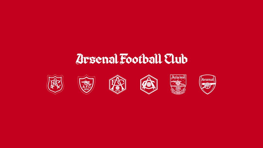
Rocastle – designed in terrain by David Rudnick with Léa Bruneau
INT:
On that point, Johnnie, now it’s ready to be put out into the world, what do you think makes Rocastle so distinctively Arsenal?
JC:
That’s a good question. I think it’s distinctively Arsenal because it’s also quite distinctively London as well. I think it speaks to going our own way, probably not following trends and reacting to what other football clubs are doing, having our own set of core truths that we stand by. Visually, when I first saw the early drafts, it transported me back to the era of Rocky in the 90s… what I think you called it, the “peak swag” era of Arsenal! But then it also feels like it could be from a hundred years before that, or could be living in a hundred years from now.
INT:
That point about London, I’d love to zoom in on a bit. I think if anyone was at the parade this summer, you’ll be able to testify how incredible it was to see the streets of North London so packed, and all those incredibly fashionable takes on kits. But it’s obviously quite a two-way relationship, I think. I'd love to know, how do you think London informs Arsenal’s identity, Johnnie?
JC:
I think it is a two-way thing. London definitely informs our identity, and the other way around. I’d say, obviously, we have our little dent on London culture, and we’ve played a part in that. But I’d say London’s beauty is its diversity in people, right? I think Arsenal’s story parallels really nicely with London’s story – movement from South to North and people coming together with all their different cultures to create something bigger than the individual parts. Our motto is ‘Victoria Concordia Crescit’ – ‘Victory Through Harmony’, it’s baked into who we are as an institution, and I think those two things parallel just really nicely with each other.
INT:
Right now, maybe more so than ever, we’re seeing this real interest and investment in the creative of football, something I do think has been in-part spearheaded by Arsenal opening the Creative Studio in 2022 and investing so much in the women’s team, really tapping into that new audience of fans. But why, Johnnie, do you think we've seen such an increase and interest in football creative right now?
JC:
I think it comes down to the fact that a football club is way more than an elite sporting organisation, right? It’s there to show up in so many moments of people’s lives. And because of that, it becomes part of your core identity. When you wear a football shirt, you’re making a statement, and you’re making a statement of support for that club. Way beyond the 90 minutes, what we need to do is fill that badge with as much creativity, pride and identity. And that’s why I think there’s been this flourish of football creativity, because it’s way more than just the 90 minutes – people can be as proud of what a football club can do away from the pitch as what they do on the pitch.
Rocastle – designed in terrain by David Rudnick with Léa Bruneau
Rocastle – designed in terrain by David Rudnick with Léa Bruneau
Rocastle – designed in terrain by David Rudnick with Léa Bruneau
Rocastle – designed in terrain by David Rudnick with Léa Bruneau
INT:
From your perspective, David, what do you think it says about culture and creativity today that a Premier League-winning team is at one of London’s most iconic design venues? Is it something you could ever have imagined at the start of your career as a designer?
DR:
Well, it’s not just a Premier League-winning team, it’s Arsenal! I do feel that we have a special relationship to design and visual culture. Even with the football that we play and the way that our fans embrace one another, we’re a club that isn’t there to just follow the template. We have an incredible culture of our own, and I think we like bringing it to the world, and I think the world is interested in it.
Part of what we were trying to build was a way that we could do that in a bigger way, further away from just the kind of space where things line up during the game. I spent part of my life living in America, and when I went away to college there, that was the moment where I realised that the thing I missed most about home was Arsenal. This was awful, this was before the streaming era, so I’d have to go to watch it in New York and take a two-and-a-half-hour train to go to an awful pub!
At least going there, I’d walk into a room and be around 50, 60, 100 people. It felt like that was my family, that was my neighbourhood. And okay, we’re here in the Design Museum, and on one level you’re saying, okay, we’re being elevated up to a very high context. But I think Arsenal are one of the institutions in the world that are trying to understand the design problem... how you solve what it looks like to build systems that can make a family happen 100,000 miles away. That’s what’s amazing about this – we know it’s going to go all over the globe.
“How [do] you solve what it looks like to build systems that can make a family happen 100,000 miles away?”
David Rudnick
INT:
So, Johnnie, supporters will get their eyes on Rocastle for the first time in the coming days. Where can we expect to see it in the coming months and years? Where do you expect it to exist within Arsenal’s brand and ecosystem?
JC:
So, I’m going to be quite mysterious about that! The answer is we’re going to save it for like the very best moments. So you probably won’t see it as often or as quickly as you might think, but it’s there for our greatest moments, whether that’s in culture – which obviously it’s been built to represent primarily – or in other areas of the club. It’s going to be few and far between, but saved for the very best.
INT:
And David, you’re behind this monumental project, but where would you like to see Arsenal and Rocastle turning up in design and culture in the future?
DR:
With Arsenal, I think we’re something very special. We have been all my life. But we're finding more and more ways to make that kind of concrete in the world with Rocastle, and with this type identity. First, I hope that we’ve been able to build something that can mean something to people for a long time. But my dream application of Rocastle is very straightforward, very simple: it’s if a fan ever wanted to get a tattoo... I don’t think I could get a higher praise than that.
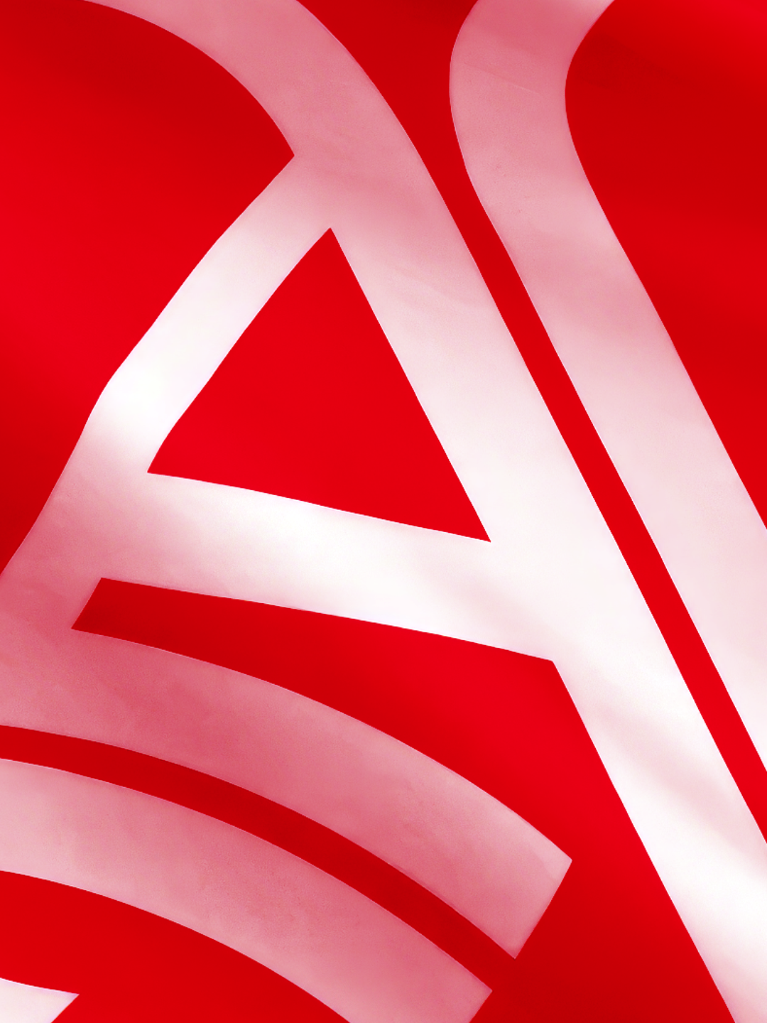
Rocastle – designed in terrain by David Rudnick with Léa Bruneau
Hero Header
Rocastle – designed in terrain by David Rudnick with Léa Bruneau
Share Article
Further Info
About the Author
—
Olivia (she/her) is associate editor of the website, overseeing the day-to-day editorial projects as well as Nicer Tuesdays events. She joined the It’s Nice That team in 2021. ofh@itsnicethat.com
To submit your work to be featured on the site, see our Submissions Guide.