- Words
- It's Nice That
- —
- Date
- 30 October 2018
- Tags
Stefan Marx and Misaki Kawai collaborate to create a poster illustrating their friendship
Share
Share
In partnership with

Dropbox Paper is a collaborative workspace that eliminates distractions that get in the way of creativity.
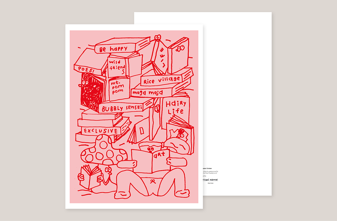
Over the course of this year, It’s Nice That and Dropbox Paper have produced a number of collaborative posters between two different creatives nestled in opposite corners of the globe. In most cases, the first creative chooses their collaborative partner off the back of admiring their work, and it’s often the case that the pair has never met either. However, for this edition, the tenth poster to be made and given out for free at Nicer Tuesdays, German illustrator Stefan Marx and Japanese artist Misaki Kawai chose to work together because they’re already pals.
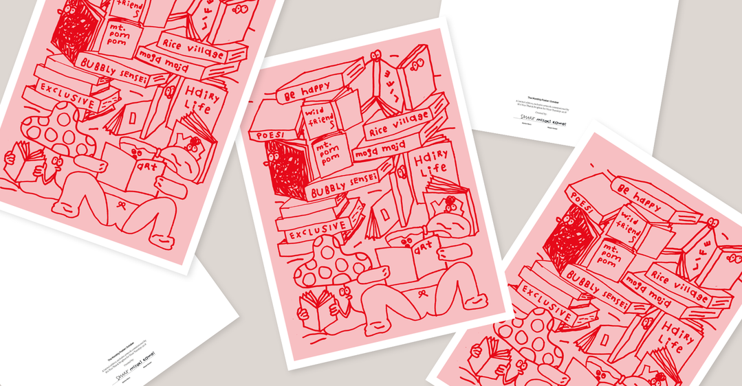
In turn, where other posters throughout the year have visually interpreted the weather or an event tied to that certain month, Misaki and Stefan instead decided to interpret the basis of their friendship: books.
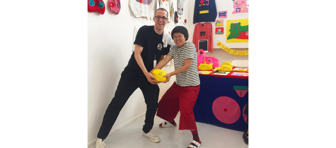
Misaki, who is based in Osaka and Stefan based in Hamburg, met back in 2016 at the Los Angeles Art Book Fair. It was Misaki’s first time there and to celebrate her debut a large vinyl of her signature character known as “Art Reading Lady” sat above each of the stalls plastered on to the wall. Stefan, who had always admired her work from afar, headed for her stall and so a long distance illustrational friendship began.
Since meeting in 2016, the pair has often found the same art book fairs and annual meet-ups as the best place for their regular catch-ups, due to the distance between them inhibiting them from hanging out day-to-day. Building upon the fact that they bonded over a mutual love of reading and illustrating their own books, Stefan began spitballing ideas for the poster’s creation by using the moment they met as an initial basis.
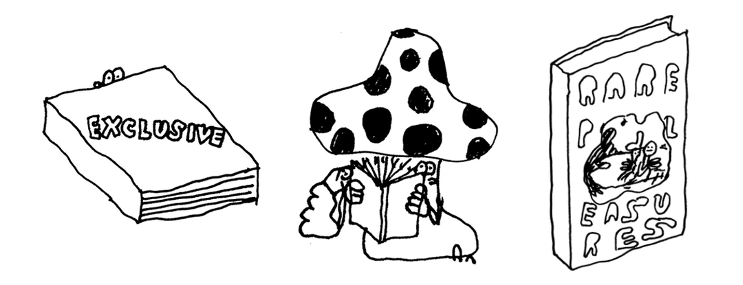
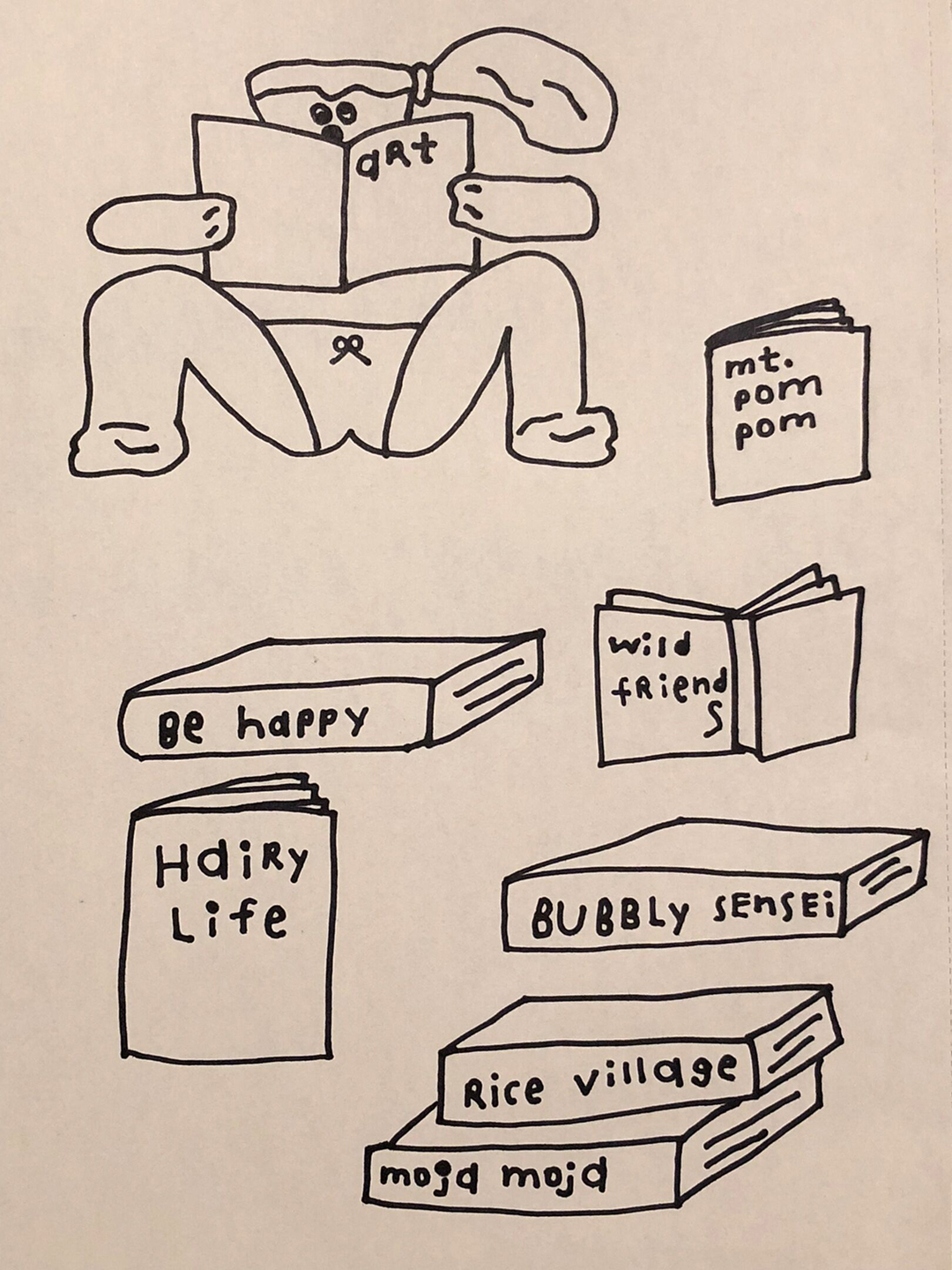
“I think, as we both love books and we love to do books, we can maybe think of drawing a shelf or stack of books,” the illustrator writes on their collaborative Dropbox Paper thread. “I lately drew some simple books, have a look, I think we could we could stack these on top of each other and give them some titles we like to see and read,” Stefan continues. “It’s fall, people like to go inside and read a book… hopefully.”
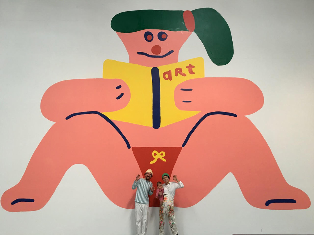
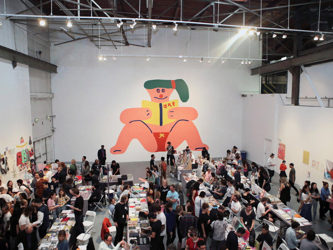
Following Stefan’s initial sketches of thick hardbound books featuring multiple titles, as well as his little mushroom man character peering into the pages of one, Misaki was sold on the idea, suggesting the pair could implement more of their personal illustration styles into the poster by having their characters sitting together enjoying the book too. Settling on using their own characters was also a particular turning point for Misaki in the project, who explains how “it was fun communicating with mushroom boy!”
To tackle the fact that their different styles of illustration could clash when amalgamated into one print, Stefan also suggested they implement some stylised rules for it to be cohesive at first glance. The pair decided to first draw in just black lines to build up a narrative. Colour would then be added as a background, rather than colouring certain parts of individual illustrations. Stefan’s preferred choice for said background colour: a rose or yellow so it’s “fully coloured, either way!”
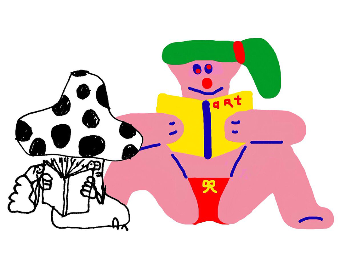
Misaki then began her illustrations, filling corners of the frame and the centre of the poster with drawings of books, while her “Art Reading Lady” sat at the top. Humour, and subtle references to the two artist’s friendship, are evident in these first sketches with Misaki adding titles to each of the books such as “be happy” and “wild friends”.
Seeing Misaki update with these drawings was a personal highlight for Stefan, “as Misaki is living in a different time zone it was fun to wake up in the European morning and see updates of her in the paper,” he explains. Being able to swap each other’s layouts and drawings within the Dropbox Paper thread was particularly easy too, with Misaki finding it a “very high tech collaboration,” and Stefan likening the layout to “a clean desk or white sheet of paper, without everything distracting”. It was this high-tech, distraction-free collaborative space that allowed for “possibilities to add different media and ideas,” Stefan concludes.
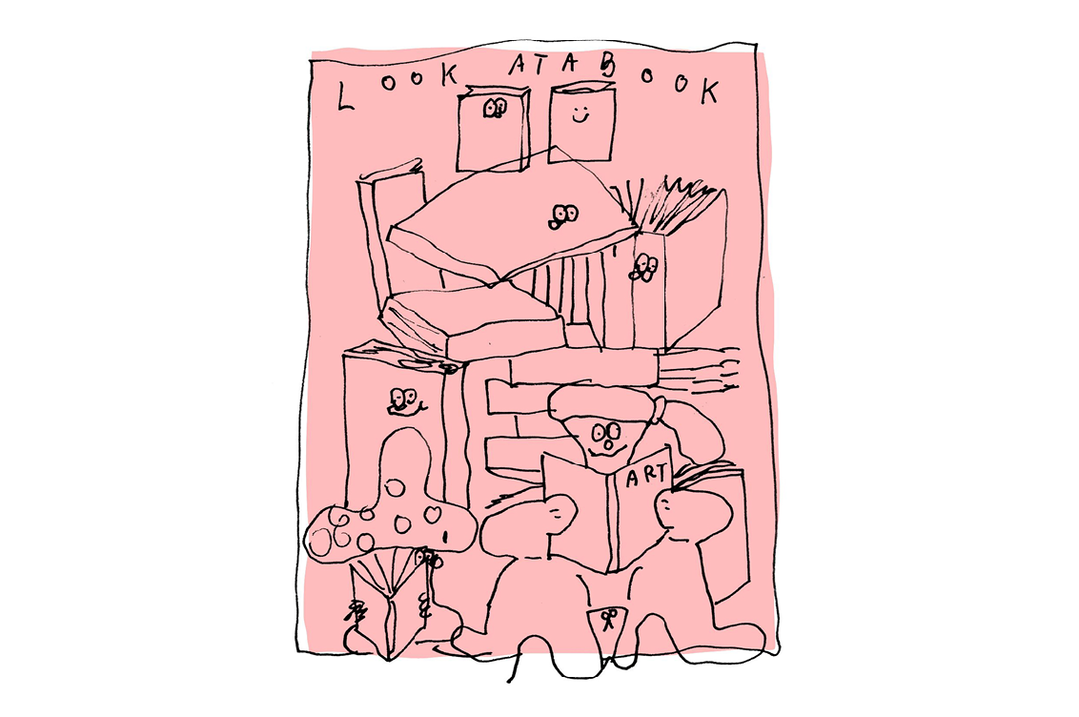
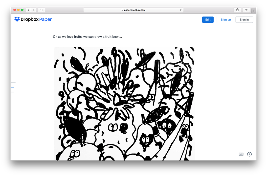
With Misaki’s illustrations set in place, Stefan then got to work with his signature wobbling lines filling the white space with yet more books, each complete with googley eyes peeking out from spines and covers. As more books were added, the pair experimented with the positioning of their characters within the poster’s design, settling on a representation of themselves sat next to each other at the bottom of the page.
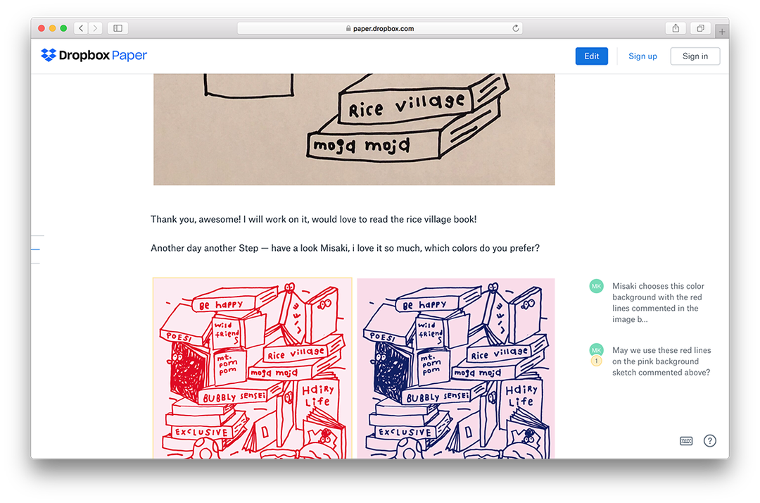
Now with the layout decided upon, all that was left to choose was that final colour palette; switching the black to a bright red or dark blue. With Misaki taking a particular liking to the red, the pair then carefully selected a complementary background colour to complete their palette. Toying between slightly different shades of pink, the pair went from a very light rose to a dark shade of bubblegum pink, settling on the latter.
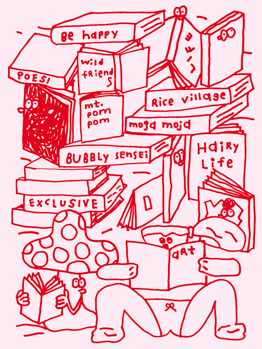
Although the red and pink slightly clash on the print, the colour palette relates to the pastel colours usually seen in Misaki’s work and adds a one-off quality to Stefan’s drawings, which are usually seen exclusively in black and white. Also, if we’re honest, it just makes the whole thing look undeniably cute too.
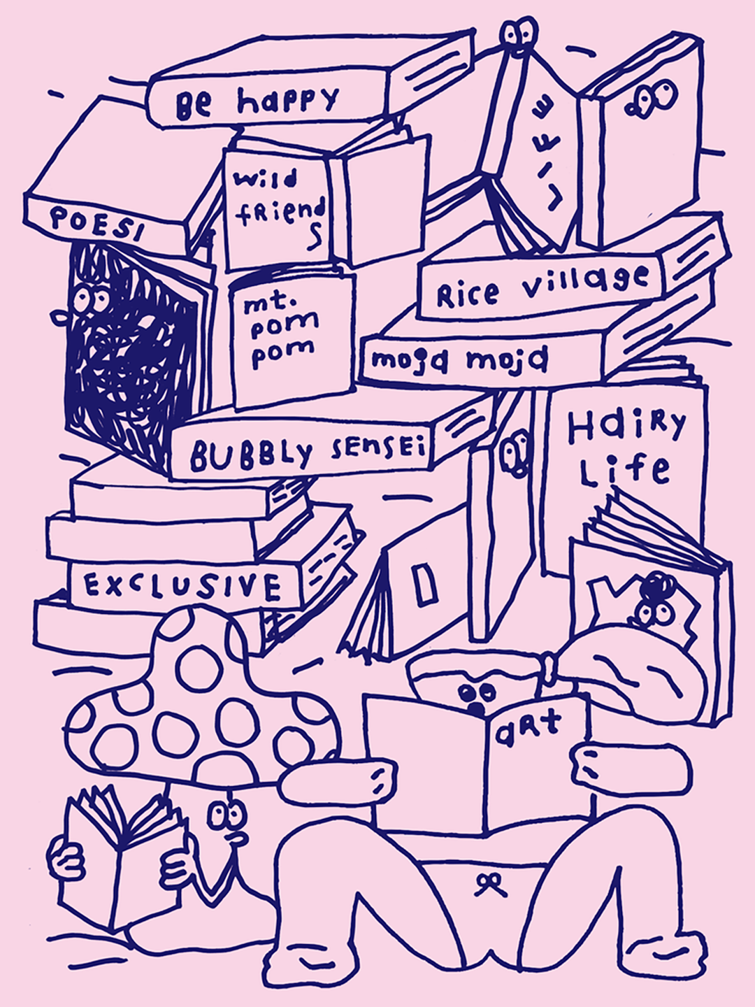
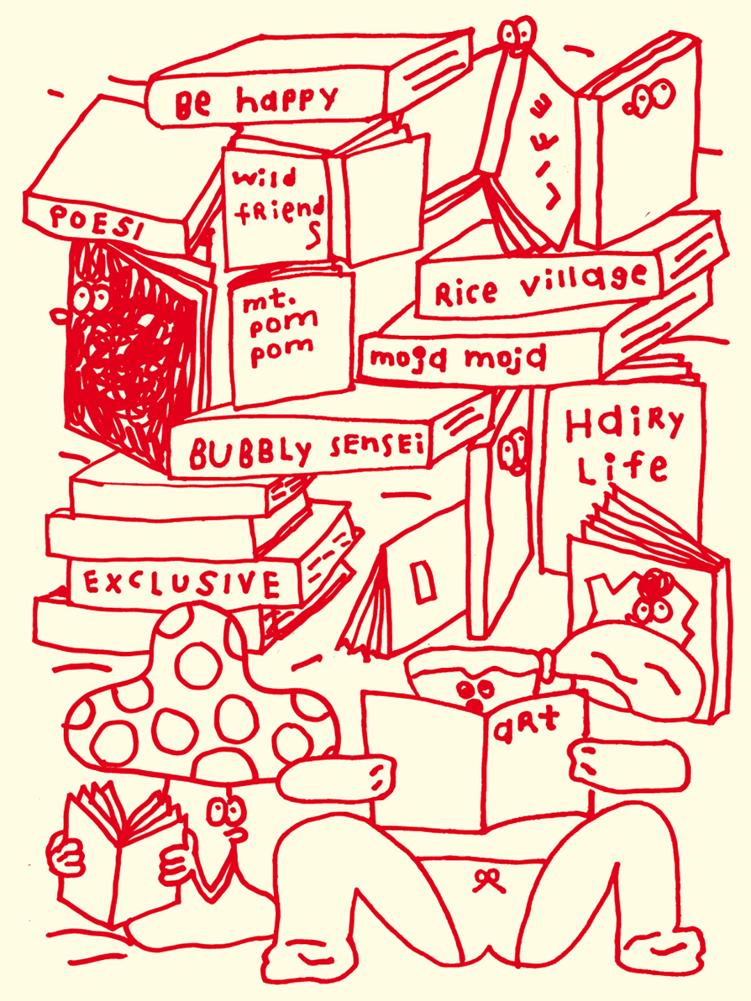
Now with the poster done and dusted and their friendship now immortalised in print form, Stefan reflects on the poster, telling It’s Nice That how the collaboration has been “a dream come true”. “I’ve loved Misaki’s work for a long time, I’m happy we became friends over the years and now we’ve made this poster together I’m very happy about it.” With Misaki summing it up a little more literally, but equally sweet saying: “Stefan and I climbed a giant book mountain!”
Share Article
Further Info
About the Author
—
This article was written by the It’s Nice That team. To find our editors and writers, please head over to our Contact page.