- Words
- Jenny Brewer
- —
- Date
- 7 September 2017
- Tags
The makings of Roald Dahl’s My Golden Ticket, a new book revisiting Wonka’s fantastical world
Share
Share
When the Roald Dahl Estate approaches you to create its first new story since the original iconic books, you know you’re on to a winner. Last year, this is the call the Wonderbly founders received, and hence began its vast undertaking My Golden Ticket – a step back through the gates of the Wonka Factory for a new generation of readers.
Wonderbly was formerly Lost My Name, a start-up publisher you might remember from Dragon’s Den, which established itself making personalised books for children. Rather than using the basic format of simply dropping a name into the same story, these books were different, cleverly adapting the entire story based on the letters of the child’s name. So each child’s book was truly individual. It was a giant hit. Within a few years it had sold a million copies and become the UK’s best-selling children’s book.
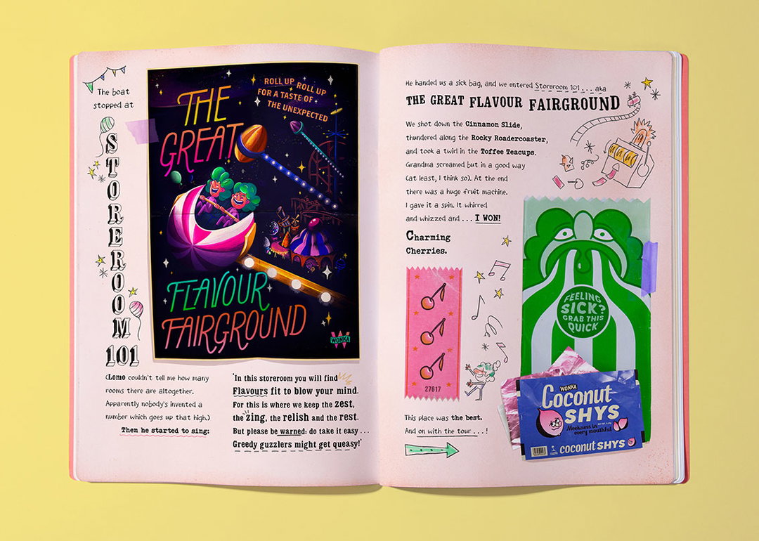
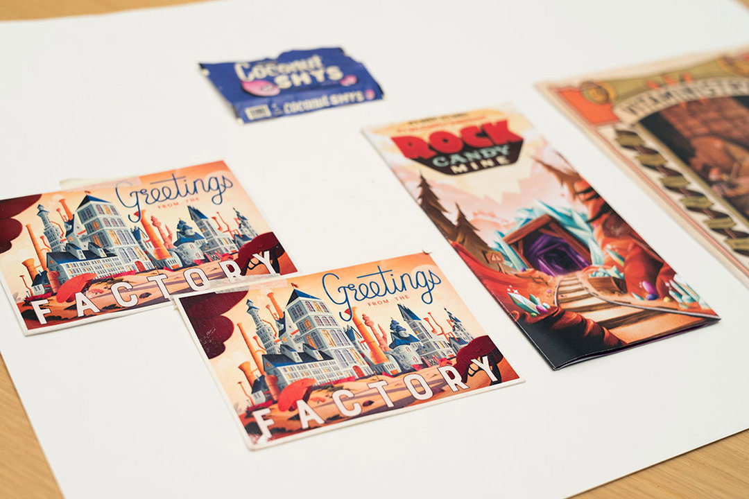
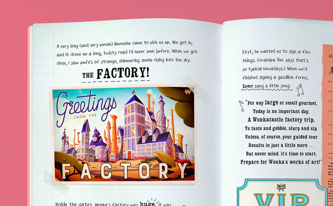
This inventive approach to publishing clearly resonated with the Roald Dahl Estate. “It struck a chord with the Wonka World,” says Wonderbly’s founding partner, David Cadji-Newby, whose background is in comedy writing for the BBC. The concept for the new book was to revisit the setting for Charlie and the Chocolate Factory, exploring the factory in first person through a journal or scrap book. “It was important it didn’t try to emulate Roald Dahl, but complement the original works as a companion piece,” David explains. “So writing it from the child’s perspective meant it wasn’t trying to recreate Dahl’s way with words.”
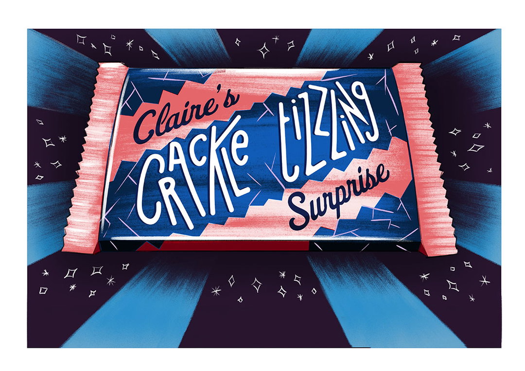
As with Lost My Name, the story is personalised to the owner’s name. Say your name is Joe. It begins with you, Joe, receiving a golden ticket and making your way to the factory as Charlie did, for a tour around its incredible, wondrous and bizarre rooms and inventions. Along the way, aspects of the story are adapted to the letters J, O and E – for example in the Great Flavour Fairground, you play a slot machine where you win a Juicy Jello, with an accompanying illustration of wobbling jellies. Later, you come across a block of rock candy that is “outrageously oozing”. And in the Fizzical Effects Machine, you are subject to an experiment that leaves you “all elastic”. Near the end of the story, you’re also presented with a customised chocolate bar tailored to your name.
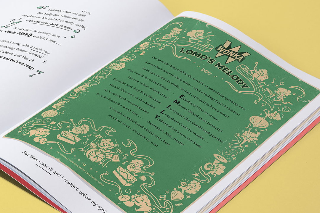
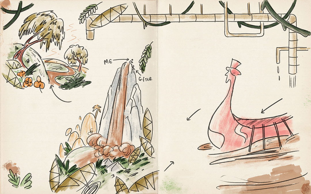
How this is personalised for every child is pretty mind-boggling, and Katy Balfour, story producer at the company (and former associate director at Punchdrunk) tells me the possible iterations go into the millions. “The rooms you visit are dictated by the number of letters in your name, and in every room there’s 26 possible outcomes, one for each letter. Plus in the Family Tree, your surname adds to the mix. There’s an Oompa Loompa song for every name in the world. So in terms of the possibilities, there’s… a lot.”
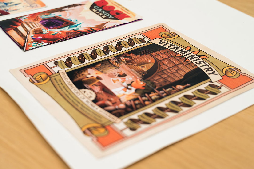
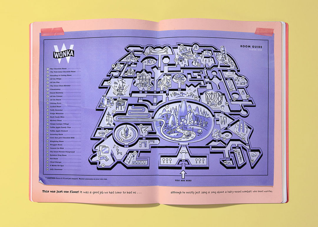
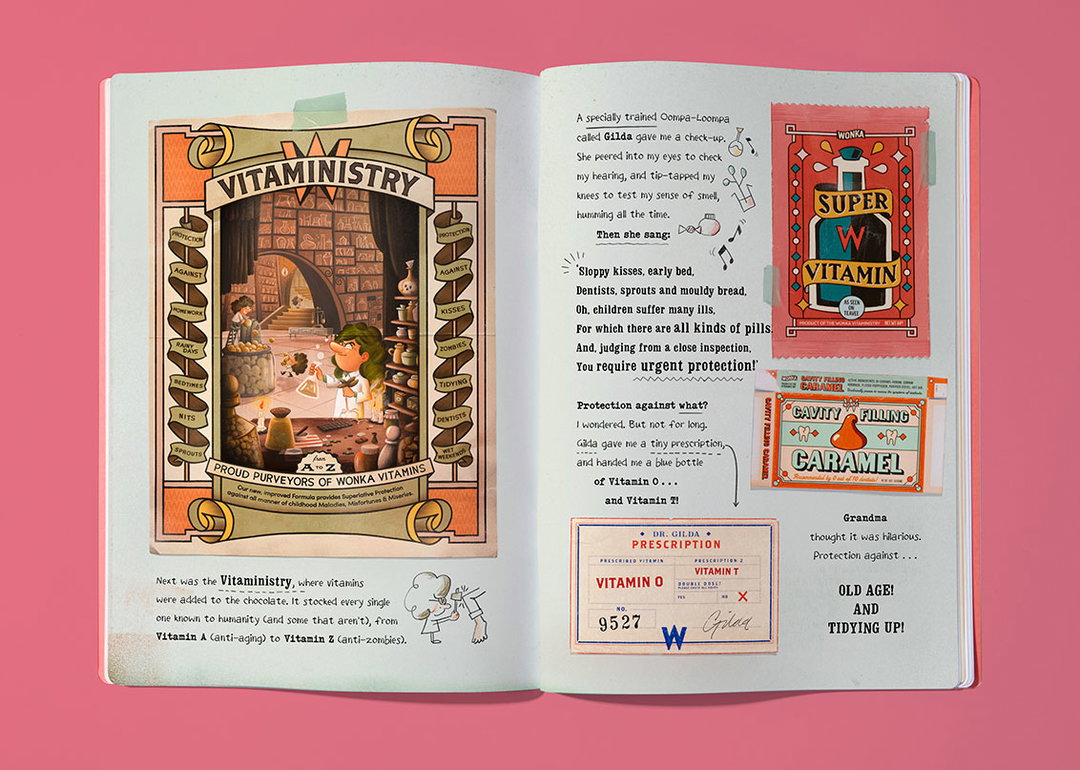
Wonka’s crazy factory is a feast of visual inspiration that’s been interpreted and depicted multiple times, but for My Golden Ticket Wonderbly delved deeper into the details that had barely been touched upon in the original text. “Charlie and the Chocolate Factory is a riot for the senses,” David says. “We wanted to bring that sensuality to life through design rather than words, so it’s overwhelming in its visual richness. Much of the world had been largely unexplored, and our approach was to take these and flesh them out, so everyone who read the originals could enjoy both, with no overlap, which it gave us a lot of freedom.” Some rooms and inventions alluded to in the original book have been visualised, such as the Juicing Room Violet Beauregarde is rolled to, which has been extrapolated. “For example, if you juice a rubber chicken you get silliness, or a globe you get adventurousness,” says David. Meanwhile other entirely new ones have been introduced, such as the Vitaministry or the Sound Hatchery.
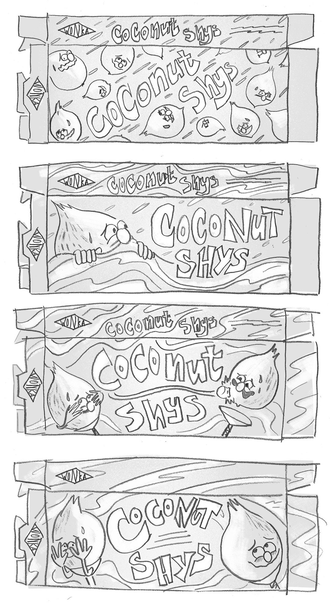
Adam Hancher was art director and illustrator on the project and has worked for nearly a year, with a team of artists, bringing every element of every possible story to life. “When I started it was already decided it would be a scrapbook,” Adam says. “The challenge was to make it a coherent storybook narrative, but also varied, with hundreds of different items and sources.”
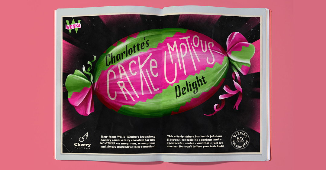
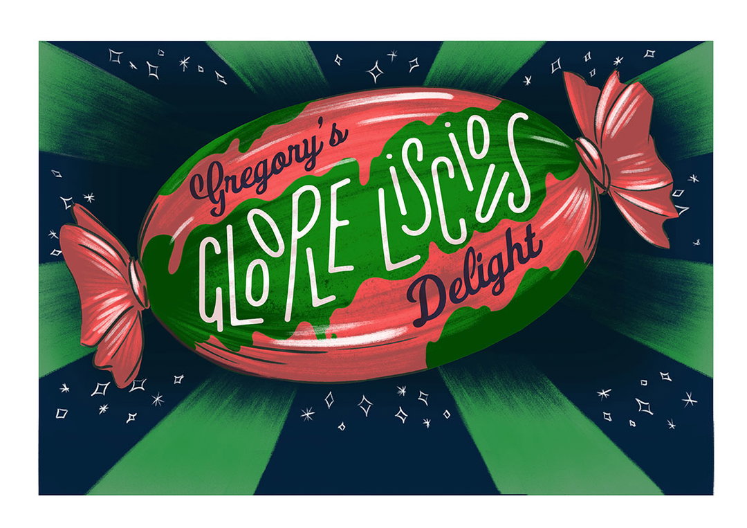
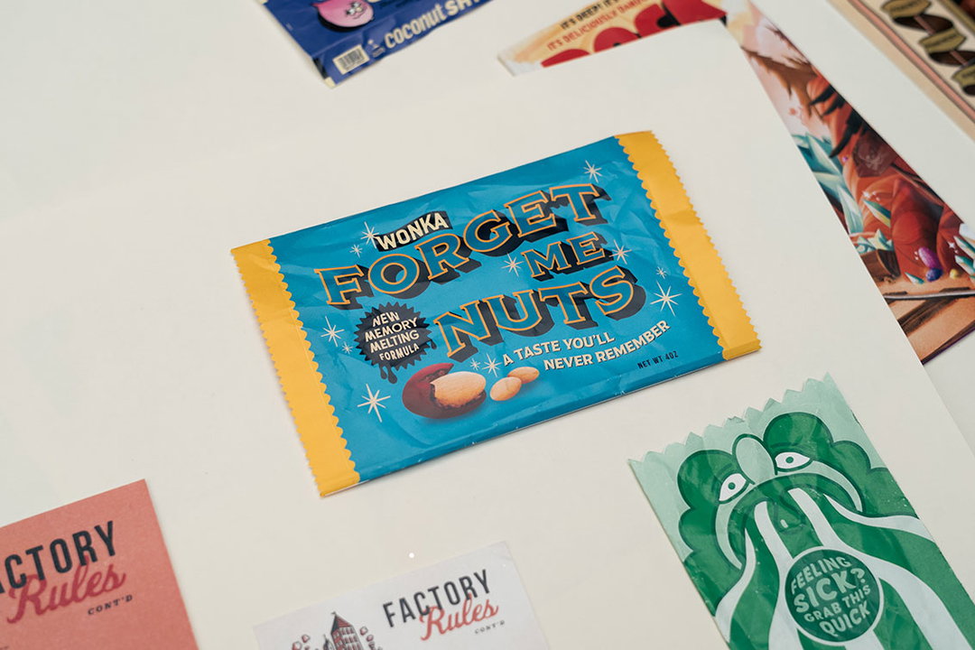
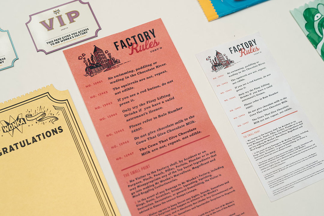
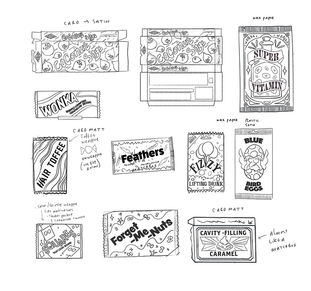
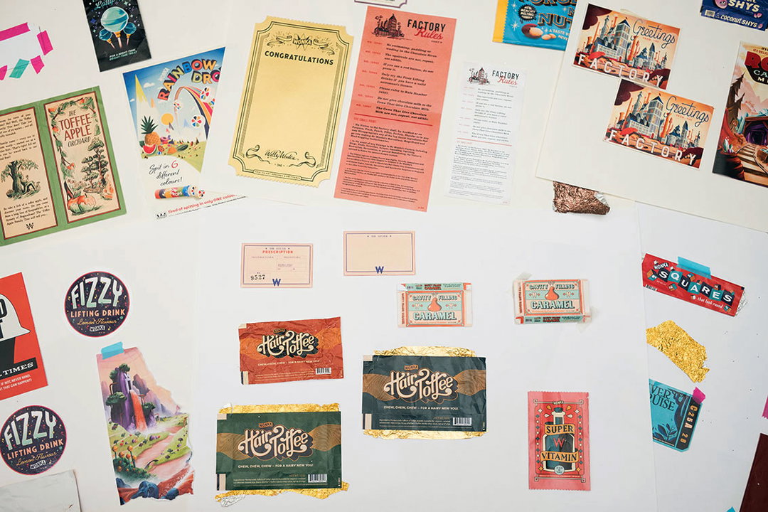
In essence, he explains, the visuals are split in two. The wrappers, packaging and posters featured in the scrap book use vivid, retro-inspired imagery, that’s bright, textured and varied stylistically. The “in-house” design for Wonka, including its entire brand identity, lists, plans, blueprints and rules, were all inspired by heritage industrial graphic design. “My dad has an industrial working background, so all that imagery is rattling around in my brain,” Adam says. “These designs were stripped back and utilitarian, referencing functional graphic design from the 40s and 60s, bold and simple.”
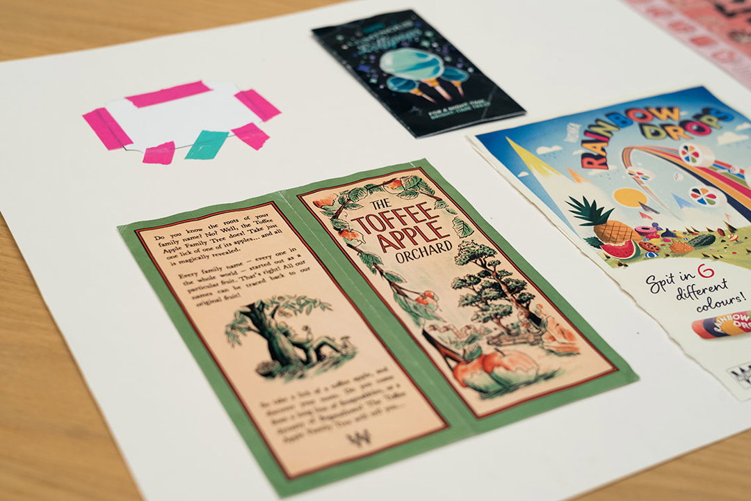
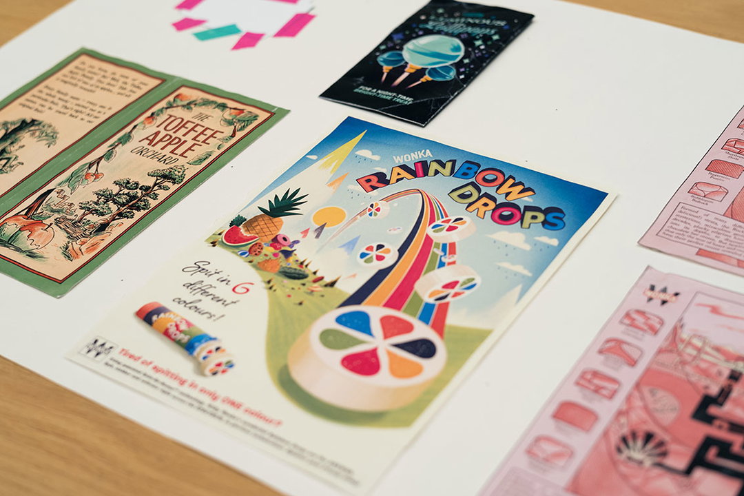
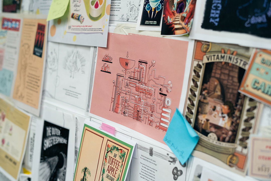
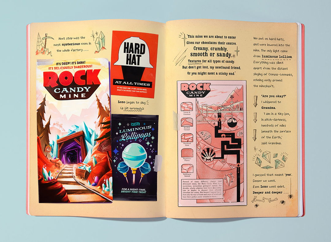
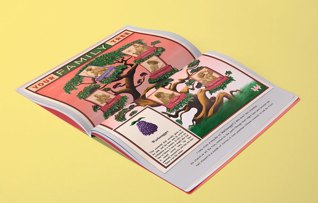
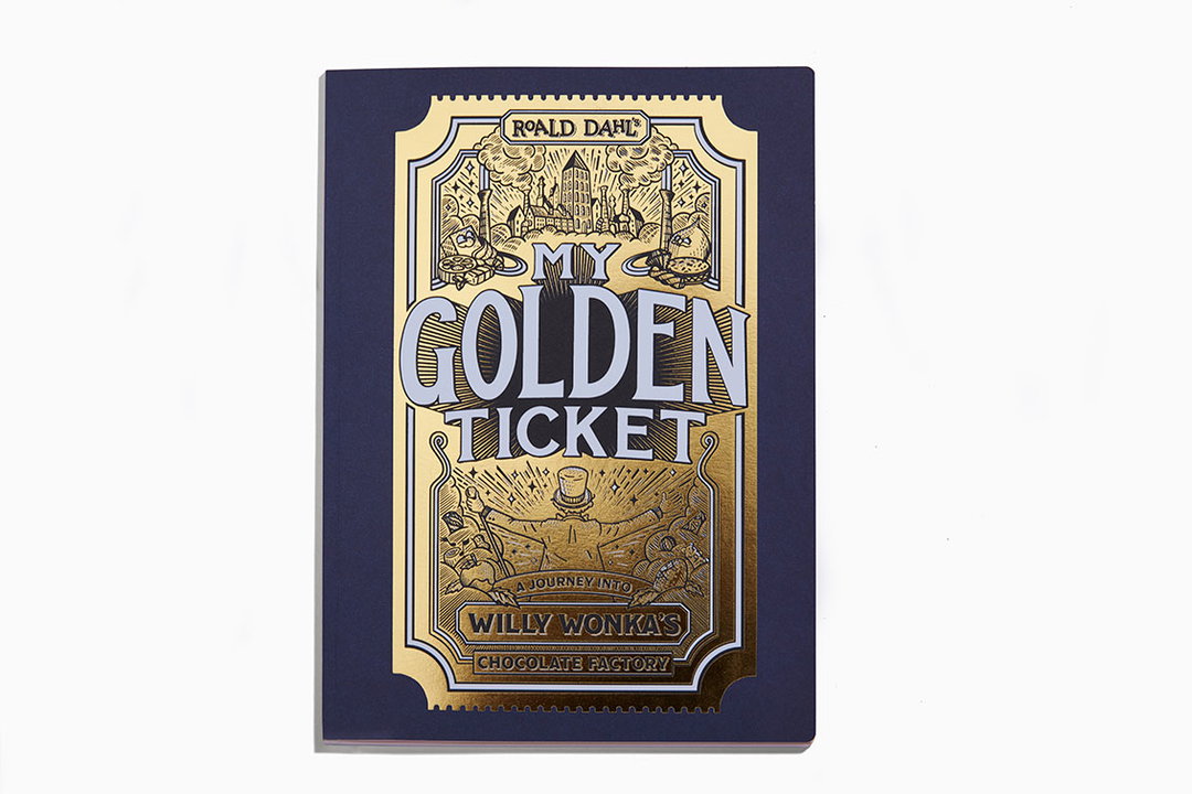
Adam storyboarded, researched and developed how the book would look, before starting work. He and assistant illustrator Adam Williams created countless images for all the elements, then worked with graphic designer Andreas Brooks, who added all the text and titles to the artefacts, and collaborated with Adam on the packaging design. Wonderbly art director Giorgia Chiarion and designer Sean Thomas laid out and set the narrative text, which was hugely varied to add to the scrapbook feel. In fact, as can be seen in these images, every single item was designed, made, printed, cut and taped into a real book which was then photographed, rather than merely Photoshopped in, to give the book tangibility and absolute authenticity. Finally, the front cover was printed by a manufacturer of chocolate box packaging, to give it that extra sheen.
From the outset, each page throws the reader into the magic of Wonka. From the postcard depicting the factory in beautiful detail and the charming, bedraggled ticket to the Wonka River Cruise, to the intricate blueprints of the factory, cross-section diagrams of the Rock Candy Mine, and myriad crumpled sweet wrappers that look so real you could grab them off the page, every millimetre is packed with discovery and delight. Which is the only way Dahl’s legacy could ever be continued.
My Golden Ticket is available now via Wonderbly.

Share Article
Further Info
About the Author
—
Jenny oversees editorial output across It’s Nice That. Get in touch with writing pitches for features or opinion pieces, big creative story tips, or questions about all things editorial. jb@itsnicethat.com
To submit your work to be featured on the site, please see our Submissions Guide.