Christopher Doyle & Co.’s identity for Troye Sivan’s fragrance line is filled with free-form image making
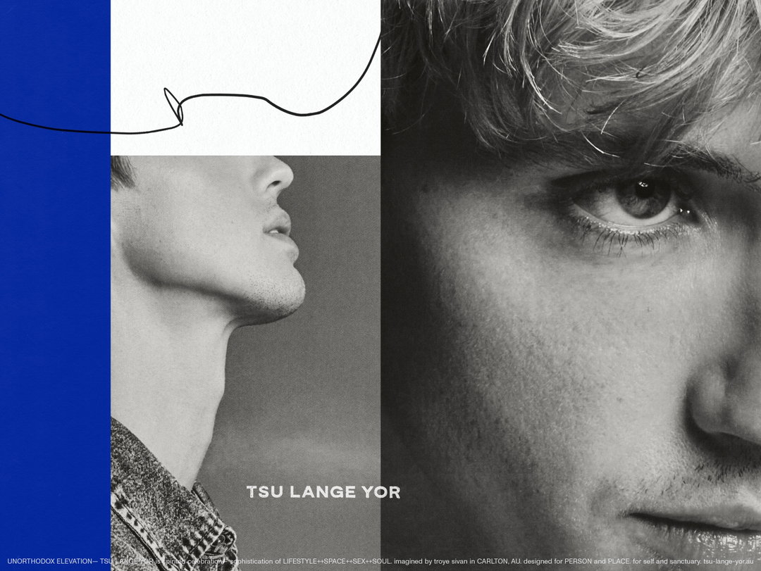
Featuring a logotype from Bráulio Amado, the identity for Tsu Lange Yor balances simplicity with moments of grandeur.
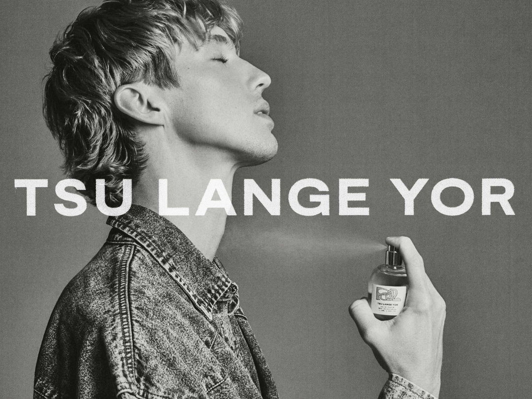
Last week, the Australian singer and actor Troye Sivan released his first fragrance and product line, Tsu Lange Yor. The project is a “dream” that is years in the making, the singer states on his Instagram, and is inspired by his infatuation with interior design. The line features personal fragrances, candles, oil burners and decorative homeware pieces.
The brand takes its name from a Yiddish saying, which directly translates as ‘To Long Years’, and is a nod to the singer’s Jewish heritage. Created in collaboration with his brother Steele Mellet, the line is independently led by the duo, with creative direction by Troye and Steele as project lead. The Sydney-based creative studio Christopher Doyle & Co. was enlisted to lead the brands identity, art direction, motion, packaging and digital design.
Troye Sivan: Tsu Lange Yor (Copyright © Troye Sivan & Christopher Doyle & Co, 2023)
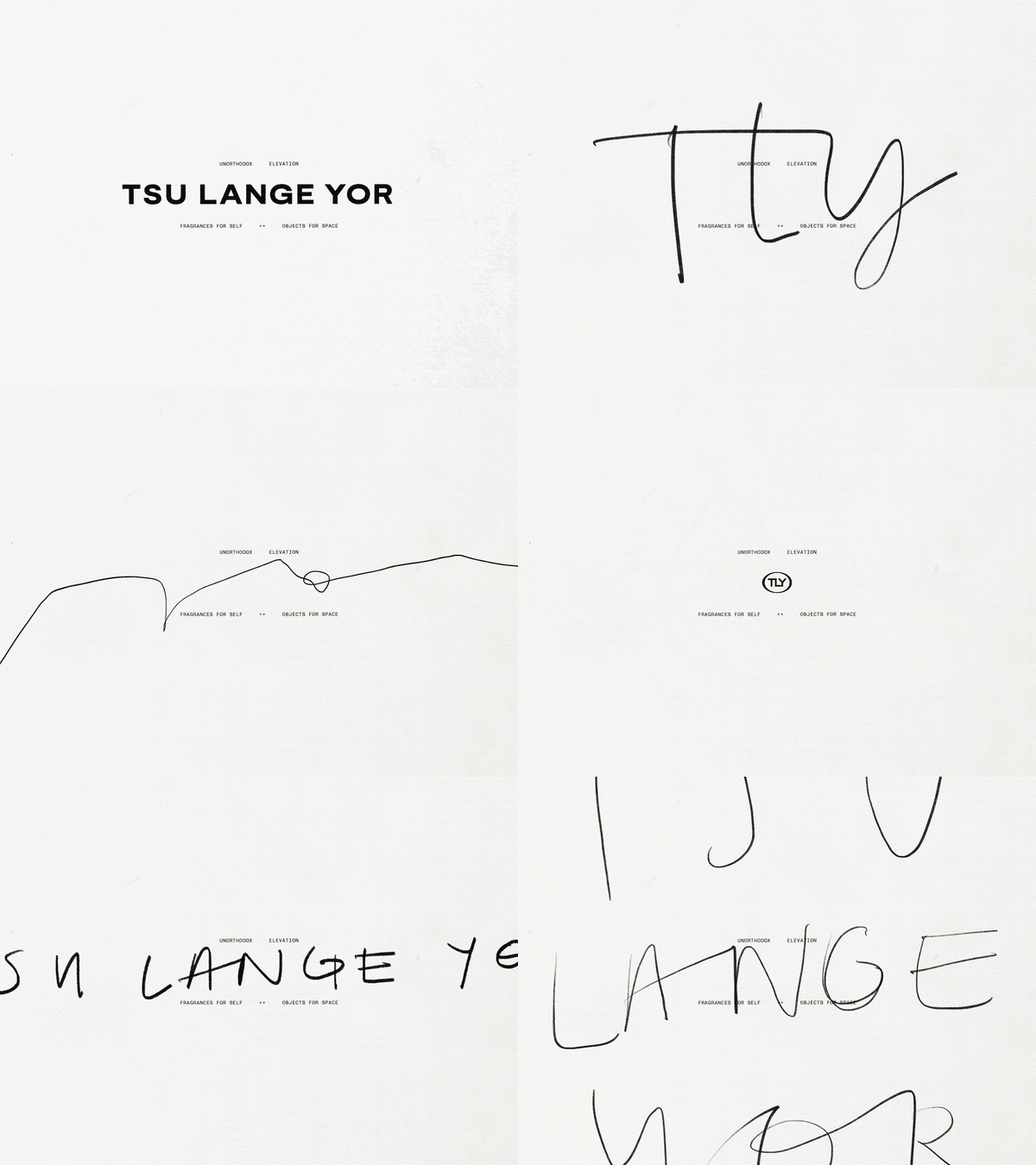
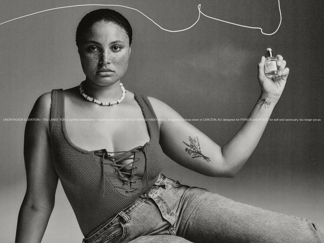
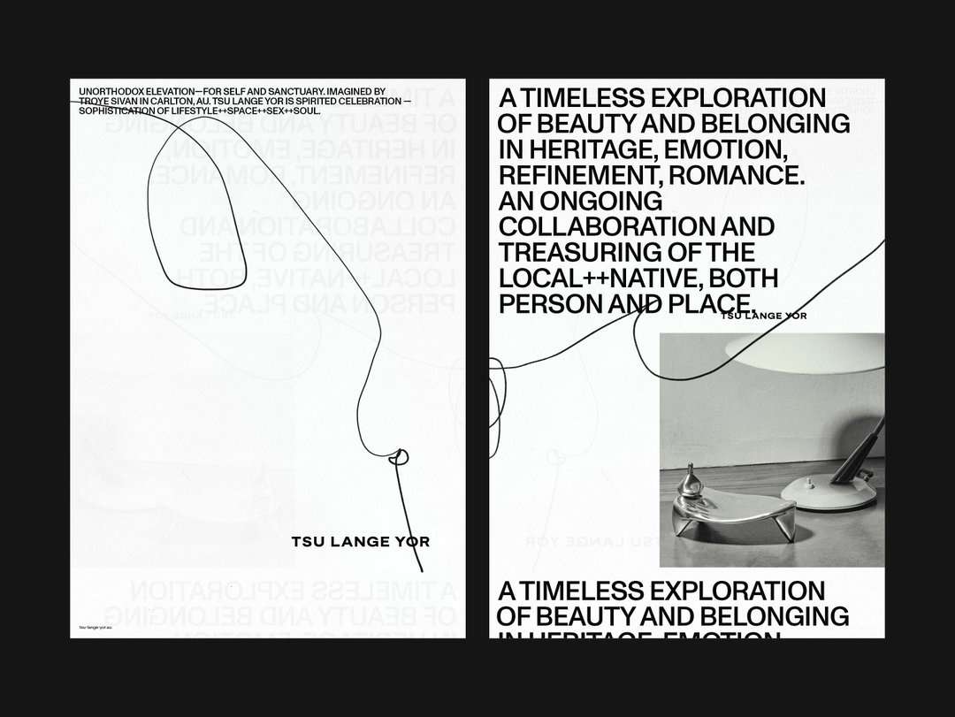
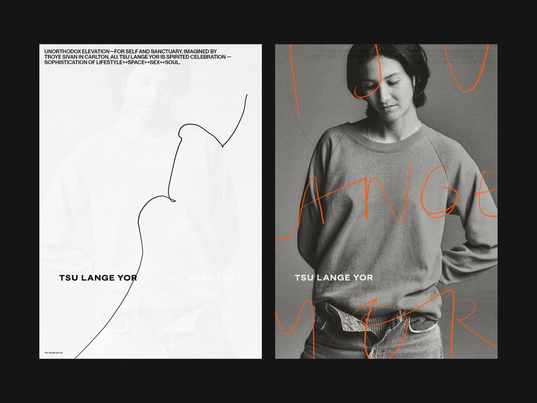
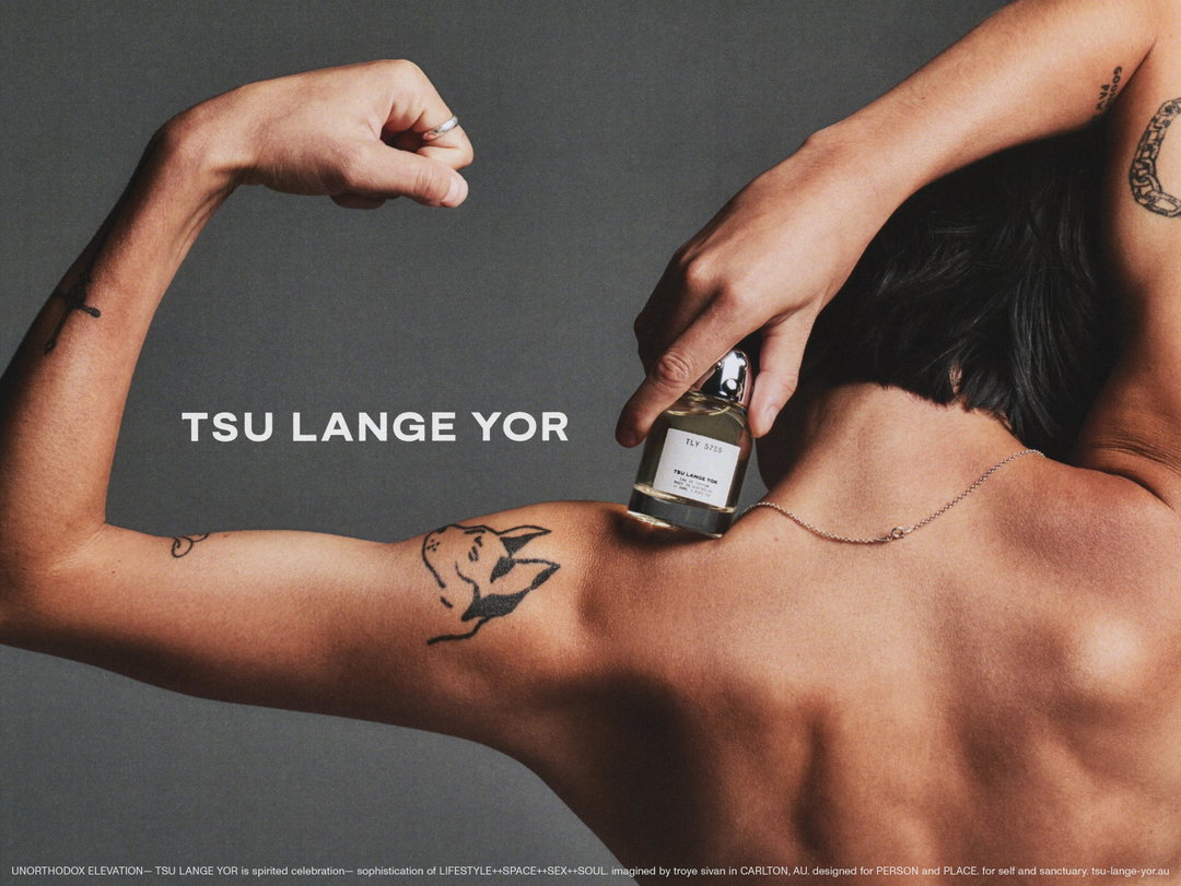
The creative studio worked closely with Troye, carefully taking his vision into consideration. Tsu Lange Yor is defined by Troye as “a spirited celebration of self and sanctuary”, that aims to elevate “lifestyle, space, sex and soul”. To bring this to life, a press release from Christopher Doyle & Co. explains that the visual language was “born from free-form image making and experimentation”. Throughout, graphic elements are combined with hand-drawn visual elements and lettering to create a visual language underpinned by varying “texture and feel”. In one motion element, various depictions of the product name flash between one another from the central logotype, to quick time scrawls, to abstract line drawings.
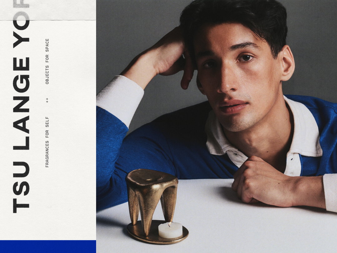
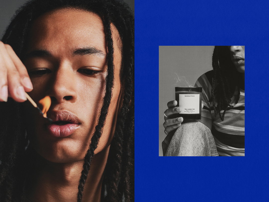
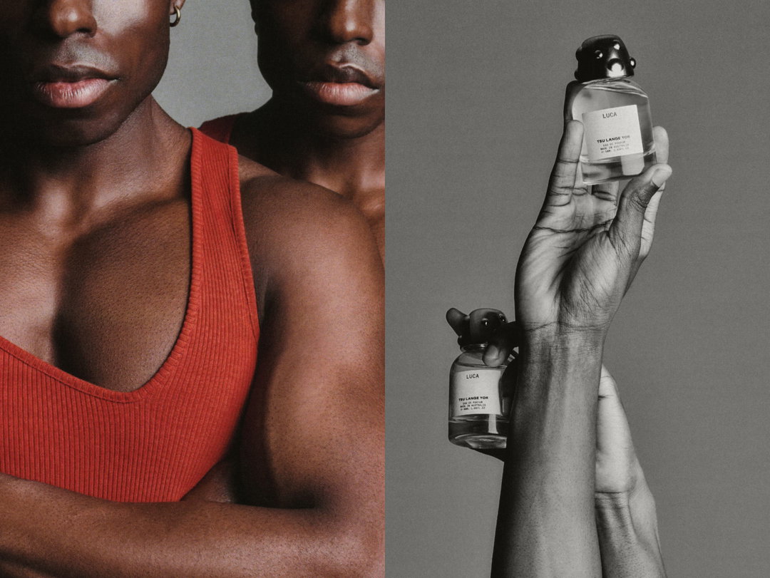
Sitting at the centre of the system is a bold logotype and supporting type system which has a mechanical essence. For the physical products, a pared back labelling system of the core type system was applied – off white labels with small, wide-spaced type – with space being allocated for custom product logotypes and graphic elements. One of the fragrances, Pool, features an illustrated logotype from Bráulio Amado. In his signature way with type, the leaves energetically intertwine with one another, finished in a bright water blue, adding an intriguing contrast to the rest of the simplistic label.
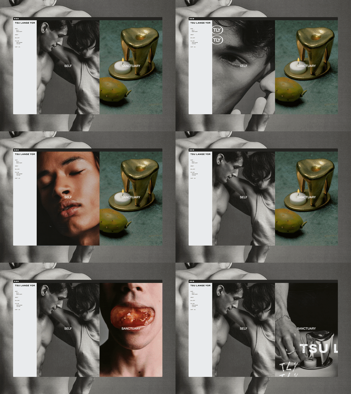
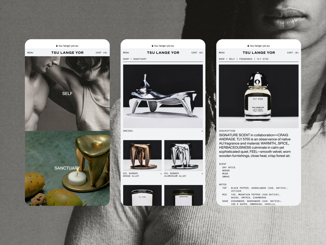
Throughout the campaign, these graphic elements are combined with photography by Joe Brennan, Lauren Bamford and Joel Adler that has a high-fashion feel and includes Troye alongside models. Tying everything together, the studio developed an e-commerce site, aiming to create an immersive, “media-rich browning experience” the site both directs you to the product range, while also leading viewers to a gallery of brand images and collages.
GalleryTroye Sivan: Tsu Lange Yor (Copyright © Troye Sivan & Christopher Doyle & Co, 2023)
Hero Header
Troye Sivan: Tsu Lange Yor (Copyright © Troye Sivan & Christopher Doyle & Co, 2023)
Share Article
Further Info
Credits
Creative direction by Troye Sivan
Project lead Steele Mellet
Brand identity, art direction, motion, packaging, and digital design by Christopher Doyle and Co.
Photography by Joe Brennan, Lauren Bamford, and Joel Adler
Video production by Byron Spencer
Product design by Joel Adler
Tone of voice and copywriting by Cat Wall
Digital development by Bone Digital
Packaging production and management by Contain
Pool type illustration by Braulio Amado
About the Author
—
Olivia (she/her) is associate editor of the website, overseeing the day-to-day editorial projects as well as Nicer Tuesdays events. She joined the It’s Nice That team in 2021. [email protected]
To submit your work to be featured on the site, see our Submissions Guide.