Study reveals the Pantone references of banknotes around the world
A new study into the design of money currently in circulation reveals a range of global trends, from the use of colour to which famous figures countries choose to represent them.
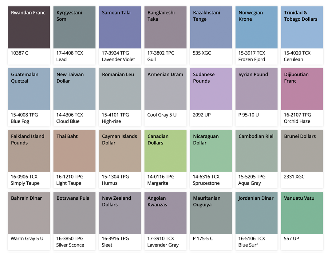
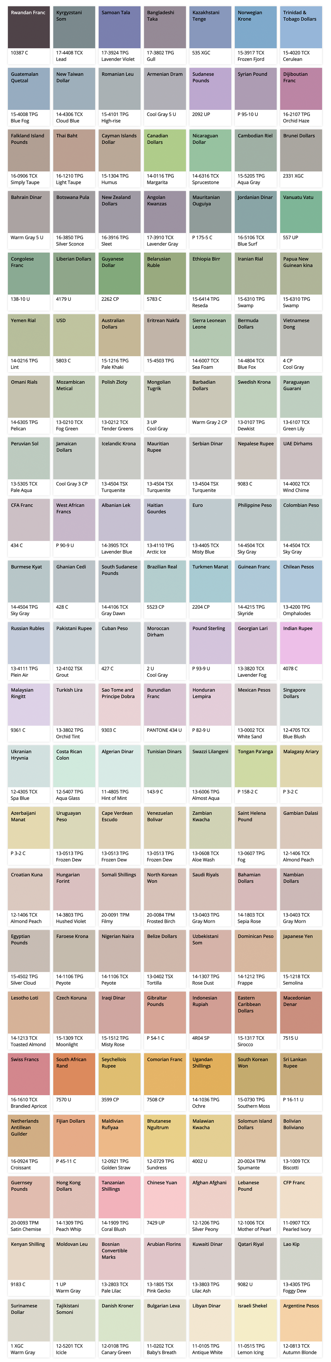
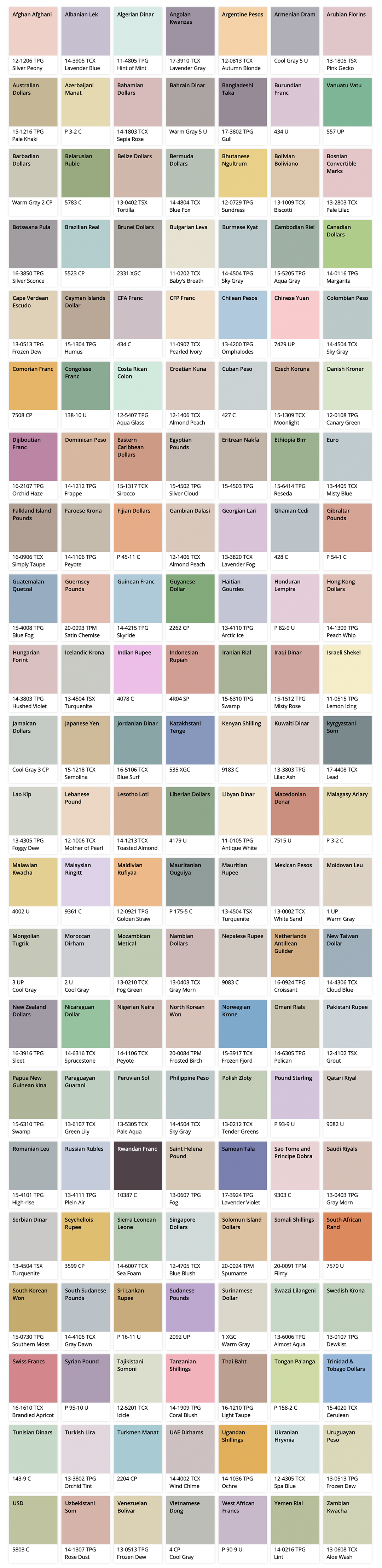
Money.co.uk has released a new study looking into the different aesthetic attributes of currency on a global scale – even looking into the Pantone references for each too. The results display certain patterns in use of colour, the appearance of different famous people or animals, and proposes what a global currency could look like.
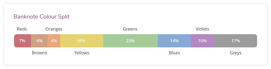
To decide on which specific colour is representative of each country, the study analysed the most popular note in circulation or, if needed, chose the denomination closest to the equivalent of £20 – hence why pound sterling is represented as a violet purple. A violet-hued banknote, however, only makes up 10 per cent of banknotes on a global scale. The most popular, at 23 per cent, is a variation of green, notably used on the US dollar, Swedish Krona and Uruguayan Peso. This is followed by yellow (18 per cent), grey (17 per cent), blue (14 per cent), and red, orange and brown all below ten per cent.
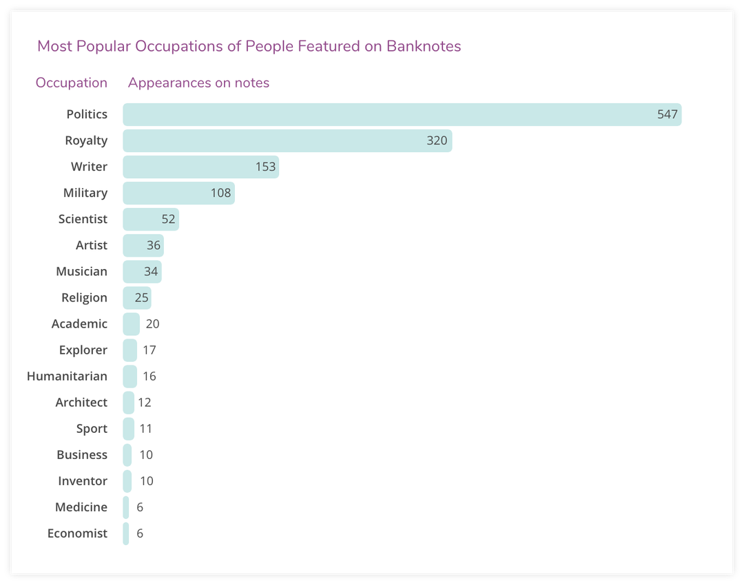
When looking into the frequency of figures featured on banknotes the study noticed how “occupations vary greatly depending on the currency and value of note they appear on,” it explains. Within its research of 1,383 banknotes which featured a person, 547 were political figures, 320 royals and 153 writers. “Perhaps unsurprisingly, Queen Elizabeth II is the most popular figure on banknotes, having featured on 45 different note designs across 11 countries,” says the study, while also pointing out how only 7 per cent of notes featured women. “In fact, only Jersey, the UK and Denmark have a balanced or female favoured gender profile, with all other currencies predominantly featuring males.”
After recognisable figures it’s animals which are predominantly seen, with birds being the most popular to appear on notes. It’s also specifically eagles that are the most popular animal, featuring on 41 currencies around the world. The final common visual on banknotes analysed is buildings, ranging from castles as the most popular, but also featuring churches, museums and mosques.
Each of these factors then led the study to propose the possible visuals that would appear on a “global note”, featuring common denominators such as a green colour palette and an eagle. “Ask anyone and they can probably tell you what colour a £20 note is, or which famous monarch’s picture is on the back, but when as the last time they actually looked at a bank note in detail? We can handle a wide variety of different currencies over the course of our lives, but never really stop to take note of the finer design aspects,” concludes Salman Hiqqi from Money.co.uk on the project.


Share Article
Further Info
About the Author
—
Lucy (she/her) was part of the It’s Nice That team from 2016–2025, first joining as a staff writer after graduating from Chelsea College of Art with a degree in Graphic Design Communication, eventually becoming a senior editor on our editorial team, and most recently at Insights, a research-driven department with It’s Nice That.