




Birmingham’s creative quarter gets a new identity courtesy of dn&co and Colophon Foundry
(Via dn&co/Colophon Foundry)
Brand and design consultancy dn&co has teamed up with type masters Colophon Foundry to give Birmingham’s creative quarter a snazzy new look.
A major site of importance during Birmingham’s industrial revolution, Digbeth – which is pretty much slap-bang in the middle of England’s second biggest city – is now one of the most distinctive areas in town.
“In a place where a digital agency sits next door to a blacksmith and opposite someone who specialises in 3D-printed candy, there was never going to be a single marque that could reflect the incredible diversity of this community,” says dn&co’s creative director Patrick Eley.
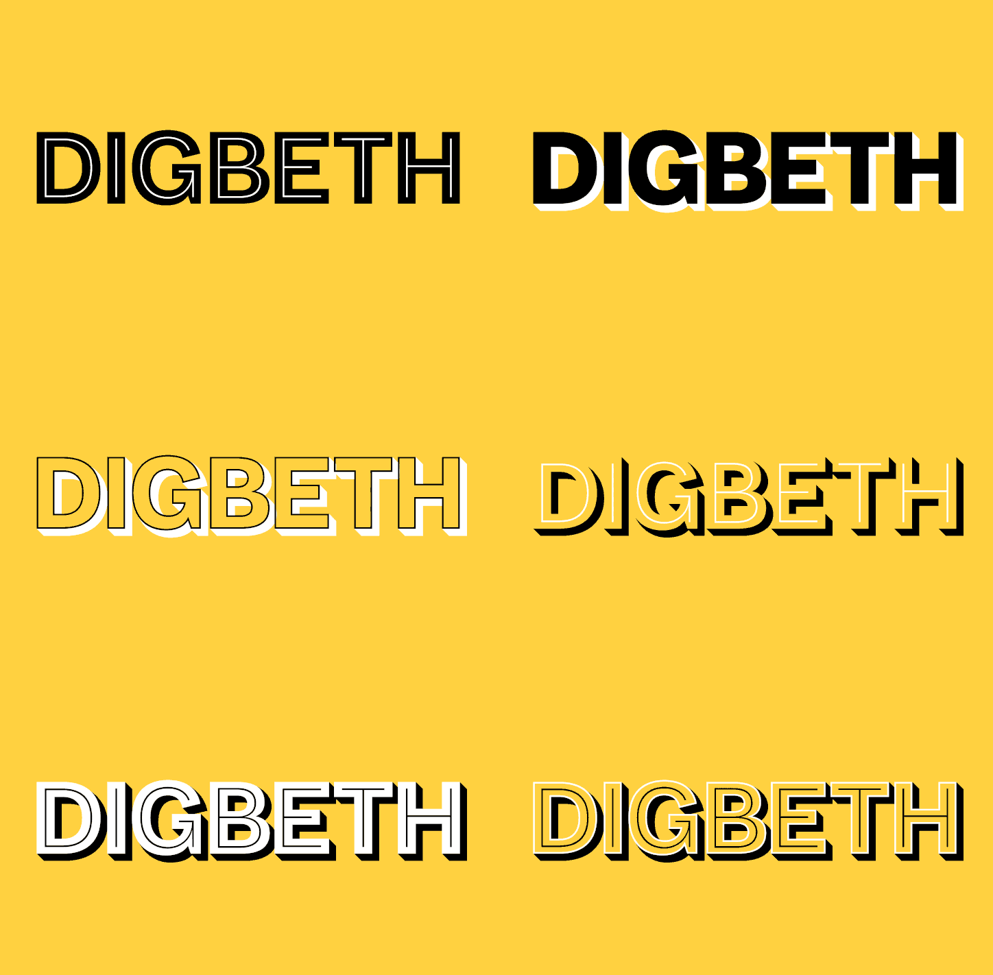
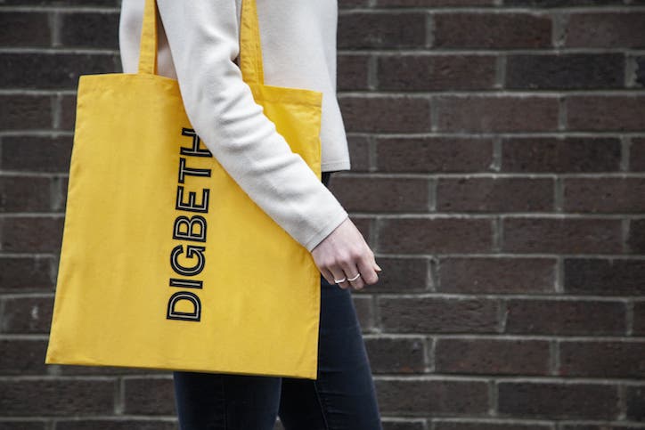
An integral part of the brand is Digbeth Sans, a new, flexible typeface which will be free to download for anyone lucky enough to be living in Digbeth. We’re told by dn&co that the result is a “flexible typeface, full of personality – much like Digbeth itself.”
Patrick also states that: “Building on the area’s rough-and-ready industrial heritage, we worked with Colophon to produce a family of layered sans typefaces that could be overlaid in multiple ways, creating one distinct voice for Digbeth that could vary in tone to capture the different characters of the area. Unusually, we’re giving the typeface back to the community, giving the identity the chance to truly reflect those it represents. We’re excited to see it used in new and inventive ways.”
Colophon’s director, Anthony Sheert, notes that the area’s industrial history was pivotal to the development of the new typeface. “The variety of styles and layers draw inspiration from the lettering on the canal boats, and the industrial typography that runs through Digbeth and the surrounding Grand Union canal,” he’s quoted as saying in the press release heralding the unveiling of the new brand.
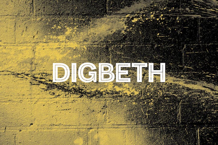
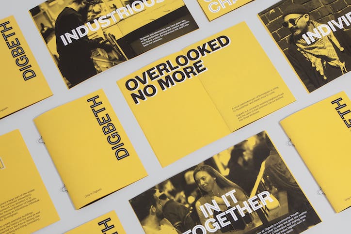
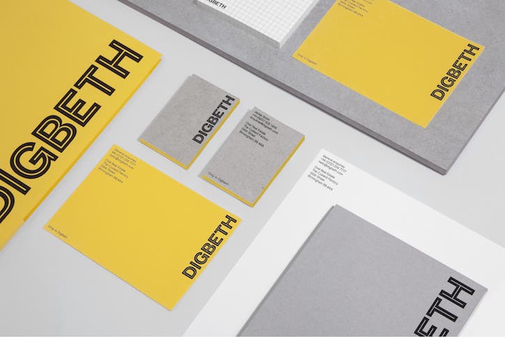
As ever with these things, the new branding – which uses a tonne of yellow as a nod to Bird’s Custard powder, one of Digbeth’s most beloved gifts to the nation – will be rolling out both IRL and all over the internet. It will be unveiled at today’s Birmingham Design Festival.
(Via dn&co/Colophon Foundry)
(Via dn&co/Colophon Foundry)
(Via dn&co/Colophon Foundry)
(Via dn&co/Colophon Foundry)
Share Article
Further Info
About the Author
—
Josh Baines joined It's Nice That from July 2018 to July 2019 as News Editor, covering new high-profile projects, awards announcements, and everything else in between.