




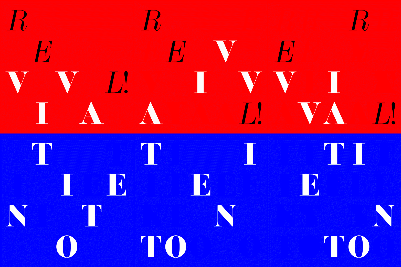
The Foundry relaunches with a new name and 23 typeface families
After an eight-year hiatus, two designers from the original studio have reunited to reboot it under the new moniker The Foundry Types.
The Foundry was originally set up over 30 years ago by David Quay and Freda Sack, who then took on Stuart de Rozario as a junior designer in 1998. The team collaborated with legendary designers such as Wim Crouwel; built up a library of well-known typefaces, including Foundry Sans, Foundry Monoline and Foundry Gridnik; and created corporate typefaces for brands such as NatWest, Yellow Pages, Swiss International Airlines and the World Wildlife Fund.
Today, eight years after the studio was disbanded, two of the original team members – David and Stuart (Freda sadly passed away last year) – have reunited to revive the company under a new name: The Foundry Types. Their mission, they say, is to continue The Foundry’s legacy of designing well-crafted and unique typefaces, utilising their combined total of over 75 years of experience in type design, which has seen them live through every technological stage of the medium “since hot metal”, as they put it in a statement.
To coincide with the launch, David and Stuart approached 17 of their designer friends to create assets showcasing their newly released typeface Foundry Tiento, a face with a neo-classical aesthetic that lends itself to editorial, headline display and branding projects. These designers include Andy Altmann, Iancu Barbarasa, Becky Chilcott, Roger Fawcett-Tang, Joe Faulding, Ade Mills, Nicole Arnett Phillips, Lucienne Roberts, and Gilmar Wendt. They were all given the same brief, loosely based around ideas of “Rebirth / Reboot”. (You can see a small selection of the responses to that brief below.)
“The opportunity to work alongside David again after eight years apart, is not only very exciting, it fills me with immense pride,” partner Stuart de Rozario wrote in a statement. “David and Freda gave me my first big break after leaving college in 1998.” Having spent seven years working for Fontsmith (now part of Monotype), he says he now feels like he is returning “home to where my heart is”. Today, he goes on to say in the statement, “we give The Foundry Types a rebirth, aiming to continue Freda’s legacy.”
The new foundry is being launched with a new website, designed by Clare Playne and her team at Playne Design, and 23 typeface families in total.
GalleryThe Foundry Types: Examples of the Tiento typeface (Copyright © The Foundry Types, 2020)
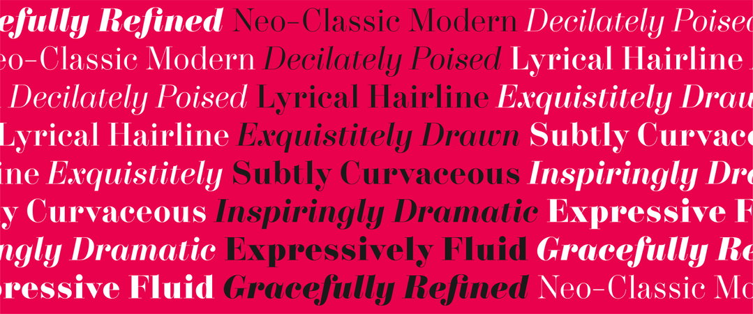
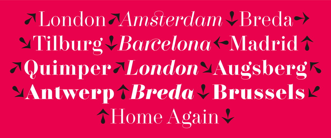
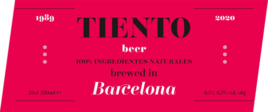
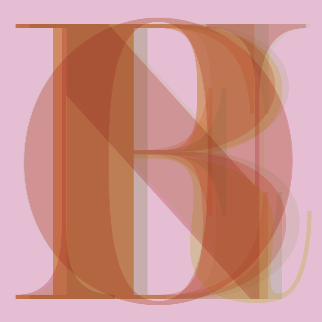
Gilmar Wendt for The Foundry Types (Copyright © Gilmar Wendt, 2020)
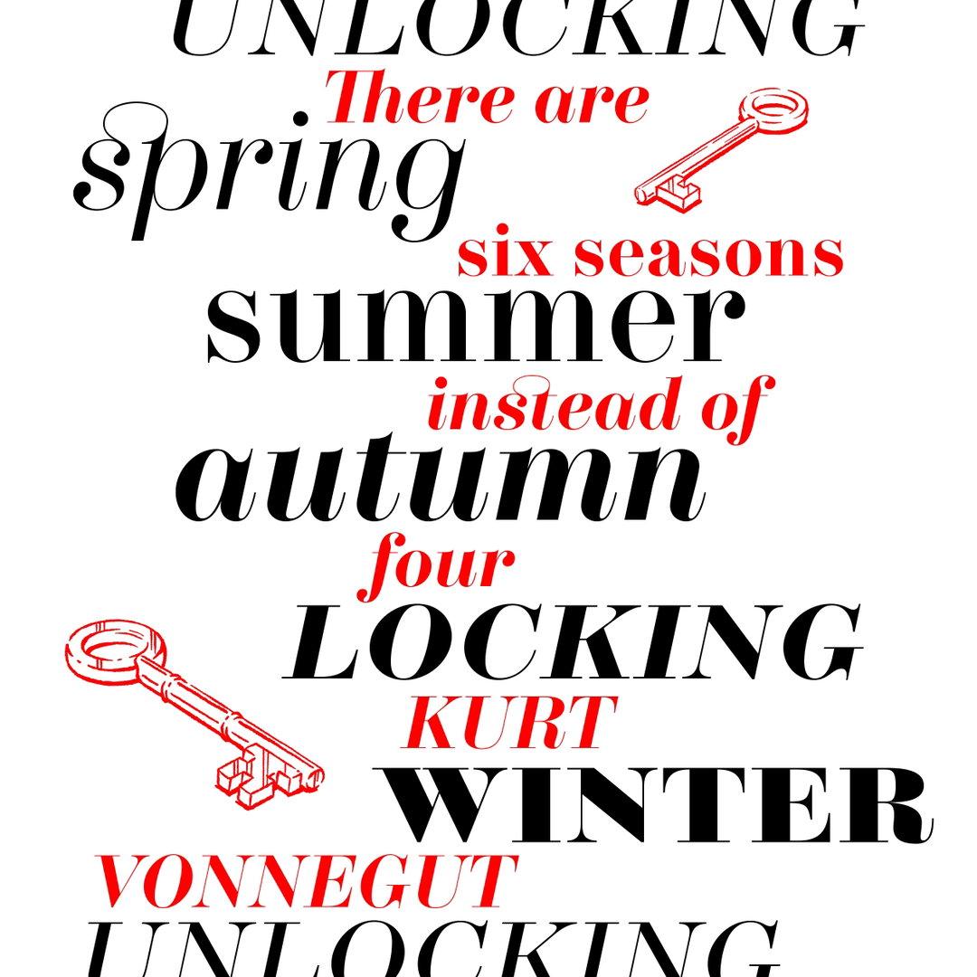
Iancu Barbarasa for The Foundry Types (Copyright © Iancu Barbarasa, 2020)
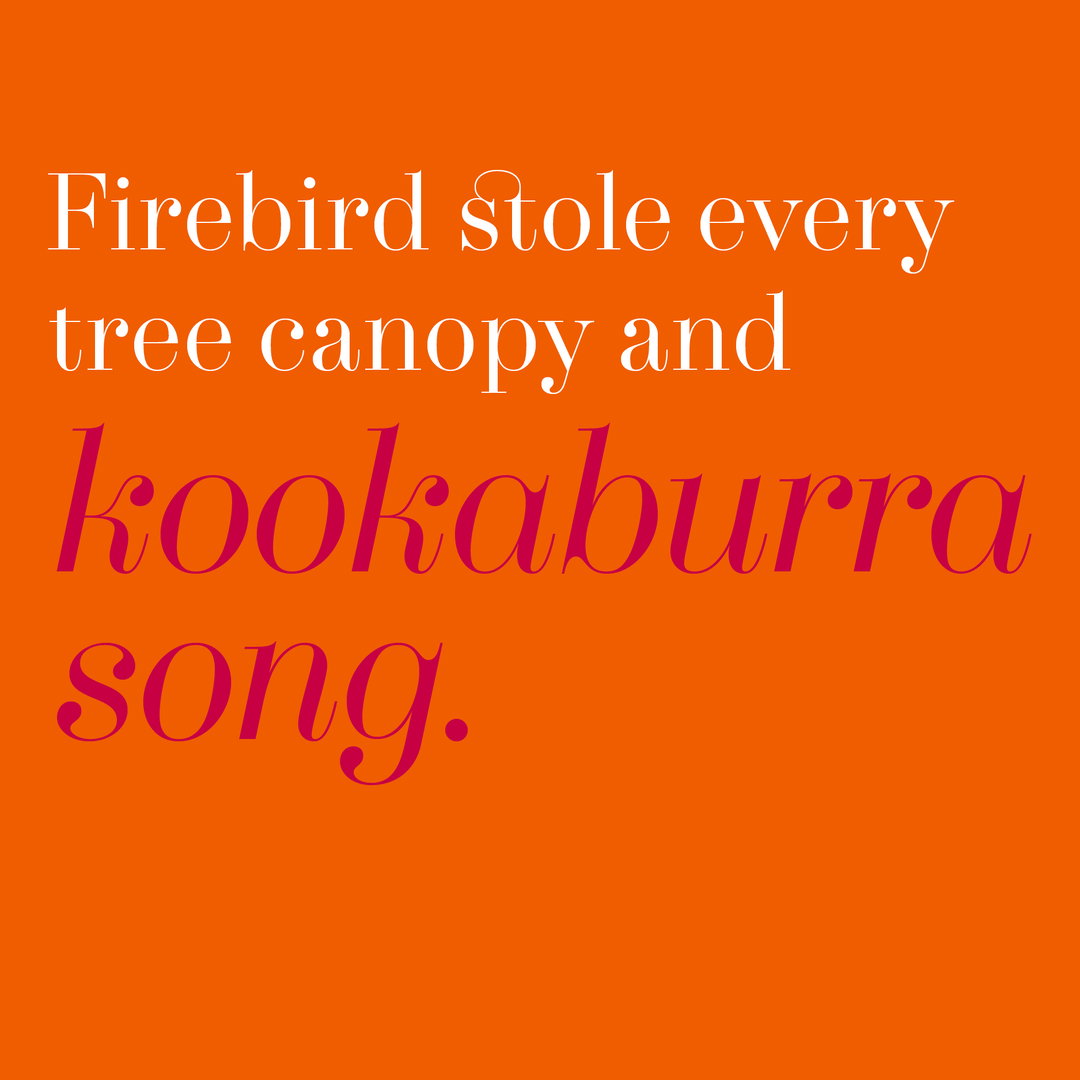
Design by Becky Chilcott for The Foundry Types, using words by Dettra Rose (Copyright © Becky Chilcott, 2020)
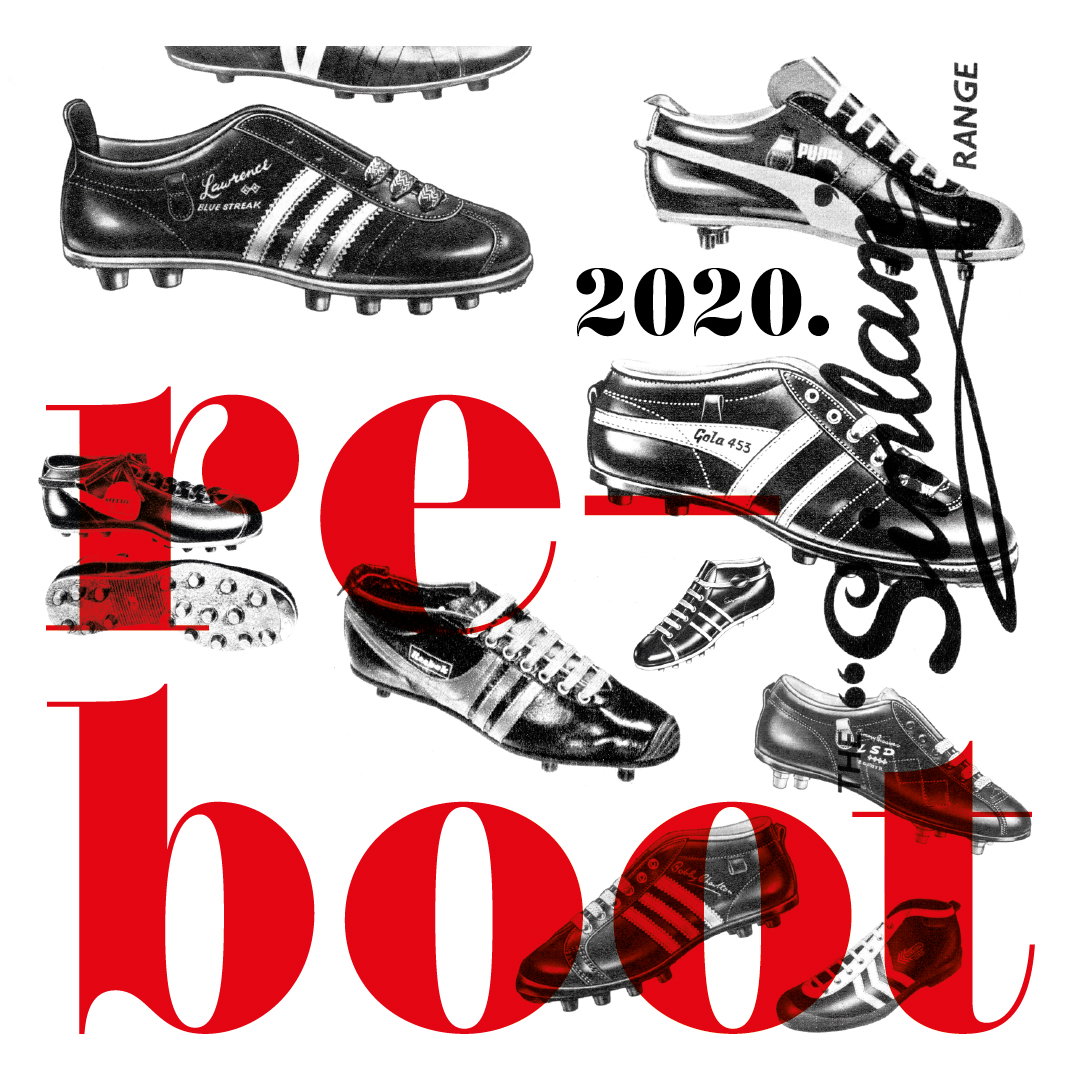
Andy Altmann for The Foundry Types (Copyright © Andy Altmann, 2020)
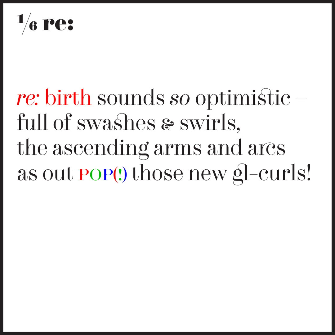
Lucienne Roberts for The Foundry Types (Copyright © Lucienne Roberts, 2020)
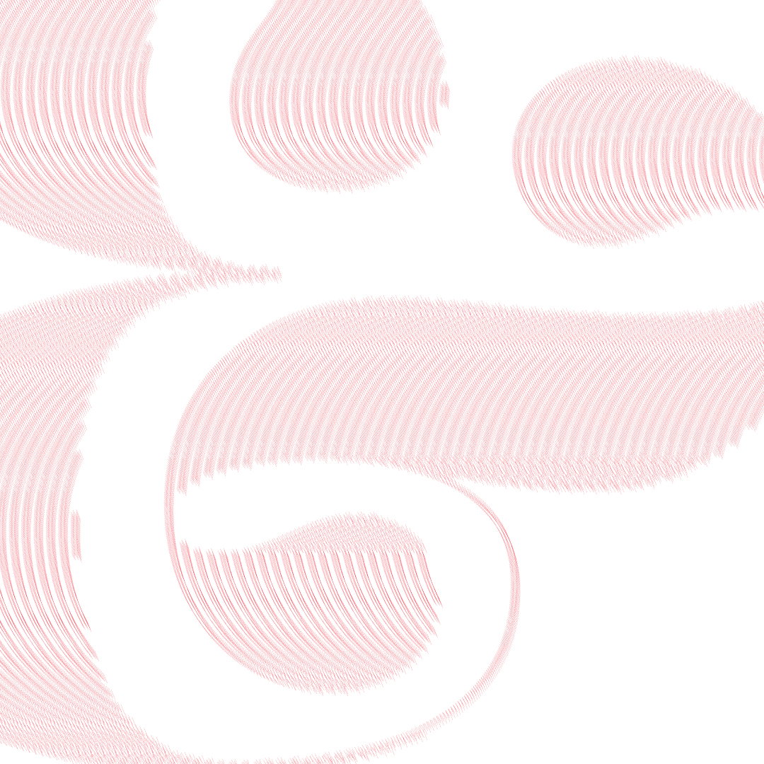
Nicole Arnett Phillips for The Foundry Types (Copyright © Nicole Arnett Phillips, 2020)
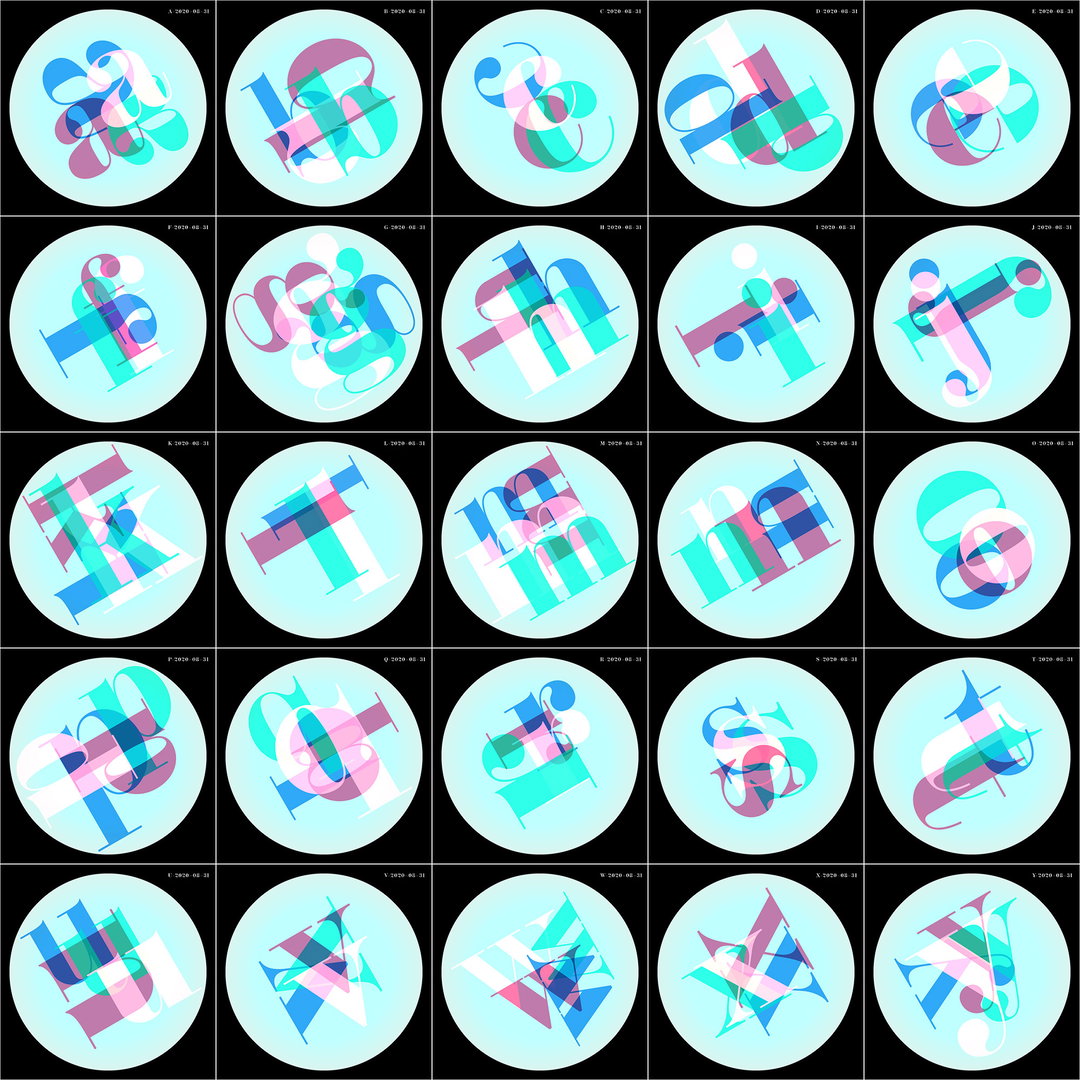
Nick Feeney for The Foundry Types (Copyright © Nick Feeney, 2020)
Hero Header
Bryan Edmondson for The Foundry Types (Copyright © Bryan Edmondson, 2020)
Share Article
Further Info
About the Author
—
Matt joined It’s Nice That as editor in October 2018 and was editor-in-chief in September 2020–2024. He was previously executive editor at Monocle magazine. He is now a freelance writer and editor.


