Gudrun Zapf von Hesse releases her first digital typeface, aged 100
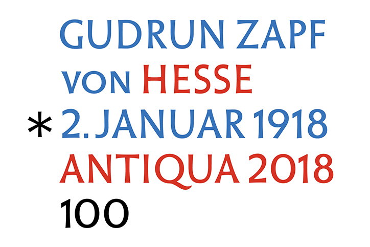
Gudrun Zapf von Hesse: Hesse Antiqua
To mark her 100th birthday on Tuesday 2 January, lettering artist and bookbinder Gudrun Zapf von Hesse has released her first digital typeface, Hesse Antiqua. The typeface is now available at Fontshop.
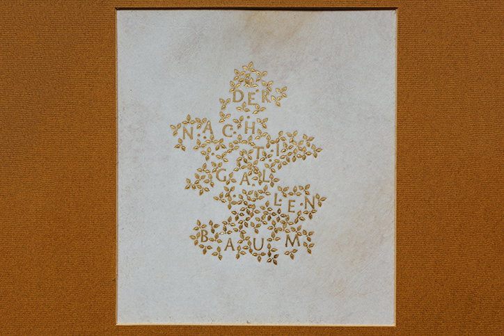
Gudrun Zapf von Hesse found a job with the Bauer Type Foundry in Frankfurt just after the Second World War, although her interest in lettering had been sparked much earlier by calligraphers such as Edward Johnston and Rudolf Koch. She developed her alphabet during her time in Frankfurt, where she punch cut the letters onto wooden handles and used them for title lettering on leather book covers and spines. The first book to use Hesse Antiqua was the anniversary book of Georg Hartmann’s 75th birthday in 1946. 70 years later, after innovating her initial alphabet, Gudrun can add digital typeface designer to her list of accomplishments.
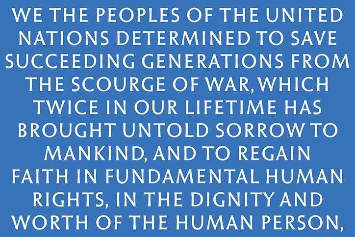
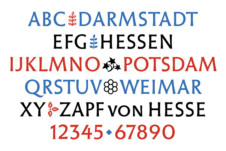
“This is a transformation of the Hesse Antiqua from a lettering alphabet into a typeface” explains Ferdinand Ulrich, the typographer who helped Gudrun Zapf von Hesse digitise her alphabet. Through close collaboration, Gudrun and Ferdinand worked to fashion a modernised font that remained true to the original letters. “A great challenge immediately arose in its various appearances in different circumstances,” says Ferdinand Ulrich. From initial drawings to golden hand-stamps, the font had repeatedly changed over time. Yet the finalised digital format manages to retain the alphabet’s initial warmth. The letters are uppercase with rounded off strokes that maintain the font’s tenderness, while the typeface also includes some of the ornaments from Gudrun Zapf von Hesse’s original brass punches like the triple-leafed branch. This has beautifully preserved the font’s distinct character.
Hesse Antiqua is available in capital letters, small caps, figures and several ornaments. Ferdinand Ulrich advises not to use the font smaller than 36 point and recommends it for a variety of projects from book jackets to contemporary editorial design covers and posters.

Gudrun Zapf von Hesse: Hesse Antiqua
Gudrun Zapf von Hesse: Hesse Antiqua
Gudrun Zapf von Hesse: Hesse Antiqua

Hesse Antiqua: photograph by Norman Posselt, from the collection of Gudrun Zapf von Hesse
Hesse Antiqua: photograph by Norman Posselt, from the collection of Gudrun Zapf von Hesse
Share Article
Further Info
About the Author
—
Daphne has worked for us for a few years now as a freelance writer. She covers everything from photography and graphic design to the ways in which artists are using AI.