Rebranding a country: El Salvador's national identity by Interbrand
Interbrand: El Salvador rebrand
Brand design agency Interbrand has designed a visual identity for Central American nation El Salvador, creating a vibrant illustration-based marque conveying the country’s “cultural riches”.
Working with PROESA, the exports and investment promotion agency of El Salvador, Interbrand aimed to exemplify the small nation’s qualities to its own inhabitants, but also outwardly. It is the smallest country in Central America but according to Interbrand has rapidly overtaken its neighbours in infrastructure and development in the last ten years, so the idea of the rebrand was to represent the “new face” of the nation.
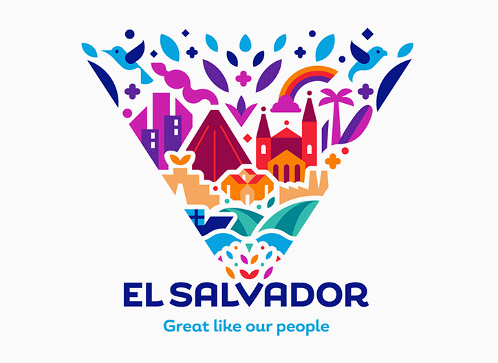
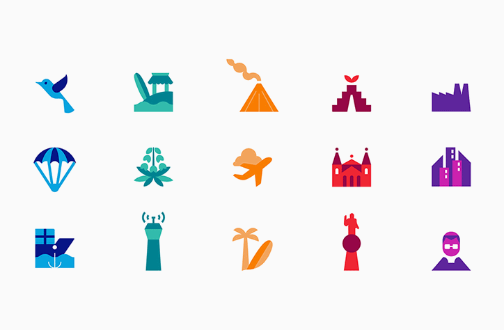
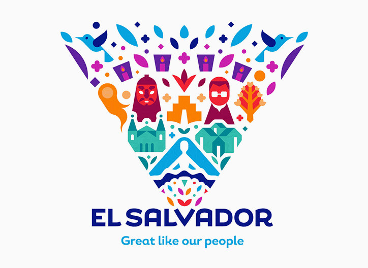
Based around the idea that “El Salvador is the place where everything converges, germinates, and amplifies”, the identity is comprised of flat, block colour illustrations of myriad icons of the country. Everything from a volcano to a church, factory skyscrapers, birds and palm trees are featured, which Interbrand says communicate the “multiple dimensions that are part of a Salvadoran identity: Economic, historic, geographic, and social”.
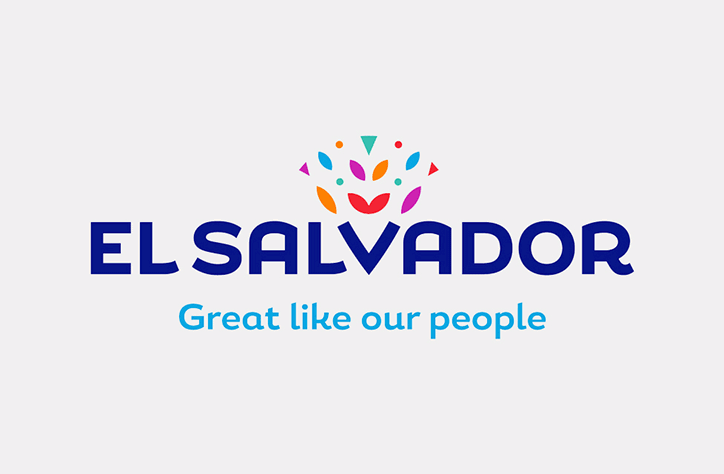
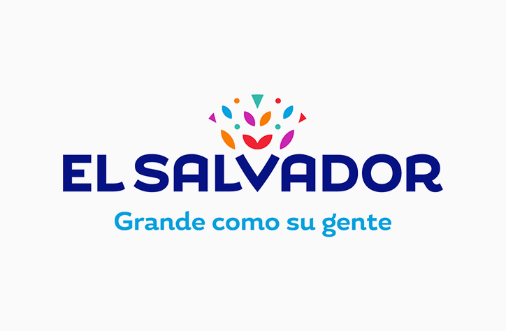
These converge on the central anchor of the wordmark, the ‘V’, “where a diversity of natural and cultural riches explodes outwards and expands with vital force – expressing the surprises the country can offer, and the infinite variety of experiences therein.”
Interbrand: El Salvador rebrand
Interbrand: El Salvador rebrand
Interbrand: El Salvador rebrand
Interbrand: El Salvador rebrand
Share Article
Further Info
About the Author
—
Jenny oversees editorial output across It’s Nice That. Get in touch with writing pitches for features or opinion pieces, big creative story tips, or questions about all things editorial. jb@itsnicethat.com
To submit your work to be featured on the site, please see our Submissions Guide.