Laurence King on how "anti-digital" design is reshaping publishing
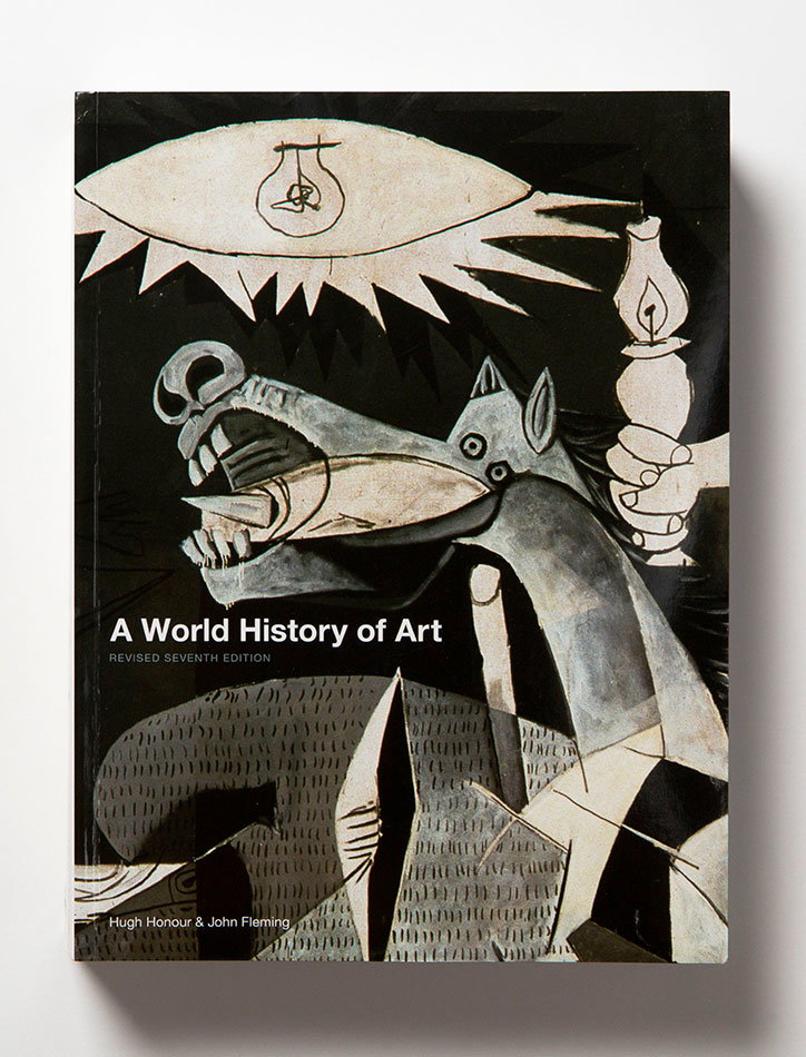
Laurence King: A World History of Art
Laurence King: Read This If You Want To Take Great Photographs
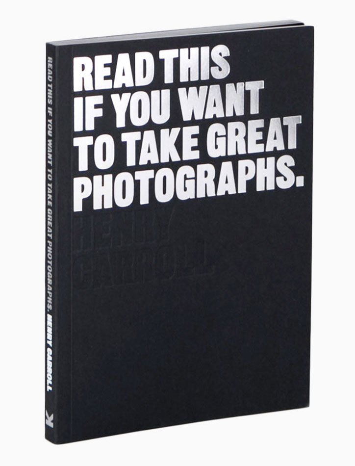
Laurence King: Read This If You Want To Take Great Photographs
A quarter of a century ago Laurence King founded a publishing house, and since then so much has changed. Now, on the company’s anniversary, Laurence speaks to It’s Nice That about how, in a digital-weary world, design has become more integral to publishing than ever.
In the 25 years since I started the company, designers have become increasingly central in the whole process of creating illustrated books. The digital revolution has meant that people want a distinctly non-digital experience from printed books. Handling a book has to be pleasurable, just as reading it is. Books now have to be taken seriously as physical objects, to be sold in fashion chains, art supply stores and supermarkets, as much as in bookshops, competing with non-books for the attention of potential buyers.
The marketing of each book has to be embodied, not just in the cover, but in the whole way it is produced. The extraordinary success we had with the series of books beginning with Read This if You Want to Take Great Photographs, derived from the collaboration between the author, Henry Carroll, and our creative director, Angus Hyland, who helped realise Henry’s vision. The stark message of the title is replicated in the way it is positioned on the cover – standing out boldly against a plain, black background. The texture of the cover is that of the black card often used in photography. The jargon-free, practical text is mirrored in the clear, accessible layout inside. The writing and the design had to happen concurrently. The designer no longer starts work when the author has finished; the design is integral to the concept.
It’s not surprising that publishers like us have started producing gifts, games and stationery. Semi-educational games such as Bird Bingo, The Clash of the Titians or Story Box, in which the content and the design are almost one and the same, can embody our values as much as the classic text, A World History of Art, which we published in 1991.
The importance of the design and physicality of books is nowhere more evident than in the extraordinary phenomenon of colouring books – a quintessentially anti-digital experience. Secret Garden, the book that started the whole trend, sold about nine million copies last year. I believe that its success owed as much to the black, gold, and cream branding, the texture of the paper, the format, and the placing of the illustrations, as it did to the brilliance of Johanna Basford’s work. The brand extended into postcards, journals, and other related products, each of which was a collaboration between originator and designer.
No one knows the future of the illustrated book, but such collaborations must form a key part of it.
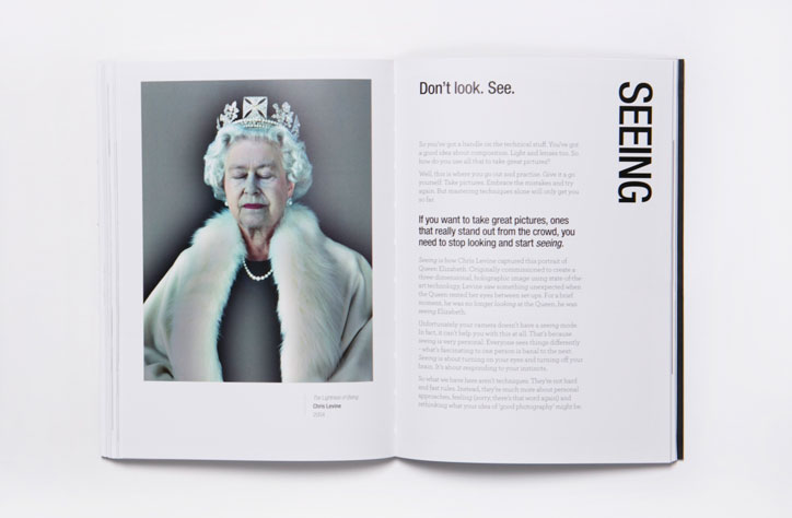
Laurence King: Read This If You Want To Take Great Photographs
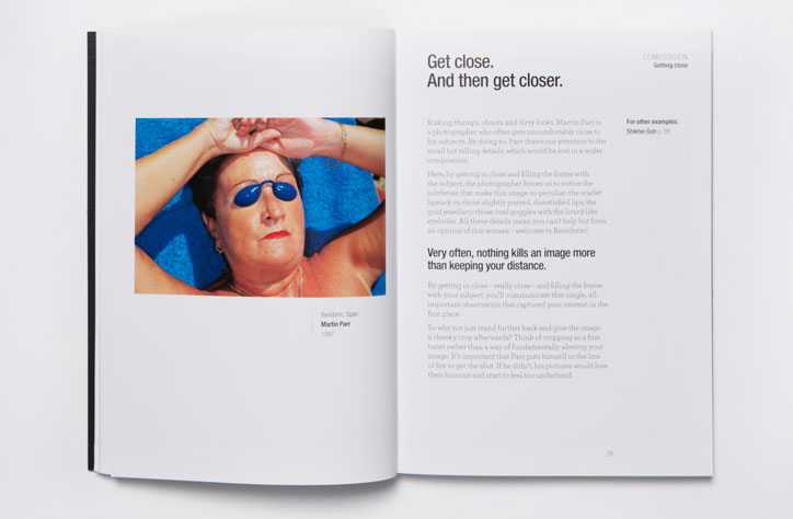
Laurence King: Read This If You Want To Take Great Photographs
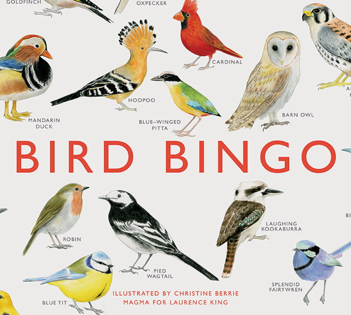
Laurence King: Bird Bingo
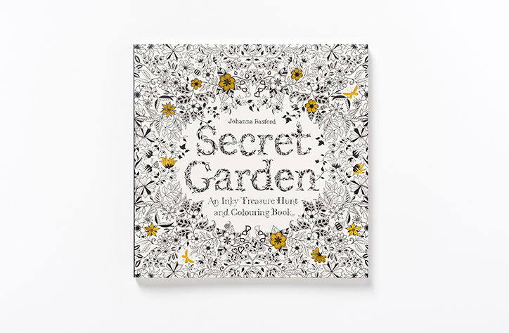
Laurence King: Secret Garden
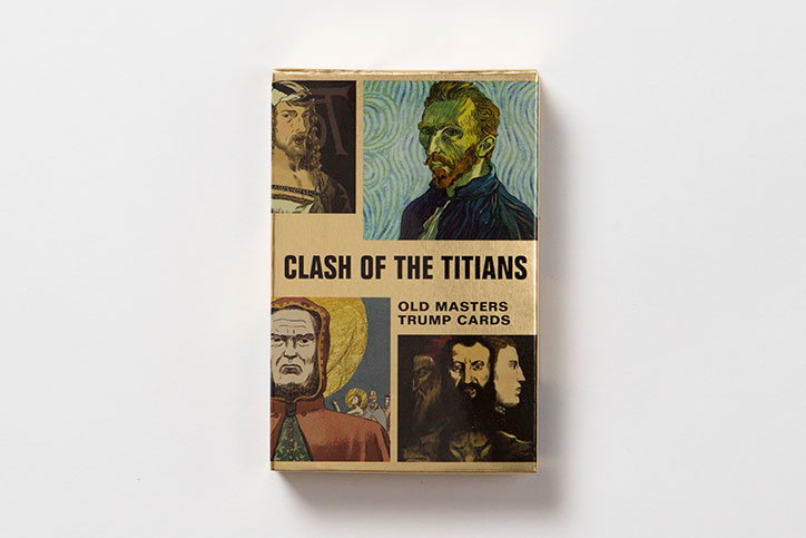
Laurence King: Clash of the Titians
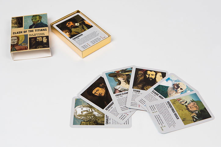
Laurence King: Clash of the Titians
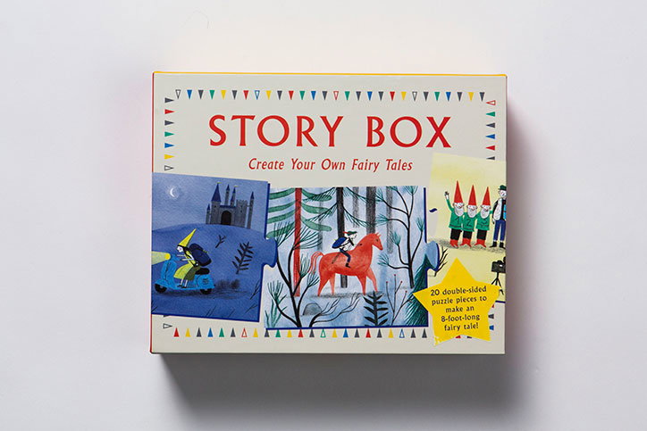
Laurence King: Story Box
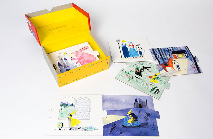
Laurence King: Story Box